|
| Group |
Round |
C/R |
Comment |
Date |
Image |
| 31 |
Nov 20 |
Comment |
Thank you Ian and Paul. |
Nov 17th |
| 31 |
Nov 20 |
Comment |
Thank you Ed, John, and Peter. Your comments are very much appreciated. |
Nov 14th |
| 31 |
Nov 20 |
Reply |
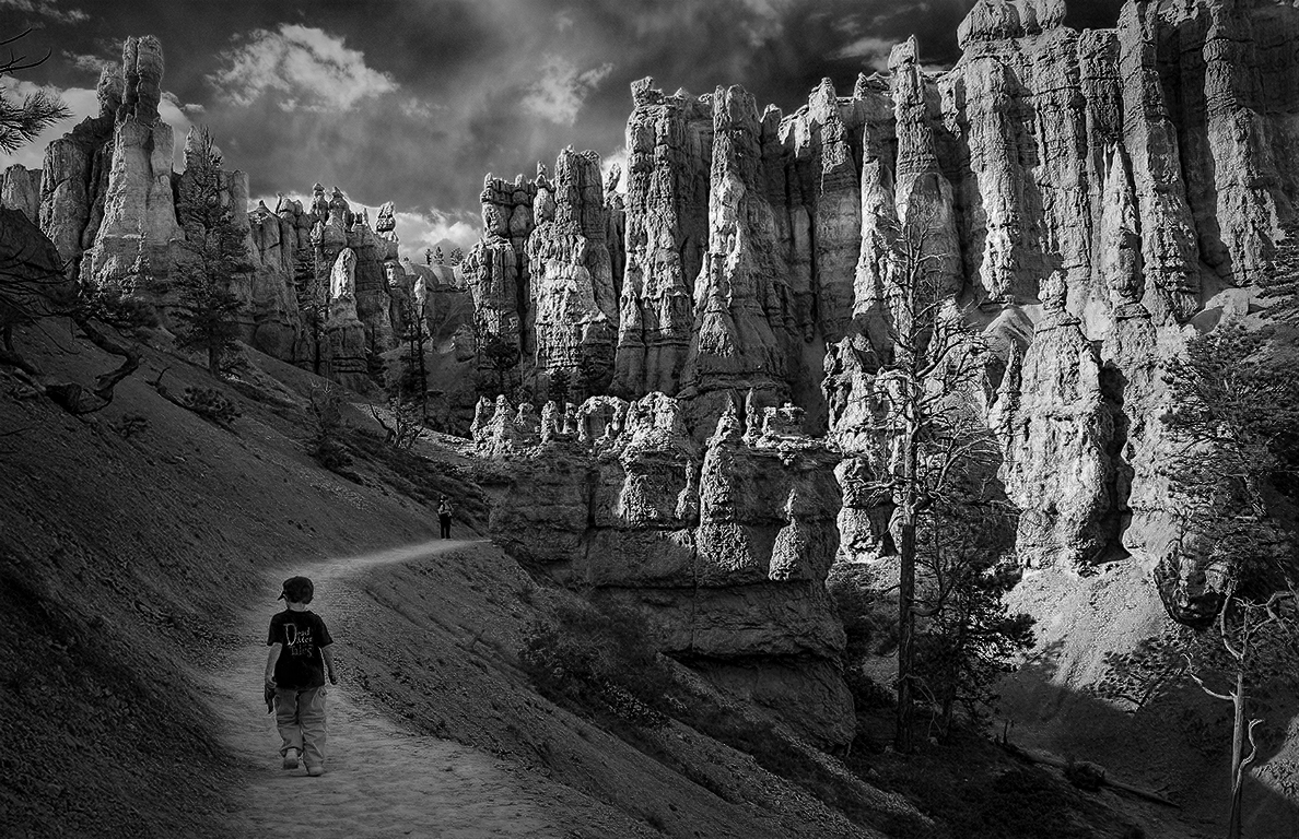
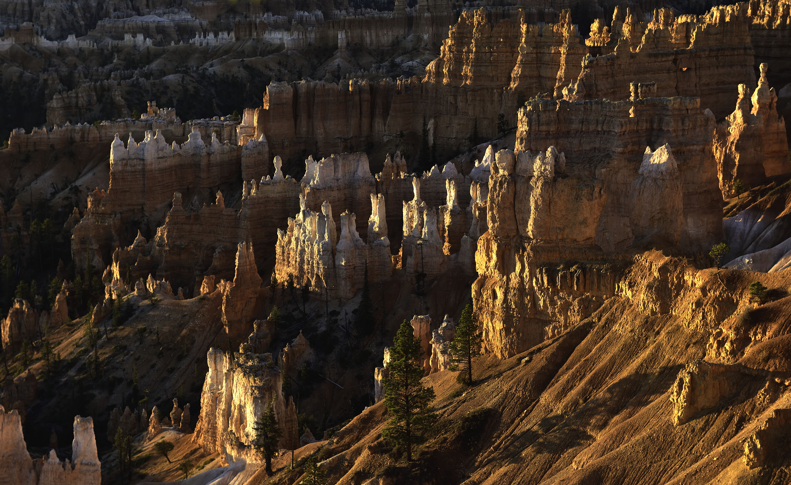
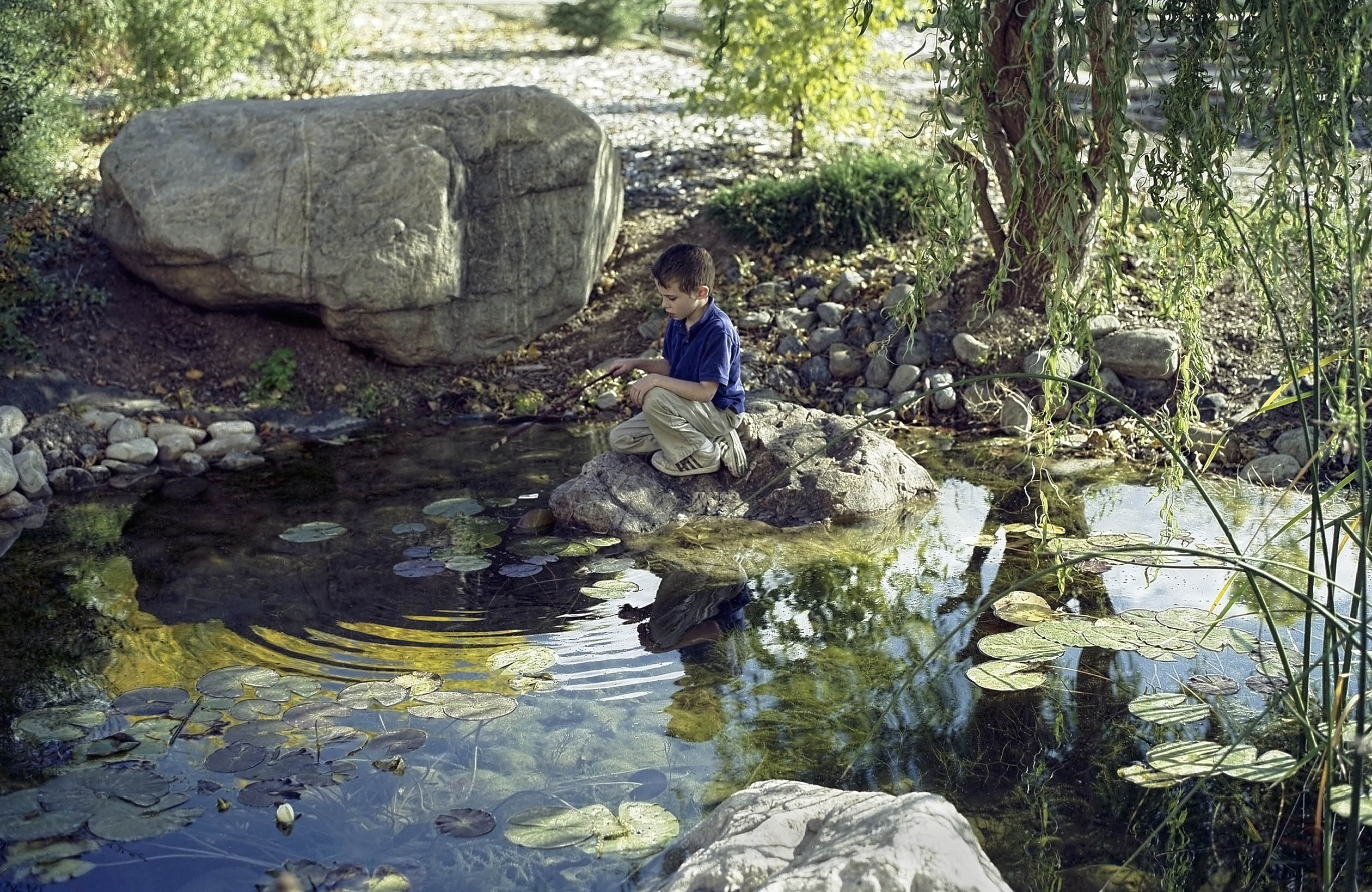
Thank you Ella, I appreciate it. Bryce is a magical place rarely photographed from inside the formations. |
Nov 11th |
| 31 |
Nov 20 |
Comment |
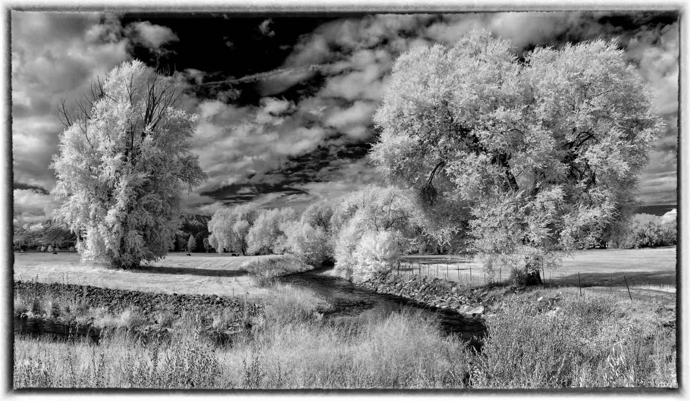
It is always interesting to me on how people can photograph an existing piece of art and create a separate and equally viable piece of art. Very well done Ella. The stationary art reflecting in the moving water enhances the image via an unusual use of contrast. I like it. |
Nov 6th |
| 31 |
Nov 20 |
Comment |
Very well done Ian. Everything important is sharp and the composition fits the action that is occurring in front of the audience. |
Nov 6th |
| 31 |
Nov 20 |
Comment |
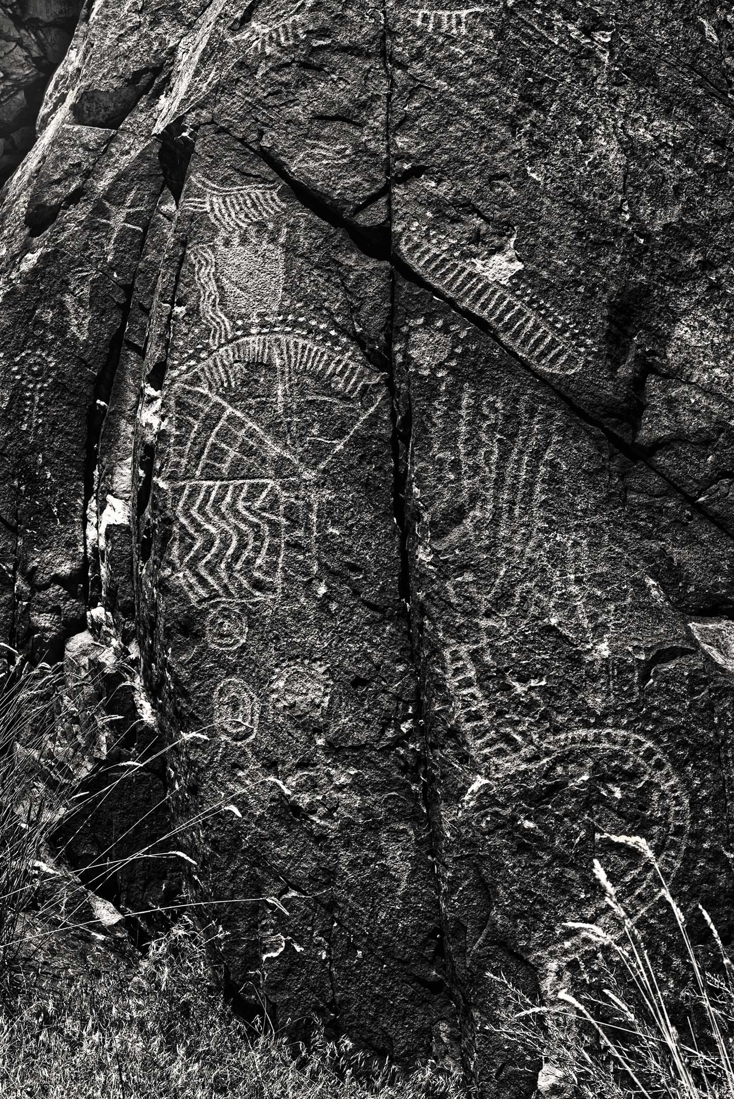
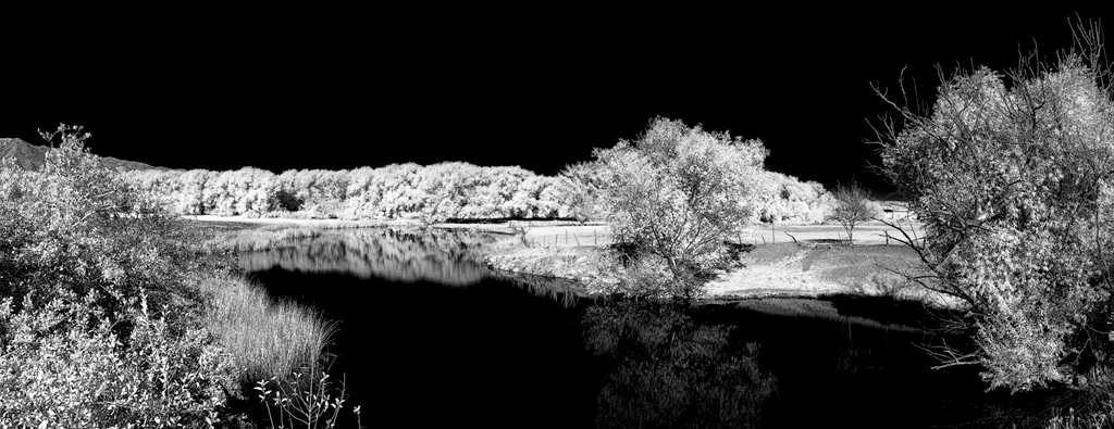
The amount of detail in the highlights and the shadows reveal an amazing exposure that has no clipping. I doubt I would make any adjustments to a print of this image. I would probably lighten the rocks (not the water) along the top edge to reveal more detail for viewing on a monitor due to the nature of a projected image.
I am curious as to the original color image to see how it compares. |
Nov 6th |
| 31 |
Nov 20 |
Comment |
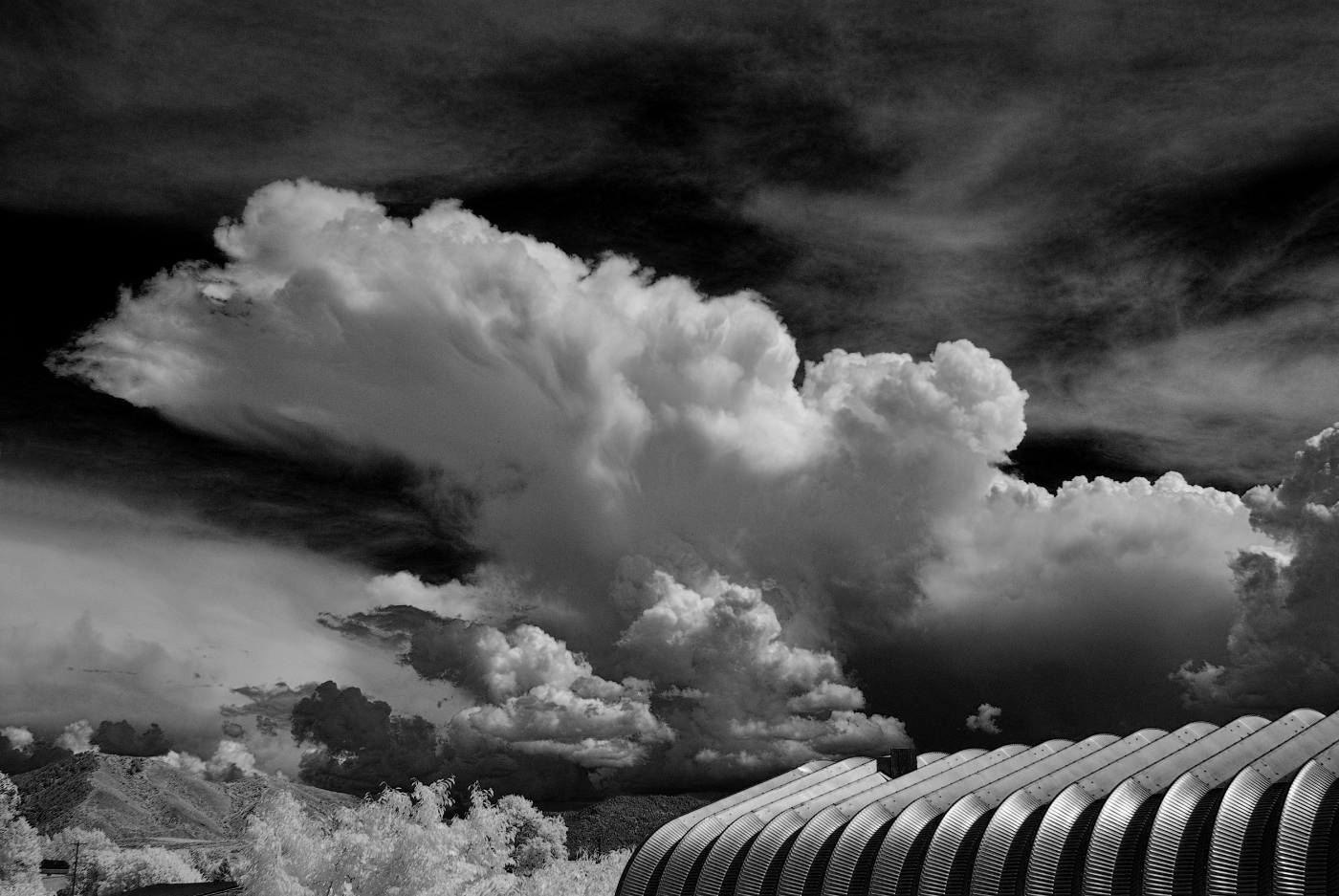
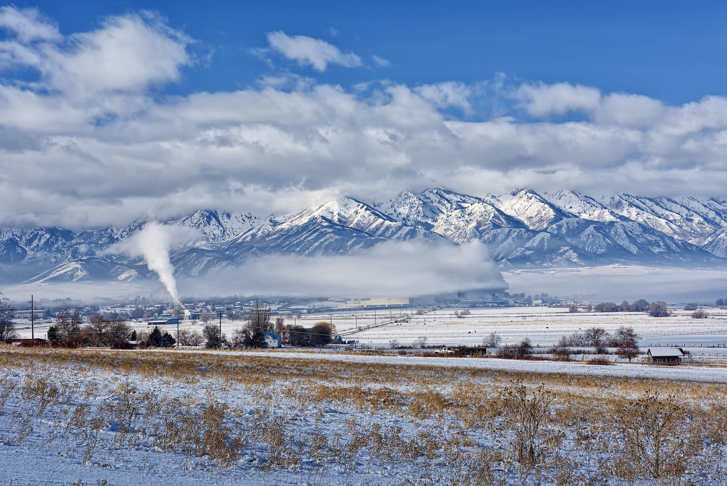
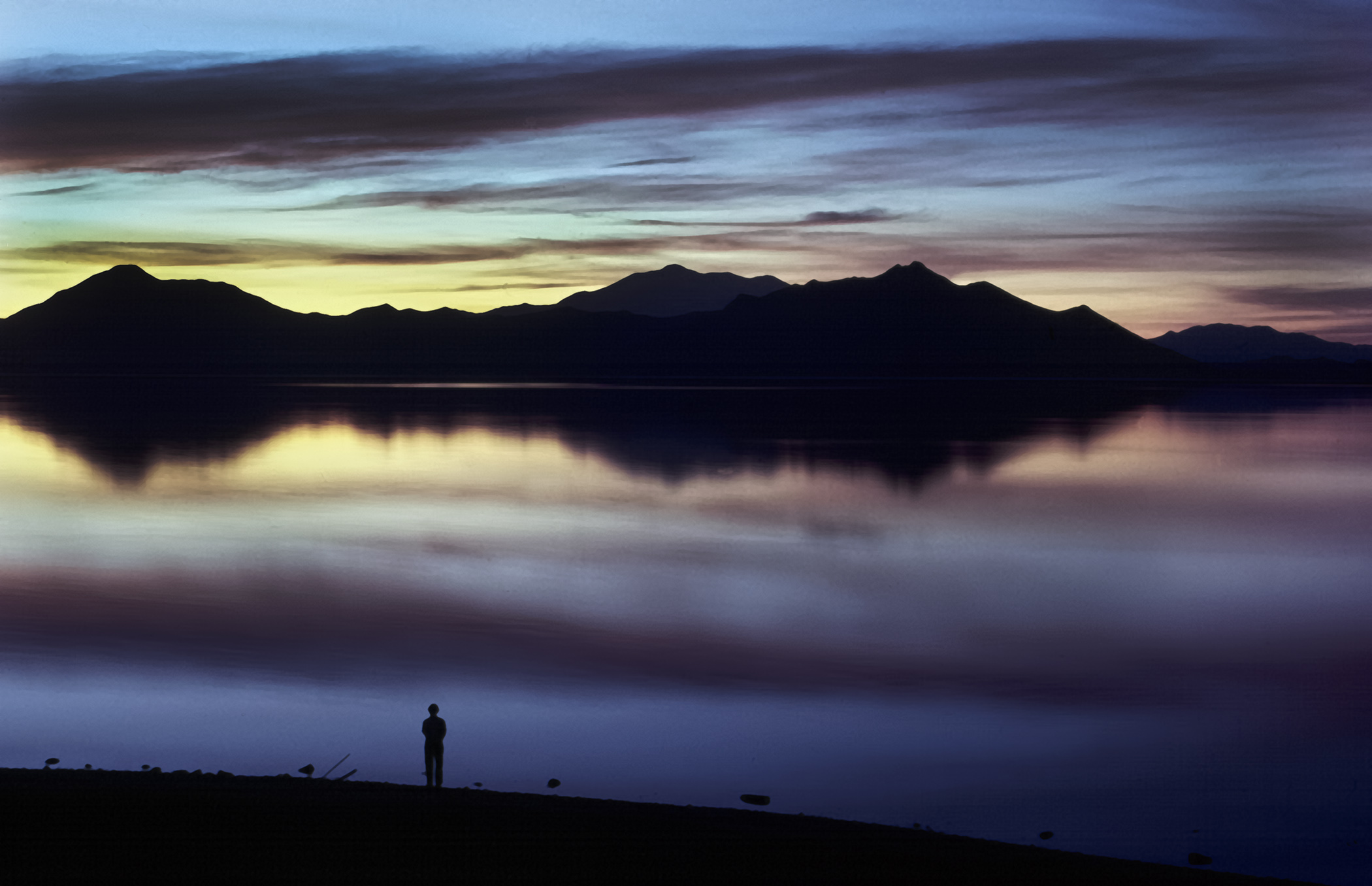
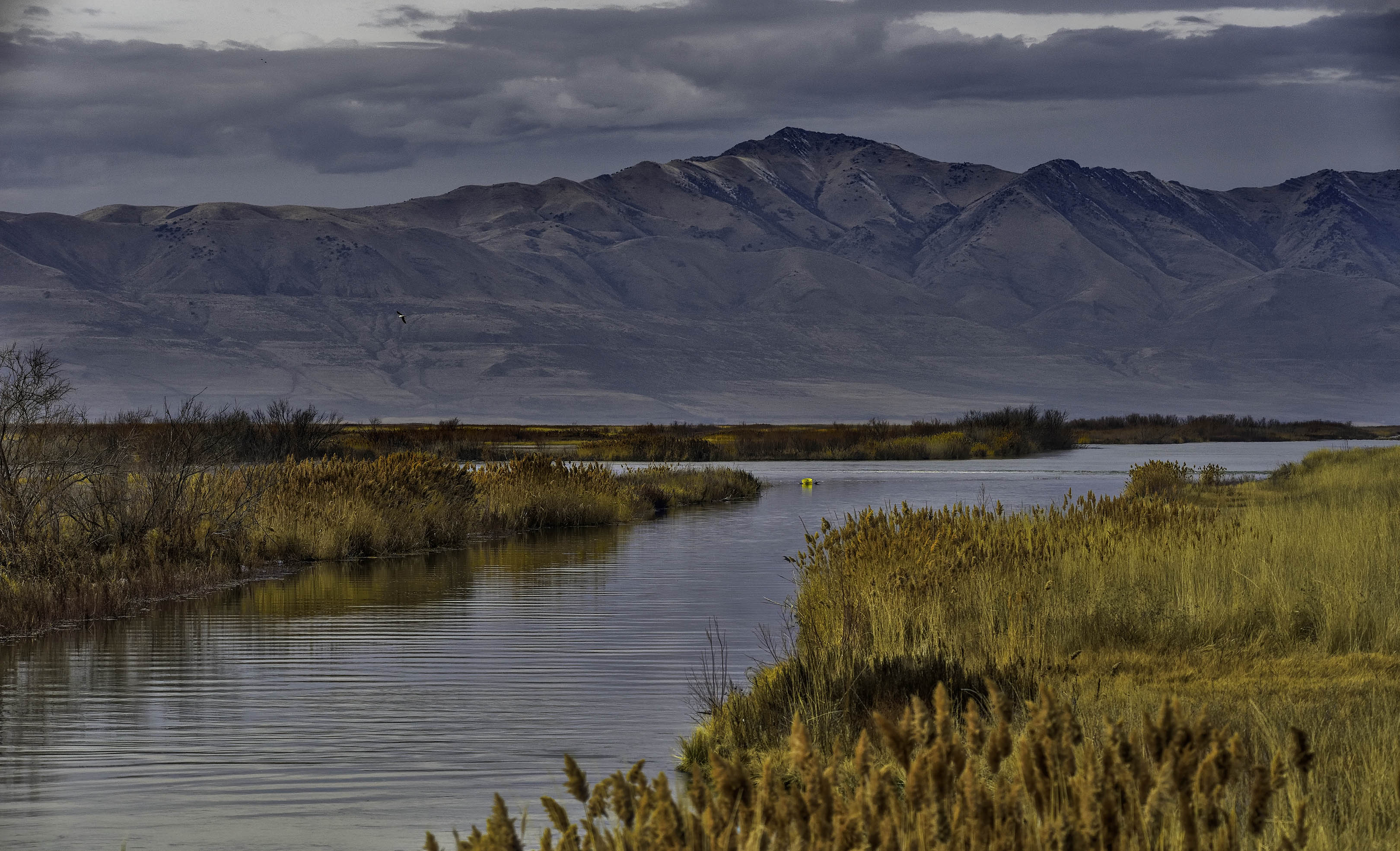
Definitely very dramatic light that draws the eye in. The scale of the mountains and valley is immense as compared to the buildings built by man. A very impressive photo Peter. |
Nov 6th |
| 31 |
Nov 20 |
Comment |
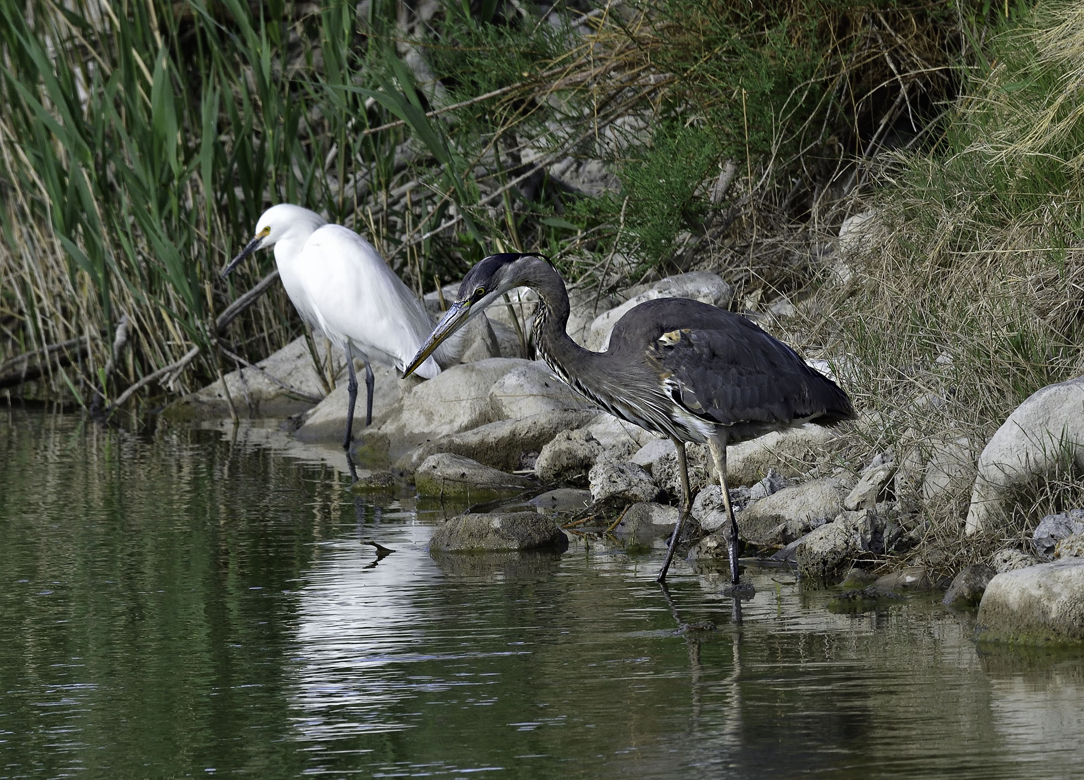
Nicely done Ed. Reminds me of the local mountains here where I live prior to the arrival of fresh snow. In Carolina, I would expect sleet or heavy rain. |
Nov 6th |
| 31 |
Nov 20 |
Comment |
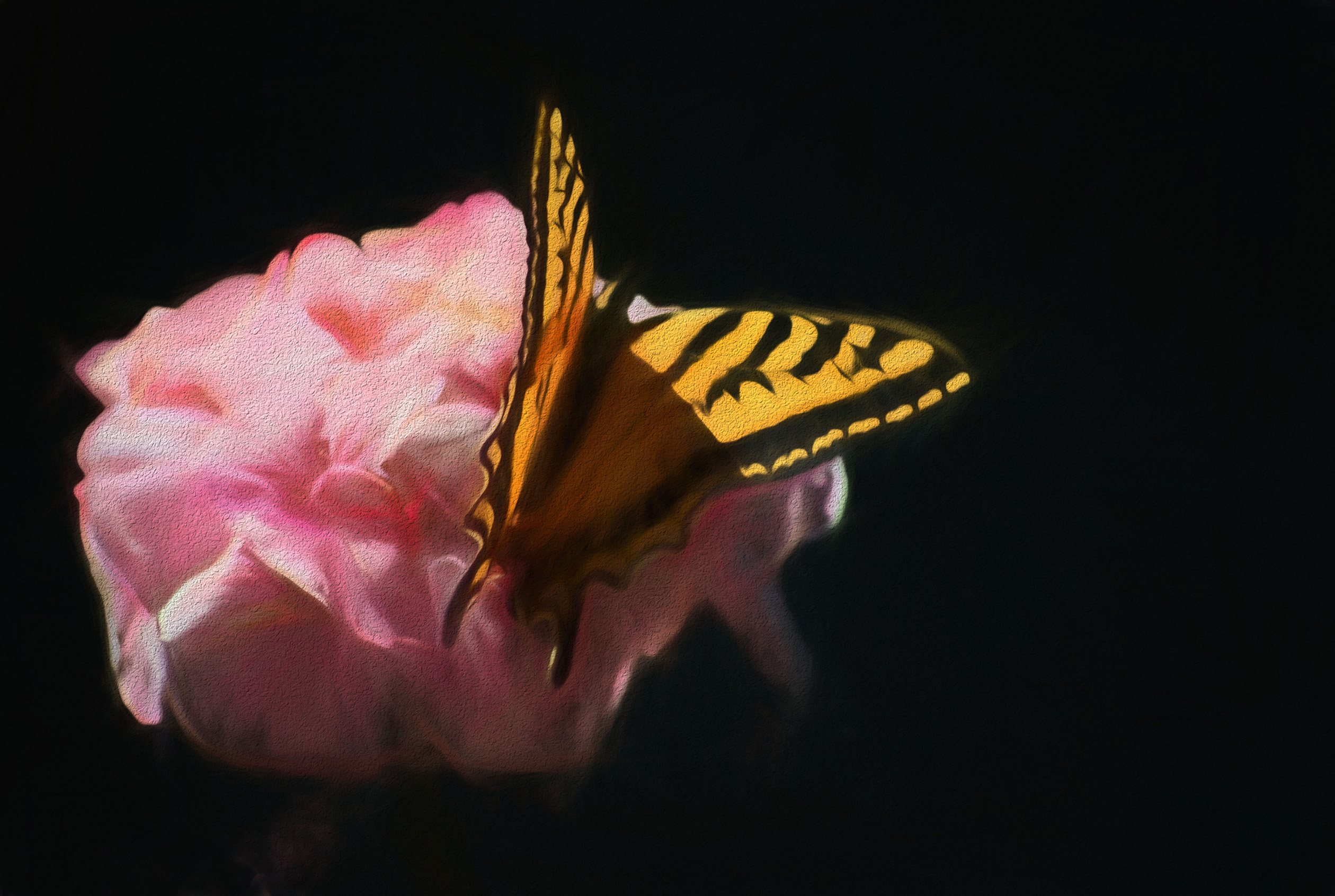
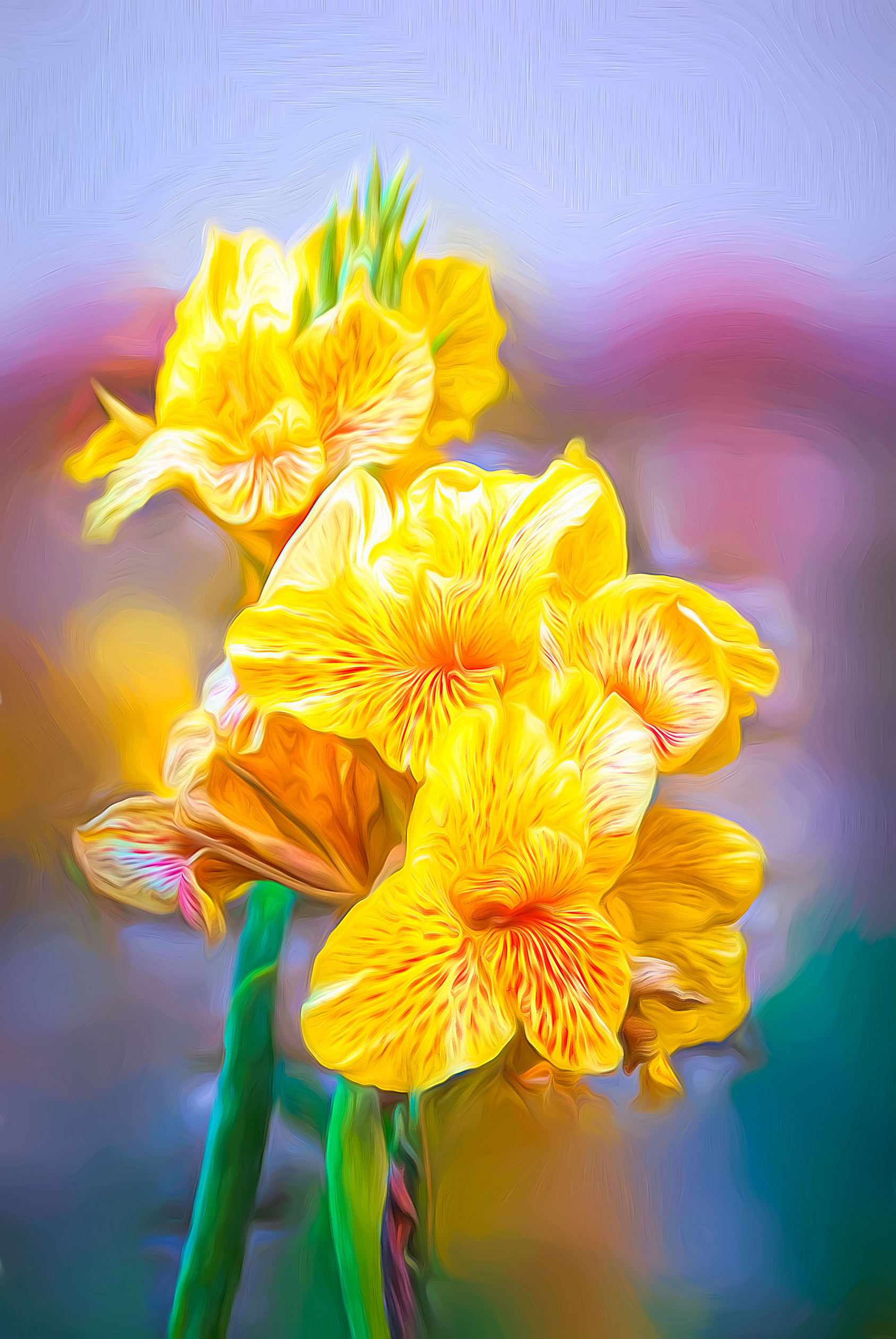
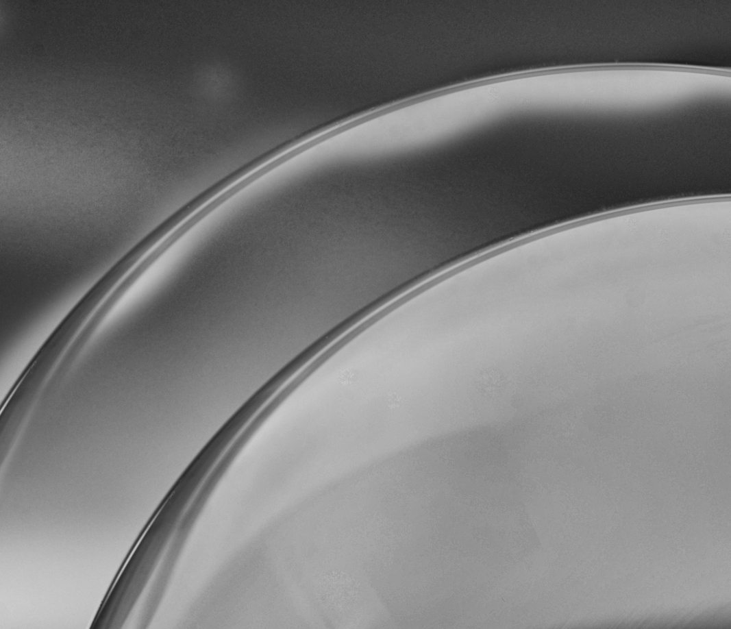
Interesting image of an abstract creation. There is a line for the eye to follow but, for me, it does not reach an obvious point of interest. The background does not contain any cosmological information to produce a planetary object for me. Maybe clone a secondary ring from the edge of the glass paperweight to suggest a planet? |
Nov 6th |
 |
8 comments - 1 reply for Group 31
|
| 93 |
Nov 20 |
Reply |
Thank you very much Ed. I appreciate your comments. |
Nov 17th |
| 93 |
Nov 20 |
Reply |
I disagree, in my opinion you did not do a bad conversion. At worst your conversion is incomplete and could use more post processing. To be fair, all of us would need to know how you did the conversion before any of us could compose a critique that would be of any use.
A simple desaturation would leave a lot to be desired for almost any color image. Using either "channel mixer" or "Black 7 White" under Image then Adjustments would provide multiple sliders that would adjust the gray tones (lighter or darker) produced by the color information. Using NIK Silver Effects Pro, by itself, would provide for even more choices. Using Silver Effects Pro after converting in Photoshop adds even more choices.
Just for arguments sake, I downloaded your original color image and did a black & white adjustment on a duplicate layer where I adjusted the blue slider a lot to darken the sky. I then added another layer using NIK Silver Effects Pro and adjusted almost everything possible using several sliders including global adjustments, film types, and finishing adjustments to name a few. The result is not great but hopefully illustrates what is possible through experimentation. Don't give up on B&W conversions, it is another tool available to express yourself with. As with all modifications that are done on separate layers, if you don't like the results, then you can delete the layers and keep the original color image. As for the changes I made, I would not keep them. Your color image in my opinion is much better. |
Nov 11th |
 |
| 93 |
Nov 20 |
Reply |
Thank you Darcy, I appreciate it. |
Nov 11th |
| 93 |
Nov 20 |
Comment |
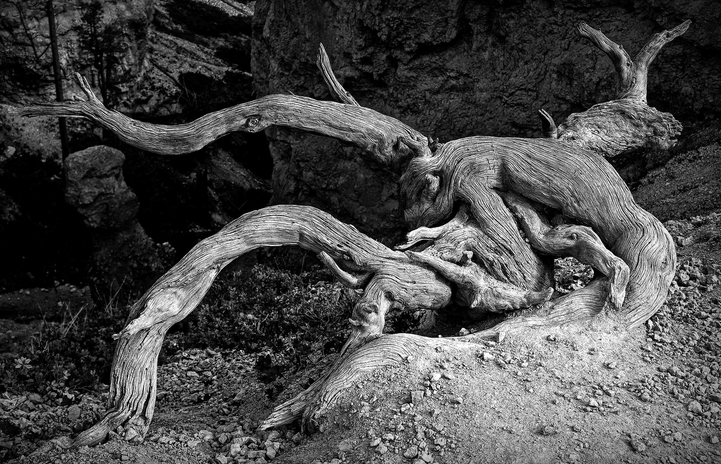
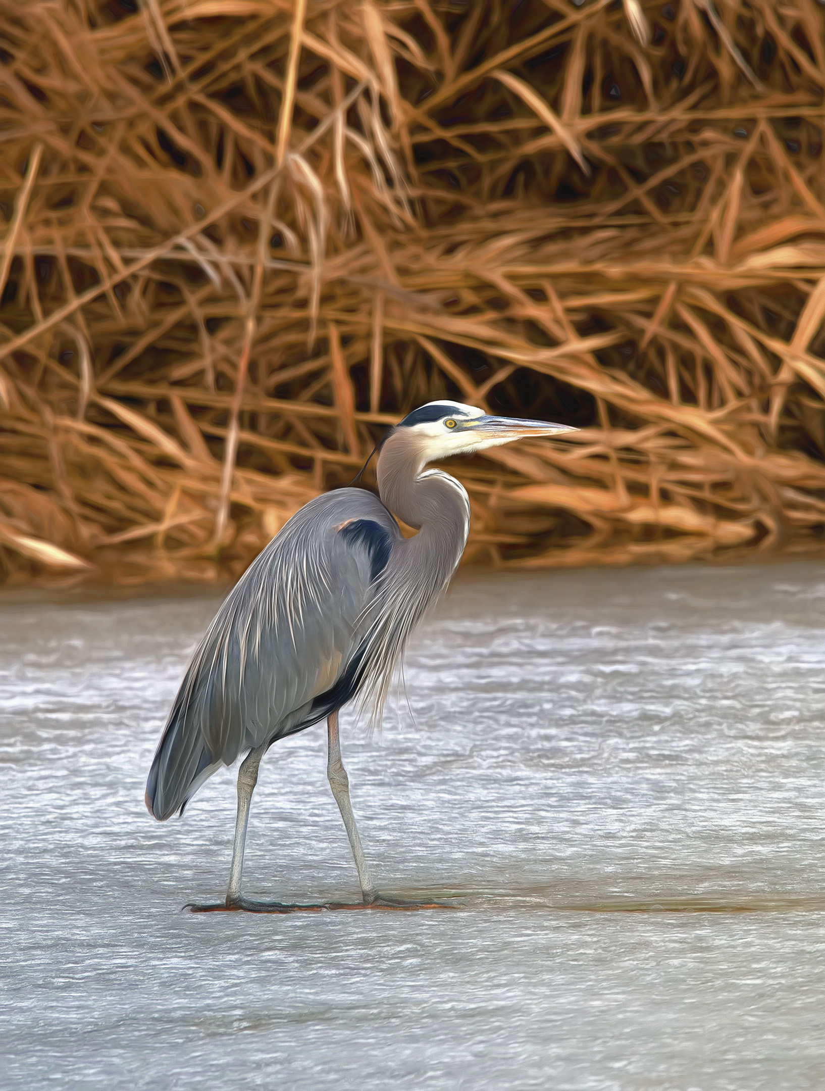
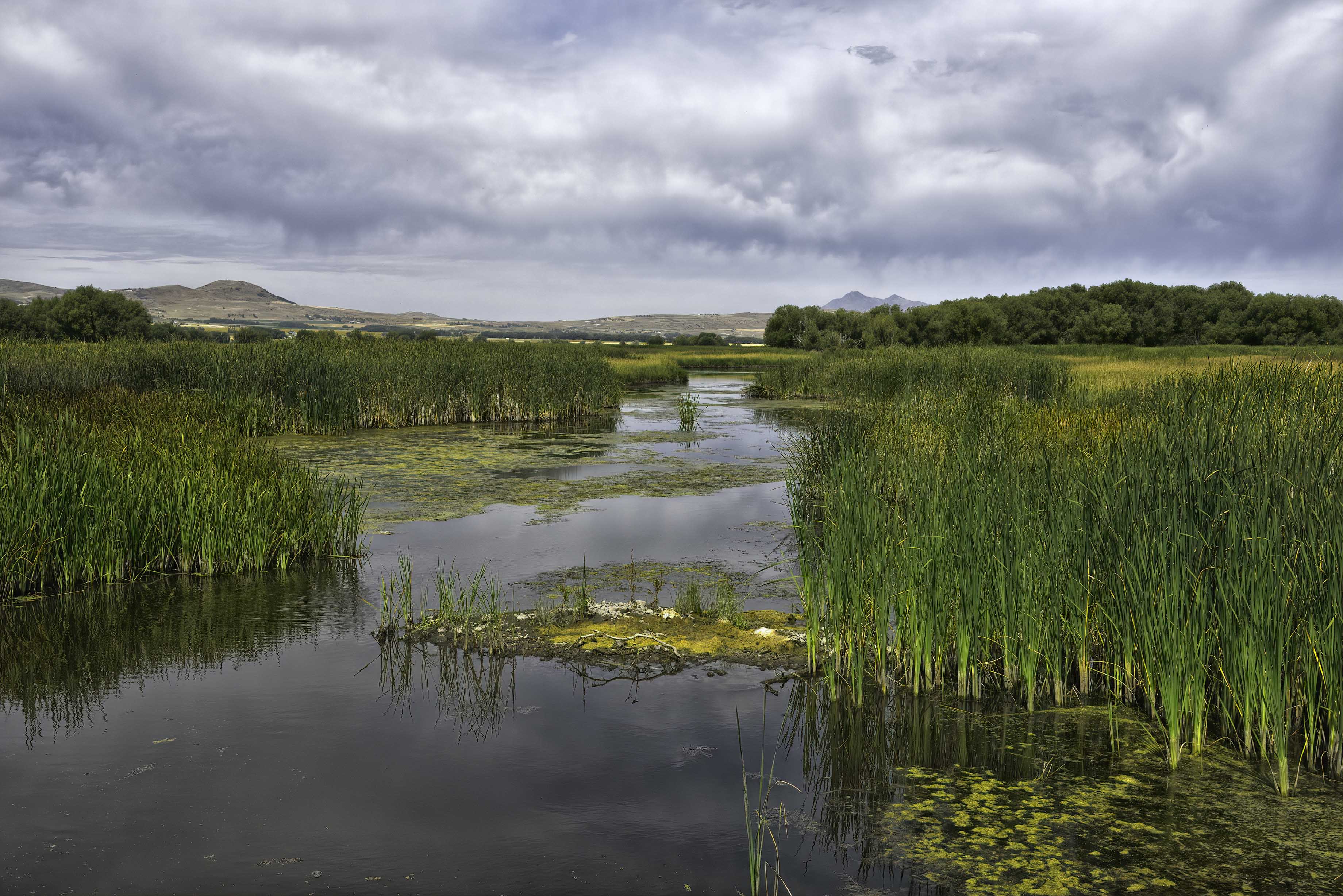
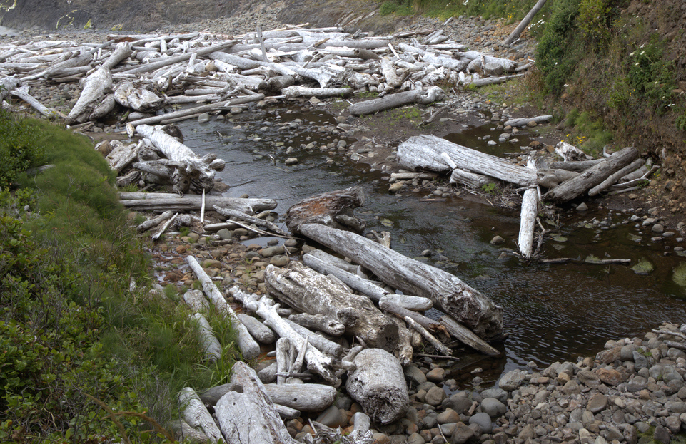
Interesting image Ed. If you replace all the greenery with red rock and sand, you would have an image reminiscent of many of the dry washes in southern Utah after a flash flood.
I tried a tighter crop to remove the light triangle at the top left of the image which was distracting me and concentrate the view on the drift wood. |
Nov 11th |
 |
| 93 |
Nov 20 |
Comment |
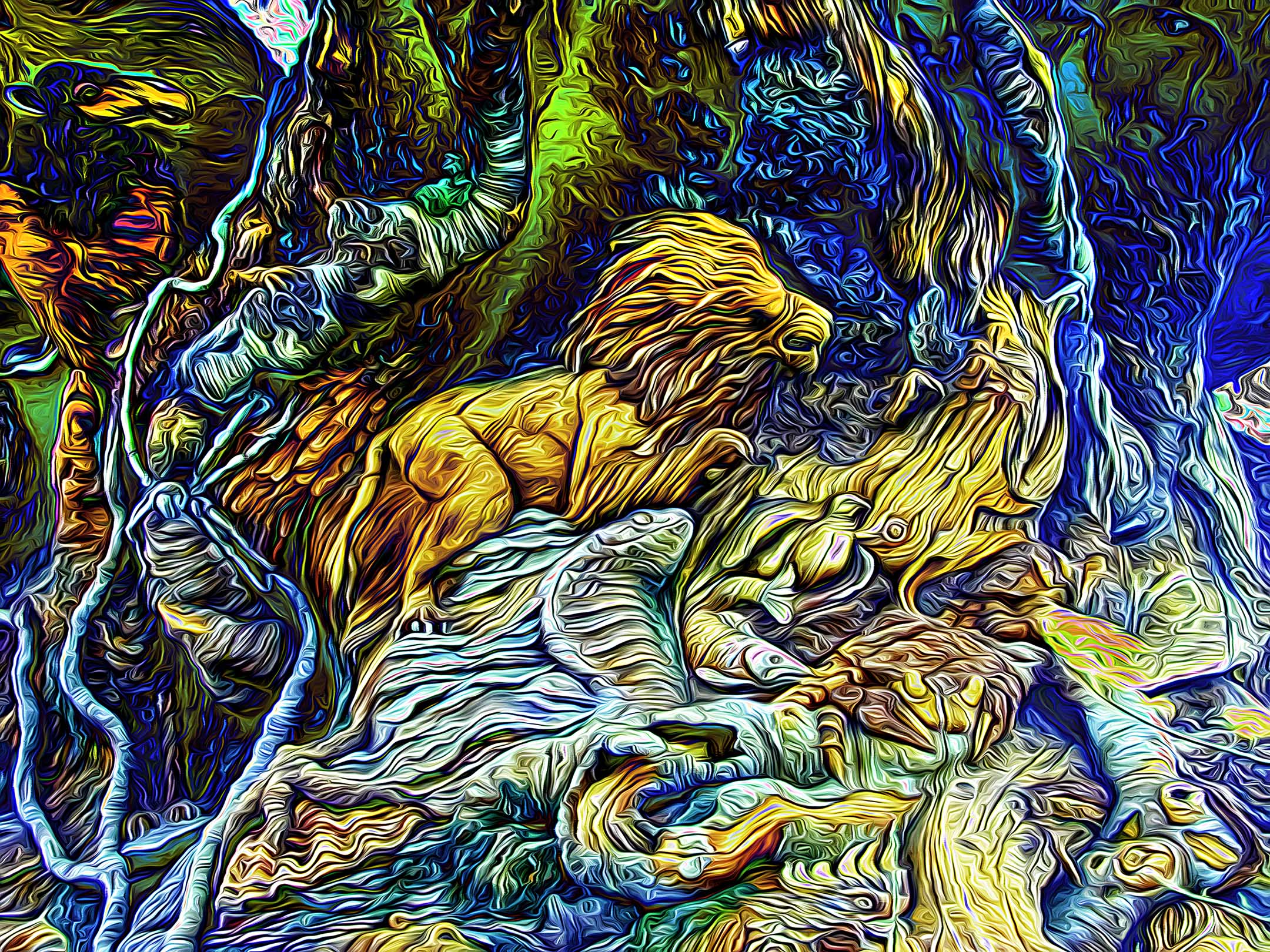
I like the results of your efforts Paul. Topaz does take a lot of practice and experimentation to get the effect that you want. Looking at what you accomplished, I would suggest three things: 1 - adjust to a smaller brush size and 2 - increase the number of strokes. If YOU like the results, try adjusting the "smudge" control in small increments to lessen the hard edge the brush strokes initially have. For whatever reason, blending the edges of the strokes makes the final image for compelling to me. Unfortunately, you will need to start over at the beginning to try these changes unless you used Topaz within a "smart layer". This is a major deficiency in Topaz |
Nov 11th |
| 93 |
Nov 20 |
Comment |
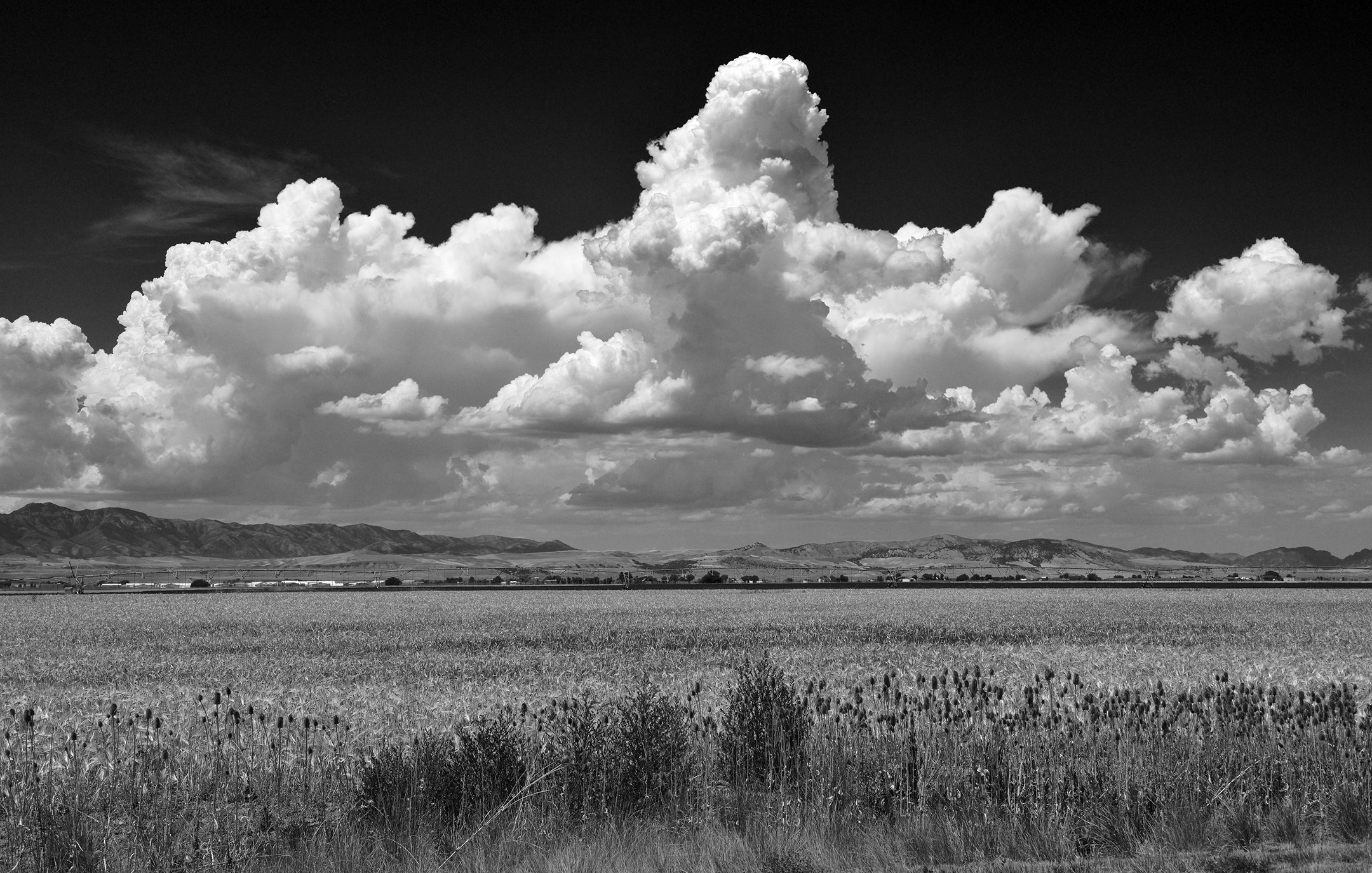
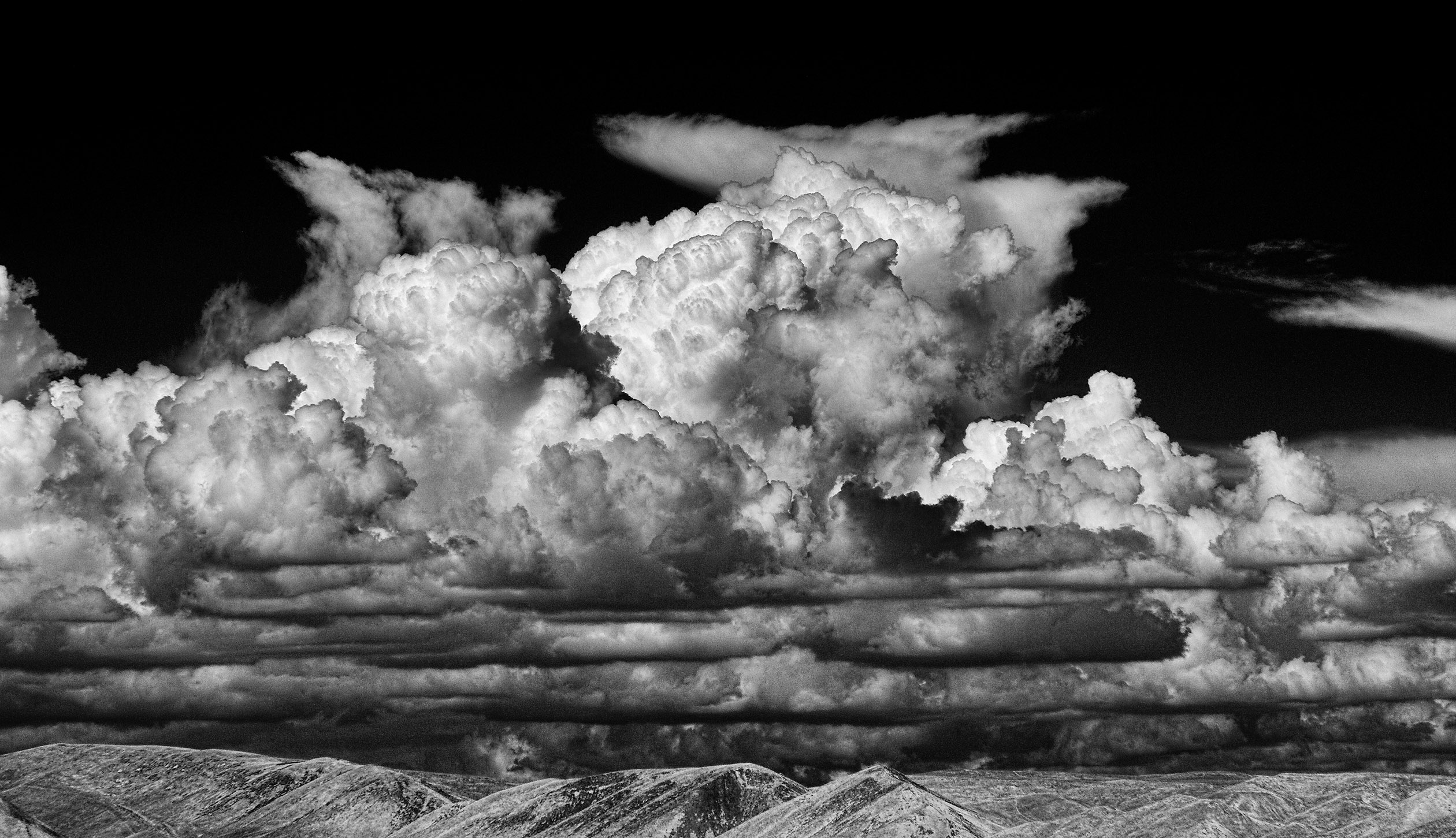
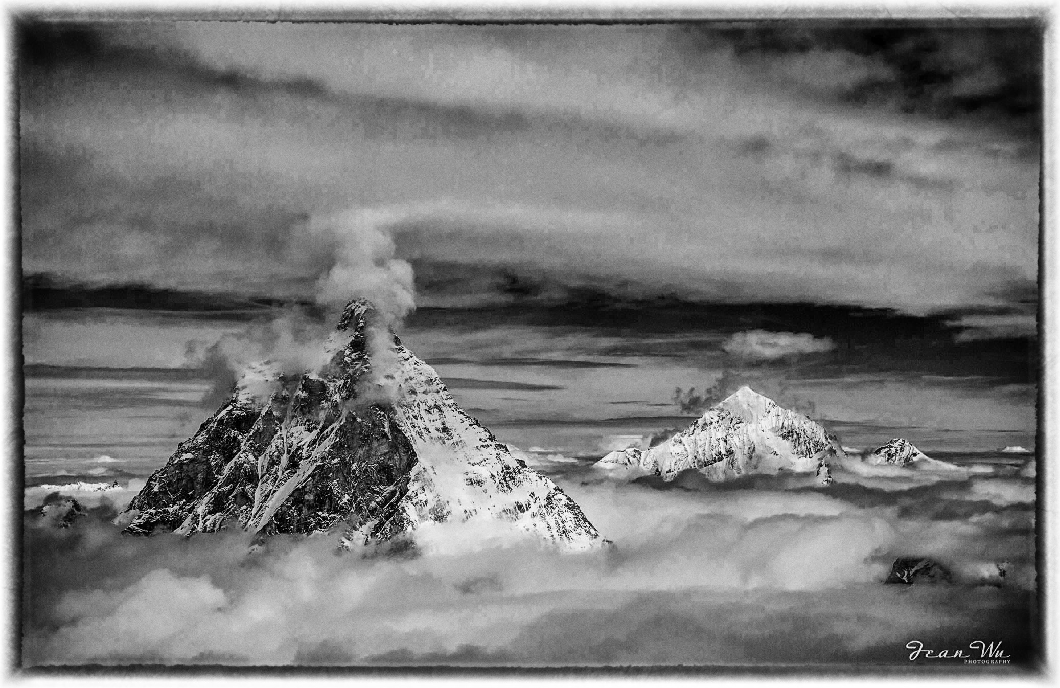
I prefer the color image Jean. The repeating pattern of the 3 peaks leads my eye through the image from left to right and the blue sky brings it back to the beginning. In my opinion. the B&W image lacks the inherent contrast that the color image has except where the light is reflecting off the snow. The clouds in the B&W image are a large expanse of gray without much definition. |
Nov 11th |
| 93 |
Nov 20 |
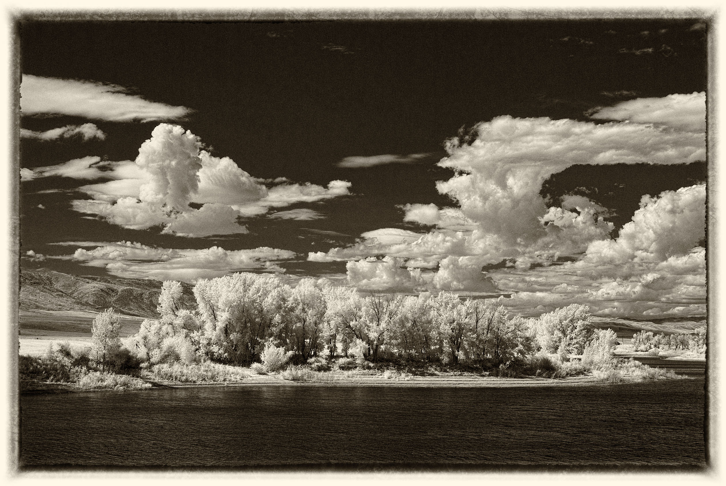
Comment |
I prefer the B&W image also. I agree with Ed about the shrub in the lower left corner. If you have NIK Color Effects Pro, maybe try the "Darken/Lighten Center" adjustment. Choose "Brush" then "Paint" and adjust just the corner to taste with the brush tool in Photoshop. Click apply and you will have a new layer with just the corner modified. |
Nov 11th |
| 93 |
Nov 20 |
Comment |
Love the huge sky Jerry. The early morning light is awesome. |
Nov 11th |
| 93 |
Nov 20 |
Comment |
Really well done Jeff. I like the contrast between the smoother sand with the leading lines guiding my eye to the ruggedness of the mountains. |
Nov 11th |
| 93 |
Nov 20 |
Reply |
Thank you Jeff, I appreciate your comments. I did not crop in any farther as, to me, the image lost visual balance. In your opinion, do you think that providing a vignette to darken the edges would achieve the same visual effect? |
Nov 9th |
6 comments - 4 replies for Group 93
|
14 comments - 5 replies Total
|