|
| Group |
Round |
C/R |
Comment |
Date |
Image |
| 31 |
Oct 20 |
Comment |
Thank you both Ed and John. |
Oct 17th |
| 31 |
Oct 20 |
Comment |
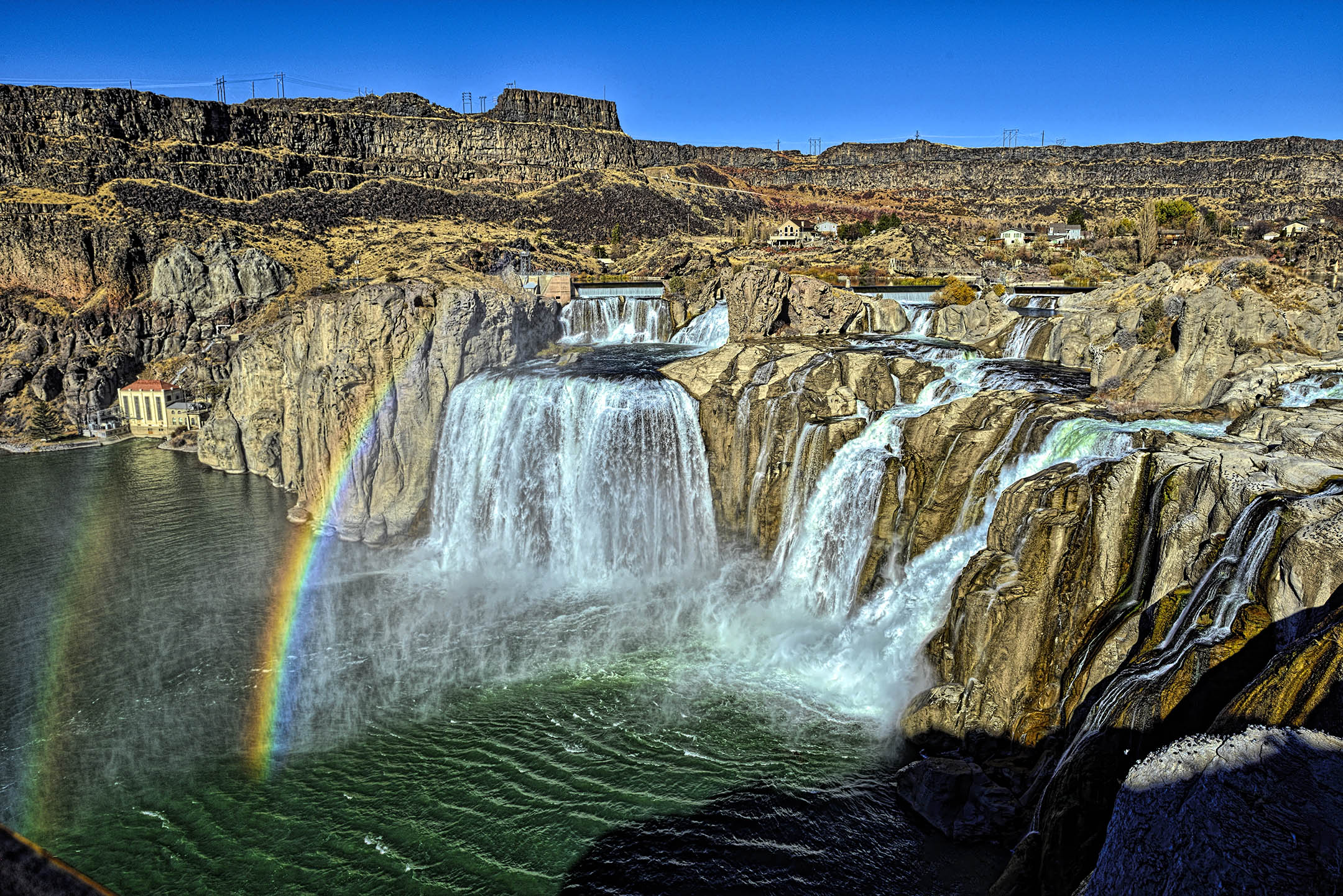
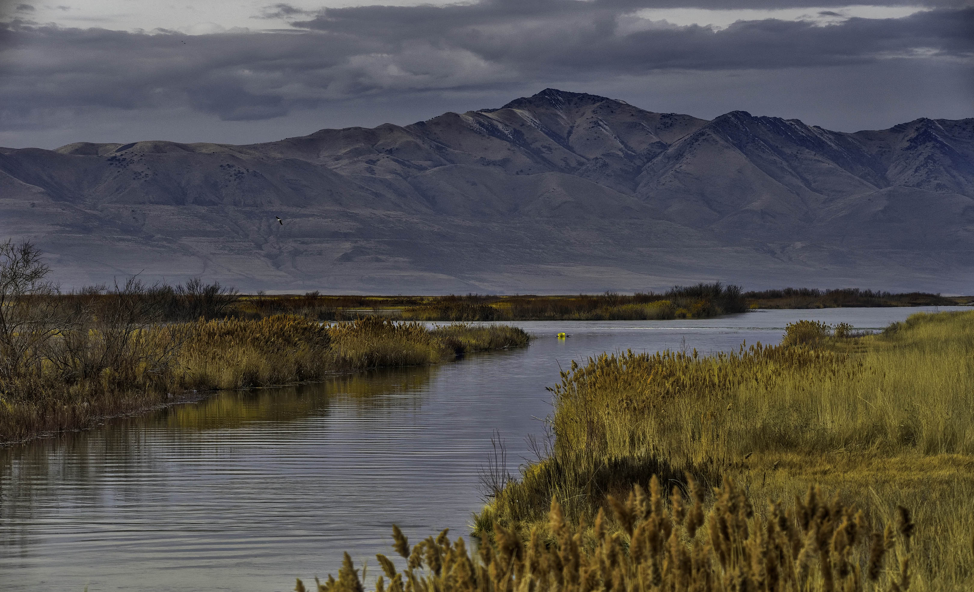
Where and on which island were you when you captured this image? I like this image but, personally, I am confused as to the direction of light. Some of the rocks appear to have a source of light from the left side (producing what looks like side lighting) while the water in the foreground appears to have back lighting (but not the water behind the rocks). |
Oct 5th |
| 31 |
Oct 20 |
Comment |
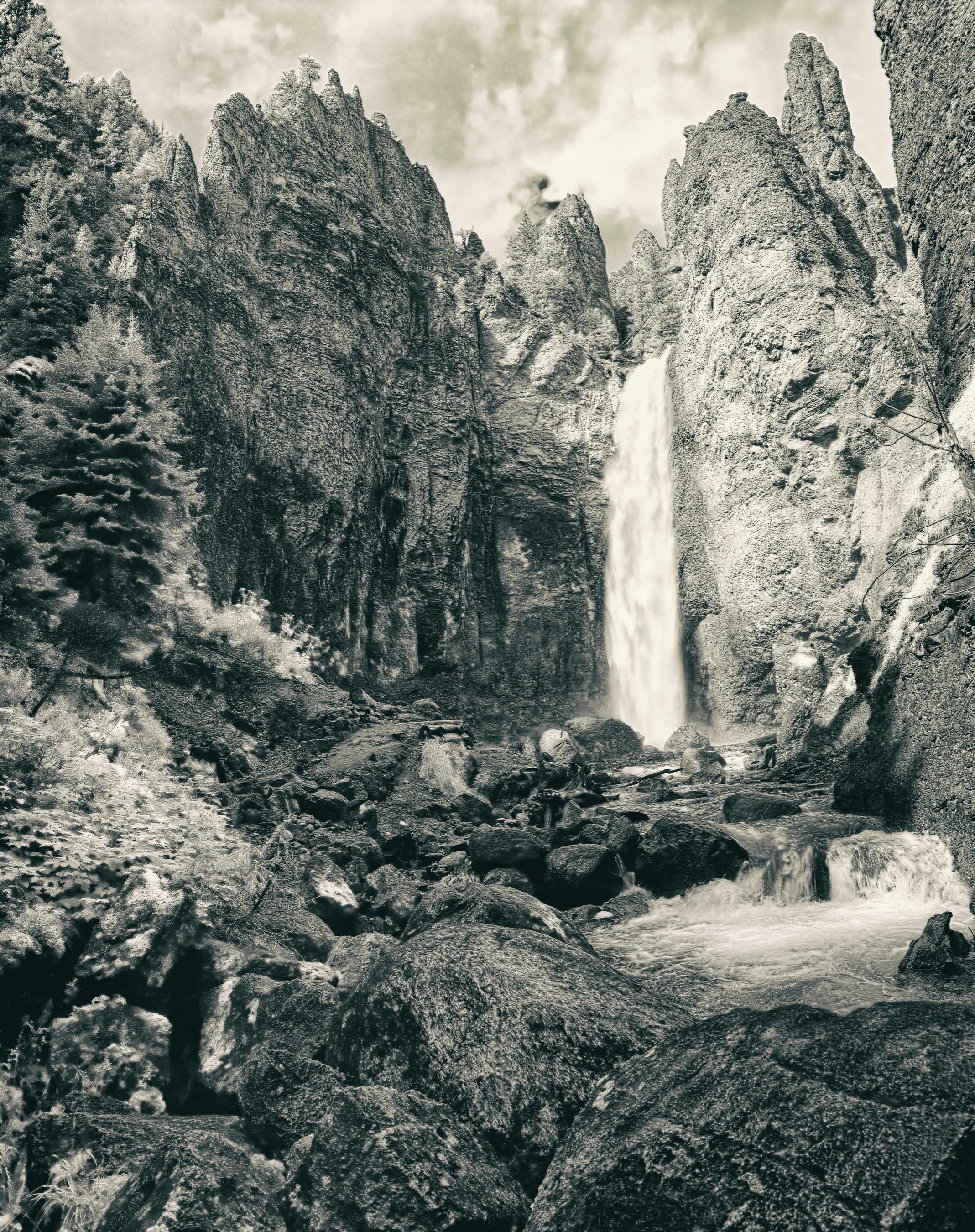
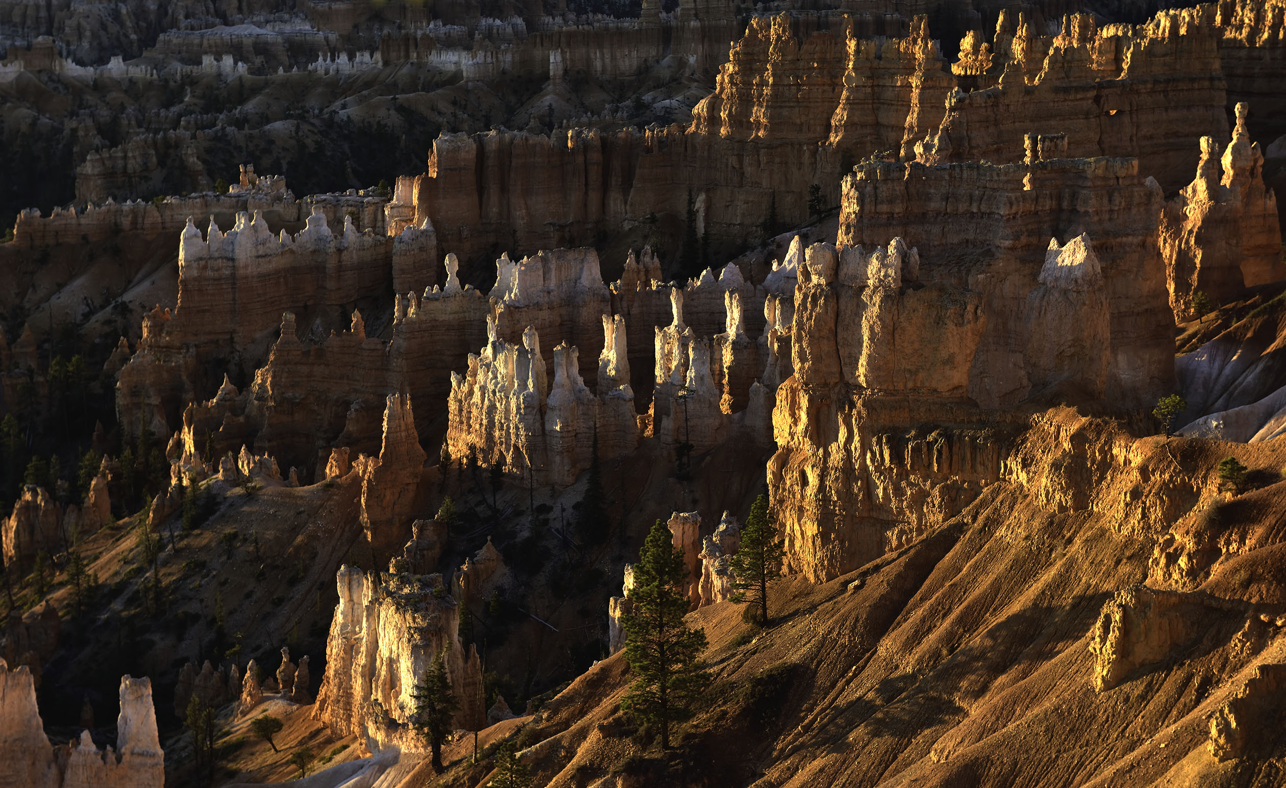
Mt. Eiger is an impressive monolith of granite Ed, and this image stands out equally well. The sharpness of focus and the contrast of tones in the rock really stand out. |
Oct 5th |
| 31 |
Oct 20 |
Comment |
Very nice use of the leading line of the road to the entrance to the church. The wind blown snow edging its way across the road is a good indicator of the harshness of winter on the day you recorded this image Peter. While I have never visited Iceland, This image definitely reveals the cold I have experienced here in Utah many times in winter. Well done. |
Oct 5th |
| 31 |
Oct 20 |
Comment |
John, this is an interesting image of doorway. I am not familiar with the architecture of the Canary Islands. Is the construction a type of rock stuco or an adobe and rock mix? is this an entrance to a residence or a local church? The letters above the arch are not familiar to me. The tonalities are good as is the focus, but the image is ambiguous (to me). |
Oct 5th |
5 comments - 0 replies for Group 31
|
| 93 |
Oct 20 |
Reply |
Thanks Jerry, I appreciate it. |
Oct 23rd |
| 93 |
Oct 20 |
Reply |
Thank you Jean. You are correct in that the same effect can be done with Photoshop and other editors. Plugins, like Topaz, just make the modifications easier to complete and usually with less time and effort. I would need to create and record an "action" in Photoshop for each and every change I wanted to re-create. Topaz has just made it easier and faster. In addition, I can have Topaz do a series of changes with each change on a separate layers as I go. I can then go through each layer and make adjustments within them using traditional photoshop edits (such as layer masks, color gradients, etc.). |
Oct 17th |
| 93 |
Oct 20 |
Reply |
Thank you Jeff, I appreciate it. It does rotate in and out of a frame with others like it. It prints best on a soft matte surface so that it looks more like a painting than a glossy photo. |
Oct 14th |
| 93 |
Oct 20 |
Reply |
Thank you Ed, I appreciate it. Sorry you cannot try Topaz. It does run on Mac or an iPad under Affinity as a plug-in. I have no idea if it will operate with GIMP using Linux. |
Oct 14th |
| 93 |
Oct 20 |
Comment |
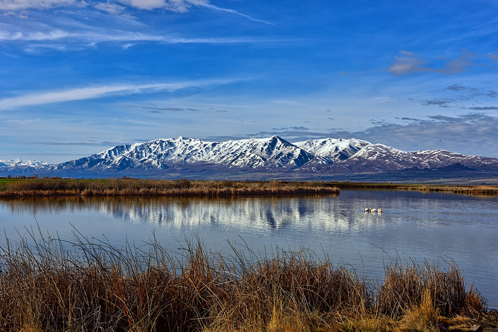
You have some interesting choices Darcy as regards the horizon. You can place it in the center as Jeff suggests or raise it to emphasize the stillness of the water and presence of the mist, or lower it thus hinting at the mist and drawing more attention to the foliage. Personally, I lean more towards emphasizing the water and the accompanying mist. |
Oct 14th |
| 93 |
Oct 20 |
Comment |
Very well done Ed. Reminds me of early mornings on the Chesapeake Bay in Virginia. The reflections in the calm water are sharp and clear despite the slight ripples in the water. |
Oct 14th |
| 93 |
Oct 20 |
Comment |
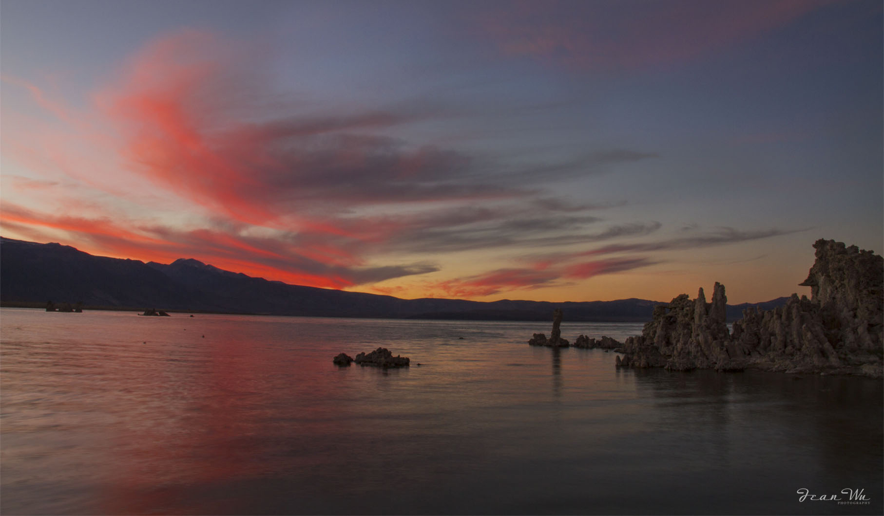
Definitely an "eye grabber" as described by Ed. I adjusted the tufa formation using NIK CEP detail extractor at 30% to brush in detail. Tried to not be too heavy handed with it. I like it either way. Well done. |
Oct 14th |
 |
| 93 |
Oct 20 |
Comment |
Nice record of an sand sculpture. The illumination of the entire sculpture defines the details well without over powering the tea light. Well done. |
Oct 14th |
| 93 |
Oct 20 |
Comment |
Very well done morning shot with your drone. I like the way the composition divides the image into parts that draws my eye sequentially through the image starting with the T pier at the bottom, then to the bridge, and finally to the far horizon at the top. |
Oct 14th |
| 93 |
Oct 20 |
Comment |
Personally, I think having the patrons and background in black & white and the umbrella as a color accent makes for a stronger (more contrast) composition. The bright red does draw my eye initially but it is balanced by the larger expanse of black & white. Well done - I like it. |
Oct 1st |
| 93 |
Oct 20 |
Reply |
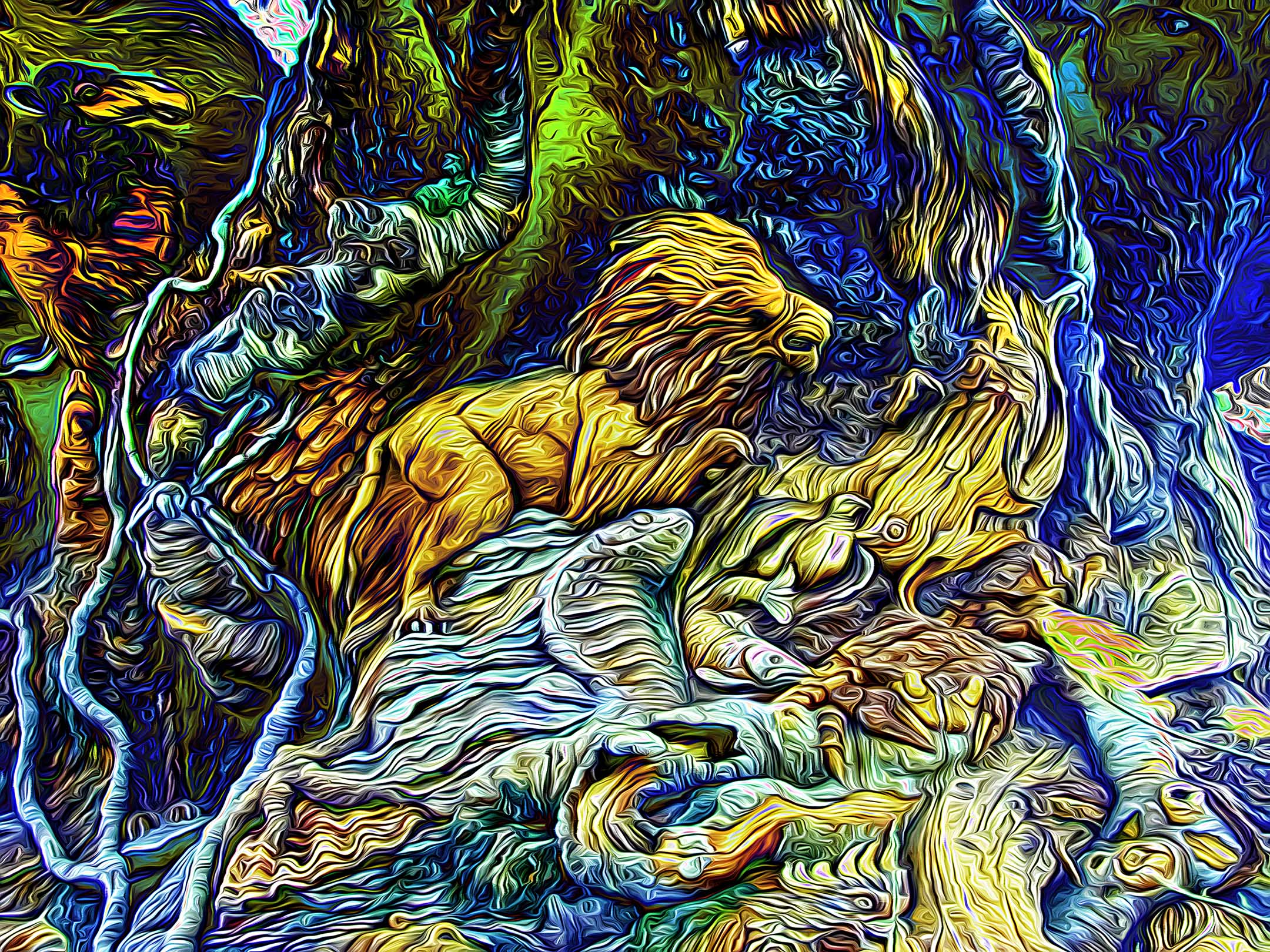
Thank you Paul, I appreciate it. What I enjoy most about Topaz Impression II, is that I can use multiple presets on successive layers in Photoshop to produce different appearances, exit Topaz, return to Photoshop and add separate layer masks (feathered of course) to each Topaz layer to produce something akin to a composite image. That way separate sizes and styles of brush strokes can be deliberately used throughout the image much like a painter choosing different brushes. |
Oct 1st |
6 comments - 5 replies for Group 93
|
11 comments - 5 replies Total
|