|
| Group |
Round |
C/R |
Comment |
Date |
Image |
| 31 |
Sep 20 |
Reply |
Thanks you Paul. I don't like the green tone either and I'm glad it doesn't print that way. I am curious as to what else you think could be done to improve the image. Any suggestions will be greatly appreciated.
No, my monitor is not calibrated (don't have the equipment and the only adjustment my monitor is capable of is brightness). 2nd - I have not double checked the RGB indicators. |
Sep 11th |
| 31 |
Sep 20 |
Reply |
I did not take your comments as being critical but as your being curious about the "green effect". All the images I submit for comments from this and another group are chosen from prints I have made. IF I tone an image with NIK Silver Effects, it tones the entire image and is not always acceptable to me. IF I choose to do a split tone print, then I can choose where the toning occurs and maintain a true black or dark gray in other areas of the print. This control over the appearance of the print I really like. I personally cannot duplicate this split tone effect in Photoshop, thus the long winded explanation earlier. I am planning to follow up with some split tone prints of this particular image as you have pricked my curiosity on how it will come out. Wish me luck. |
Sep 11th |
| 31 |
Sep 20 |
Reply |
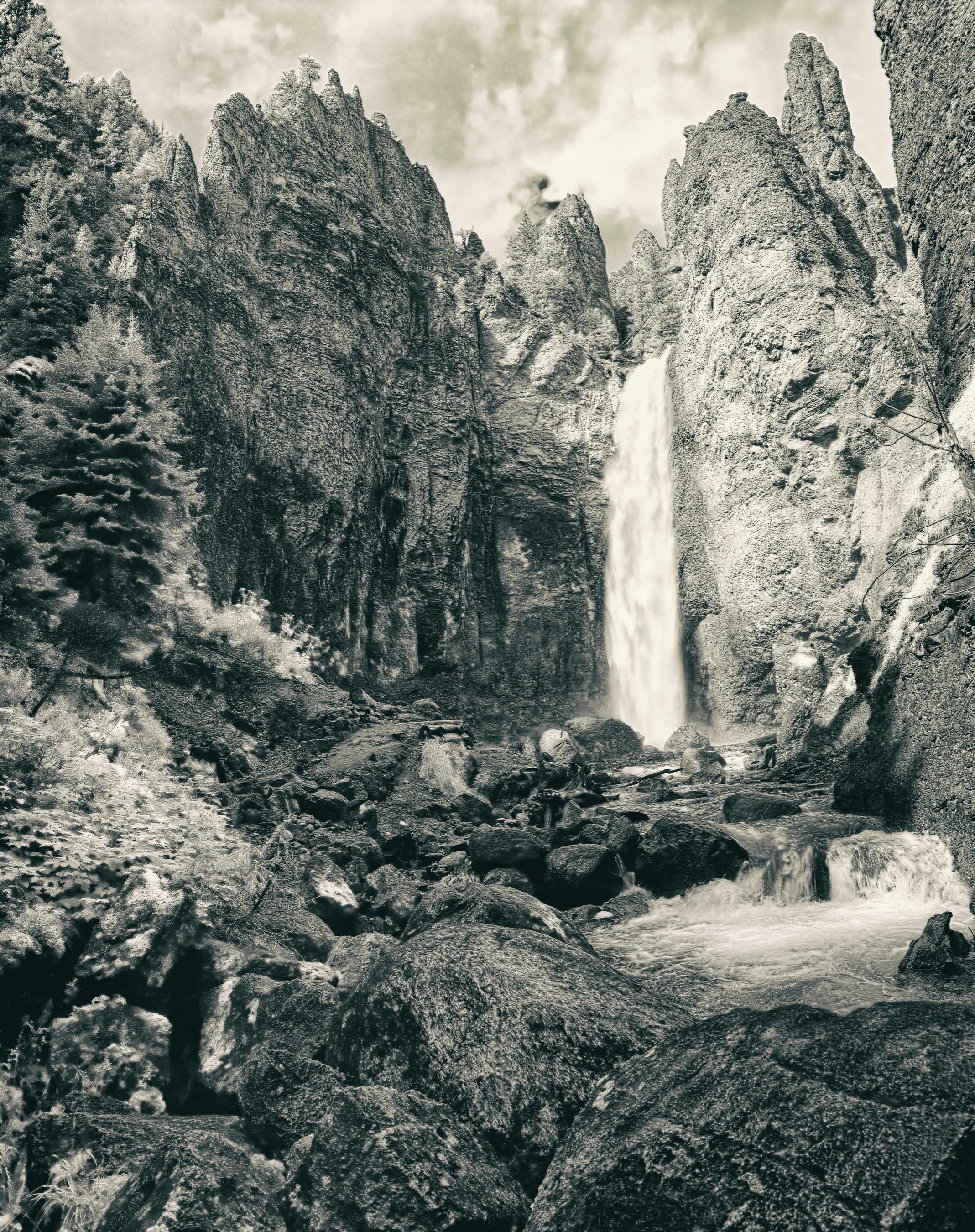
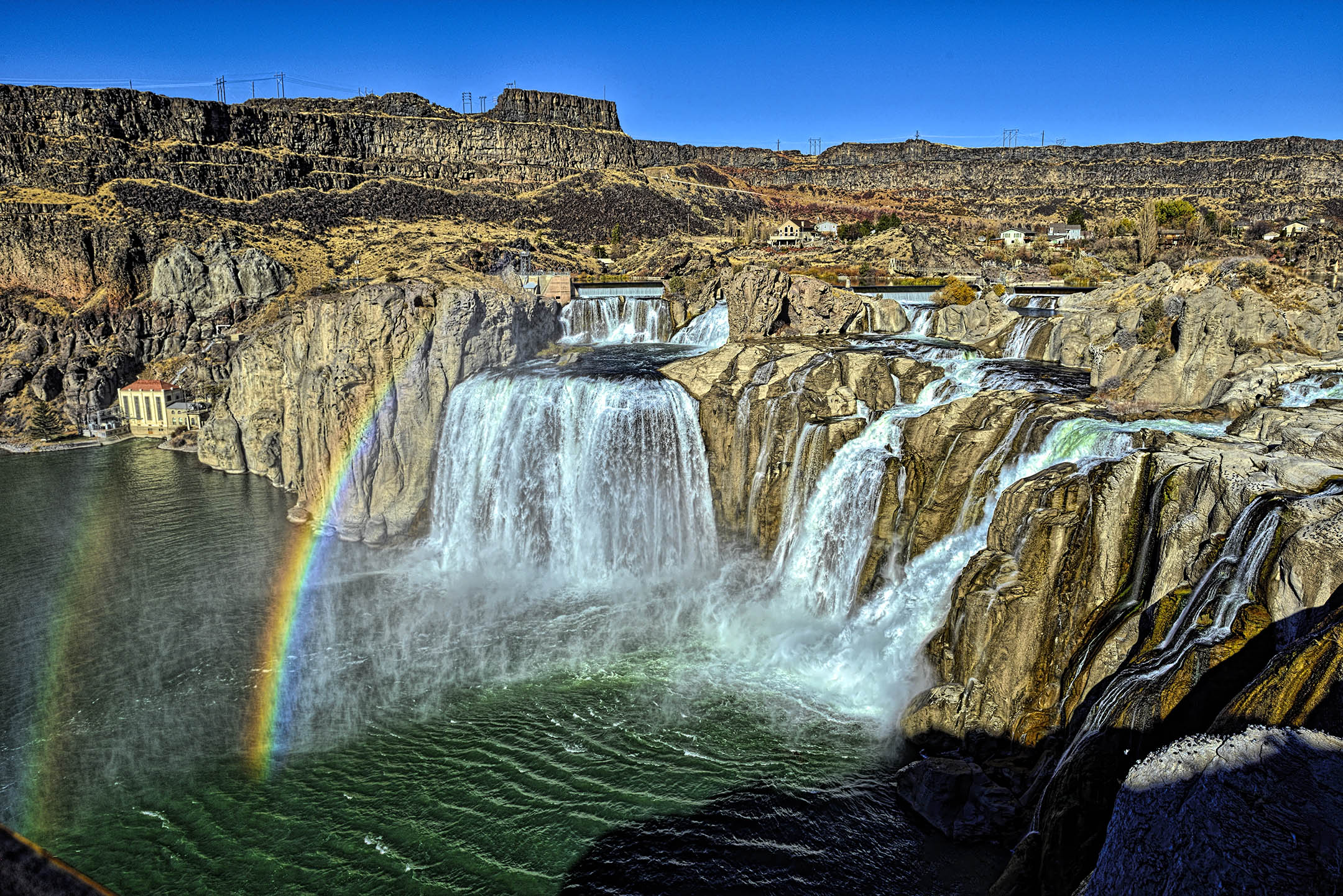
Thank you John for the kind comments. Unfortunately the original slide the water is slightly blown out and I would rather live with paper white in the print versus gray water. |
Sep 10th |
| 31 |
Sep 20 |
Reply |
I was not attempting a split tone effect for this particular image as it is (for me at least) too difficult to do in Photoshop and get a pleasing result. I use QTRgui software to produce a split tone effect when printing the final B&W image as it gives me more control over the results with a lot less effort. The only drawback to the software is that it does not produce an acceptable preview on my monitor but it does produce an outstanding print on specific papers. Having the correct ICC profiles for the paper used is a must. Now that you have mentioned it, I am going to try a few just to see the results. |
Sep 10th |
| 31 |
Sep 20 |
Reply |
Your corrections are very well done Peter. As far as access to where I was standing, the short (400 yards) paved trail down to the base of the waterfall may have been closed. It is very steep from the parking area next to the main loop road and subject to severe erosion. I may re-work the entire image sometime in the future. |
Sep 10th |
| 31 |
Sep 20 |
Comment |
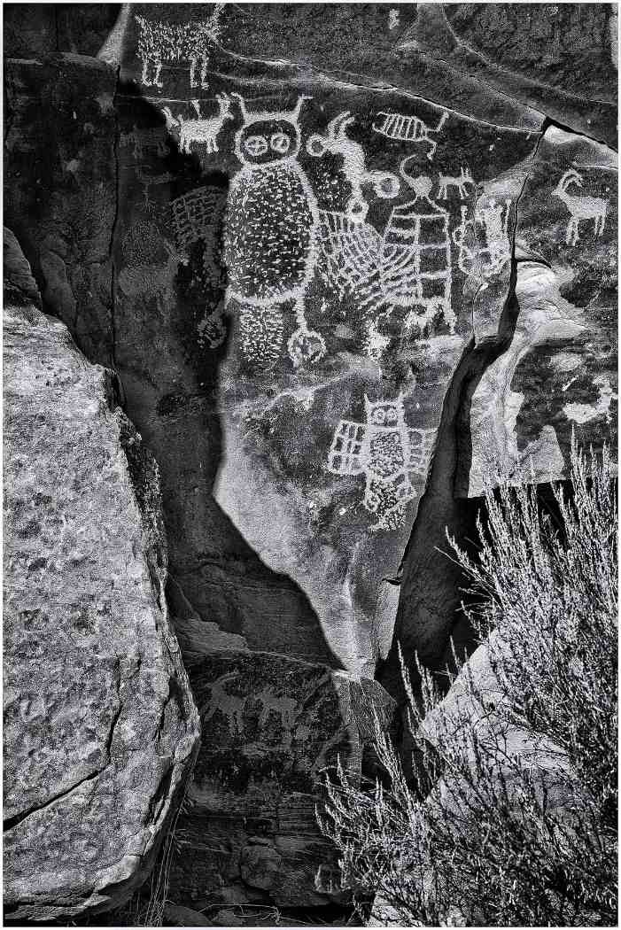
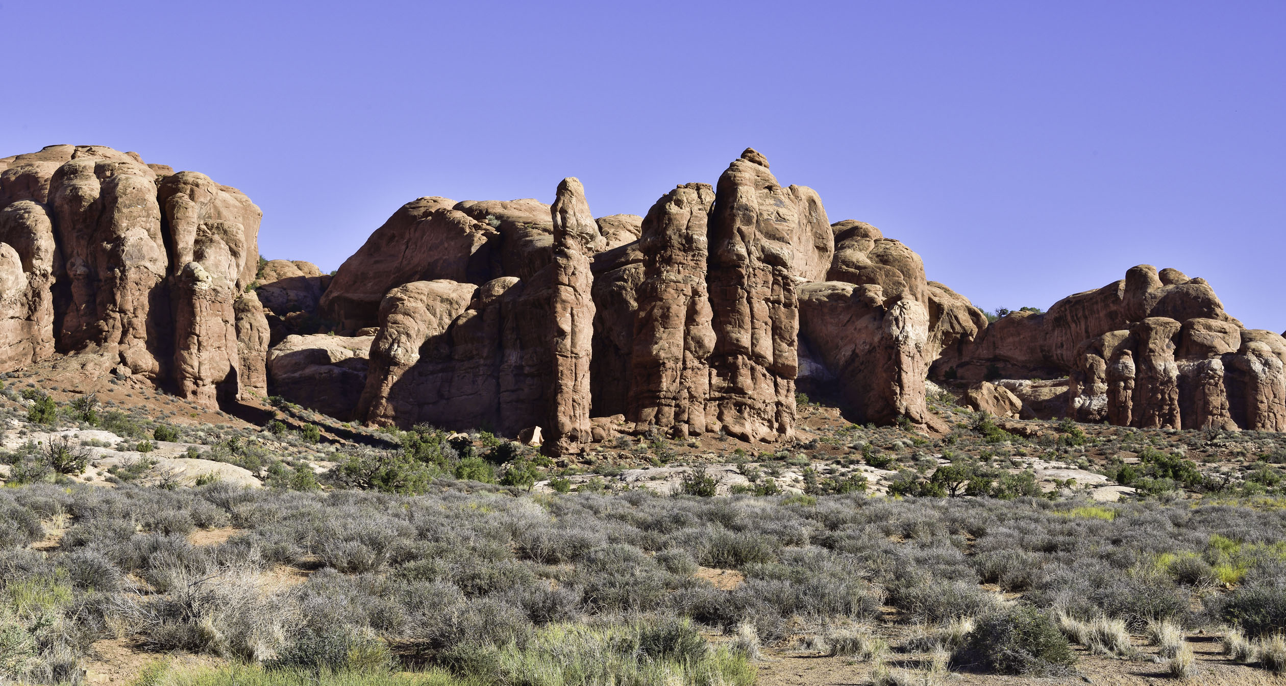
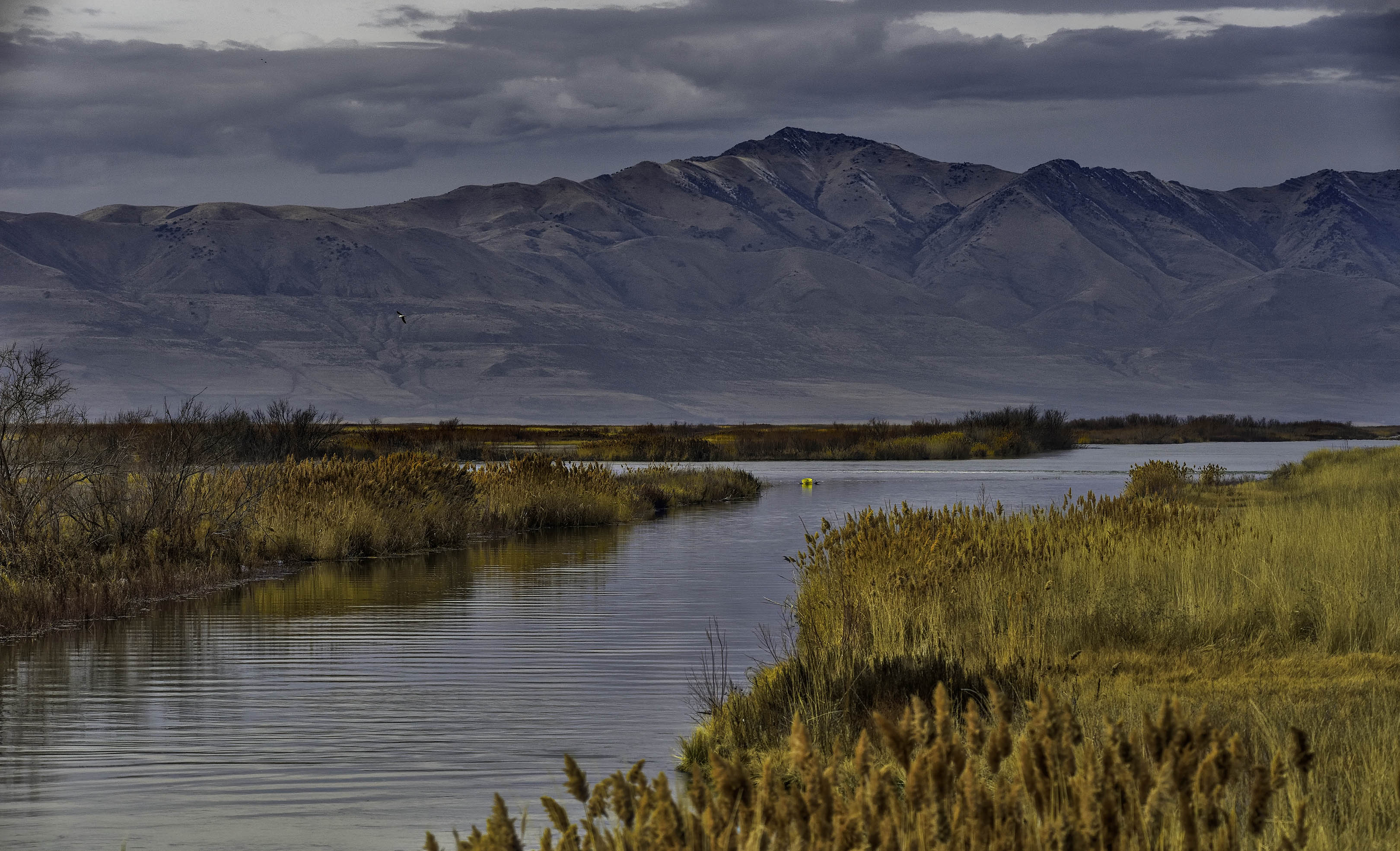
Ella, this is an excellent image of the deserts here in the southwest. Dry, hot, and mountainous describes most of Arizona, Utah, Nevada, and certainly the Panamint mountains in Death Valley as shown here. Well done. |
Sep 8th |
| 31 |
Sep 20 |
Comment |
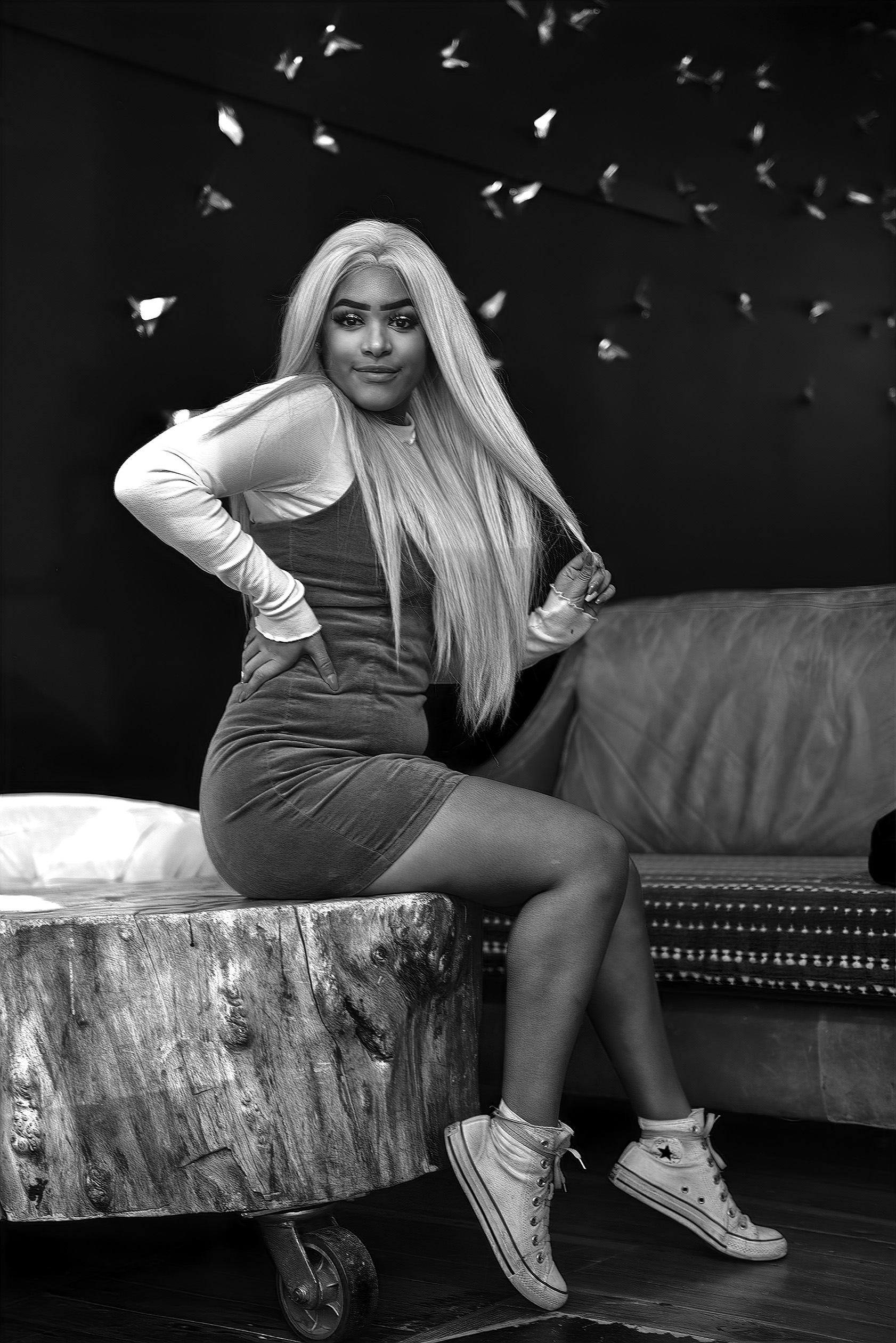
A very powerful portrait Paul. Very good use of selective focus to isolate her from the background and excellent exposure. |
Sep 8th |
| 31 |
Sep 20 |
Comment |
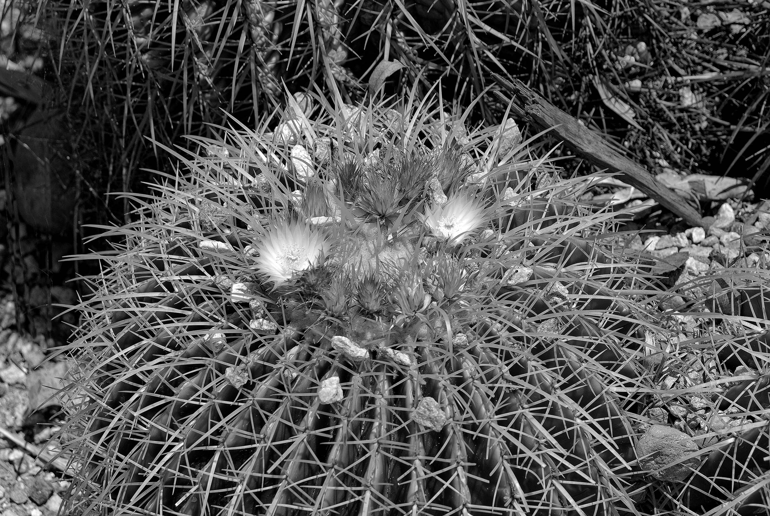
An interesting image Ed. I would be interested in seeing how it prints on different papers such as a silver metallic paper versus a standard gloss paper. Would the extra reflectivity of the water be an enhancement or a severe distraction when comparing the prints on each type of paper?
As it appears on my monitor, the image seems a bit flat and looks almost like a solarized (Sabatier) print. I don't think an increase in contrast would help, but maybe a yellow or light orange lens filter to cause a tone shift in some of the vegetation to increase separation between the various plants and flowers. What was the lighting like? |
Sep 8th |
| 31 |
Sep 20 |
Comment |
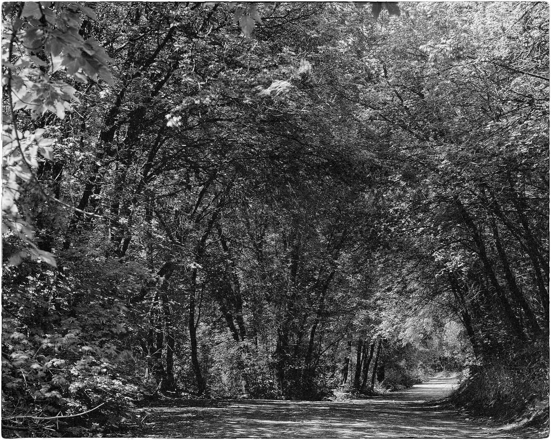
Very well done Ian. I like the framing of the building between the trees with the leading line of the pathway to the building entrance. I agree with you on leaving the aerial as it is a record of how the building appears now. |
Sep 8th |
| 31 |
Sep 20 |
Comment |
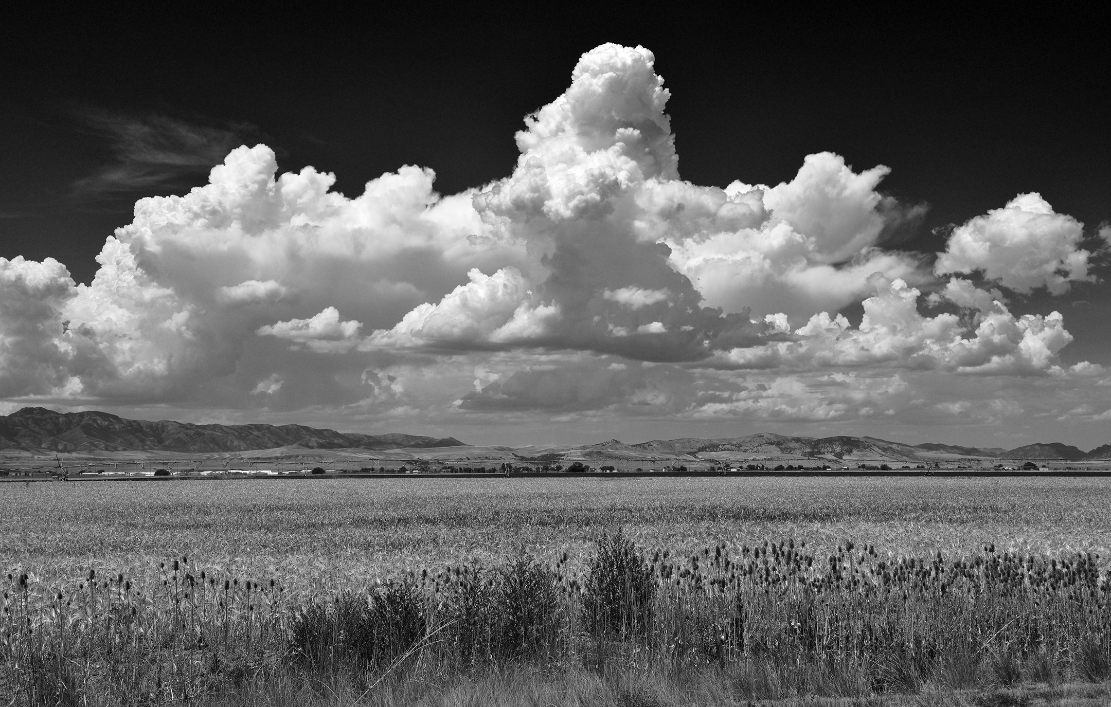
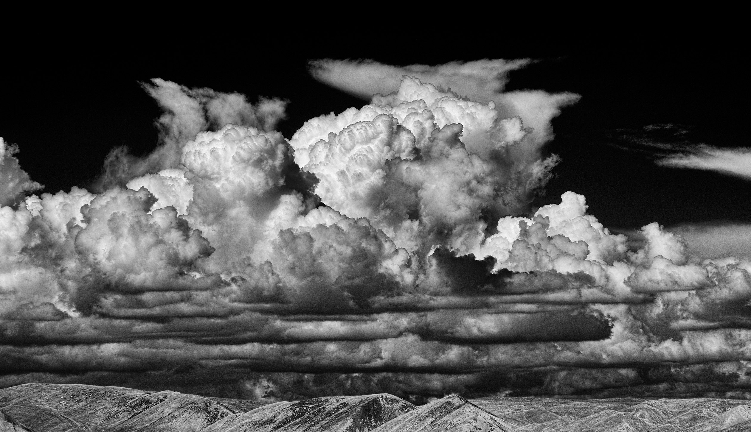
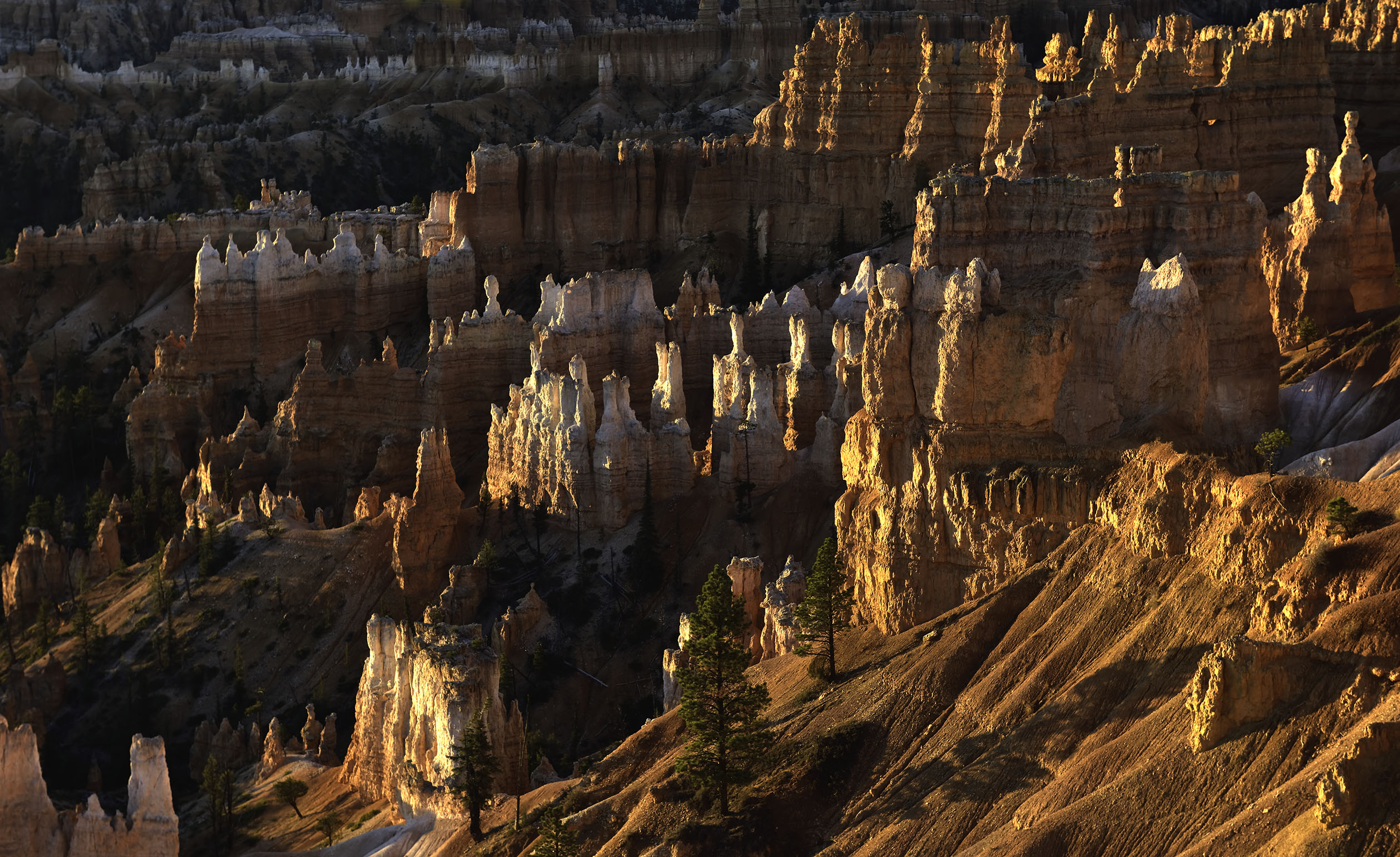
Very nicely done Peter. The side lighting definitely highlights the details in both the mountain and the vegetation. The pattern of the bright mountain peak, a band of shadow below the peak, and the bright light across the vegetation reminds me of several Ansel Adams images. I personally like the way the storm clouds in the background seem to project the mountain forward due to the differences in contrast. |
Sep 8th |
| 31 |
Sep 20 |
Comment |
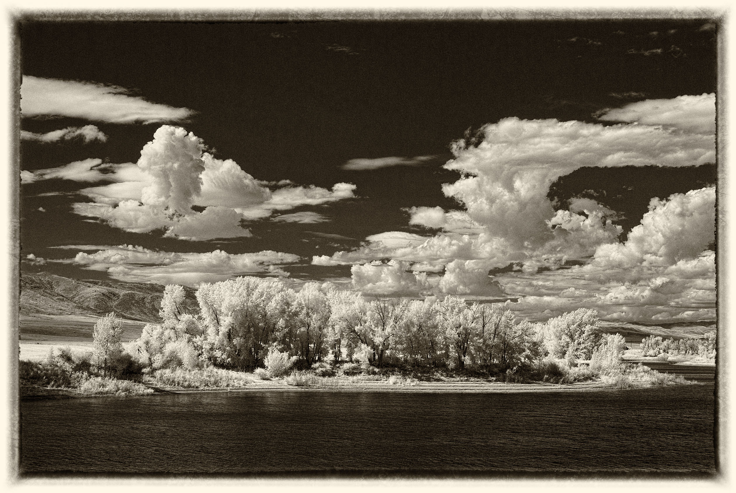
Very nicely done John. The level of detail is exceptional throughout the image. |
Sep 8th |
| 31 |
Sep 20 |
Reply |
Thank you Ed. I did not add a tone but have had some occur when adjusting after converting from color to black and white. The B&W adjustment works fine but some adjustments after that create the tone. I use an older version of Photoshop (CS4) and sometimes wonder if the conversion of the tiff files (that I do all the processing with) to jpg files is part of the problem as my original tiff files do not have the color cast. |
Sep 8th |
| 31 |
Sep 20 |
Reply |
Thank you Ella. The green cast occurs when adjusting after the B&W conversion. I don't know why. It prints without the color cast when I use the "advanced b&w mode" for my Epson printer as it uses only black ink instead of mixing color inks ti simulate black. If I desaturate the flattened file, the problem is solved. |
Sep 8th |
6 comments - 7 replies for Group 31
|
| 93 |
Sep 20 |
Reply |
Thank you very much Jean. I appreciate it. |
Sep 16th |
| 93 |
Sep 20 |
Reply |
Thank you for your kind comments. |
Sep 15th |
| 93 |
Sep 20 |
Comment |
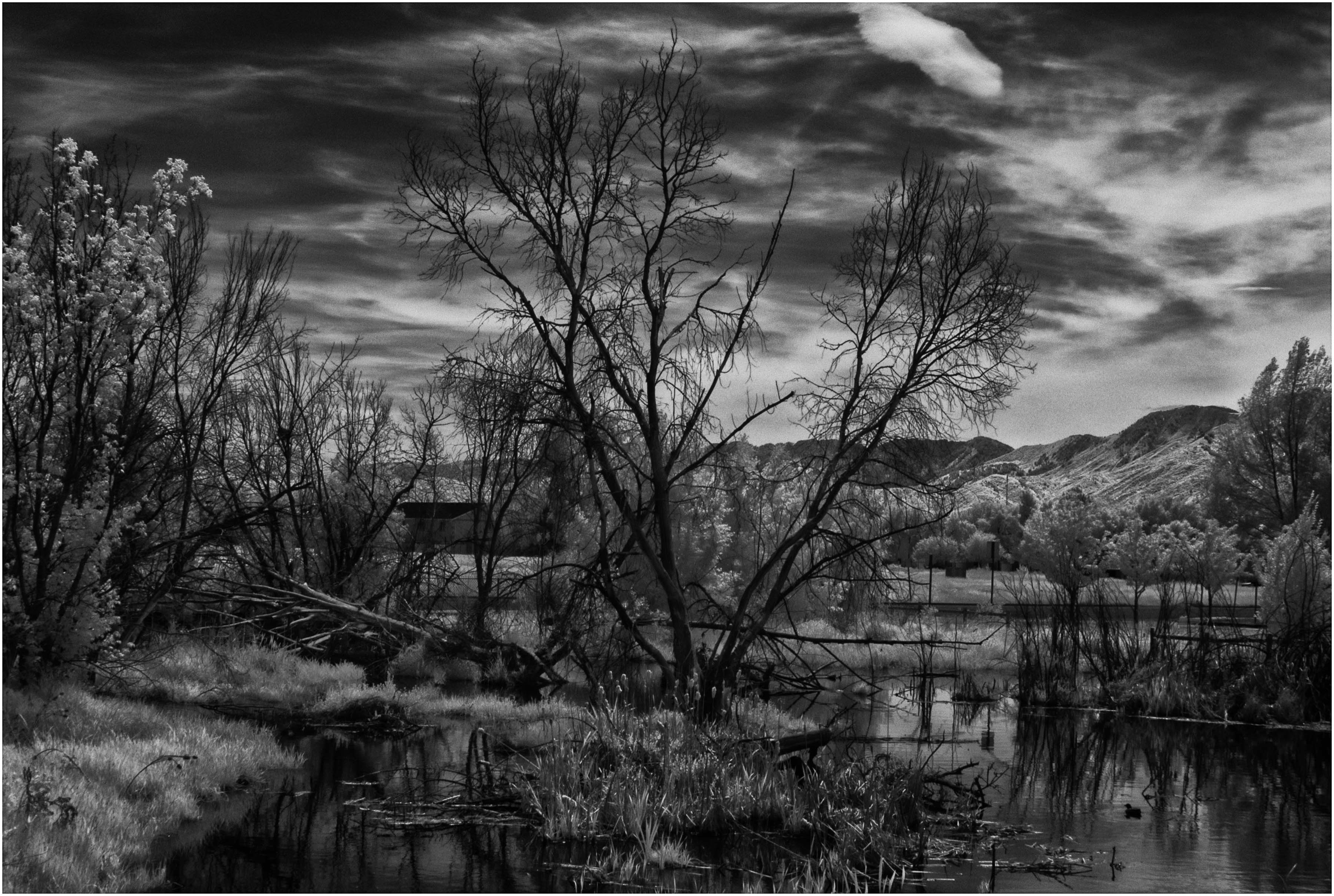
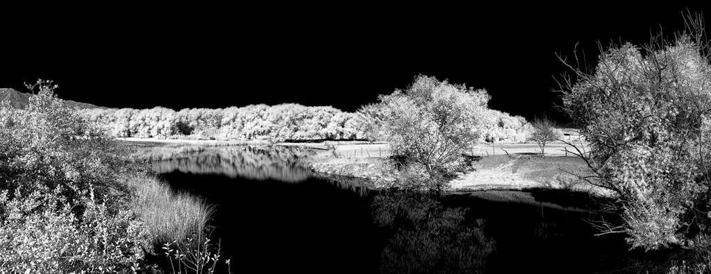
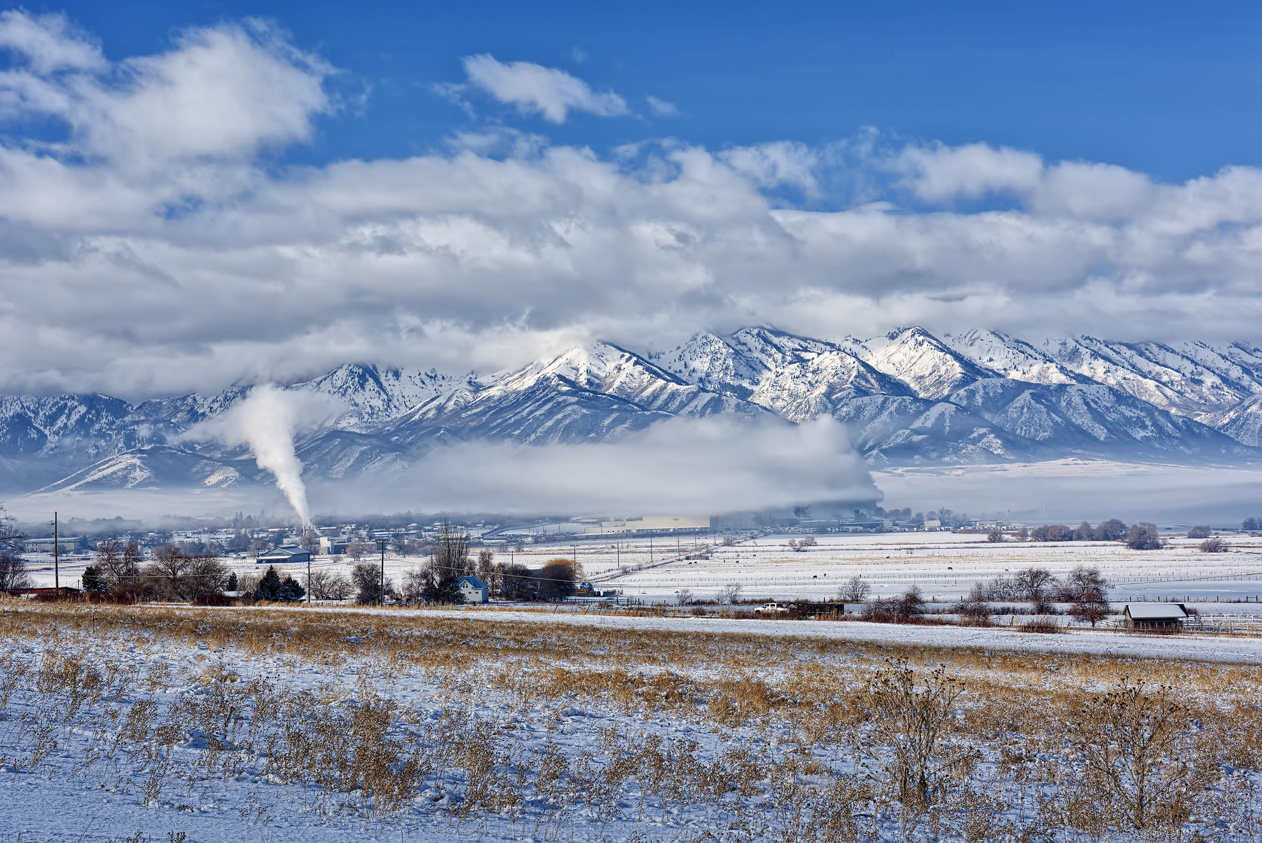
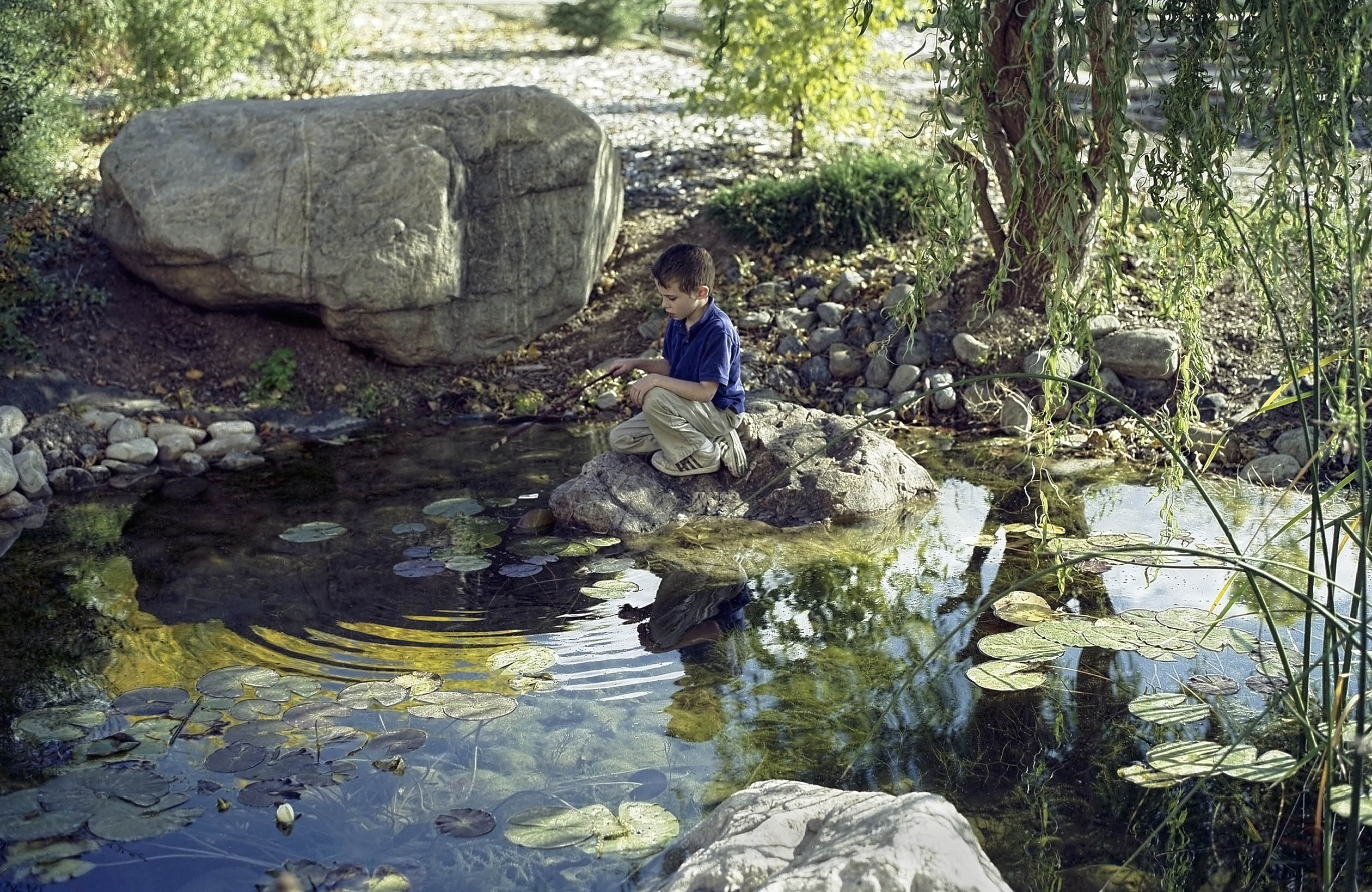
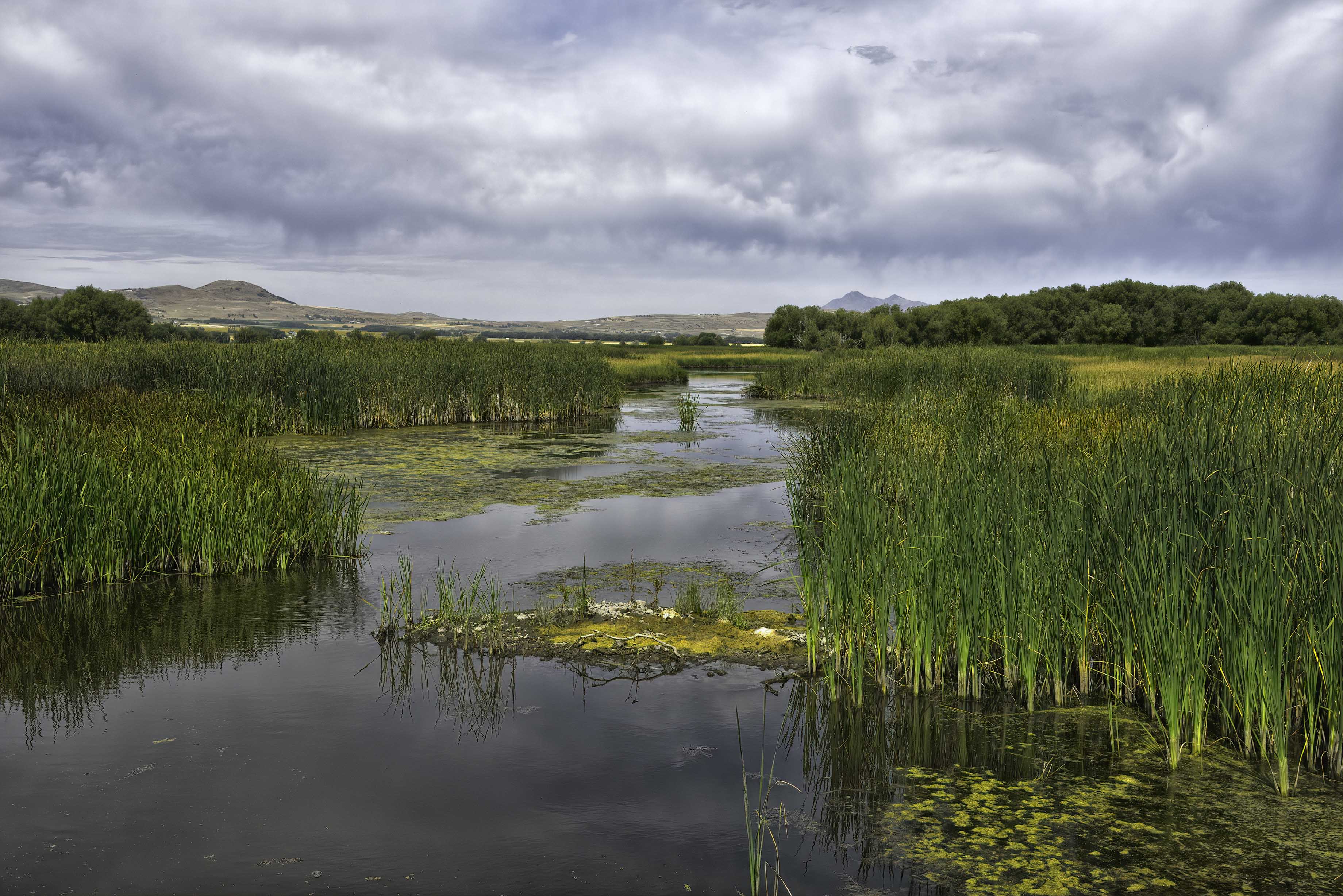
Thank you Paul, Darcy, and Jerry for your kind assessments. The yellow object is a channel marker for directional flow of the water. It is just part of the human environment that exist throughout the bird refuge, so I left it in. |
Sep 10th |
| 93 |
Sep 20 |
Comment |
Welcome to the group Jeff. Your technical expertise at blending the two images is amazing. Well done! |
Sep 8th |
| 93 |
Sep 20 |
Comment |
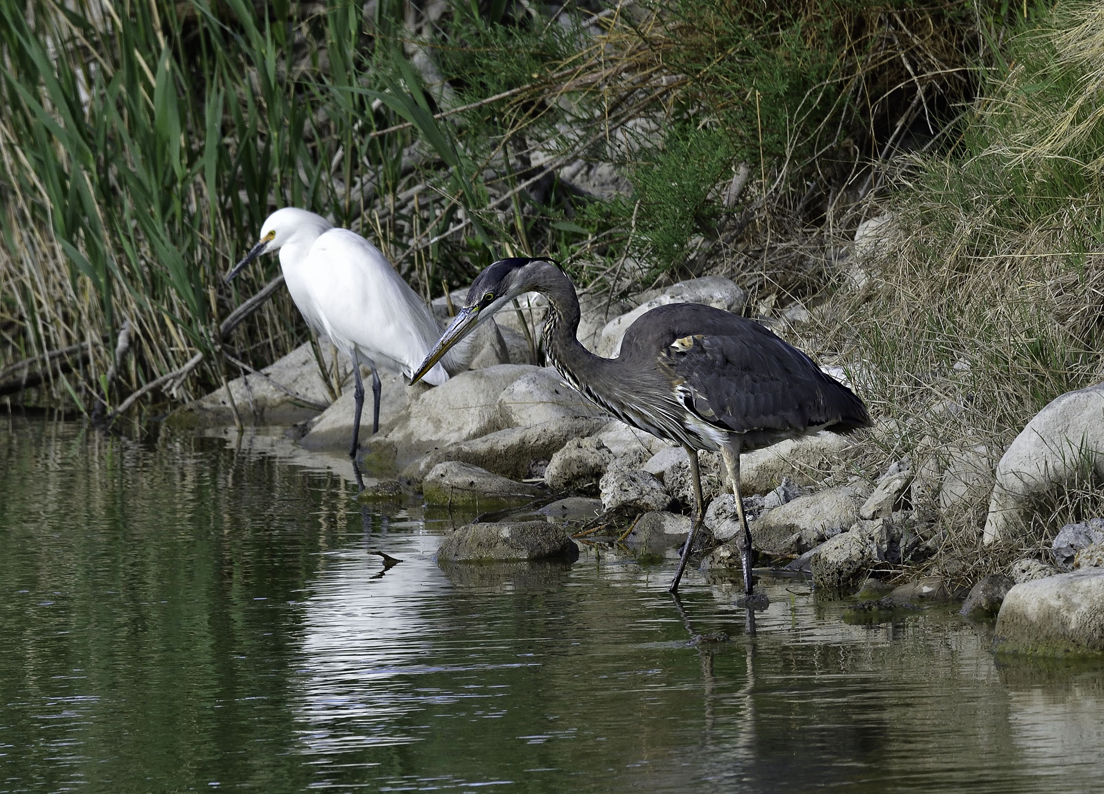
Thank you for including the original image Ed. I was fooled by the background as it appears at first to have a diagonal horizon line as opposed to the curve of wet sand. Being a B&W image is a definite plus in my opinion. |
Sep 8th |
| 93 |
Sep 20 |
Comment |
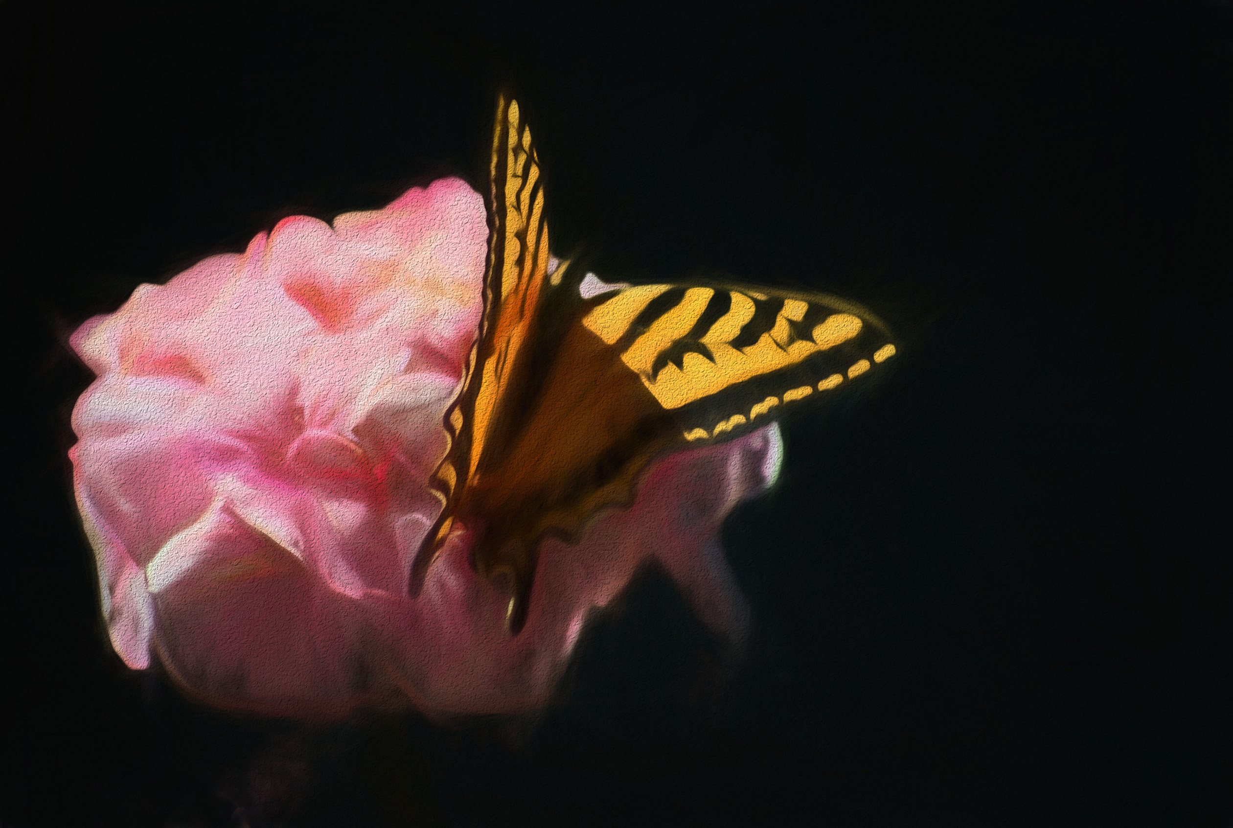
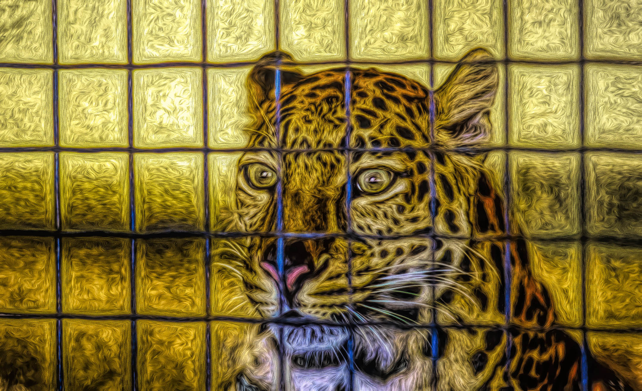
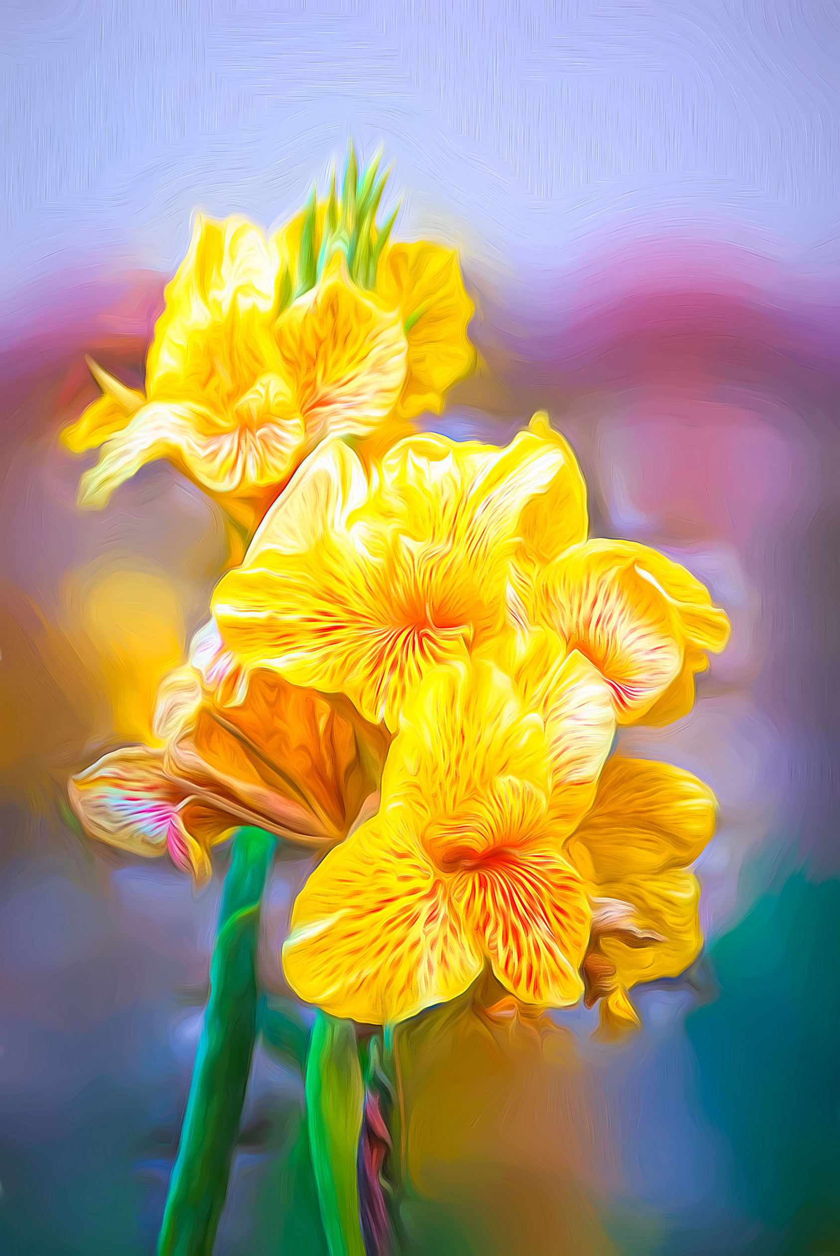
Very nice use of Topaz to add a painted appearance Paul, I like it! I am curious as to which filter or preset that you used. Personally I have a few images where I have used Topaz Impression II followed by printing on Hot Press Bright paper. This mat finish paper, in my opinion, displays the "painted" colors better than a glossy photo paper. Just remember to switch to a matte black ink (instead of photo black) so that the primary colors of the blossoms project more. |
Sep 8th |
| 93 |
Sep 20 |
Comment |
Jean, I agree with Ed about why the image is so captivating.
I also am human and often take many less than perfect photos in order to get the one that everyone appreciates. This one is not lacking anything in my opinion. |
Sep 8th |
| 93 |
Sep 20 |
Comment |
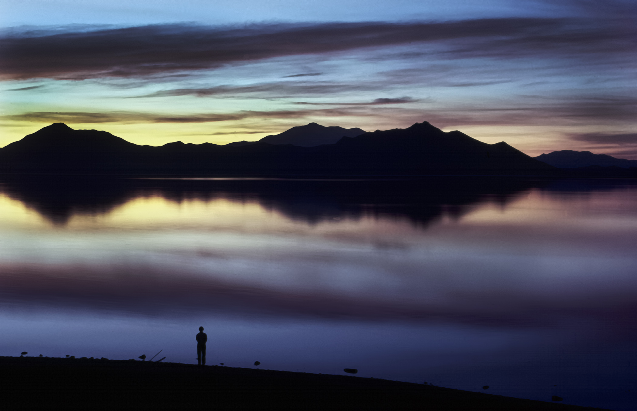
Well done Darcy. I agree with Ed about the silhouette and details remaining visible in the foreground. Disagree about cropping more as in my opinion the dark foreground gives the image scale. |
Sep 8th |
| 93 |
Sep 20 |
Comment |
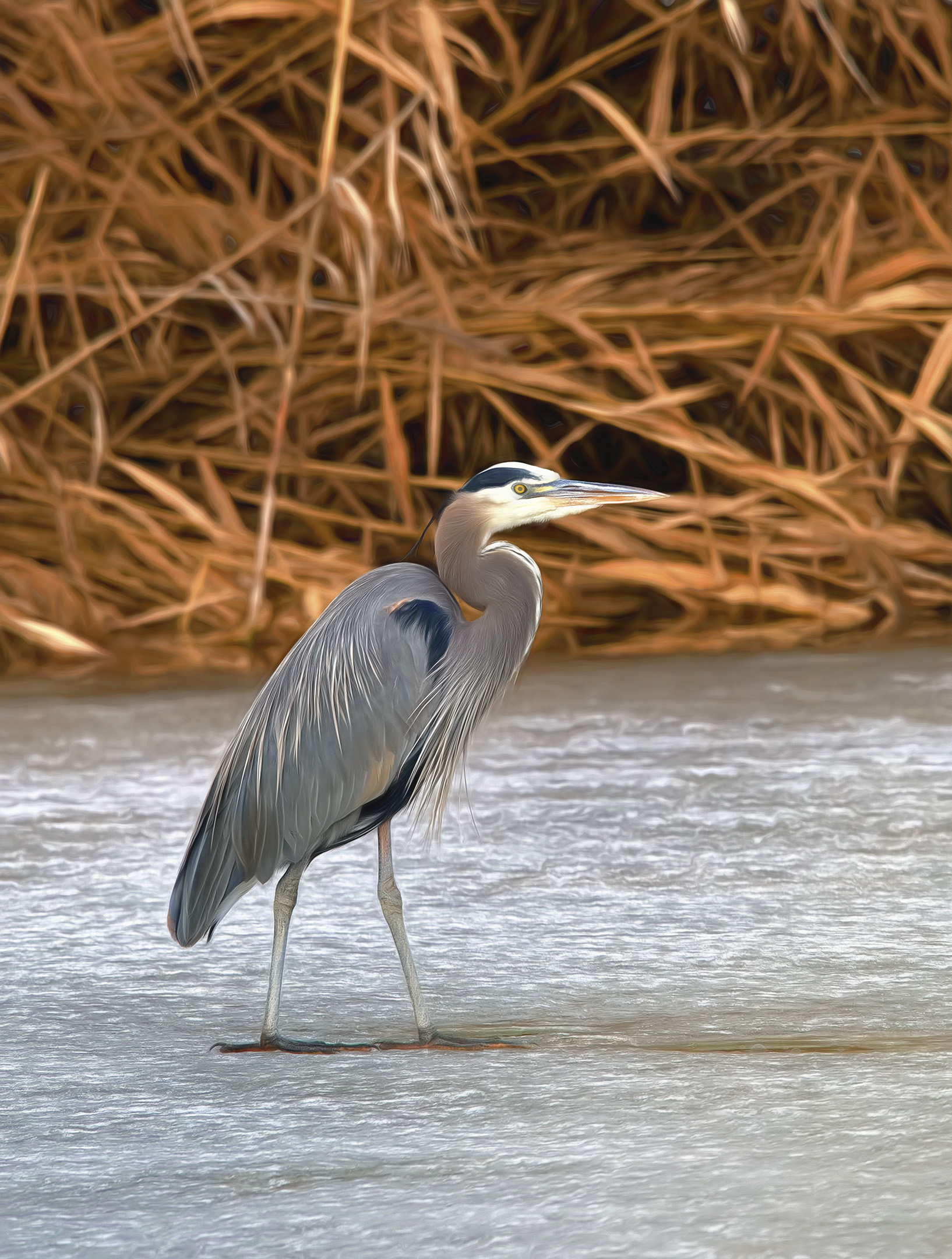
Very impressive Jerry! I like the contrast between the dark rocks in the foreground with the fingers of sunlight in the background. Be careful where you add light to the rocks with the brush tool. Since the sun is providing backlight, leave the shadow in front of the rocks. You have plenty of detail on top and in front of the rocks. |
Sep 8th |
7 comments - 2 replies for Group 93
|
13 comments - 9 replies Total
|