|
| Group |
Round |
C/R |
Comment |
Date |
Image |
| 31 |
May 20 |
Comment |
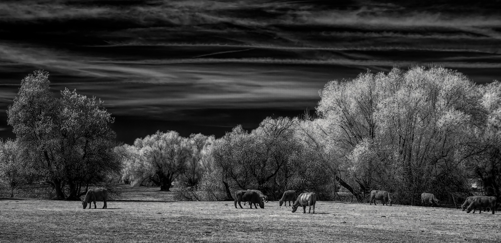
I agree that removal of the two cows on the right would improve the image. However, my skills at removing them in photoshop are not up to the task. I generally print my better photographs at 11"x14"" or larger and any mistakes are greatly enhanced at large print sizes and are all too visible. Therefore the cows remain.
My solution should have been to redo the image and rotate the camera slightly to the right so the cows are better placed. I appreciate everyone's comments and suggestions. |
May 19th |
| 31 |
May 20 |
Comment |
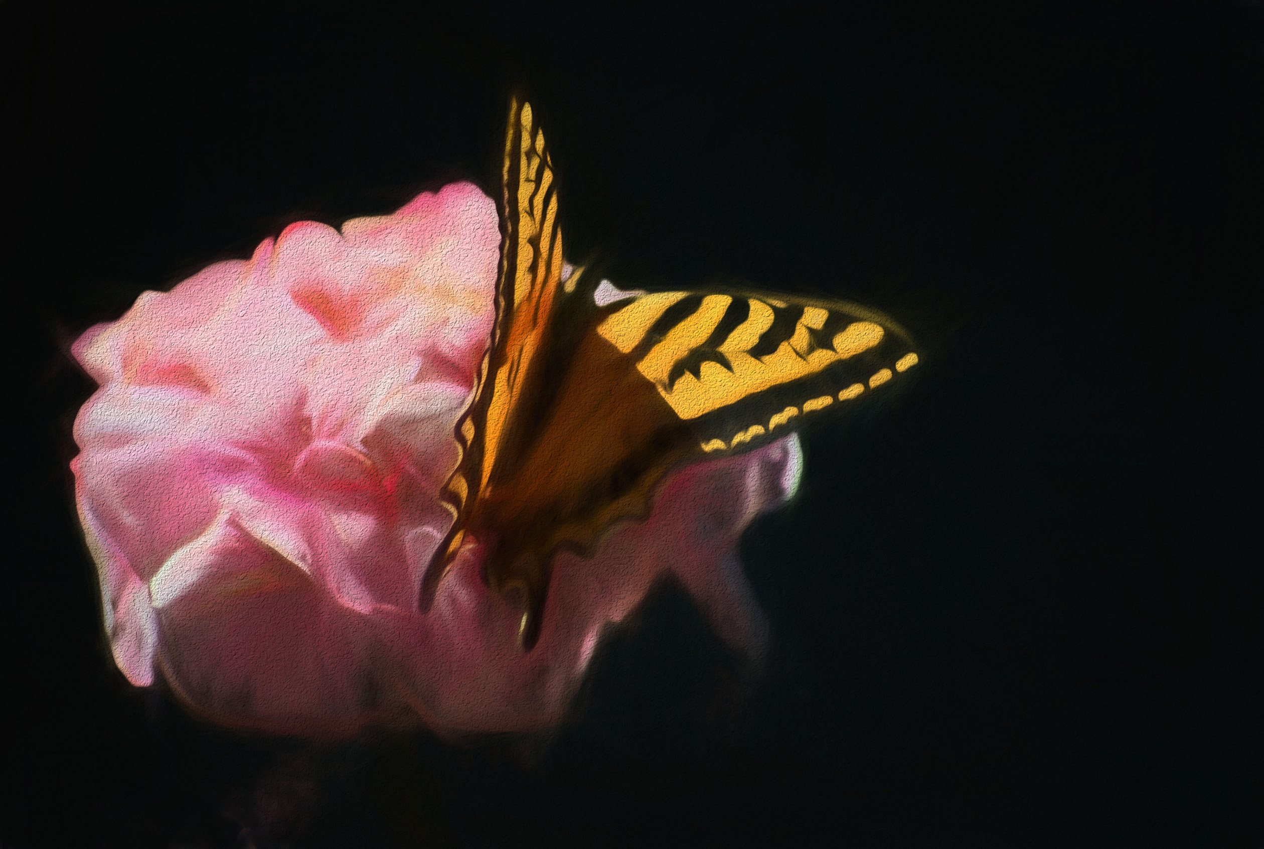
Ella, your produce really thoughtful and interesting still life images. This one with a scarf, flowers, and box. This one draws my eye from the top with the scarf down and around the flowers to the box and back up to the flowers. The darkness of the leaves provides good contrast to the scarf and the flowers. I made a print before disagreeing with Peter and Paul as I thought that the blacks would reveal more texture and detail than we can see with our monitors and it does. I made no adjustments except to image size and resolution and printed it on luster paper with my Epson printer. I can see the veins in the shadows of the large flat leaves in the print whereas the same area on my monitor is just a flat black with no detail. Well Done! |
May 17th |
| 31 |
May 20 |
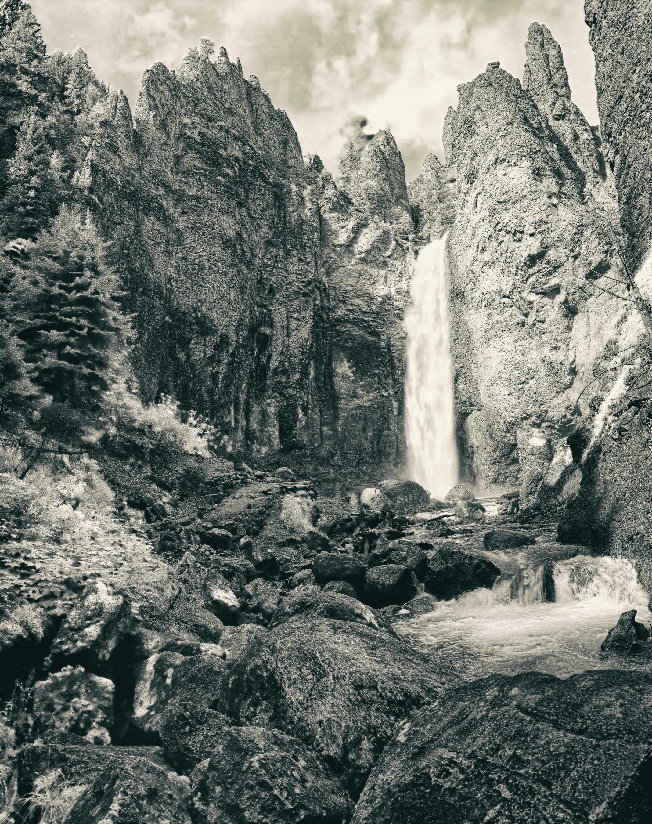
Comment |
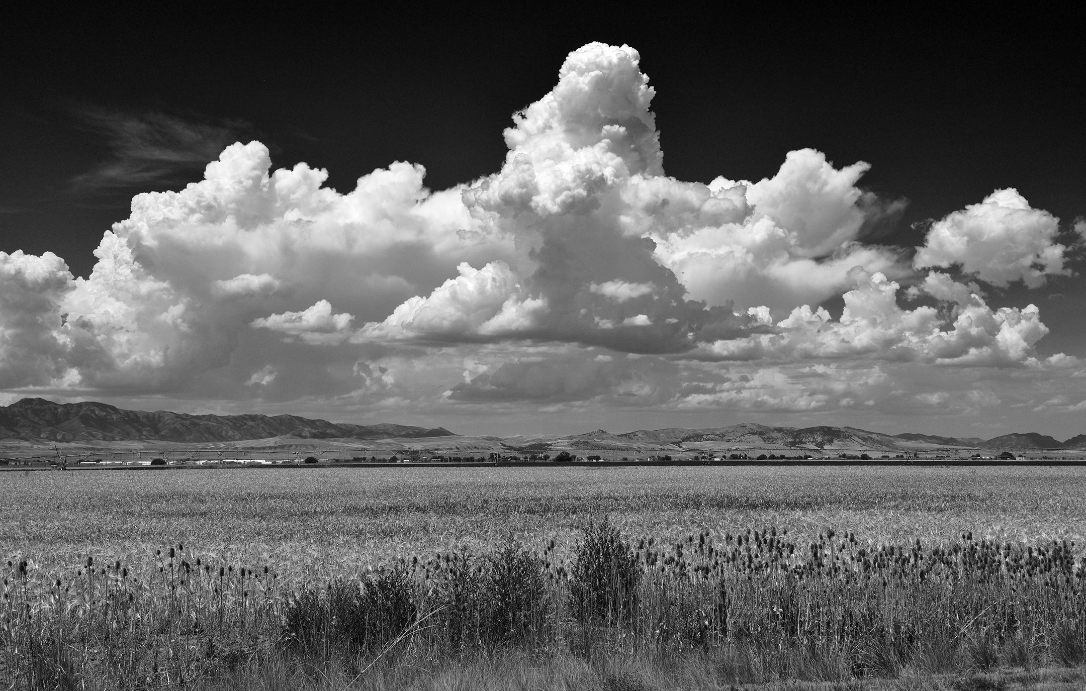
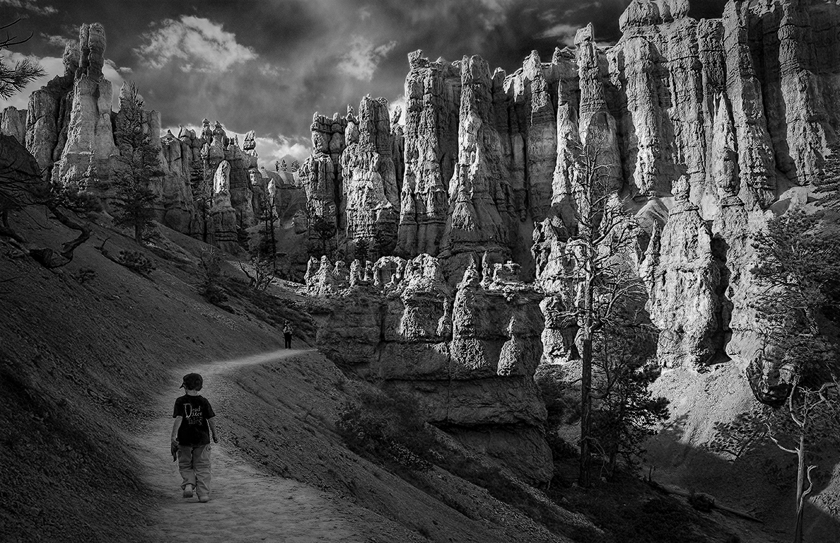
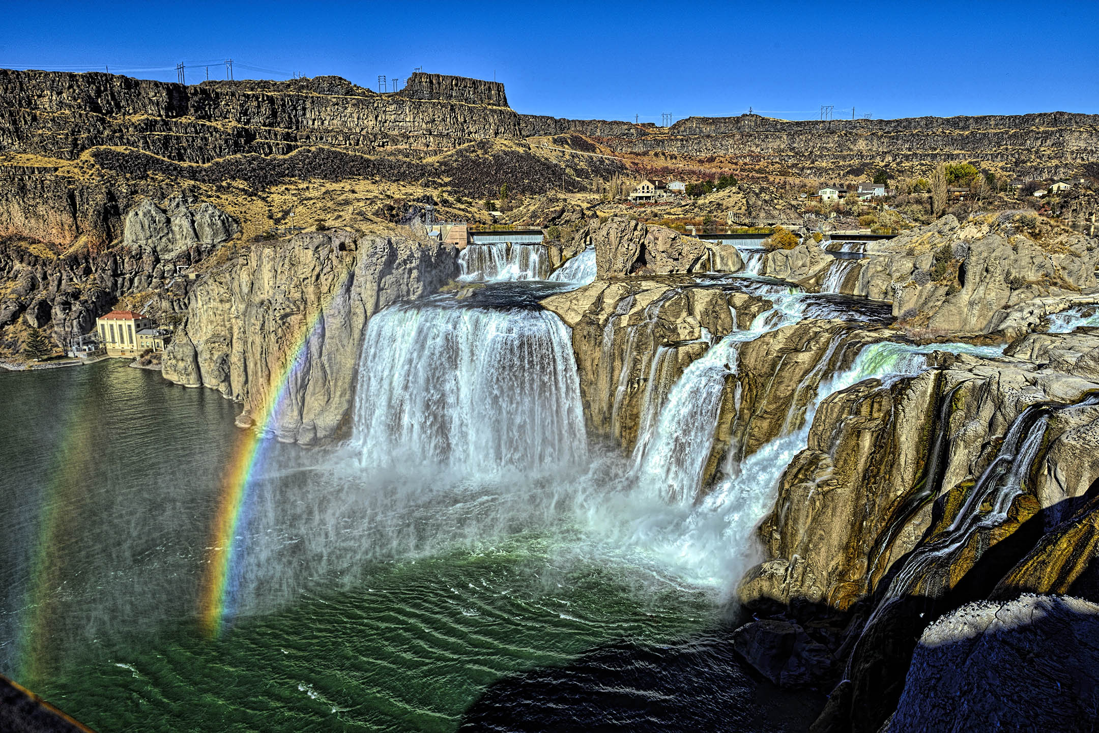
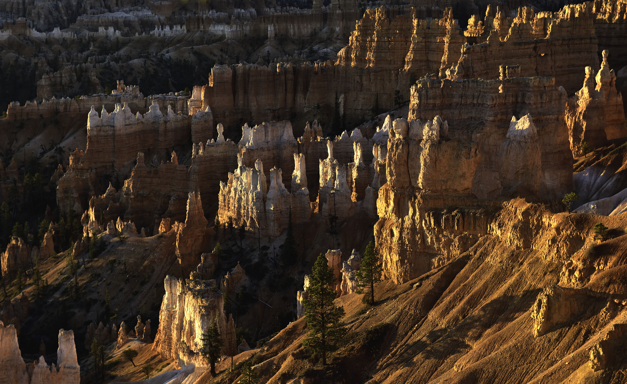
Wonderful image of the mountains majesty. Very Well done. |
May 17th |
| 31 |
May 20 |
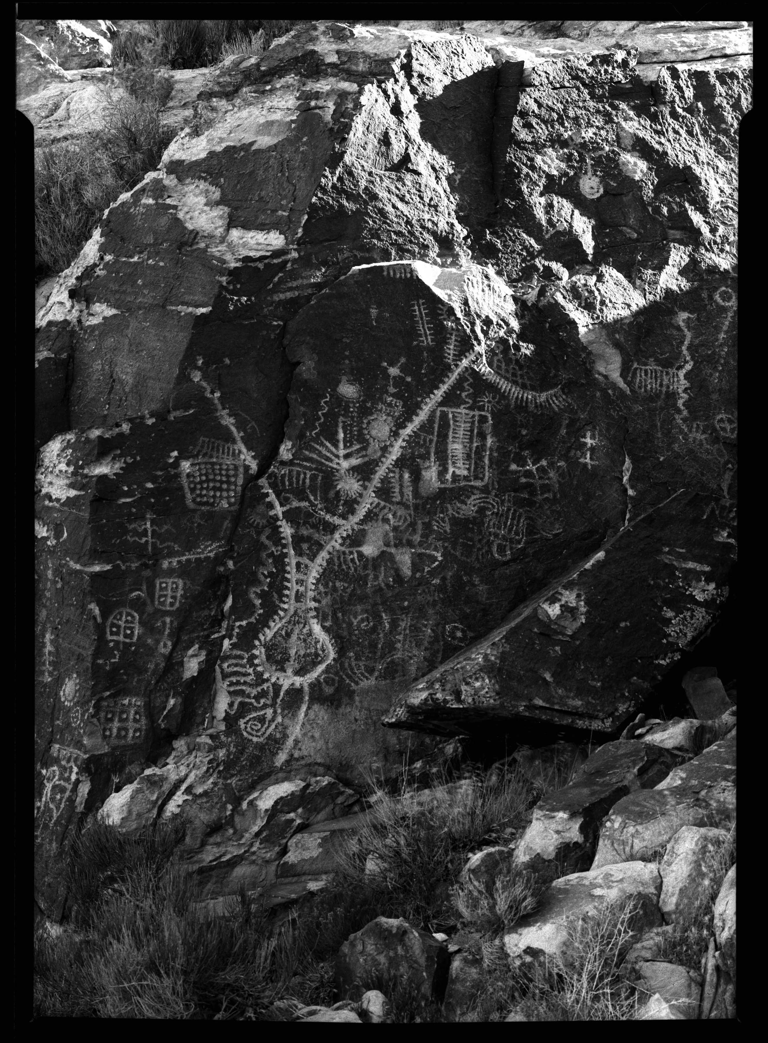
Comment |
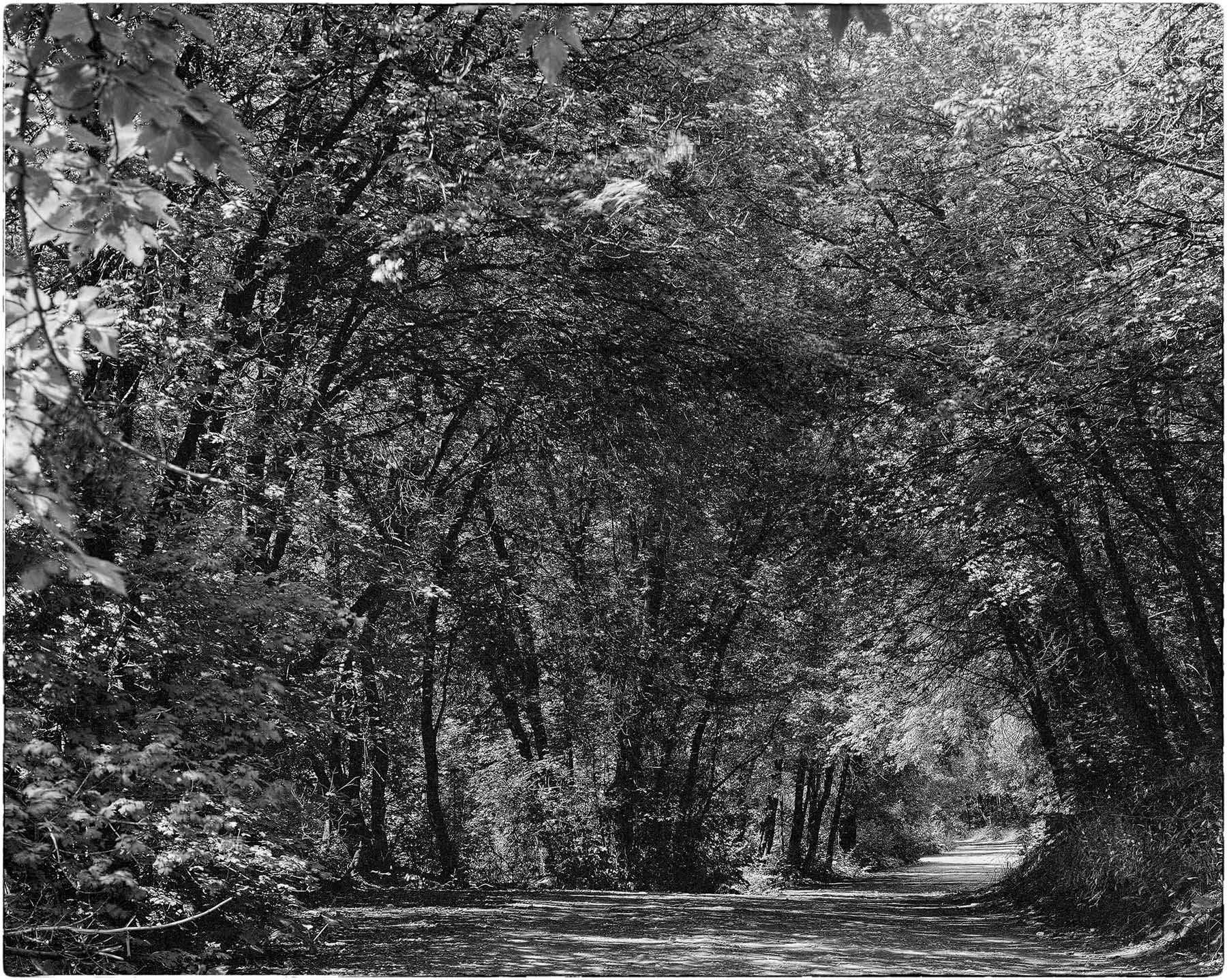
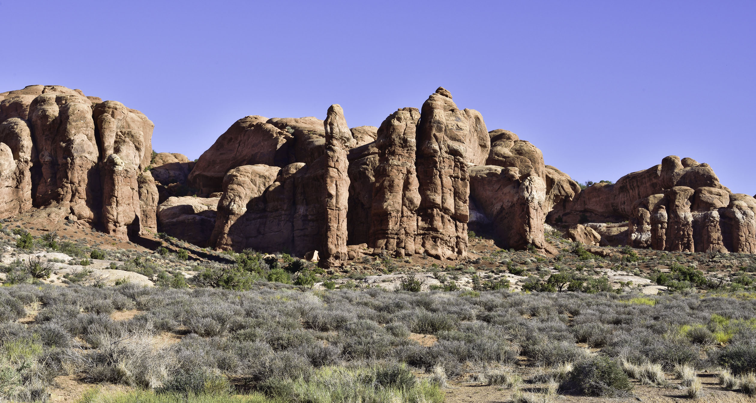
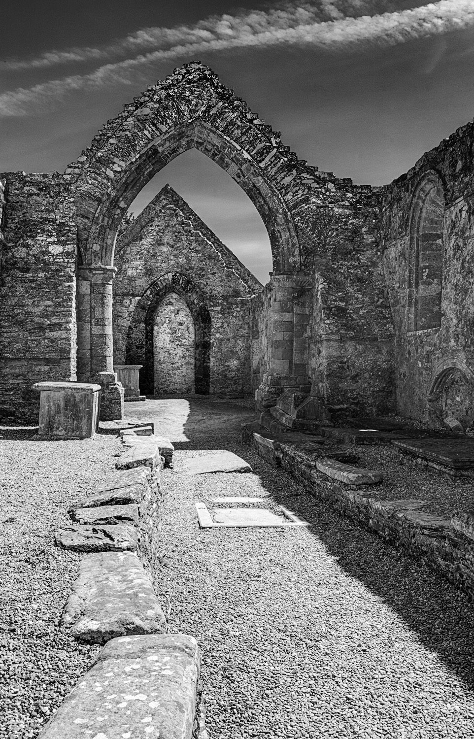
Personally I like your composition as is. Unlike the others, I follow the image from the top and work my way to the bottom. I'm drawn by the texture of the stonework. A possible improvement might be to darken the arches some so that they are more pronounced. I did just the arch farthest from the camera using a rough selection (not very precise) and think that a false shadow of the arch in front could accentuate the arches a bit. Just a suggestion. |
May 17th |
 |
| 31 |
May 20 |
Comment |
Very nice tight composition with the tree growing on the dune. It reminds me of the grass covered dunes of the barrier islands along Virginia and the Carolina's. Well done Ian. |
May 17th |
| 31 |
May 20 |
Comment |
Very well done Peter. I enjoy and admire the texture in the sand along with the repeating pattern of the shadows. It would be interesting for me to see the sand dunes with different cloud formations to see what impact the various cloud formations would produce. |
May 17th |
| 31 |
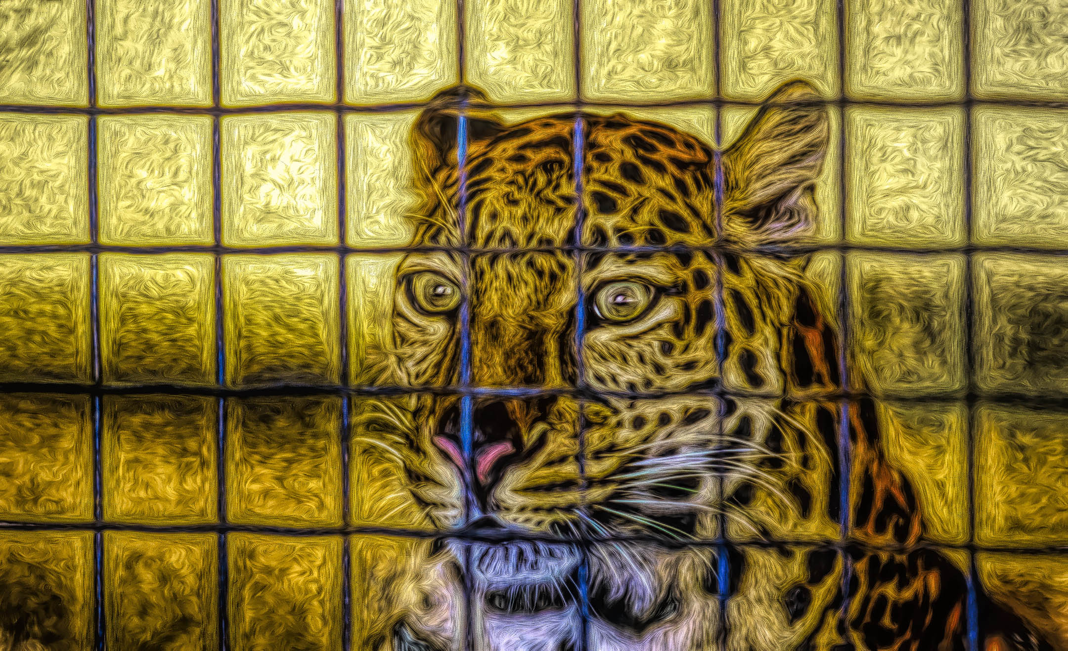
May 20 |
Comment |
An interesting set of reflections with slight differences in the distortions within each glass panel. I have no preference for either the color or the monochromatic version. I am in agreement with Peter and will join him on the fence. |
May 17th |
7 comments - 0 replies for Group 31
|
| 93 |
May 20 |
Reply |
Thanks Darcy. I don't mind the change in the sky, but I personally need the birds. To me the image seems empty without them. They are not the center of interest by any means but add interest to what is there. |
May 28th |
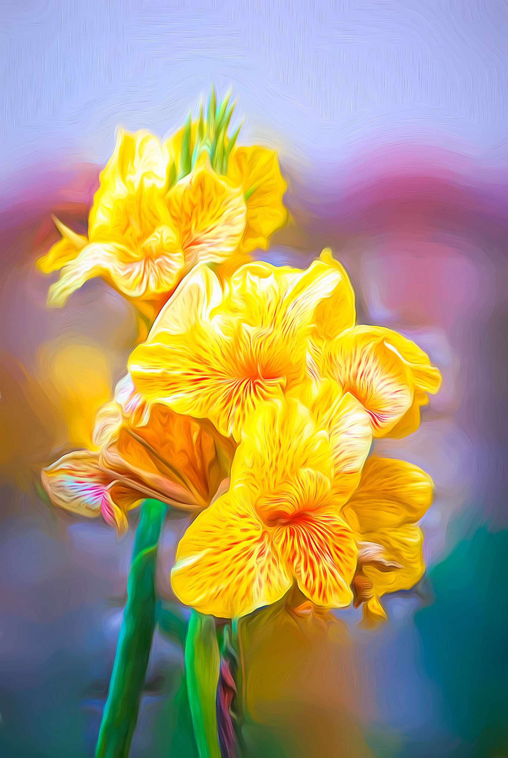
| 93 |
May 20 |
Comment |
Well done image of the flower. Personally, I don't mind that the depth of field reveals the sharp details surrounding the flower as (to me) it reveals the environment it lives in. The only distraction to me is the wood post behind bloom.
I did a rush job on cloning out the post and it shows when enlarged as there is a slight loss of focus in the background as compared to the middle ground. |
May 17th |
 |
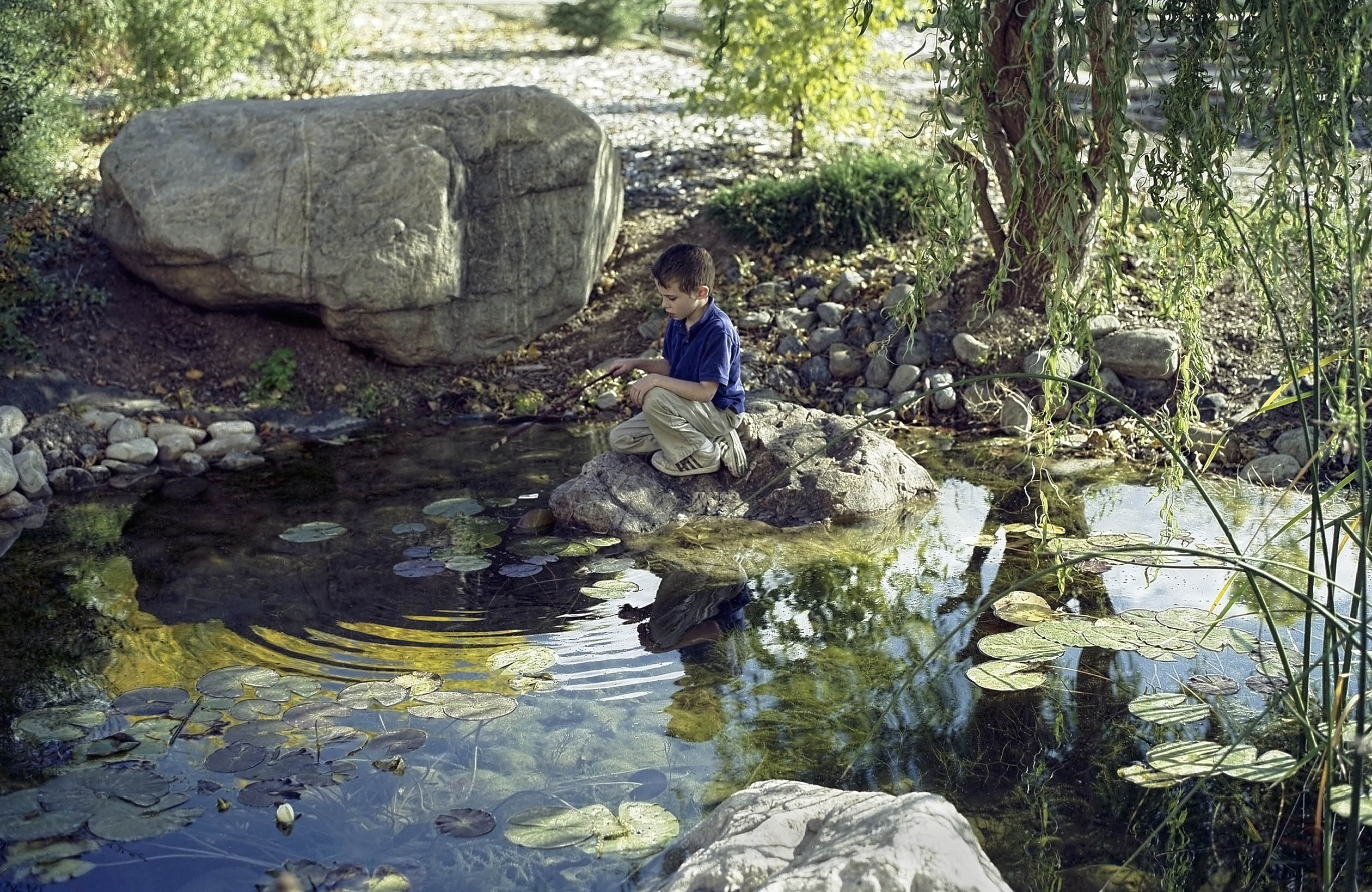
| 93 |
May 20 |
Comment |
Nice use of a fortuitous accident. The bright colors do draw my eye initially, but cause me to focus my attention in on the rising geese. |
May 17th |
| 93 |
May 20 |
Comment |
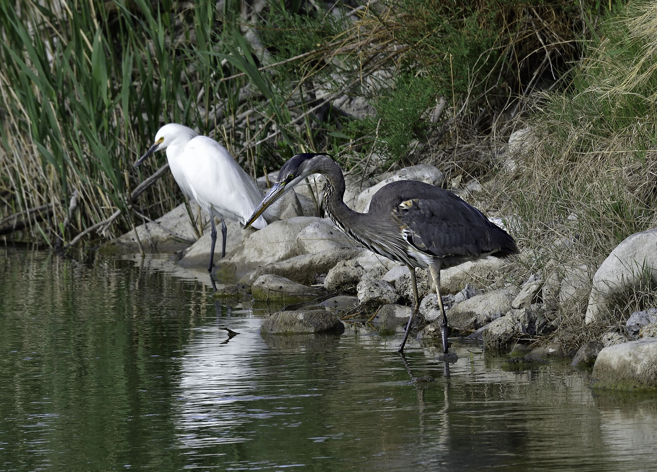
Well done Jean. The people add scale and lead my eye to the sea stack. The birds perched on the rock add interest for me and prevent my attention from wandering off the image. |
May 17th |
| 93 |
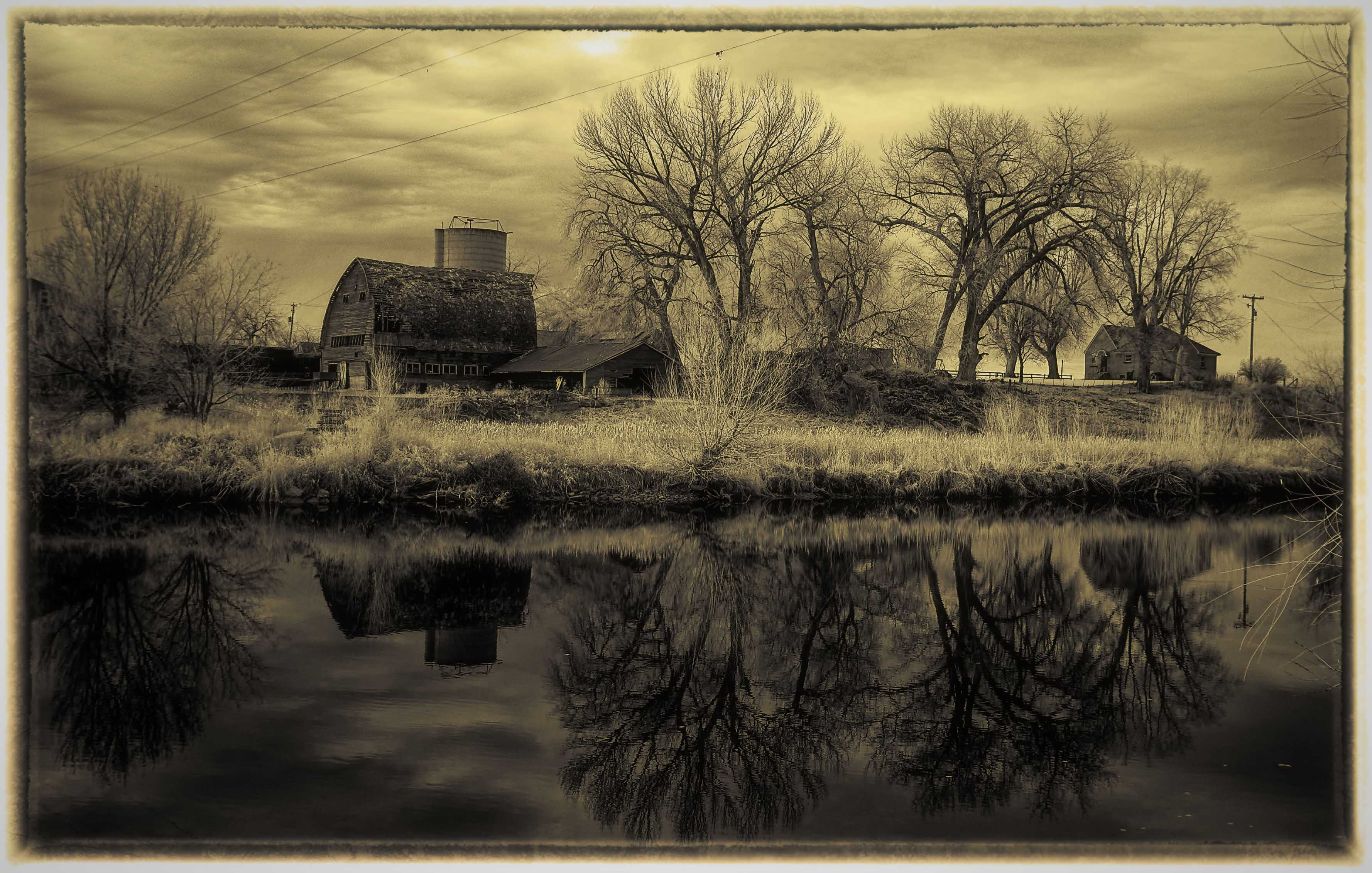
May 20 |
Comment |
Nicely done Darcy. I agree with Ed but I would choose to adjust the camera position to include more water at the bottom (instead of cropping). Either way I like the image. |
May 17th |
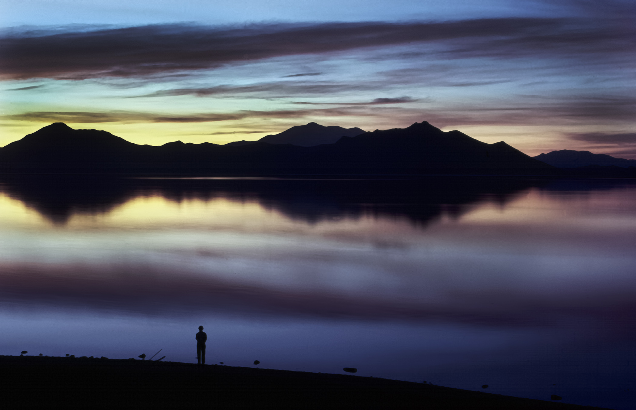
| 93 |
May 20 |
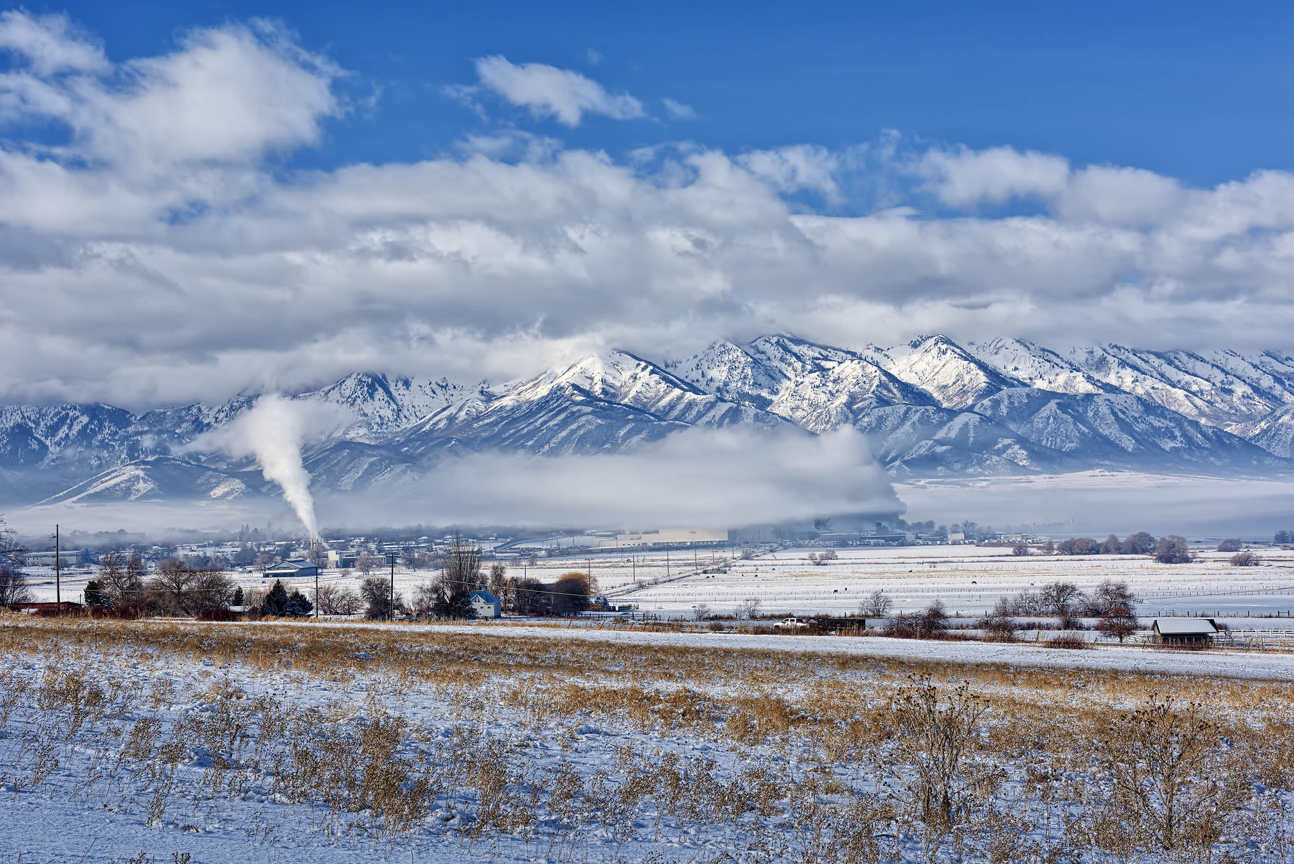
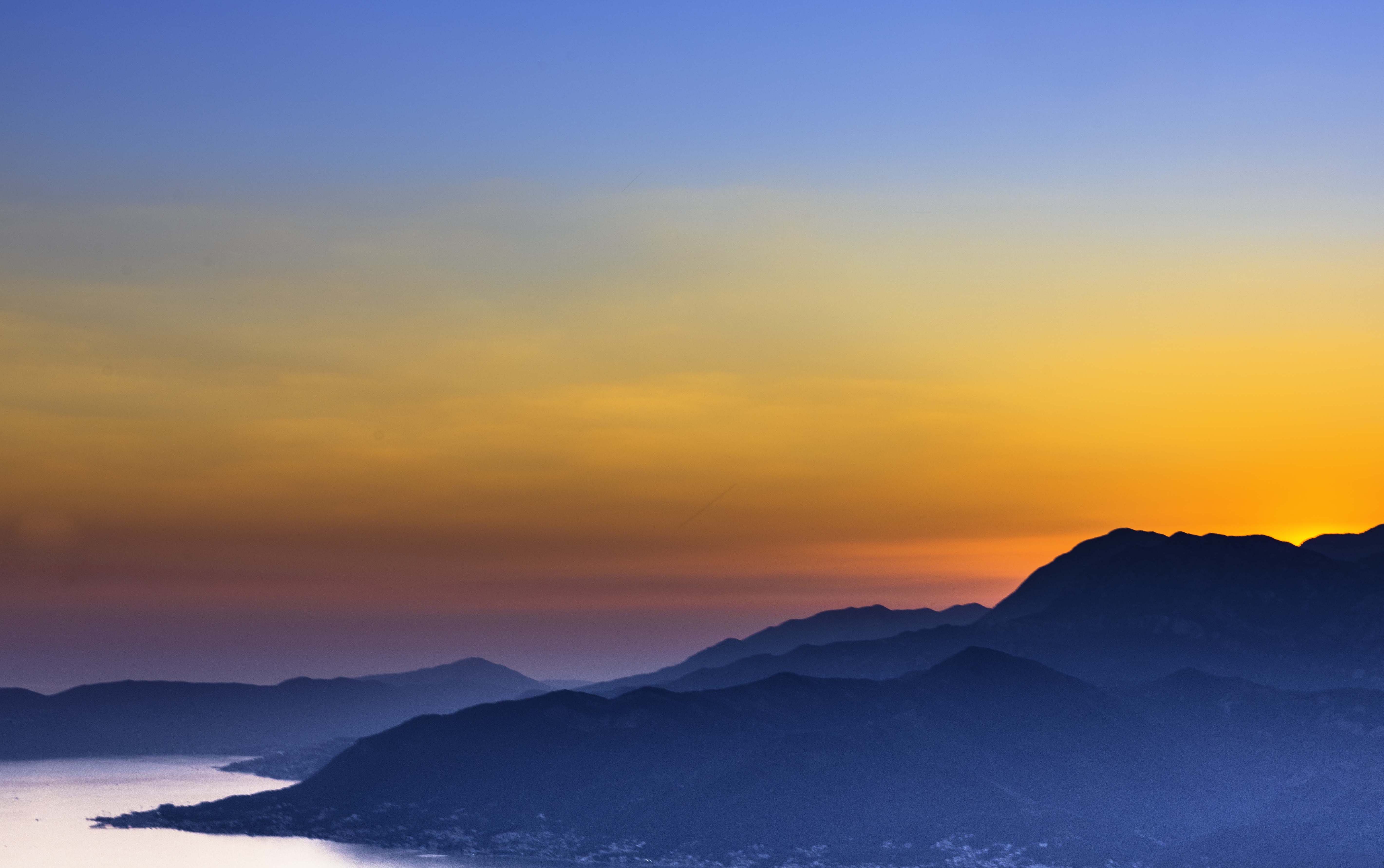
Comment |
Very nice sunset with muted colors in the foreground that help the warm colors stand out more. Personally, I may have cropped some of the blue sky to widen he proportion of the warm colors in the middle. |
May 17th |
 |
| 93 |
May 20 |
Comment |
Very Nice composition and exposure. The addition of the water drops makes a nice framing device for the reflection. Well done. |
May 17th |
| 93 |
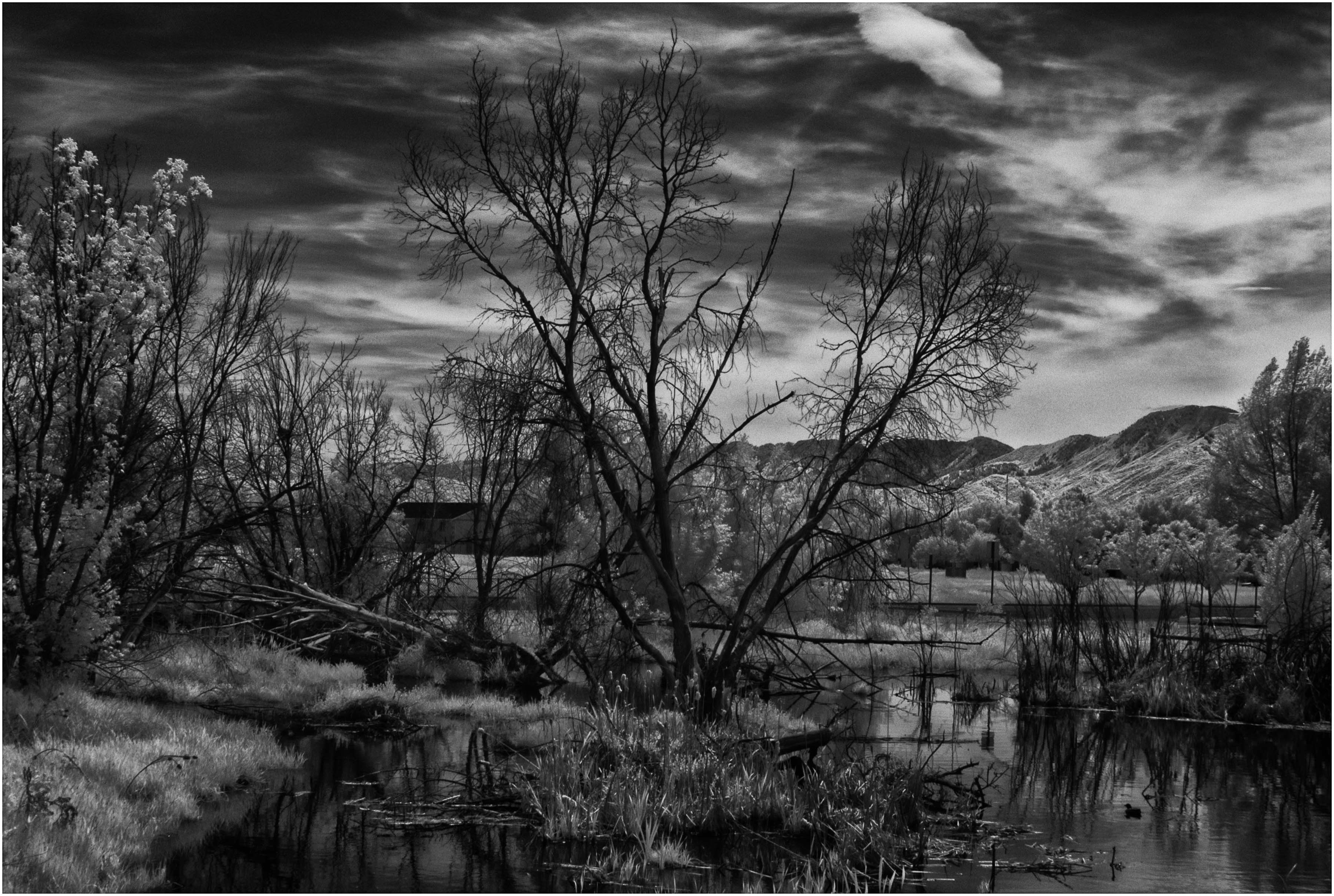
May 20 |
Comment |
Thank you Jean and Dan, I appreciate it.
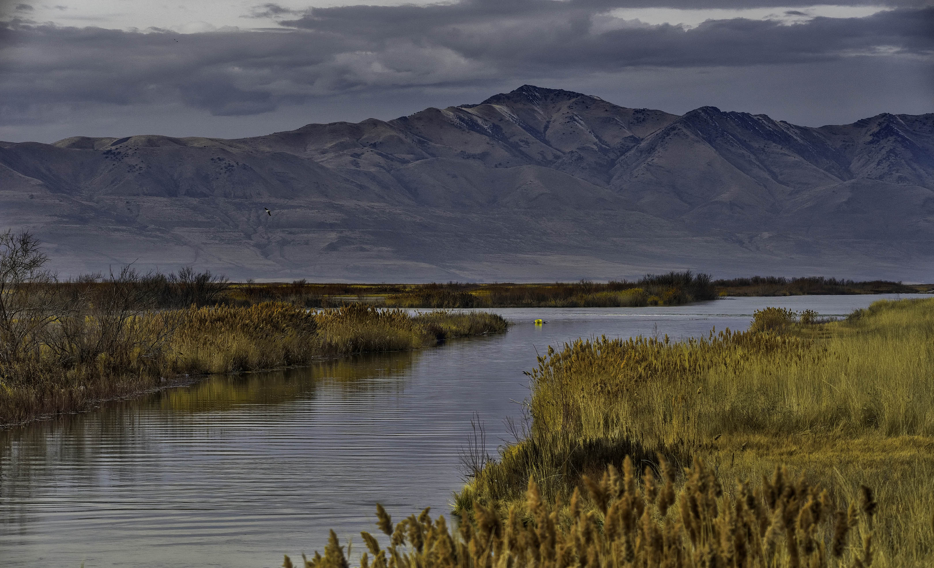
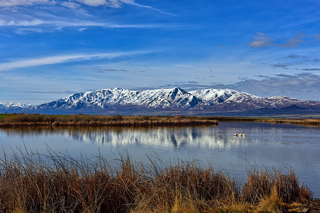
The image is not cropped and makes a nice 11"x17" image on 13x19 paper. Compositionally, I was trying to divide the image horizontally into thirds. Foreground reeds, middle ground water and mountain, sky in top third. Evidently I missed. |
May 11th |
7 comments - 1 reply for Group 93
|
14 comments - 1 reply Total
|