|
| Group |
Round |
C/R |
Comment |
Date |
Image |
| 78 |
Sep 25 |
Comment |
Taking in Ed and Kathryn's suggestions, here is my latest version. |
Sep 20th |
 |
| 78 |
Sep 25 |
Reply |
Thanks for your feedback! I'd rather not adjust the saturation because I want viewers to take in the entire image. |
Sep 17th |
| 78 |
Sep 25 |
Reply |
Thanks for your feedback! I know the oval shape can be a bit jarring. I'll probably remove it altogether. |
Sep 17th |
| 78 |
Sep 25 |
Reply |
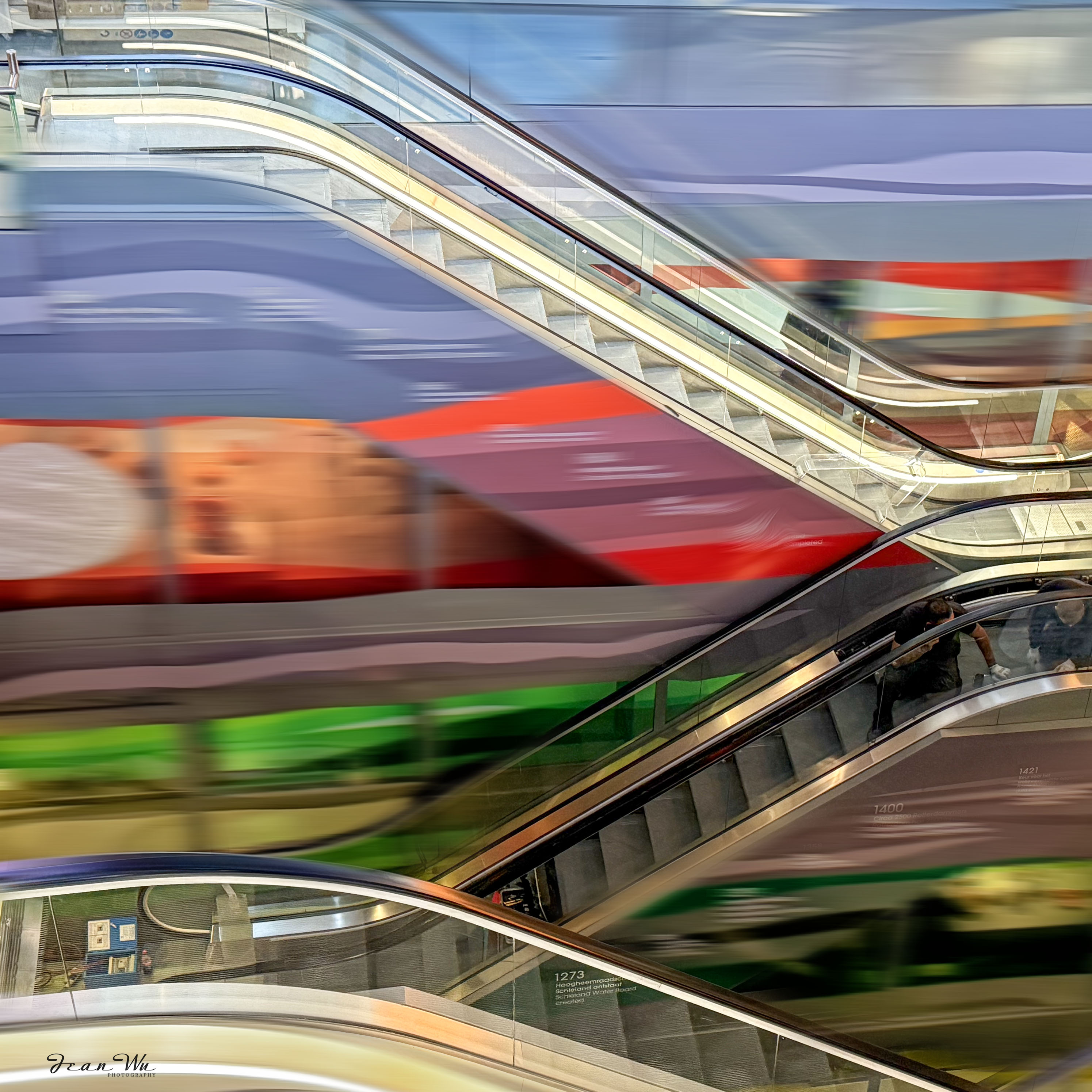
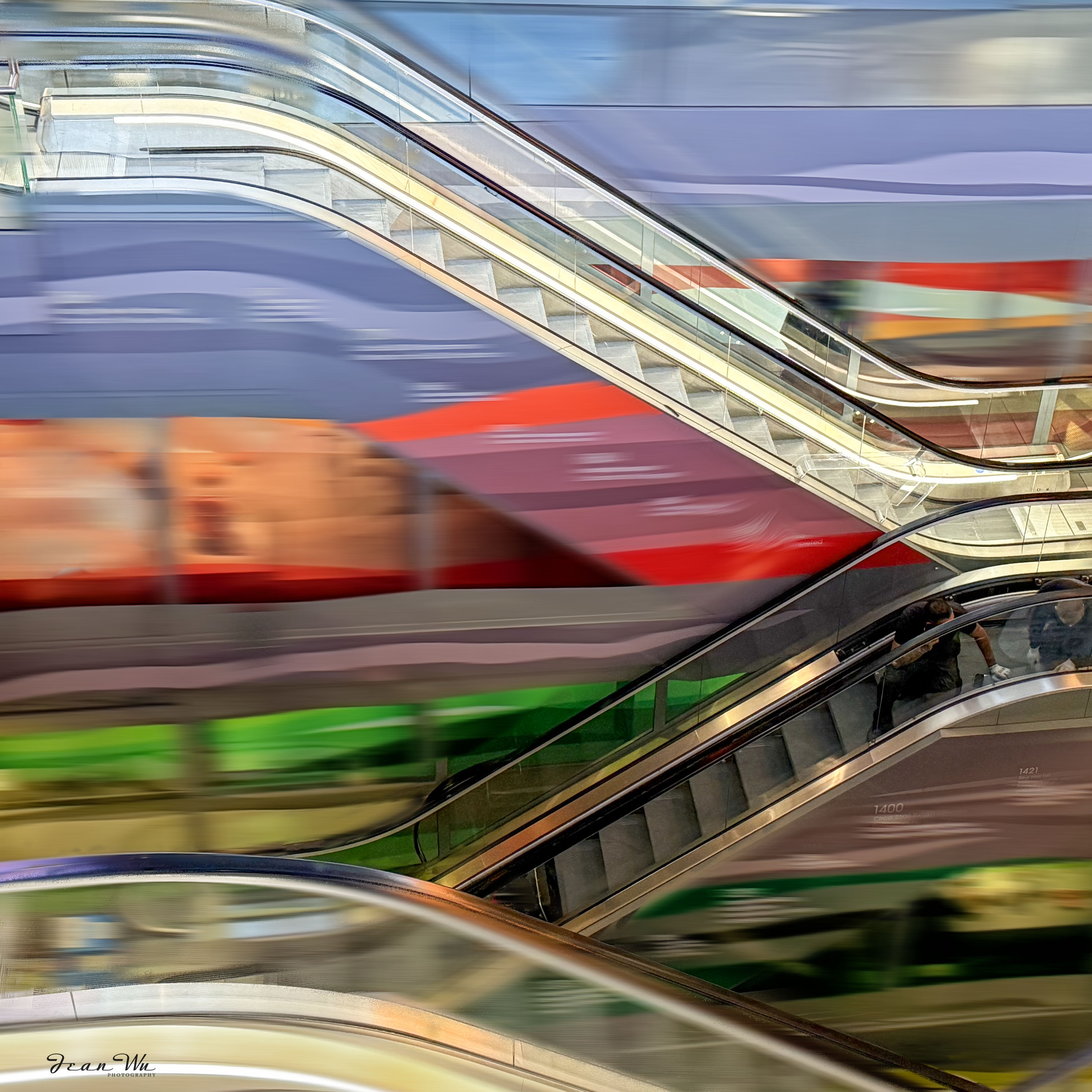
Thanks for your comment and suggestion! I might try to blur everything except the curve line of the escalator and some steps. |
Sep 17th |
| 78 |
Sep 25 |
Reply |
Thanks for your comment!! |
Sep 12th |
| 78 |
Sep 25 |
Comment |
Brenda and Robert already provided very nice suggestions on your image.
You can download various 'skies' for sky replacement from Adobe site and you may find the one just what you need for this. Another suggestion is to explore Photoshop Beta version's 'harmonize' feature for your composite image. I am not sure it will work for your composite layers but worth of trying. Here is a video for your reference:https://www.youtube.com/watch?v=dWiOA5YZXwc&t=5s
|
Sep 7th |
| 78 |
Sep 25 |
Comment |
Thanks so much for sharing the photo that inspired the sculptor of this sculpture!
Robert and Brenda have already covered all the important points of your image. I don't have any more comments to add here.
Your image reminded me of another sculpture, "Against the Tide," in Amsterdam, which is the monument in memory of Peter R. de Vries. Here is the URL for your information if you are interested in reading it:
https://rinihurkmans.com/objects-sculptures-installations/tegen-alle-stromen-in/
|
Sep 7th |
| 78 |
Sep 25 |
Comment |
I totally agree with Robert's idea to add more saturation in the center. It's all about personal preference, though. I'd rather have the flower take up the entire space, leaving no black background at all. |
Sep 7th |
| 78 |
Sep 25 |
Reply |
Here us the cleaned up version. |
Sep 7th |
 |
| 78 |
Sep 25 |
Reply |
Love your suggestion on the titles. |
Sep 5th |
| 78 |
Sep 25 |
Reply |
I thinnk so. :-) |
Sep 5th |
| 78 |
Sep 25 |
Reply |
Thanks for your comment. You have sharp eyes!! I didn't do a good job to unmask edge areas. :-) |
Sep 5th |
| 78 |
Sep 25 |
Reply |
Thanks for your comment! The PS surface blur (layer mask) was applied after the Viveza presets and edits were done. |
Sep 3rd |
| 78 |
Sep 25 |
Comment |
As always, you've captured stunning, crisp, and sharp images of the flowers. I'm not sure if you intended for viewers to follow the flowers' journey throughout the image. All the flowers in this image are beautiful, but I think there's a bit of a lack of a main focus that could make the image even more interesting. |
Sep 2nd |
| 78 |
Sep 25 |
Comment |
I'm not a pro at panning, but I did some practice on a merry-go-round at a playground, and it turned out pretty well! You might find some cool panning subjects at local state fairs or Disneyland-like places. |
Sep 2nd |
| 78 |
Sep 25 |
Comment |
Wow, that's a cool image and title! I think you could add some more light, contrast, and saturation to the main subject to make it more vibrant and eye-catching. And adding a vignette could make the subject pop even more. |
Sep 2nd |
7 comments - 9 replies for Group 78
|
7 comments - 9 replies Total
|