|
| Group |
Round |
C/R |
Comment |
Date |
Image |
| 78 |
Aug 25 |
Reply |
I'm seeing this image as a blue surface on top of the screen, with a small part of an aircraft wingtip in the middle. The bottom half of the screen is gray. Is this how you're seeing it too? |
Aug 25th |
| 78 |
Aug 25 |
Reply |
https://www.youtube.com/watch?v=YEnw4Iu8oV4&t=151s
https://www.youtube.com/watch?v=dWiOA5YZXwc
Check these out. Enjoy! |
Aug 3rd |
| 78 |
Aug 25 |
Comment |
I totally agree with Robert and Brenda's comments. The distance between the add-on eagle and the boat isn't quite right. You might want to try using PS beta version. It has a 'harmonize' feature for composite images. It's a beta version, so it might work sometimes, but not always. |
Aug 3rd |
| 78 |
Aug 25 |
Comment |
Brenda and Robert have already shared some great suggestions, so I don't have anything else to add. I think you did a fantastic job converting to BW. It's an interesting topic! |
Aug 3rd |
| 78 |
Aug 25 |
Comment |
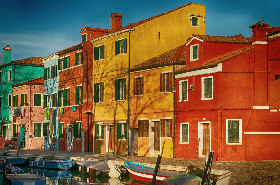
Very nice composition. The rows with different directions guide the viewer's eye really well. But the greenish colors in the whole image are a bit too similar. I think adding some color effects based on the light direction would make it even more striking. |
Aug 3rd |
| 78 |
Aug 25 |
Comment |
I totally agree with Robert and Breda's thoughts. You have such a keen eye for interesting subjects and a unique perspective on taking photos. |
Aug 2nd |
| 78 |
Aug 25 |
Comment |
Wow, that's a great shot! Did you take a lot of pictures to get this perfect moment? I think your cropping is perfect. The only thing I would suggest is to darken the background more if you want to make it look more dramatic. |
Aug 2nd |
| 78 |
Aug 25 |
Comment |
Wow, you did an incredible job replacing the roof! Like Brenda said, I wouldn't know if you didn't tell us. I completely agree about removing the partial building in the back right and the antenna. My suggestion is to reduce the light in the background and surroundings, and increase the saturation in the barn so it stands out more. |
Aug 2nd |
| 78 |
Aug 25 |
Reply |
The original shot was taken with a JPEG format, which isn't the best format for sharpening images. My skills weren't great either, so there are some limitations on how much software can improve the image. Here's an updated version with texture and a bit of toning down of the saturation and vibrancy. |
Aug 2nd |
 |
6 comments - 3 replies for Group 78
|
6 comments - 3 replies Total
|