|
| Group |
Round |
C/R |
Comment |
Date |
Image |
| 96 |
Mar 22 |
Reply |
Hello Cheryl, I like what you did with the adjustments. Yes, Selective Color is a very useful tool for B&Ws - good for color too.
If this image were mine, I would now drop the opacity of your adjustments a bit to balance the reflection with the rest of the image. You probably know this, but just in case, keep in mind that reflections are always darker. Look for that balance where you retain some detail but stay true to physics.
Also, I liked the detail in the trees on your original. This redo lost a lot of that. |
Mar 19th |
| 96 |
Mar 22 |
Reply |
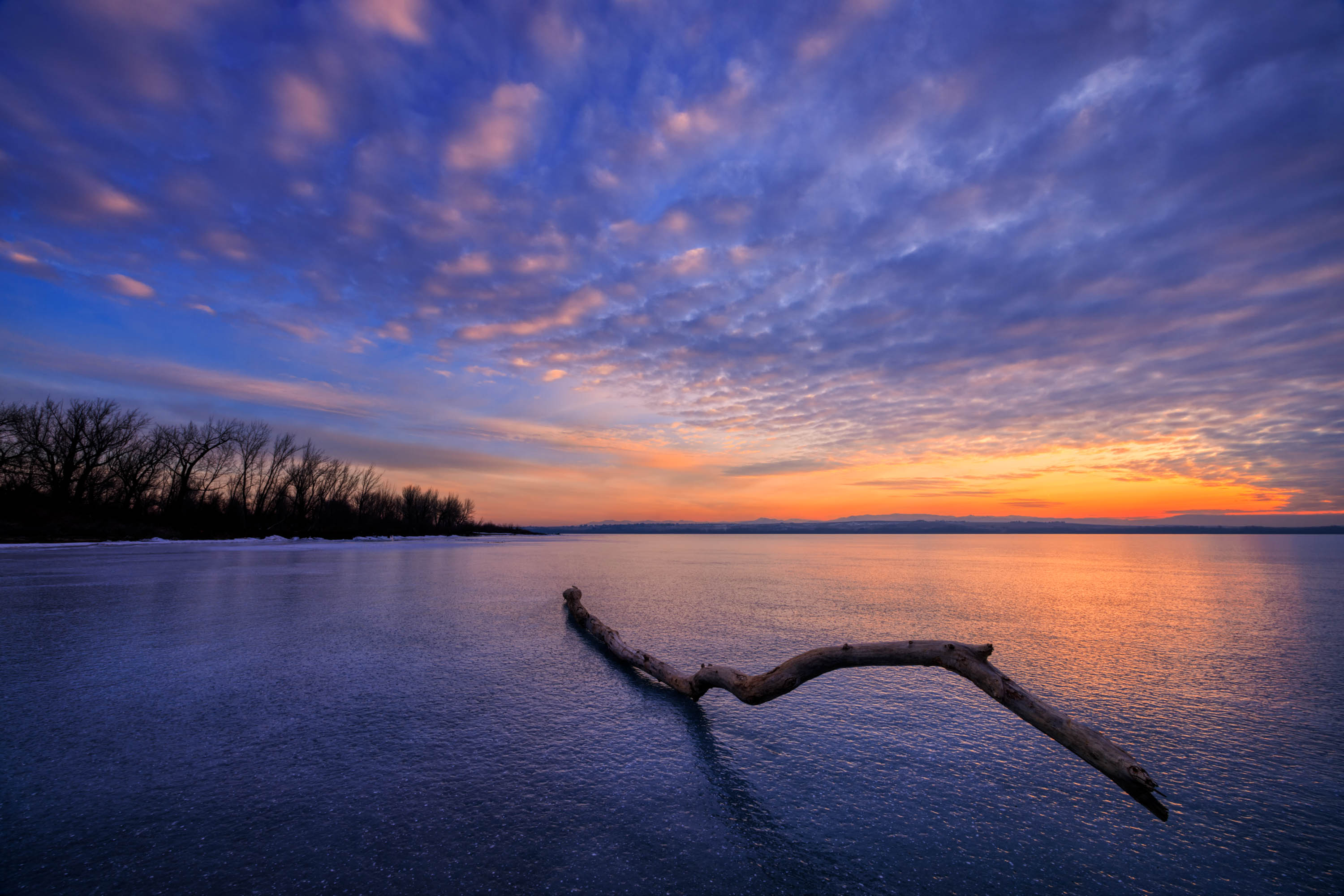
Thank you, Robert. I suppose the reason I didn't post this one instead of the original was that I felt there might not be enough space between the branch and lower right frame. |
Mar 12th |
| 96 |
Mar 22 |
Reply |
I'm not a big fan of Topaz for NR and sharpening. LR, ACR and PS do a terrific job at NR and sharpening without the artifacts you talked about. I regularly use NIK Dfine 2 for the NR. It works quite well.
I might be mistaking sensor spots for tips of lava barely appearing from under the steam (?)
Again, it's a fabulous photo. |
Mar 12th |
| 96 |
Mar 22 |
Reply |
Hi Robert, Thank you for the insightful review. I too have wondered about the branch and its placement. Now that you mention the branch being too much of the subject, I am looking at it with a different eye.
I took several shots of this scene and with some, I moved the branch around. Here is one of those shots taken a few minute from the original posting.
Thanks again! |
Mar 12th |
 |
| 96 |
Mar 22 |
Comment |
I like what you did, Bob. I also appreciate your coming back to it. I am going to give this a try in full resolution. Thanks! |
Mar 10th |
| 96 |
Mar 22 |
Comment |
This is a very appealing photo, Robert. I think you nailed it here. The three elemental layers work well for a non-cluttered, simple composition. As opposed to last month's image, this gives me just enough idea of what I'm looking at but not too much. It holds my attention. The visual motion directs my eyes from the middle left diagonally down to the wave where it brings my attention to the middle right. Then there's that dark lava mound that is the perfect holding point.
Your deep darks work nicely. For me the power comes from that lower wave.
Fix the noise and a couple sensor spots and you have an image that I admire. This is an excellent show of nature's drama. |
Mar 9th |
| 96 |
Mar 22 |
Reply |
Thank you, Haru. I too felt that there was too much space at the bottom. But I liked the small, white bubbles. I thought it added some visual excitement. I tried a crop to bring the lower frame up. It made a 50/50 split in the horizon and I didn't like losing the bubbles. So, I left it as it is. I hope this doesn't sound defensive. I wanted to share my thinking. |
Mar 9th |
| 96 |
Mar 22 |
Reply |
Yes, you make perfect sense, Haru. I don't think I would say for you to give it up. I don't see your full vision yet and your processing skills and imagination could take this photo in an interesting direction. What I might suggest, is after you get all the comments from the members of this group, see if someone hits on something that would help. If not, put the image down for a few months and come back to it fresh. Sometimes interesting things come from putting it out of your mind for a while. |
Mar 5th |
| 96 |
Mar 22 |
Reply |
Thank you, Bob for the comment. The branch is not composited. I found it on this frozen lake and shot it as it appears. |
Mar 5th |
| 96 |
Mar 22 |
Comment |
Welcome to Group 96, Dr. Wimborne. I hope you enjoy it as much as I do.
It's refreshing to see a nicely shot street scene amongst a bunch of landscapers. I appreciate the documentary style in which you approached this shot. It's real without any visual embellishments.
Your framing works well in that you guided my eye into the scene with the road as a leading line and with your use of the architecture. The wall on the right holds my eye in the frame and drives my attention to the center, three story building. As I view the center building, the crown in front catch my attention. I'm held there intrigued, wondering what is going on over there. It's a fun visual exploration.
I would coach you to control the highlights in your capture by stopping down a bit. However, this might be solved in LR or your preferred processing software by bringing down the Highlight and/or White sliders. Darkening the left side would hold my eye in the frame.
Thank you for joining our group. I look forward to seeing your future images. |
Mar 3rd |
| 96 |
Mar 22 |
Comment |
Hi Haru, you have an interesting image that I feel has potential. This looks like a very cool place to photograph. I envy your ability to get there.
Your questions caught my attention for what was not asked. Is the image too busy? The first question came close so I will try to answer that along with the question I feel you should have asked.
Cropping might help, but you would have to go way in to simplify your image. You might lose too many pexels to maintain a sharp picture. When you return next winter, have an open mind about isolating different subjects. Of course, take wide shots for the grand expanse and scale, but then look at the smaller pictures within your shot and take those too. Use a long lense and have fun. This is when the creativity comes.
Your main image, from my point of view, is way too busy and extremely over processed. I like the others much better.
The first original in color is clearer and easier on my eyes. The B&W is nice too. It defines the scene.
I hope this helps, Haru. I look forward to reading the other comments. |
Mar 3rd |
| 96 |
Mar 22 |
Comment |
The best photographers find their own images. They don't copy someone else's photo that has been taken tens of thousands of times. The best photographers make their own images. This is why I like Bob's picture so much. He visited an iconic location and made his own photo.
I would not have recognized this as Palouse Falls. To go a step further, Bob made a terrific shot with style and mood. The warmth works well in creating that mood. It's a nuclear winter to my eyes. The sky has a strange ambiance that feels like it might not match but putting it in the context of that scenario, it works. Some parts of the cliffs and grass might be too hot, but again, it fits if you except this theme. Thank you for choosing this image to submit, Bob. It is an inspiration. |
Mar 2nd |
| 96 |
Mar 22 |
Comment |
Hello Cheryl, I don't feel that the image is too busy. It's my personal opinion that the clouds give your image some added drama. If I were processing this image, I think I would deepen the blacks a little on the mountains and forest. Again, personal opinion.
An idea to enhance the cloud reflection: Make a new layer, select the sky, flip it vertically and move it over the water. Make sure it's properly aligned. Then, lower the opacity so the reflection retains its watery blur. You know how to do this.
Other than that, a trick I use to enhance my B&Ws is to make an adjustment layer of "Selective Color". Do the drop-down to White. Adjust the Black slider for the desired effect. Do the same with Gray. After that, you might want to apply a Curves or Levels adjustment layer for just a smidge more contrast. I think you are on your way to making a spectacular image. |
Mar 1st |
6 comments - 7 replies for Group 96
|
6 comments - 7 replies Total
|


