|
| Group |
Round |
C/R |
Comment |
Date |
Image |
| 93 |
Jan 22 |
Comment |
Happy New Year to you, Paul!
Your monochrome rendering is very nice. It's not over-dramatic. The darks have the perfect amount of detail. I love those clouds.
Circles in images are attractive. They project a calming effect. My eyes are lead up the slightly slanted fence to those round hay bales. Well done.
Much of the overlap, or lack of separation makes for a busy composition. Watch for items that extend out of frame. In this picture, on both sides, you have things that unnecessarily complicate your story. Look for a way to clone out the white bales on the right and the dark barn that peaks into the frame on the left. I wouldn't suggest cropping because your viewer needs breathing room. However, consider cropping up from the bottom to just above the lowest fence rail. The brighter lower weeds do not contribute to your image story.
I love your story about following the loan officer to those old barns. That is very resourceful of you. For sure, they won't be around much longer. |
Jan 3rd |
1 comment - 0 replies for Group 93
|
| 96 |
Jan 22 |
Comment |
Hi again, Emily. I didn't explain my technique very well in my first comment.
First I made a new Layer. Then I made a selection under the right side of the horizon all the way up to the top of your frame. Then, I did Edit>Transform>Flip Horizontal. This flipped the selected area only. I used the Move tool and dragged it to the left and aligned the horizon so they fit together. Make a Mask so you can brush the sky as desired so it doesn't look like a mirrored images. A little cloning might be needed too.
In addition to this, I cloned out some distracting nicks and things out of the snow so the viewer's eyes don't get caught in the minute detail.
Please let me know if you need some further assistance. |
Jan 24th |
| 96 |
Jan 22 |
Reply |
As I look at my rendering, the sky might need cropping a little. |
Jan 24th |
| 96 |
Jan 22 |
Comment |
Hi Emily, this is something like I was thinking. It changes the entire feel of your photo which you may not like. |
Jan 24th |
 |
| 96 |
Jan 22 |
Comment |
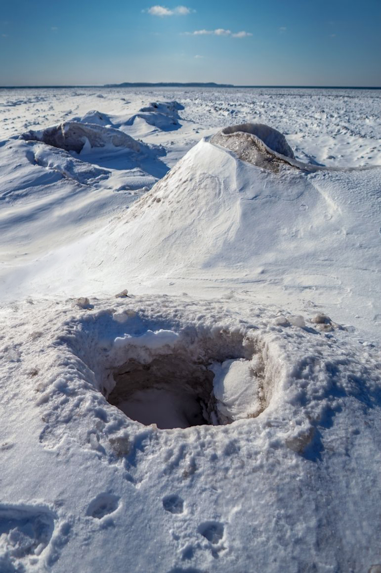
Hey there Emily,
Yes, quite the unique find - very fascinating. You have a great eye for seeing and capturing interesting subjects.
Much of what Robert and Cheryl said I agree with. I would like to have seen the focal length a little wider to get a little bit more perspective. I am disoriented as to the size of the mounds.
A suggestion would be to eliminate the upper-left trees and buildings by flipping the right side horizon and moving it into the left. This way you might solve the depth of field issue that was discussed above. You would bring your viewer's attention back down to what's in focus. There is too much stuff up there that calls for attention. It's not relevant to your subject and out of focus. I fear this could frustrate your viewer. Then, the shallow DOF would work in your favor by keeping your viewer's eyes where you want them to be. (I hope this makes sense.)
Snow is a very difficult subject to get an accurate exposure. You did an excellent job. Your tones are not grayed-out and your highlights are perfect.
Finally, I appreciate the compositional quality of your image. You lead my eye, starting from lower left diagonally up to the two prominent mounds, then over for a sharp left, and again diagonally right. A nice and subtle backwards Z. Thanks, Emily. Keep them coming.
|
Jan 22nd |
| 96 |
Jan 22 |
Reply |
Thank you, Cheryl for taking the time to provide such detailed input and also with your rendition. I like what you did to the colors, tones and contrast. I purposely kept the photo muted, but your ideas work just as well. |
Jan 19th |
| 96 |
Jan 22 |
Reply |
Hey there Bob, I don't take it personally. If I did, I would lose some important insight offered by you and others. Every comment has value and is based on how people see the images we post. Please don't hesitate in the future. |
Jan 19th |
| 96 |
Jan 22 |
Reply |
Thank you very much, Robert. And, welcome back! You were missed last month - especially that keen insight of yours. What's beyond the fence is a mystery to me. That is what I found to be the most captivating about the scene.
|
Jan 19th |
| 96 |
Jan 22 |
Reply |
Thank you for your free flowing thinking, Haru. And, no; your thoughts are very relevant. What I get from what you said is that this image caught your attention. For good or bad, that is important. |
Jan 19th |
| 96 |
Jan 22 |
Comment |
Hi Gloria,
I'm so glad to see that you are working hard at making your photography self expressive. "More Than A Rock" by Guy Tal is a great start. The photo you posted for this month is also a great start.
Your image is very pleasing to my eyes. The colors speak to me as well as the lines and forms of your shot. I don't feel you need a center of interest. The entire image is what's interesting. To me, it expresses calm softness. You restrained yourself from the temptation to increase the saturation and contrast that would make the picture scream at me. The pastel colors in the sky are very soothing. Although I respect Bob's and Cheryl's view, I don't think that their renditions with the added clouds work with what I see as your vision.
You might want to see if cropping some of the sky works. If you don't like the way it looks, undo the crop with Ctrl-Z.
The only other thing I would add to my comment is consider separation when composing your shots. The Rock cluster in the bay interferes with the distant hills. If you raised your camera up just a few inches you would create enough space where you will eliminate the conflict and give your image a greater amount of peace.
As Haru says, keep returning. Each time the place will look different and your emotions will be different too. Your future shots will reflect that. |
Jan 19th |
| 96 |
Jan 22 |
Comment |
Hi Robert,
I have always thought that a good photograph starts with a good capture. I can't count how many times I've tried in vain to squeeze out a image in processing that was from the beginning not that remarkable. The experience of being there was no doubt wonderful, but I have learned that sometimes I just need to put my camera down and enjoy the show.
This is not to say that I feel your photo was not worth the effort. I am speaking to the second paragraph of your description.
Sometimes cropping and enhancing the elements of an image helps bring out the vision or story we are after. But I don't think that will fully work here.
I get the sense that this was an emotional experience for you. Unfortunately, it's extremely difficult to translate that emotion onto a photograph.
|
Jan 19th |
| 96 |
Jan 22 |
Reply |
You are very welcome, Haru. As I said above, it's an image that deserves recognition. Nice work! |
Jan 4th |
| 96 |
Jan 22 |
Comment |
Hi Haru, Happy New Year to you.
It pays to return to an area rich in photographic opportunities. You really nailed it with this image. Your January photo is quite exceptional. What a nice improvement with the fall colors. I like the subtle ways you simplified your composition.
The autumn colors are not over-saturated. The tone and color looks perfect. From my point of view, I would definitely remove the person in the falls. It is very odd looking and presents a distraction away from the scene. The solitude without the person contributes to the story. This is the kind of shot that would make me think that no one has ever been there before.
Compositionally, I like the circle that frames the waterfall and directs my eyes to where you intend me to look.
Your shot excites my visual sense. Frame it and put it on your wall. Enter it in contests, you should do well. Way to go! |
Jan 3rd |
| 96 |
Jan 22 |
Comment |
Hey Bob, now we can add 'Moonscapes' as a new category in our "Scapes" group. This is an intriguing image.
At first view, the area beyond the foreground hills looks like a Motion Blur filter had been applied. It is sort of dizzying. This is not necessarily a bad thing. It made me stop and take a long look.
The green tone, particularly in the top half is interesting. Is it copper in the soil or a color cast? The green is shown in the sky too which makes me think it's a color cast.
Also, try bringing up a dark gradient in the lower frame. My eyes get taken down and lost in the lower bright detail. Darkening this should help direct the viewer's eyes to your area of interest.
Your three layers work very well compositionally. With just a couple easy fixes, you have a fascinating and otherworldly image that is fun and interesting to look at. |
Jan 2nd |
| 96 |
Jan 22 |
Comment |
Happy New Year Cheryl. I admire your picture and the way in which you created it. You tackled a subject that you were curious about and had a vision on how you wanted it to look. After studying ways to shoot and process fireworks images, you created a fine work of art.
Knowing your attention to detail, I would guess you have already tried various crops. If your gut tells you to keep the photo as it is, that's what I would do. With that said, if it were my image, I would experiment with cropping out everything right of that center building with the spire. This would bring the viewer's eye closer to your point of interest. Really though, whatever way you present it, it will still be a terrific picture. |
Jan 2nd |
8 comments - 6 replies for Group 96
|
9 comments - 6 replies Total
|


