|
| Group |
Round |
C/R |
Comment |
Date |
Image |
| 96 |
Jun 21 |
Reply |
Chuckle - Thank you, Bob. Really, I think Robert is the one who brings us the A-game. |
Jun 19th |
| 96 |
Jun 21 |
Comment |
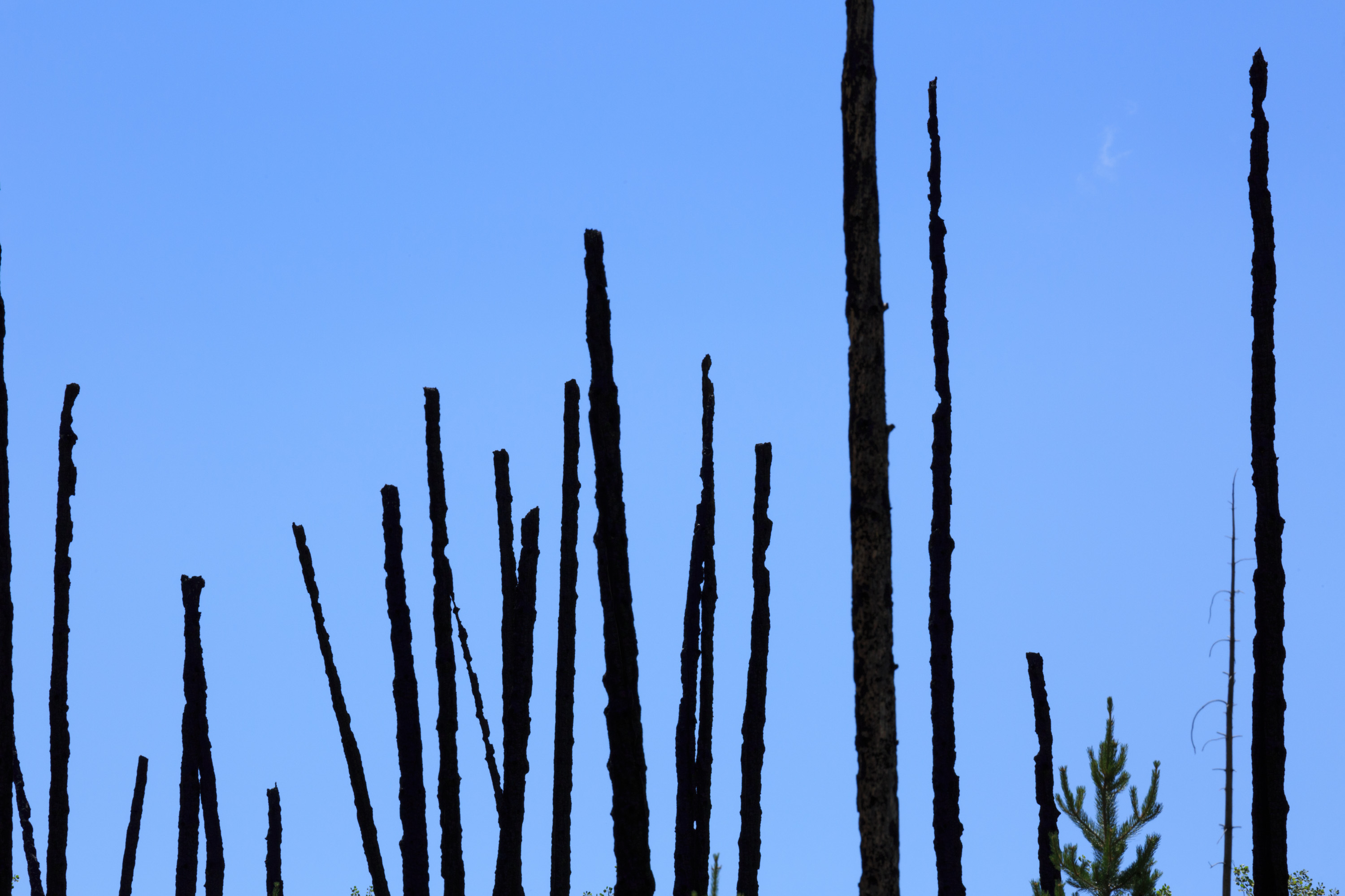
Thanks to those who went along with my experiment in not providing a description. I appreciate your thoughts about the impression the image made on you, and your helpful comments.
This is a photograph comprised of four different images. The shot started out as a failure from what I saw - a futile recovery from a devastating forest fire many years ago. I was drawn to the chard, black tree trunks that looked like skeletal fingers reaching up to the sky grasping for a chance at life that was not going to be. As I looked at the capture on my computer, it seemed dull and without the feelings that I originally saw. But, I had an idea.
The base shot is shown here. There are two cloud shots put together using blending modes in PS. I selectively brushed in and out various sections of the clouds to my liking. For the foreground, I expanded the canvis at the bottom and made it a vertical. A shot taken in Death Valley of the desert floor was placed in the bottom. With a low opacity brush I extended the clouds into the bottom for a slight fog look.
This was all a process of seeing where I could go with each step along the way. I would be lying if I said I had a vision from the start that got me to the final result.
Along the way, I liked what I was seeing so I dialed in lots of reds to emphasize the surreal quality of the image. Many layers were used to drive up the color volume as well as soften the the foreground floor.
For me, photography is about visual expression. Sometimes it comes from the original capture and sometimes it's created on the computer. |
Jun 16th |
 |
| 96 |
Jun 21 |
Comment |
Hi Tim, your photo is a pleasing image to look at. I love how you composed the shot that includes the flock's reflection. It has the potential to be wall hangable.
I feel it needs some toning down. My thought to make it more peaceful with understated impact would be to lower the contrast a bit. I've looked at your image several times and although I struggle with identifying where the harshness (to my eyes) comes from, I would suggest softening the overall feel. Then, if I may further suggest, try adding a cool tone to the birds to play off that wonderful golden hour tone you captured.
I'm probably off base with my suggestions. As I say with any critique, take what suggestions work and discard what doesn't. The most important thing is that you are happy with the photo.
BTW, how do you like your R6? |
Jun 15th |
| 96 |
Jun 21 |
Comment |
Hi Bob, welcome to the party!
This is visual Metalica. From the color tone, to what Cheryl calls "High Frequence", you have an loud, hard driving image. Jack Dykinga talks a lot about the sound of an image. Were you trying to scream through your photo?
The kind of photography our group studies is Land, Sea and Cityscapes. In my opinion, 'Scapes' photography is about our interpretation of a scene based on our feelings and emotions. These things enfluence how we see.
Your photo goes way beyond reflections. To me, it's gritty and perhaps angry looking. Its narrow color palette reflects a single minded determination. What did you see before you made the capture and subsequently processed it? Do you feel that it accurately translates your feelings at the time?
There's a number of elements that make me think this way: The two opposing triangles formed in the sand create an intersection that holds my eye. Was this intentional? Then the horizontal detail in the waves. Above, there is the somewhat softer clouds sweeping crossed the frame pointing to the rocks that fall off the page. Finally, there's that aggressive warm tone.
To me, this is a story about anguish and conflict. If this was your aim, you were very successful. |
Jun 13th |
| 96 |
Jun 21 |
Reply |
Cheryl did a good job at making this image come alive. Nice work! |
Jun 13th |
| 96 |
Jun 21 |
Reply |
Cheryl, you did an excellent job at removing the people. |
Jun 13th |
| 96 |
Jun 21 |
Reply |
Thank you, Cheryl. I like what you did here. I will definitely incorporate yours and Robert's suggestions. |
Jun 13th |
| 96 |
Jun 21 |
Comment |
Hi Emily, I have been trying to understand tension in visual art for a couple of years. Studying and comparing photography and classic paintings helps me get a grasp on it, but putting it into practice is another thing. Your image is a terrific example of how tension works.
You managed to create a perfect balance of subtle tension and simplicity with your bridge shot. This is done by placing the cantilevers at the top of your frame right in the middle but shifting the road slightly off to the right while including the left side causeway. The tension is tamed appropriately (in my opinion) by the image's simplicity. No clouds, no visually distracting elements - just the geometric lines and the two cars. However, check your leveling.
I like Cheryl's interpretation of your photo. It's an imaginative approach that takes your image to the next level. |
Jun 13th |
| 96 |
Jun 21 |
Comment |
Hey there Robert: I have become a big fan of your photography. I admire that you put a lot of time and thought into both the capture phase and the post processing of your images. Although we don't have the opportunity to see your finished photos after the group's review, I'm always impressed with your starting shot. (I wonder if our group Bulletin Board would be an appropriate place to show our finished images?)
I have to disagree with you, Robert. The vertical composition works better for me. As shown in "Original 2", the long extended rock or shaft leads nicely up to your "Touch of Heaven" light at the top of the frame. It has a slight curve which is pleasing to the eye. The darker surrounding area works well to keep my eyes in the frame and up to the light. You captured the mood nicely with that natural vignetting. Your main image feels a little busy to me, but with the vertical view, the busyness is reduced. I like the idea of your embracing lens flair, but I don't think it works with this image - which is another reason I'm drawn to your "Original 2". There's a subtle element to "Original 2" that I like a lot. It's that orange glow that comes from the far right of the frame. To me, this is where the ethereal feel comes from.
I hope this helps, Robert. Please let us see what you settle on. |
Jun 8th |
| 96 |
Jun 21 |
Comment |
Hi Cheryl, you captured a very nice evening sunset. Your composition is well balanced with the left/center cloud mimicking Haystack Rock. This is a thoughtful touch in your framing. The sunset light feels perfectly exposed and as you intended. The reflection to me is the star of the show. The detail in the sand just below the reflection completes the composition. It tells the story of the scene expertly.
It's easy to dial in too much saturation, but you used restraint so the image isn't garrish. My only point of criticism would suggest you level the image.
This is a location where tens of thousands of terrific images have been created. I try to encourage people to go beyond these iconic shots and create photos of their own. With that said, it's hard not to take this shot, especially with such great lighting as you have here. I confess that I have taken hundreds of shots of Haystack Rock from this very same spot. But yours is one of the best I've seen. You managed to take a shot when the light and sky couldn't be any better, and you did it without any people in the frame. |
Jun 4th |
| 96 |
Jun 21 |
Reply |
Thanks, Gerard. I'm happy to see that you're still here. Reading your cropping suggestion, I did the same thing and scrolled down to make a rough crop. I like your idea. It simplifies the image. Thank you for sharing your insightfulness. |
Jun 4th |
6 comments - 5 replies for Group 96
|
6 comments - 5 replies Total
|


