|
| Group |
Round |
C/R |
Comment |
Date |
Image |
| 93 |
Nov 20 |
Comment |
Hi Paul, it's good to see that you're getting the hang of using filters and textures. I love the oil painting look you produced here. The sky might be a bit overdone, but it's a nice start and I am looking forward to seeing more. |
Nov 5th |
1 comment - 0 replies for Group 93
|
| 96 |
Nov 20 |
Comment |
Hi Emily, I also like Robert's crop and the burning and dodging he did. I think we would all make better images if we had Robert sitting next to us while we edit. He always seems to get to the heart of what an image needs.
The grandness appeals to me. The large cloud on top works well.
The only thing I would do differently is bring back the color in the blue sky in a gradient fashion: Your original color higher up and less color near the horizon.
Robert's last paragraph asks an interesting question. It would be a fun discussion, but not appropriate on your image.
Nevertheless, it's a fine image and for people who love New York, this would be something they'd want on their wall. I admire the way you see. |
Nov 16th |
| 96 |
Nov 20 |
Comment |
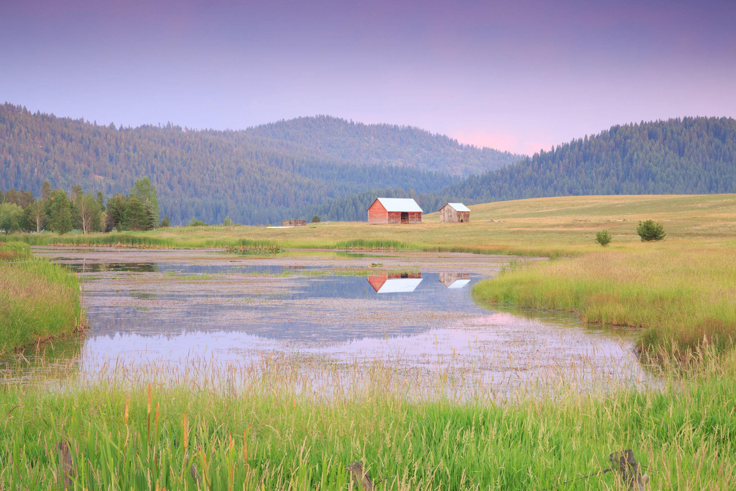
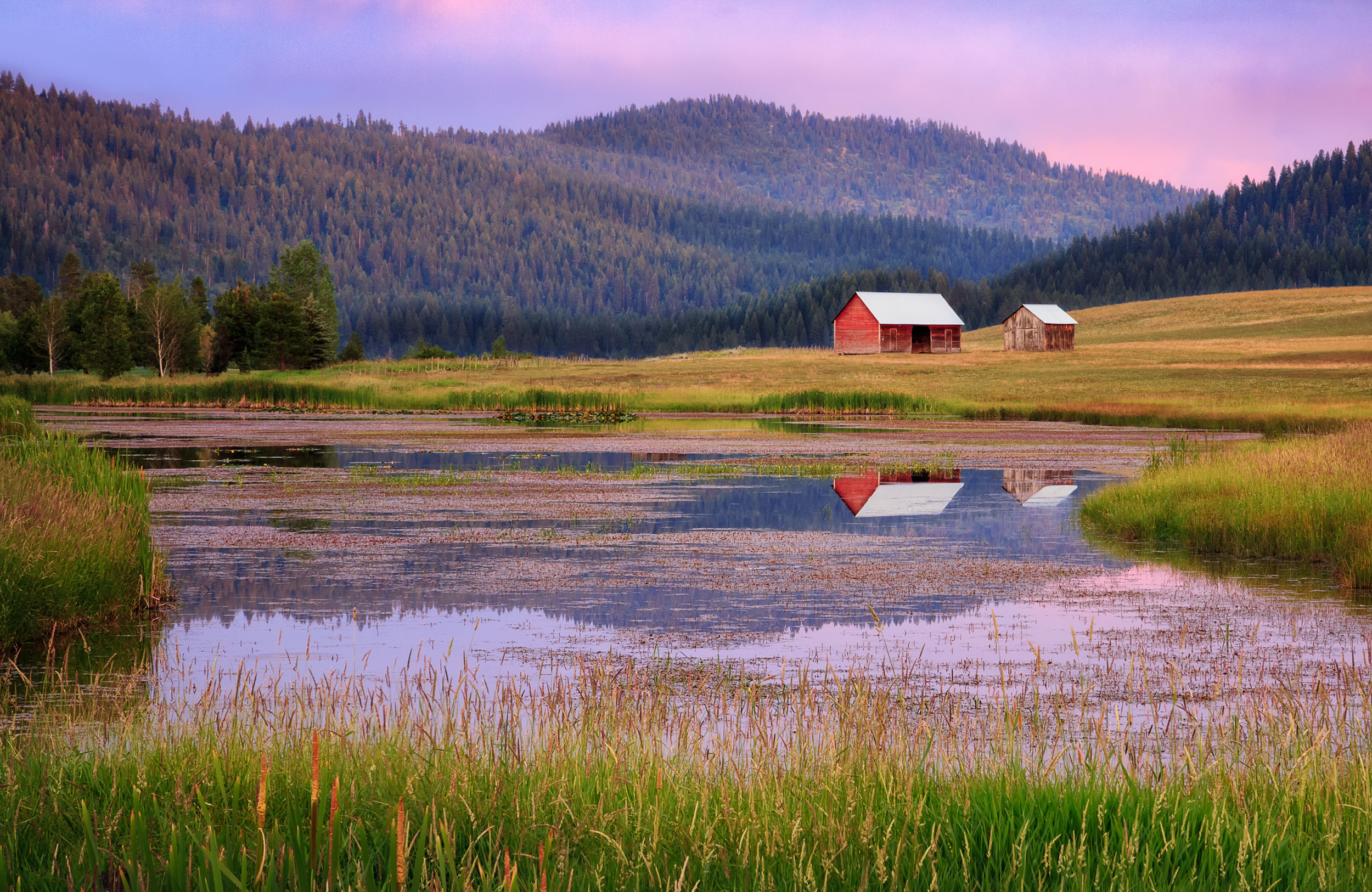
Hi Robert, thank you for the thoughtful words and for the insightful re-edit. As I said in another reply, this image can be taken in so many directions. I really like where you took this image.
On the subject of titles, regrettably, I think my title has taken the viewer in the wrong direction. In all honesty, the title was a last minute afterthought given just before submitting it to this group. It has little to do with the image other than a reflection of the times we currently live in. It's just a word that loosely refers to the two isolated barns in the middle of nowhere.
I was warned when I first joined the PSA less than a year ago that many members of the PSA take titles very seriously. That's been a little difficult to get used to because I have always believed that an image should stand on its own, without any words that might influence the viewer.
However, I have an equally strong belief that it's never a good idea to be defensive. Next time, I will chose my titles less randomly. In the meantime, thanks to everyone for their meaningful and sincere reviews of all our images. This is what makes us better image makers. |
Nov 15th |
| 96 |
Nov 20 |
Comment |
Hi Cheryl, I personally feel the pinks and magenta colors that you applied to this image works well. It provides for the after-sunset mood that you visualized. You are an artist and it shows in your photo. I also like the long exposure effect on the sky and water. It serves as a good support to the overall feel of the image. There's no dominate point of interest here, but to me, that's not a problem. It's the scene as a whole that is the interest in your photo. The way you framed the shot makes for both the sky and water to act as triangles pointing to the center. As you said in your description, the shorelines direct the viewer's eyes.
The only thing that my eyes have difficulty with is the leveling. In actuality, it seems level, but as the bridge slopes to the left, it gives me the illusion that the image is off level. Perhaps others don't see it that way, but if you're inclined, try to bring the left side up just a smidge to see if that works. The problem is, the buildings seem vertically straight, so I'm afraid any tinkering with the level might throw it off. Wonderful image, Cheryl and good choice with the aspect ratio. |
Nov 12th |
| 96 |
Nov 20 |
Reply |
Thank you, Cheryl. The perfect crop has always been an elusive thing for me, so I appreciate your suggestion. I completely agree with you about the "Rule of Thirds".
I get the sense that this image speaks to some people and not others. The image is growing on me, but I have not yet decided if it really works for me. |
Nov 12th |
| 96 |
Nov 20 |
Comment |
|
Nov 10th |
 |
| 96 |
Nov 20 |
Comment |
Thank you Gerard, Stephen and Larry for your thoughtful comments and suggestions. I have attached the Original as Stephen requested and a revised edit incorporating some of the suggestions that Gerard and Larry suggested. I slightly reduced the warmth, applied some vignetting and cropped. I also strengthened the shadows. Drama is an important component to my photography, so I appreciate Larry's comment about that subject. |
Nov 10th |
 |
| 96 |
Nov 20 |
Comment |
Hi Robert, Winter's First Caress is a wonderful image. You have an eye for capturing nice, delicate scenes. For this image in particular, I really like how the highlights work behind the lower tree trunks. It has a slight dreamy look without going too far. The brightness in the foreground is a little too strong to my eyes, but the color there feels pleasing. I am a sucker for well shot Aspins, especially when I see the last remaining fall colors. For this downsized version, it seems a but oversharpened, but as I mentioned in another image, it's probably due to downsized, JPEG rendering. I bet this would show well on a large print. Thank you for sharing. I learn from your images and your insightful critiques. |
Nov 10th |
| 96 |
Nov 20 |
Reply |
Gosh, Robert; you really transformed this image. I like it. You introduced the perfect amount of drama and gave the image, as a whole, more interest. I hope Dale likes it. |
Nov 7th |
| 96 |
Nov 20 |
Reply |
Gerard, thanks for the different look at a scene that could be taken in so many directions. I like your interpretation - something to consider if I choose to re-edit. |
Nov 7th |
| 96 |
Nov 20 |
Reply |
Thank you for your honest review, Robert. |
Nov 7th |
| 96 |
Nov 20 |
Reply |
Yes, much improvement, Gerard. The right side looks fine to me. I'm looking forward to what others might say. (By the way, where is everyone?) A byproduct of your vignette is that the rocks at the lower right are no longer over exposed looking. Nice work! |
Nov 5th |
| 96 |
Nov 20 |
Comment |
Hi Dale, images shot with backlighting are my favorite to look at. Yours does not disappoint. Backlighting is a difficult task. Exposure is tricky while your camera's meter wants you to stop down. Then it's a challenge to keep your highlights from peaking. The tall grass just right of the tree looks a little hot, but that might be due to the small JPG, sRGB internet file (?) However the lighting behind the tree is controlled perfectly. Also, I admire how you gently direct the viewer's eyes toward the upper right. It's a soothing, peaceful image that doesn't scream at me. |
Nov 5th |
| 96 |
Nov 20 |
Comment |
Hi Gerard. Yes, it does look quite bleak. You captured and processed that feeling very well. The texture is scrumptious and your desaturation is brilliant. Too much color would take away from what you were trying to show. Compositionally, the S-curve of the seawall along with the downward diagonal flow from the top right to the left center is very pleasing. Detail is everywhere which gives my eyes lots to explore. I'm hesitant to suggest a subtle gradient darkening of the upper left and lower right corners. This might help direct your viewer to that diagonal flow so their eyes don't get lost in detail in those corner. Nice capture and expert follow through. |
Nov 2nd |
8 comments - 5 replies for Group 96
|
9 comments - 5 replies Total
|