|
| Group |
Round |
C/R |
Comment |
Date |
Image |
| 93 |
Feb 20 |
Reply |
Thank you very much, Guy. |
Feb 13th |
| 93 |
Feb 20 |
Comment |
Hi Sha, I don't think I have anything to offer beyond what has been said above. It's a wonderful shot and if possible, it's worth reshooting. If these ladies regularly meet at this location, take the opportunity to reshoot the scene, but with a higher shutter speed. The only suggestion I can offer is immediately after taking your picture, take a quick look at your camera's LCD screen to make sure you're in focus and of course, have the correct exposure. |
Feb 4th |
| 93 |
Feb 20 |
Comment |
Hi Paul, there's something about a loan tree that's so intriguing. It's a wonderful image that needs just a little work. To my eyes the snow capped mountain peak in the lower right adds to your photo immensely. Your image is very pleasing and offers solitude, as Jean has said. Paul's comment about the winter starkness is on target. Paul also mentioned two things that I agree with: the sloped horizon line and the exposure. Though, I don't think the re-rendering that Paul did improves the tonality, I do encourage you to experiment with the exposure. If you are comfortable using Layers in PS, try experimenting with a strong vignette or a gradient. If the image were mine, I would want to bring out the hidden drama by dialing in some darks but maintaining some light in the center or behind the tree. The beauty of Layers is that you can always delete a Layer if the effect doesn't work. This image has great potential. Your eyes saw it. By adjusting the slope and working with the exposure, you will have a picture worth framing. |
Feb 4th |
| 93 |
Feb 20 |
Comment |
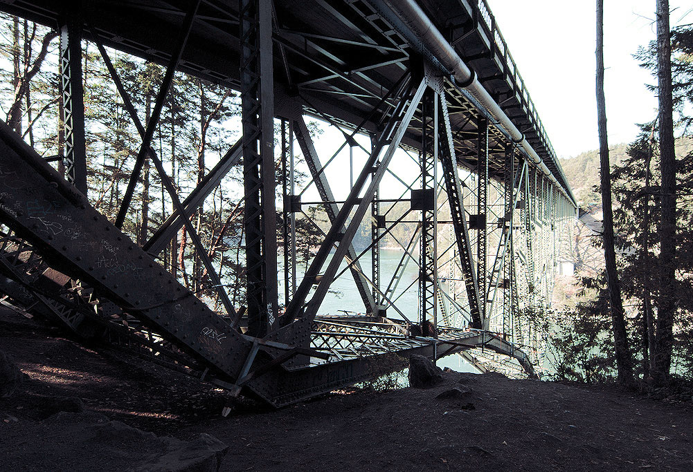
Also, Darcy, definitely, your photo in B&W is worth a try. Here is a quick monochrome I did in PS using the B&W adjustment layer. |
Feb 4th |
 |
| 93 |
Feb 20 |
Comment |
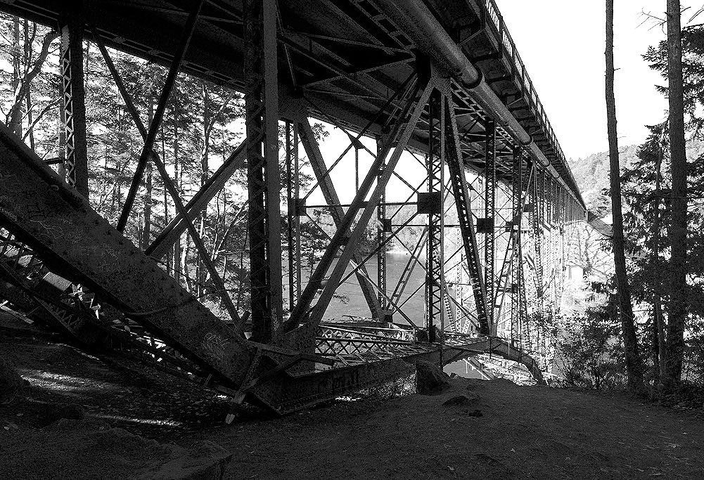
Hi Darcy, like you, I feel the underside of bridges are often more interesting. Your photo is well composed and offers a wealth of detail to explore. Your image has a strong purple cast that I would like to see eliminated. I don't know Corel Paintshop Pro so I can't coach you how to do this. In PS, there are a variety of things you can do. I would imagine that Paintshop Pro has some kind of function to effect your Hue and Saturation. I took the liberty to effect the tint in Adobe Camera Raw. |
Feb 4th |
 |
| 93 |
Feb 20 |
Reply |
Loads of thanks, Wanda. I appreciate your nice words. |
Feb 4th |
| 93 |
Feb 20 |
Reply |
Many thanks, Jean. Yes, I'm regularly use adjustment layers. |
Feb 4th |
| 93 |
Feb 20 |
Reply |
Paul, thank you for the nice compliment. To me, snowscapes are not really that difficult. The only trick is to always expose to the right. That is especially true in the snow. |
Feb 2nd |
| 93 |
Feb 20 |
Reply |
Darcy, Loads of thanks for your comments. To answer your questions, with most snow oriented photography I do, it's pretty hard to get off the road. Usually the snow is too deep. In digital photography shot in RAW, the image starts in color. My workflow is to process in color then, if I feel it has potential in B&W, I'll convert it - usually using NIK Silver Efex Pro. There wasn't much color in the scene anyway so monochrome seemed to be a natural way to go. The scene was also near white-out conditions so I tried to stay true to what it was like.
|
Feb 2nd |
| 93 |
Feb 20 |
Reply |
Jean, Yes, PS is my preferred method of post processing along with some limited use of NIK. I really thank you for your suggestions related to showing some difference between the snow and the sky. (This is what these Study groups are about.) I've been struggling with this image. I hope I don't seem defensive with my explanation. Other than just a very slight amount of difference, I wanted the image to have a "high-key" look to resemble the conditions during capture. I will have to reassess if it's looking flat. |
Feb 2nd |
| 93 |
Feb 20 |
Comment |
Hi Ed. Home to me is Alder trees, sword ferns and a wet, foggy trail. This looks so much like where I grew up. But not everyone will have this kind of a connection with a your photo. That's okay though. The image stands up on it's own without having to provoke a memory. I appreciate how you have not over saturated the colors and not applied an unreal amount of contrast. The tones and colors to me look perfect. You obviously understand certain elements in composition where curvy lines are pleasing to the viewers eyes. Think of how less dynamic this would be with a straight line trail.
I like the mystery of where that trail might lead me. I also appreciate your framing. The darker trees on each side of the frame bring my eyes into your scene nicely. You captured the mood very well. |
Feb 2nd |
| 93 |
Feb 20 |
Comment |
Hi Jean, absolutely wonderful photo. It has a sense of peacefulness. The dominate color of blue gives a calming feeling. To me, a successful image is where the viewer's other senses come alive. What I mean to say is that when a viewer can easily imagine sounds and feel textures in a single dimensional medium, you have created an image that goes beyond what the eye can see. Here, I feel like I can hear the train in the distance. It's soft enough not to destroy the scene's calm. The photo tells a story that makes the image go beyond being just a photograph. I don't agree with removing the foreground reeds, but you will find that this is a personal choice as some people will like it and other will not. My only criticism would be that your horizon line is close to the center and to some, it might look like the photo is cut in half. Personally, I'm not much of a follower of the "Rules of Thirds". It's just something to consider. |
Feb 2nd |
| 93 |
Feb 20 |
Comment |
Hi Jerry, I've studied your image for several days and have to say that to my eyes, it's a terrific photo. Your aspect ratio cropping is appropriate and the subtle tones are perfect. A number of years ago there was a gimmicky trend in photography where an image was shown in monochrome with a single object being in color. Thankfully that trend has passed. In your photo, the background is presented in near monochrome which is perfectly appropriate. It does not look deliberate and gimmicky. It actually give the boats just the right amount of pop without going too far. Compositionally, as Darcy points out, the three boats are pleasing to my eye. I also appreciate the direction flow of the boats leading my eyes from the lower right frame going up to the right. Wonderful image, Jerry. You have a good eye for seeing simplicity. |
Feb 2nd |
7 comments - 6 replies for Group 93
|
7 comments - 6 replies Total
|


