|
| Group |
Round |
C/R |
Comment |
Date |
Image |
| 2 |
Jan 25 |
Comment |
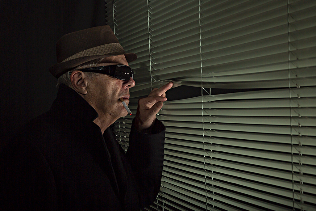
They always say that two or three sets of eyes are better than one. You are right, the lady's feet have been cropped off. I was too intent on trying to remove the white end of the concrete seat that I missed her feet. I have reworked the image. Thank you all for your comments.
|
Jan 12th |
 |
| 2 |
Jan 25 |
Reply |
The removal of the two people at the front of the image simplifies it. I would darken the shadows of the two main characters even more as I think this would emphasize the sun even more. Maybe try creating a 50% grey layer in Photoshop (see Youtube for this, it is quite simple) and then paint the shadows on the layer with a soft black brush to darken them. |
Jan 10th |
| 2 |
Jan 25 |
Comment |
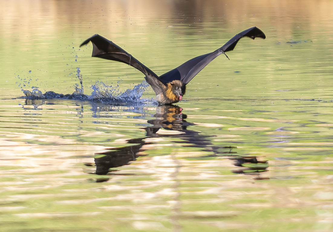
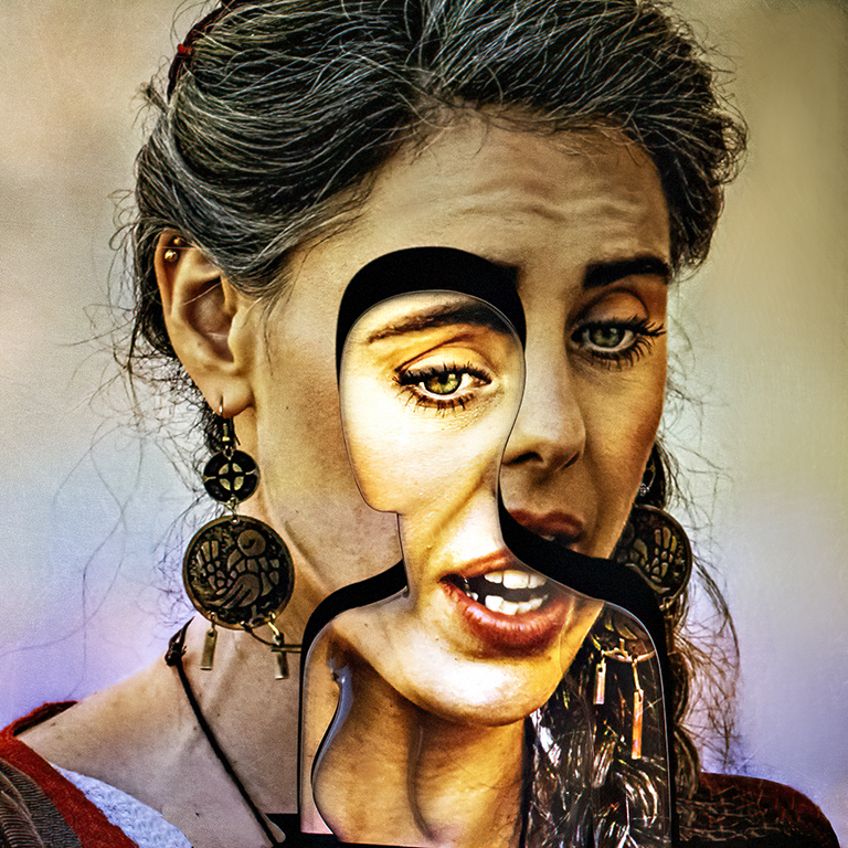
I am always amazed by the ingenuity of some photographers, and Karen, you are no exception. What a great idea.
I love this image. It is tack sharp and well lit. It has an element of intrigue about it. If I had not read your preamble I would have forever wondered how you managed to get those (I originally thought rain drops) air bubbles in there. So simple really, but something that had never occured to me.
Well done |
Jan 10th |
| 2 |
Jan 25 |
Comment |
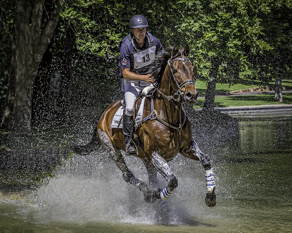
Shirley this is a great action image, but I am not convinced it is a good choice to present as a monochrome image. All the horses are the same colour (brown) except for No.3, and I find there is not enough separation in the detail between the four leading horses. To me there is a degree of confusion when I look at those first four horses. I have to look hard to distinguish the features of each horse.
The harsh overhead sunlight hasn't brought out enough detail in the individual horses to provide adequate detail.
The advantage of the colour image is that the subtle variations in colour can be highlighted, whereas they seem to be lost in the monochrome image.
It is a great image but I might stick with the colour version. Just a thought
|
Jan 10th |
 |
| 2 |
Jan 25 |
Comment |
When I first looked at this image I thought WOW this would look great when framed and put on the wall ... and then I read Jim's comment. I agree with Jim in that the human habitation element probably detracts from the image. But I love the panoranic effect.
My suggestion would be to clone out the houses and retain the panorama or completely remove the right hand side of the image. The point of focus would remain as the brightest part of the image (the sun) and the flying bird almost falls on the intersection of two of the "third" lines.
I still like the panorama! |
Jan 10th |
 |
| 2 |
Jan 25 |
Comment |
Jim, I am sorry that your trip had to be shortened. Maybe you can visit Portugal another time with better luck.
In your preamble it became evident that your aim was to catch the sunlight streaming down this narrow street. You certainly captured that! Well done.
You have done a lot of work with post processing, and you have succeeded in creating the HDR effect you were seeking.
There is a lot more you can do with this image.
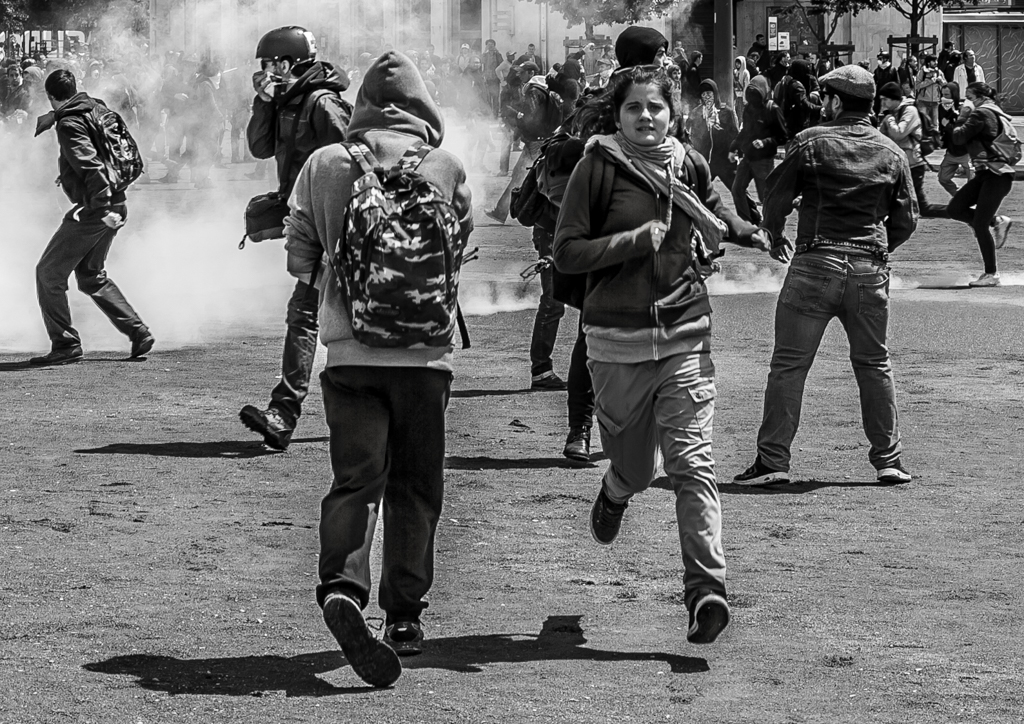
It is a very busy image. Maybe crop out the top 1/3 of the image as it adds very little to the story. Converting it to monochrome might reduce the business. The sun is the brightest part of the image, so darken the shadows to create a juxtaposition, sun and shadows. You can create a very dramatic street photo.
This is such a versatile image. It can be a record of your trip or an "arty" image. Well done
|
Jan 5th |
 |
5 comments - 1 reply for Group 2
|
5 comments - 1 reply Total
|