|
| Group |
Round |
C/R |
Comment |
Date |
Image |
| 2 |
Mar 24 |
Reply |
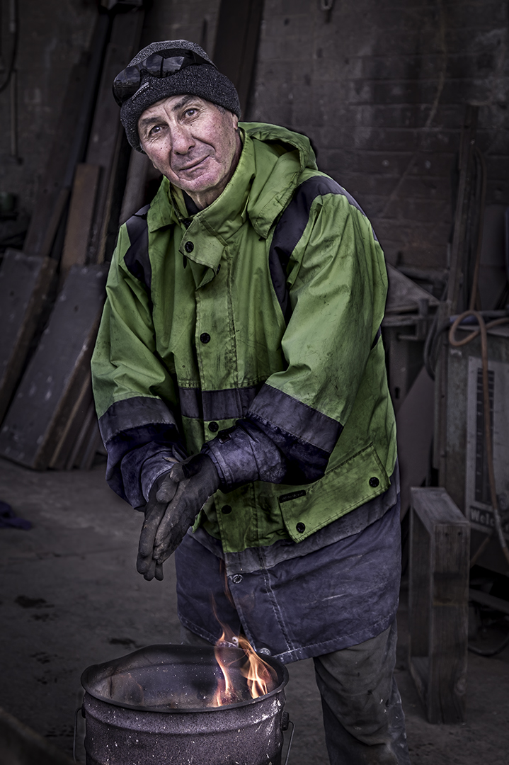
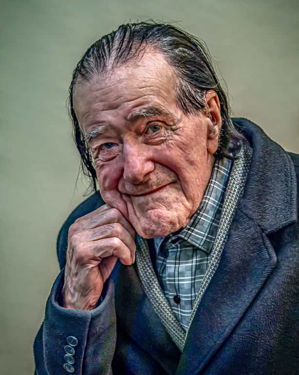
The original image is alongside the presented image. There has been little or no manipulation of the skin tones nor texture. |
Mar 24th |
| 2 |
Mar 24 |
Reply |
It looks good! |
Mar 12th |
| 2 |
Mar 24 |
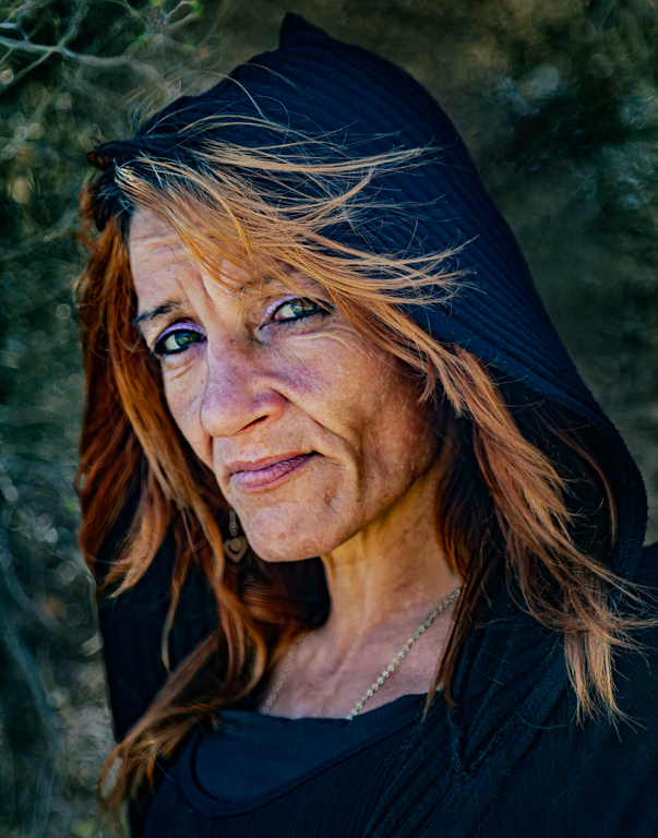
Reply |
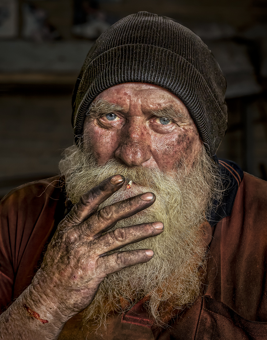
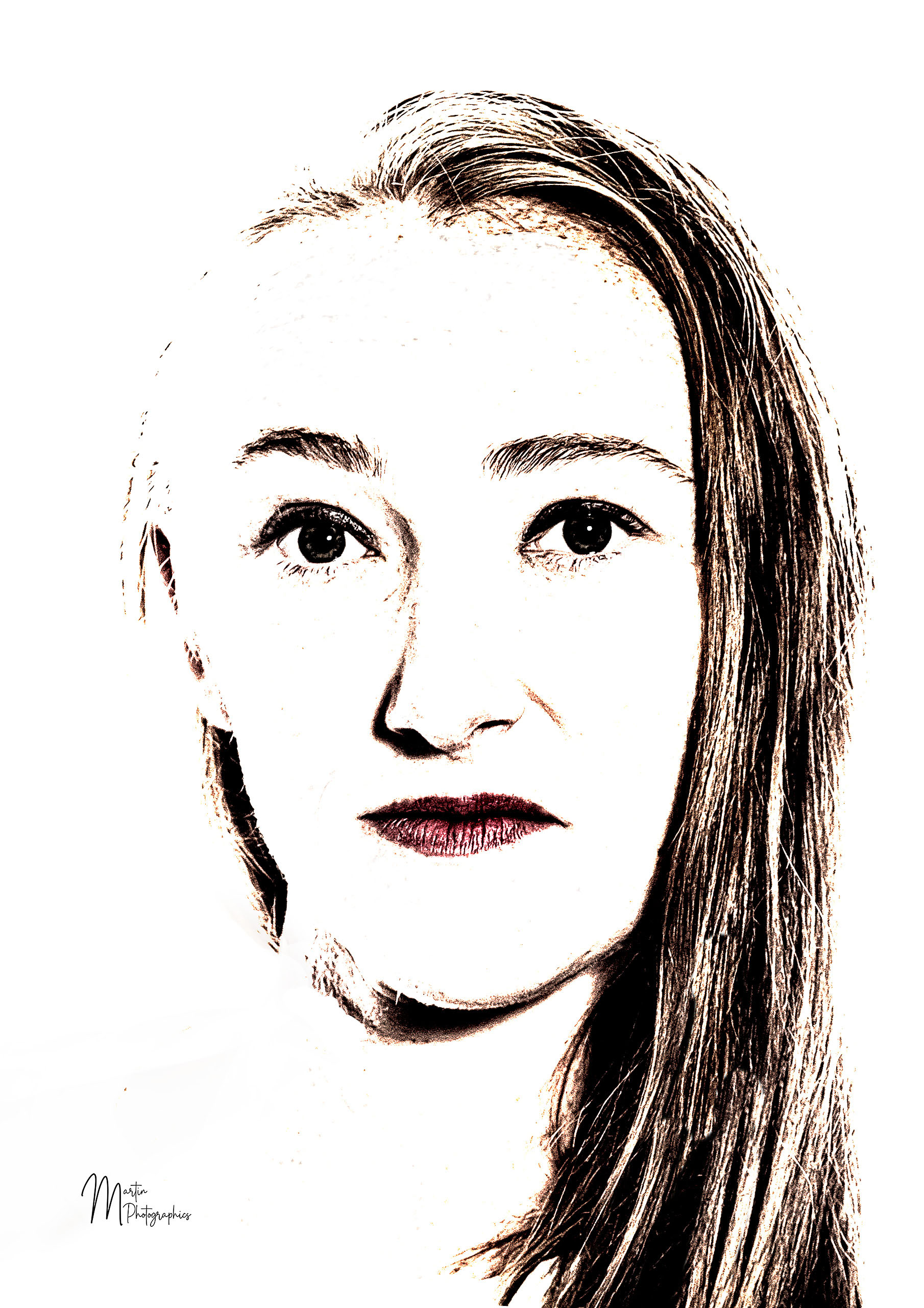
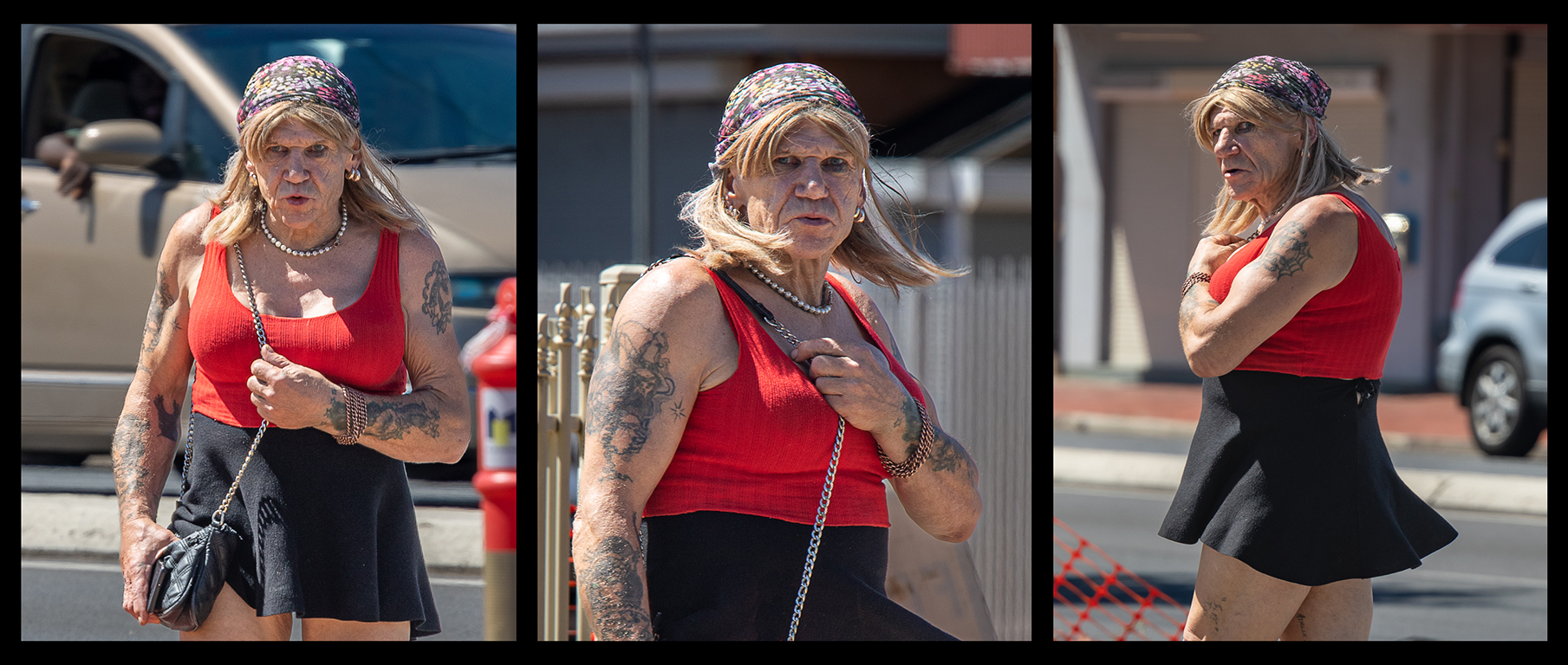
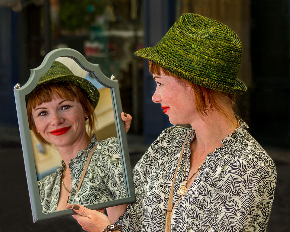
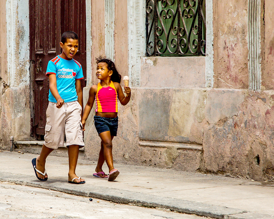
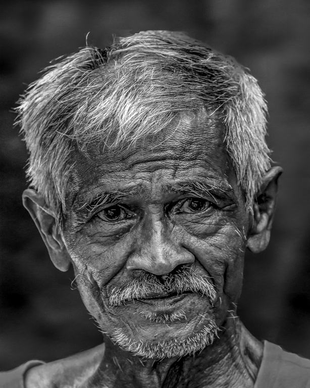
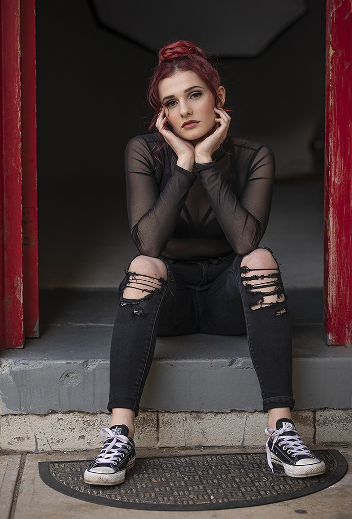
Thank you Karen.
Her hair was a vivid red and I did make it a little more vivid so that it would contrast with the green of the background.
The image below, attached to my response to Piers, has not been worked on apart from the crop. It was taken with natural light as she sat on the backdoor step of the studio.
She is a stunning model.
|
Mar 11th |
| 2 |
Mar 24 |
Reply |
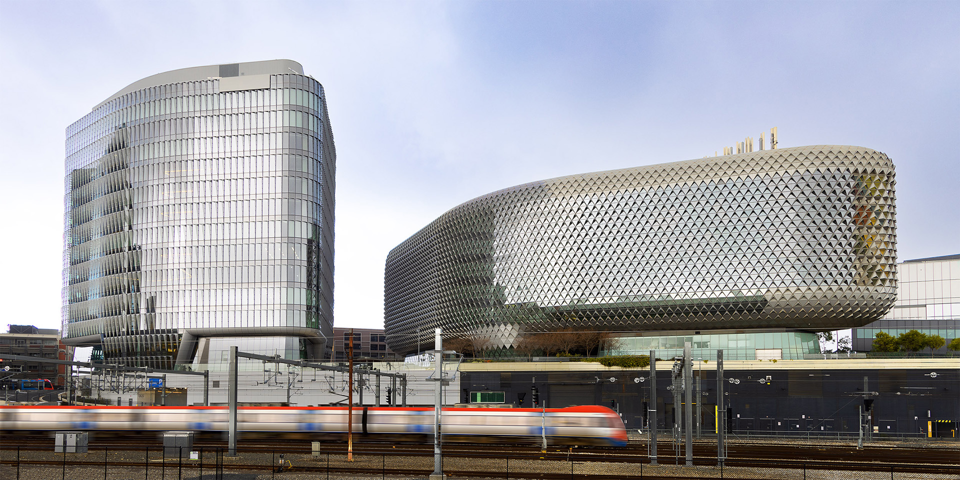
Thank you Piers.
I have a couple of hundred shots of her. She was a rather demure young lady who shone when she was in front of a camera. |
Mar 11th |
 |
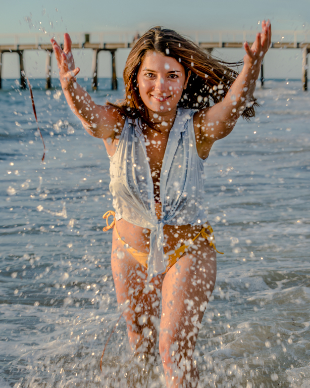
| 2 |
Mar 24 |
Comment |
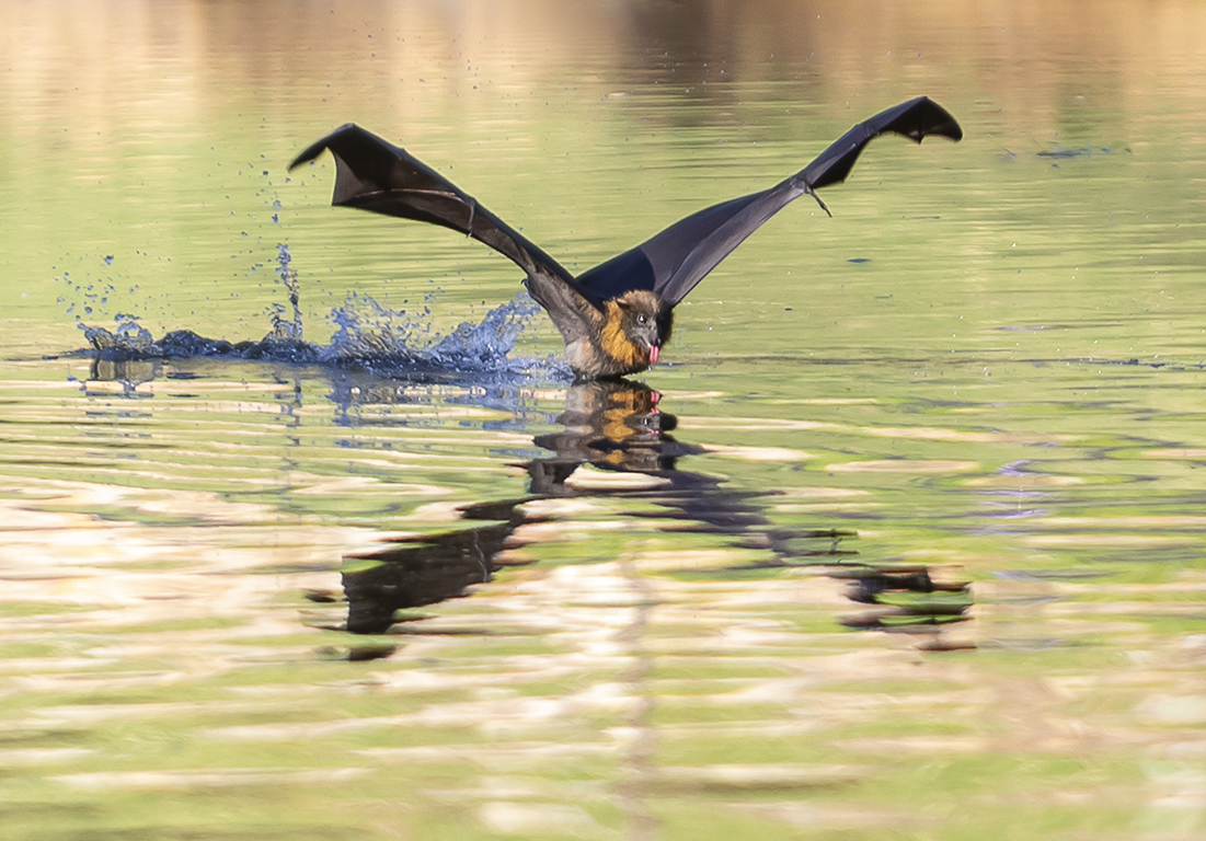
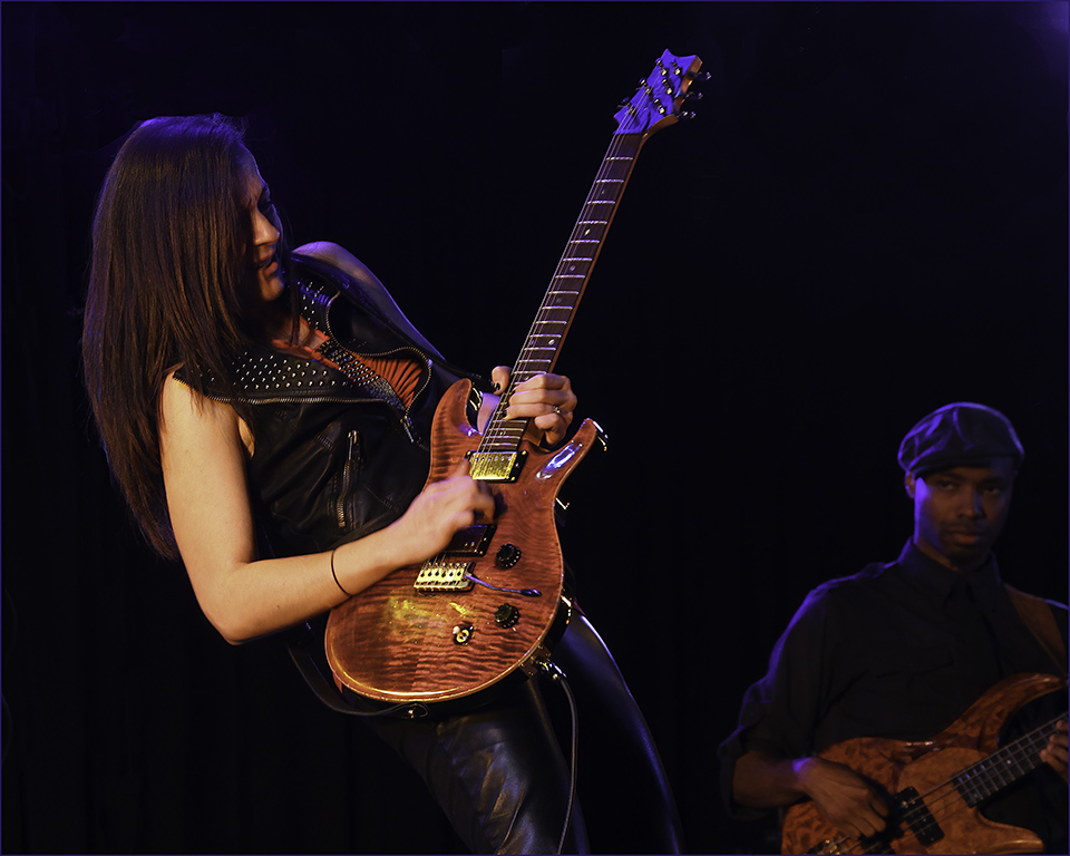
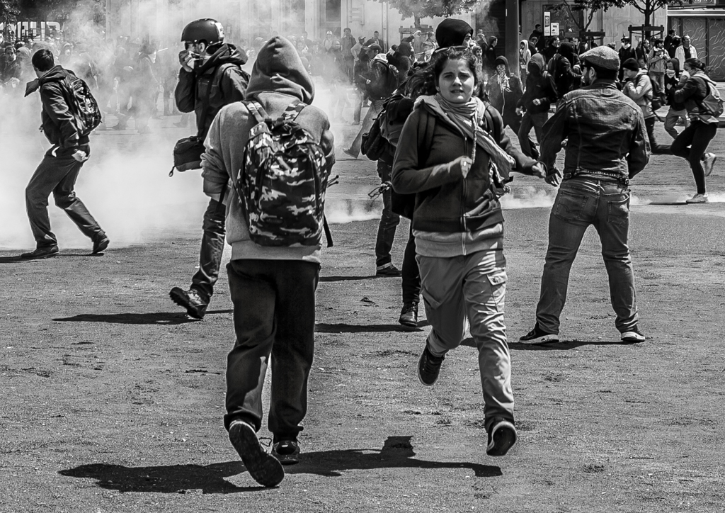
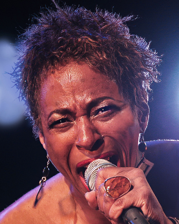
Another great image. You have caught the action well and the image is sharp and nicely composed. It tells a story.
The lighting seems to be very harsh but you have handled it well.
I agree with Piers and would lighten the eyes just a little so that they can be clearly seen.
Well done.
|
Mar 11th |
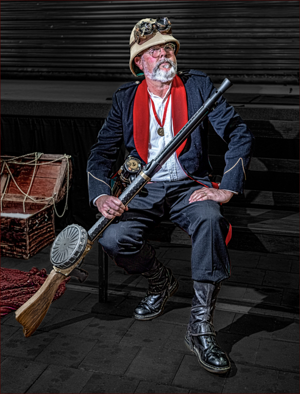
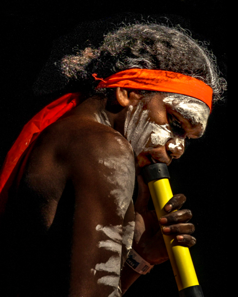
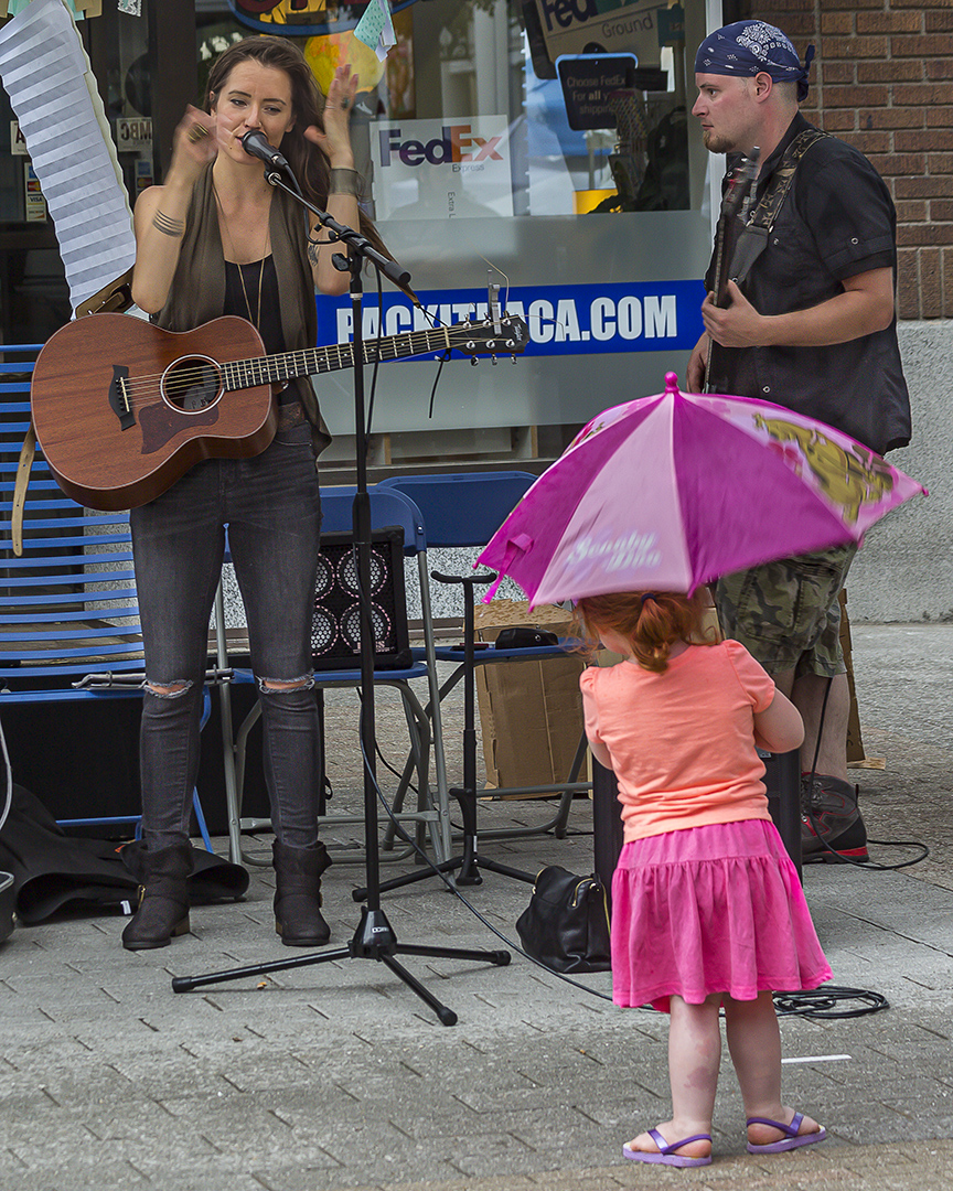
| 2 |
Mar 24 |
Comment |
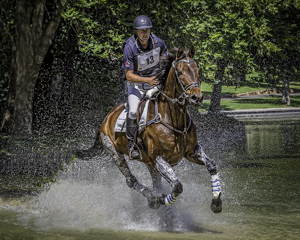
Wow! Taking images at sporting events is always problematic and you have done really, really well with this image. It is tack sharp and the lighting is good and it tells a story.
A diagonal line from the bottom left corner to the top right corner defines the boundary of a very busy top half and the negative space of the lower half, which is dominated by the puck and the hockey stich head. (sorry if the terminology is wrong).
I think this is a wonderful sporting image.
If you are going to "chop off limbs" which is what you have done on the left side of the image, then chop them off between the joints. You have this fellow's arm between the elbow and the wrist which is OK in my opinion.
Well done.
|
Mar 11th |
| 2 |
Mar 24 |
Comment |
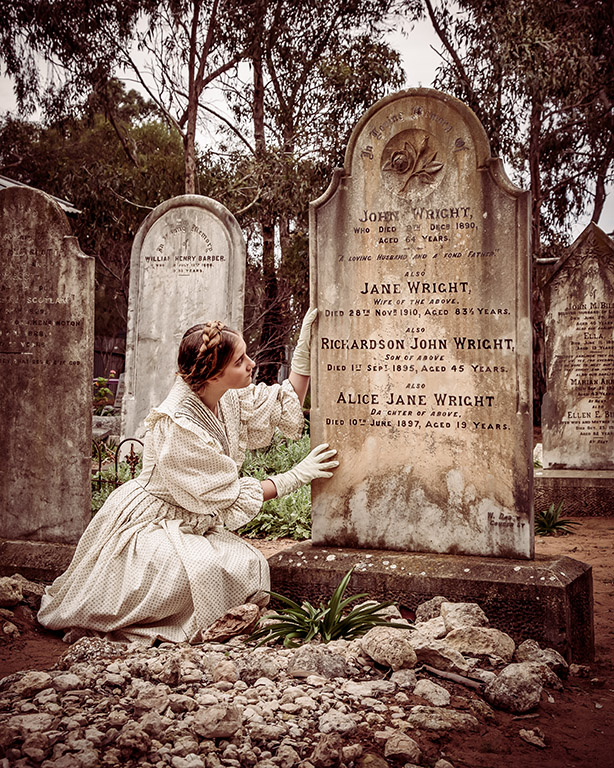
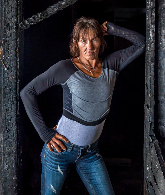
Well done Karen. I like the simplicity of this still life image. I like the composition and the lighting. I am in two minds as whether it needed to be reversed, but if you like it then it is good.
If you were entering this in a projected image competition, I might be tempted to put a thin golden border around it, just to define the edges of it on a screen. |
Mar 11th |
 |
| 2 |
Mar 24 |
Comment |
This is a great action image. Well done. It is sharp and composed in such a way that you have room to make compositional changes if you wish. To that end I would crop the top of the image down so that the heads of the jockeys all lie on the top "third line". I don't think you need quite as much background. I like that there is space for the horses to run into.
Maybe also clone out the metal structures around the last horse.
|
Mar 11th |
 |
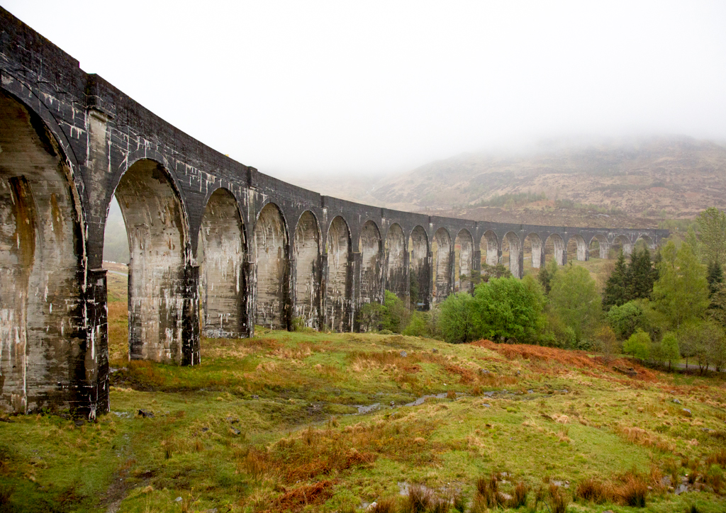
| 2 |
Mar 24 |
Comment |
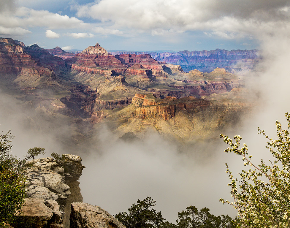
Piers, I love the pattern, the lines and the texture of the fronds. The image is well lit and sharp. However, the harsh, bright structure in the background draws my eye away from the foliage.
I like it's removal in your edited image but the "drop in sky" makes the new image look surreal. Is it possible to drop in some foliage from another image instead of the sky?
Or, maybe the photo could have been taken from a slightly different angle to exclude the conservatory and still retain the beauty.
|
Mar 11th |
| 2 |
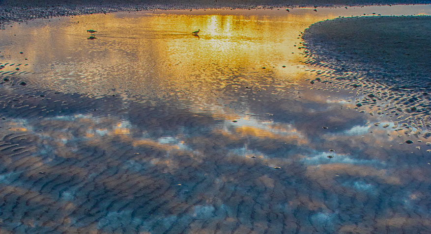
Mar 24 |
Comment |
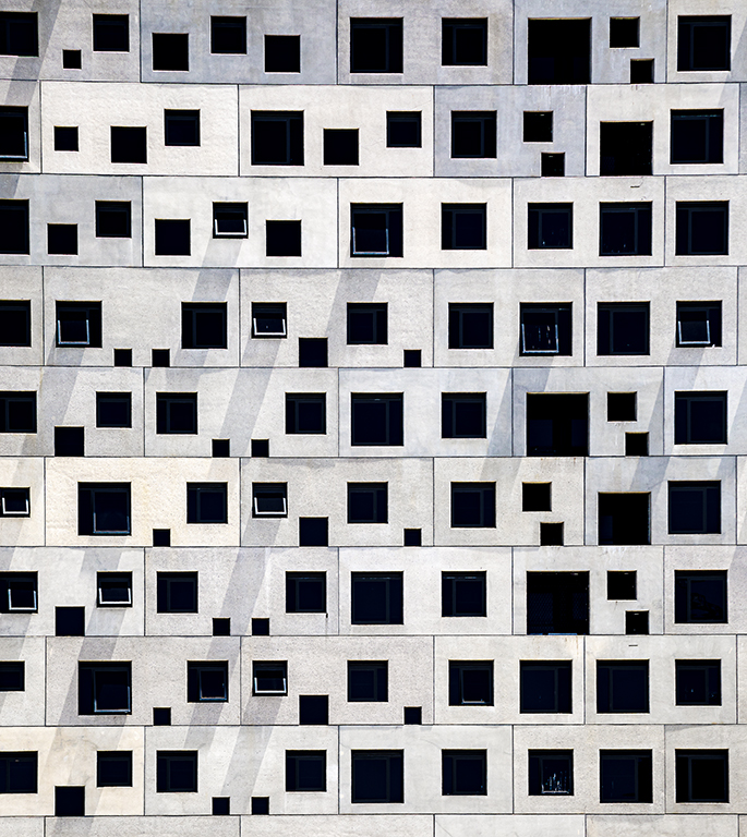
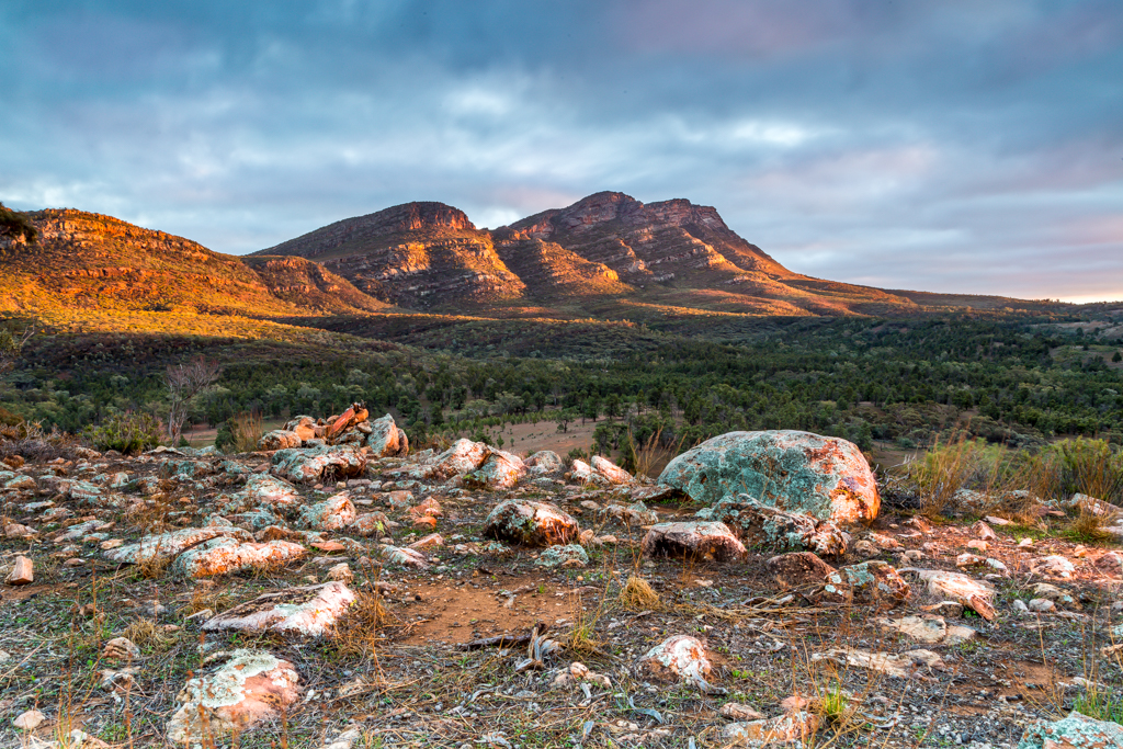
My eye went straight to the bright area at the top of the image and then out the top right corner. There is no point of interest in the lower part of the image to hold my gaze. It always goes back to the brightness of the top part of the image. So I would crop out the lower part of the image and maybe allow a little more room at the top. This would retain some of the leading lines from the lower part and highlights the sweeping curve created by the bright golden reflection. |
Mar 11th |
 |
6 comments - 4 replies for Group 2
|
6 comments - 4 replies Total
|