|
| Group |
Round |
C/R |
Comment |
Date |
Image |
| 2 |
Feb 24 |
Reply |
As one exposure it is a great photo!
Well done
|
Feb 22nd |
| 2 |
Feb 24 |
Comment |
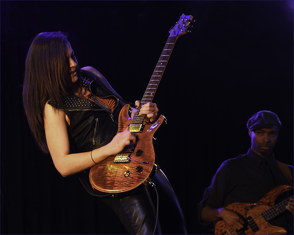
I have a feeling this could be a composite image of two if not three seperate images. The two pelicans are in full harsh light and yet all the background is illuminated by very flat light.
Maybe paint some highlights and shadows into the background to add some contrast to it, and soften the sharpness and contrast of the two birds slightly.
At first glance this is a stunning image. Well done, you have captured the subjects well. |
Feb 18th |
| 2 |
Feb 24 |
Comment |
I agree with you Terri, a textured background would add to the appeal of this image. I have used both the colour and the mono versions, that I have shown here, in competitions with some success and for some reason it has never occured to me to add a background. If I wasn't retiring this image I would probably add one. |
Feb 18th |
| 2 |
Feb 24 |
Reply |
I think this image is "cleaner" than the one below! |
Feb 11th |
| 2 |
Feb 24 |
Comment |
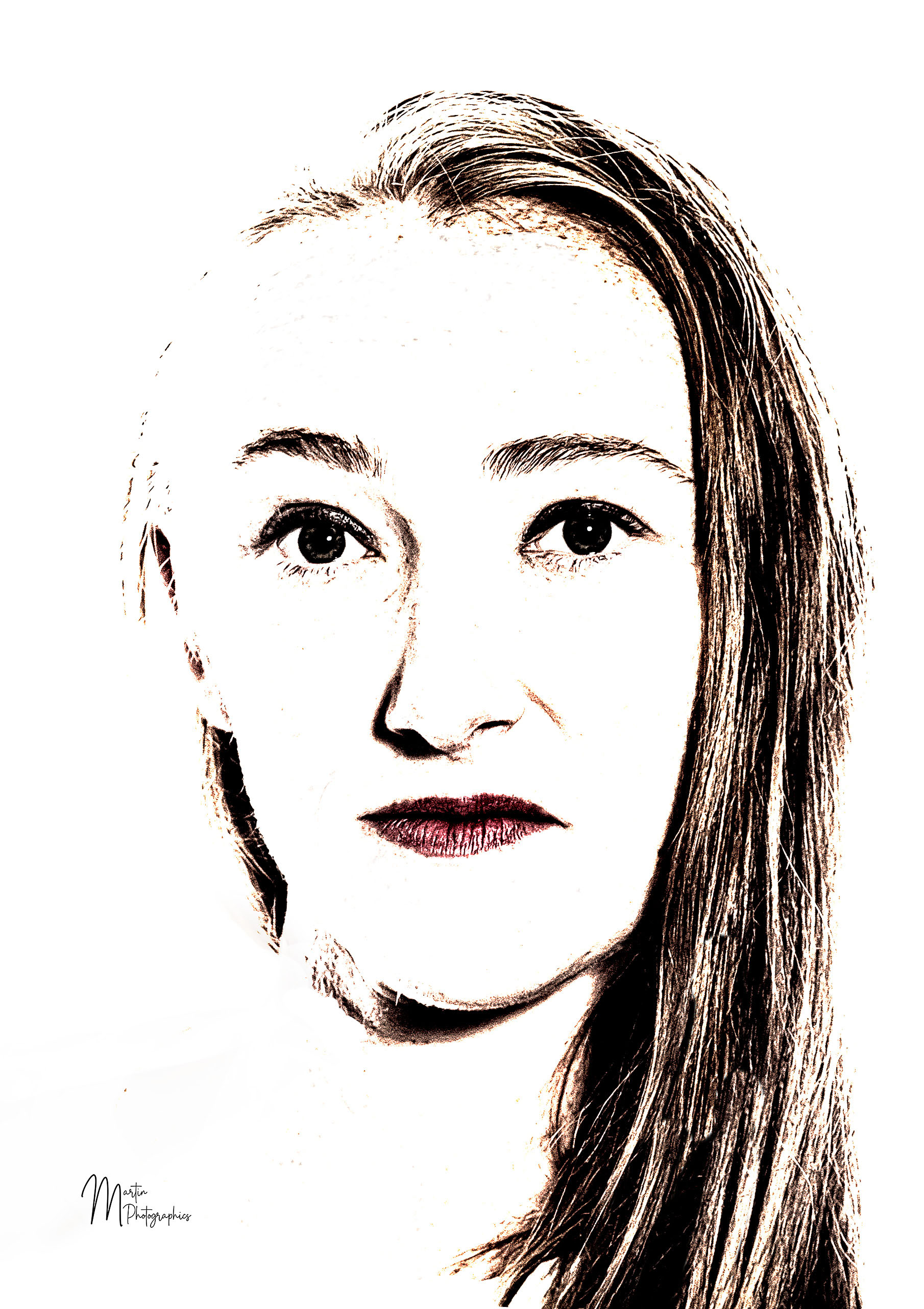
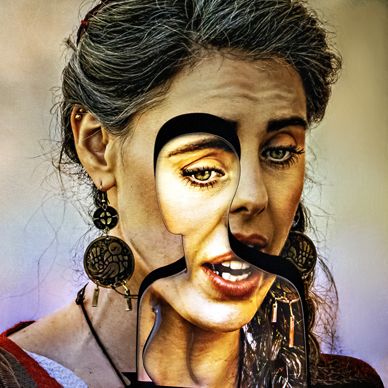
This is an interesting image, Tor. It is very stark and psychedelic, but clearly, that is the effect you are looking for.
Like Jim, I will be interested to hear how it goes/went in competition.
You have obviously put a lot of post processing work into the image and the effect is quite stunning. The greatest benefit is that you "learned quite a bit in the process."
Well done
|
Feb 5th |
| 2 |
Feb 24 |
Reply |
Thanks Piers,
As I mentioned below, in reply to Jim, I have used this image in competitions in both the colour and mono format, both with equal success and it is time to "retire" it. |
Feb 5th |
| 2 |
Feb 24 |
Reply |
Thanks Jim,
As I mentioned in the introduction, this is an old image. It has done the rounds in both mono and colour competitions and has done quite well. I am not sure why I cropped it so tightly, but as it is due to be "retired" and so I will leave it as it is. |
Feb 5th |
| 2 |
Feb 24 |
Comment |
This is a nice bright image, however the brightness of the flowers and the background draws my attention away from the table and the items on it.
The shadows on the items on the table are very dark and I think they could be lightened a little. I find there is too much contrast in brightness from the top to the bottom of the image. Maybe balance the "brights" and the "darks" a little.
It is a still life and I really don't think it is necessary to have, what looks like, smoke rising from the cup of tea to try and add some movement. I might remove that if it were my image.
This looks like the beginning of a new photographic journey for you, well done
|
Feb 3rd |
| 2 |
Feb 24 |
Comment |
Hey this is a fun photo.
I like the addition of the light colours in the top left corner to balance the moon.
The purists would probably worry that the dark side of the moon should be lit, but you could always argue that that is why it is called the dark side of the moon!
Great fun image. |
Feb 1st |
| 2 |
Feb 24 |
Comment |
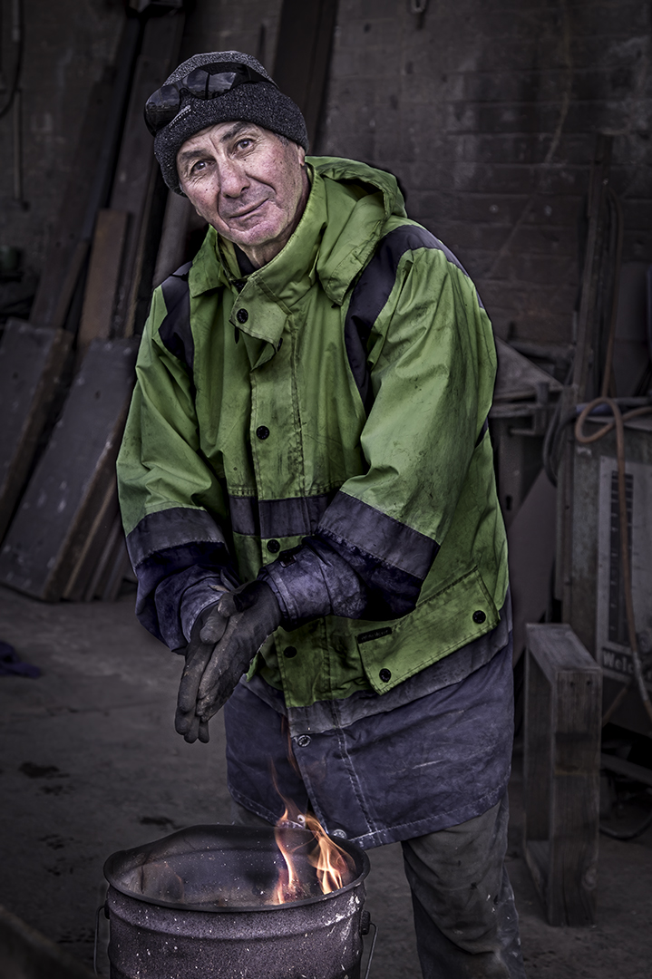
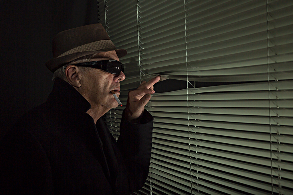
This is a nicely caught image, Piers.
I like your treatment of the final image. It is nicely cropped, but I am not sure that I entirely agree with the left to right eye movement. It works well in this case, and for a moment I thought you had given me two different images to post.
Well done. Maybe try and tease out a little detail in the shadows on the birds if you can |
Feb 1st |
| 2 |
Feb 24 |
Comment |
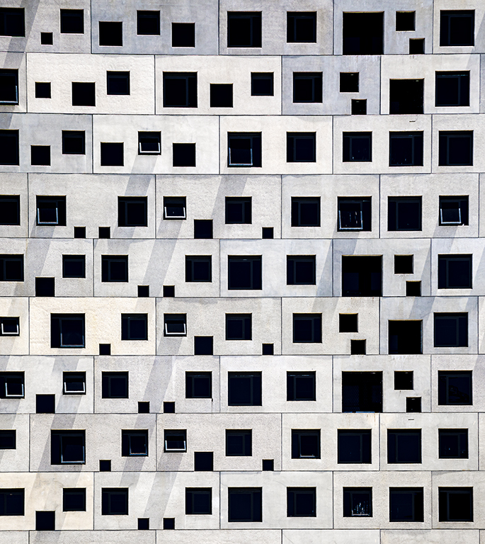
I think this is a well thought-out image.
The eyes starts in the lower right corner at the bright window and then it follows the balustrade around, past the 2+ bright windows, then heads off towards the window in the righthand wall, before heading upwards towards the far window.
It is a great journey... well done Jim |
Feb 1st |
7 comments - 4 replies for Group 2
|
7 comments - 4 replies Total
|