|
| Group |
Round |
C/R |
Comment |
Date |
Image |
| 2 |
Nov 23 |
Reply |
Hi Terri, thanks for sharing the link. I have watched a number of Gavin Hoey's videos and they are always excellent
|
Nov 8th |
| 2 |
Nov 23 |
Comment |
Thank you for your suggestions. I have desaturated and darkened the area surrounding the billboard, and I agree that it now makes a better image. |
Nov 5th |
 |
| 2 |
Nov 23 |
Comment |
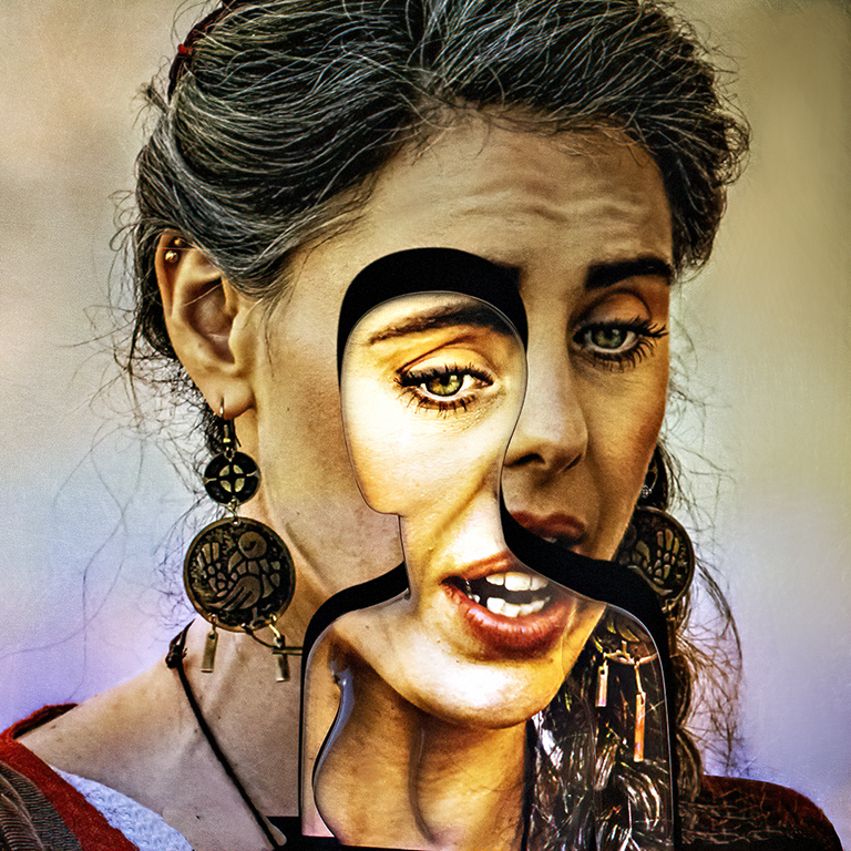
You have taken a simple image and worked on it to create a bright abstract image. The over saturation and the choice of colours all is part of your creation.
Maybe the centre of the image has been brightened too much, and almost to the extent that the white area in the centre has nearly blown out the detail.
The original image had no real point of interest to attract one's eye, but your post treatment has created one. My eye is drawn to the bright centre of the image, which is what you probably set out to achieve.
Well done.
|
Nov 4th |
| 2 |
Nov 23 |
Comment |
This is a striking image, Piers. I like the colour version over the black and white version. The front of the car dominates the image and I like the way you have cropped it.
The colour red always seems to be evocative and makes this image stand out. You have done well in not getting any distracting reflections or burnt out spot on the chrome.
A second version of this image might include more of the orange vehicle as it adds to the story; this is a car collectors' rally and it is good to see two of the same model cars alongside each other. Maybe widen the image and include more of this second vehicle! I am in two minds as to which way to go.
|
Nov 4th |
| 2 |
Nov 23 |
Comment |
This is a simple image and well done. I like the soft colour palette of the background. I like the fact that you have resisted cropping the image in a way that the branch does not run from corner to corner, but has a little free space above and below it at the ends.
My eye goes immediately to the subject of the image, namely, to the three water droplets; each containing a tiny image of a flower and each with it's own small sun burst.
I believe Piers makes a good point about adding a slight vignette to "ground" the image and remove the small light triangle in the lower right hand corner.
Go and get it printed and hang it on the wall!
|
Nov 4th |
| 2 |
Nov 23 |
Comment |
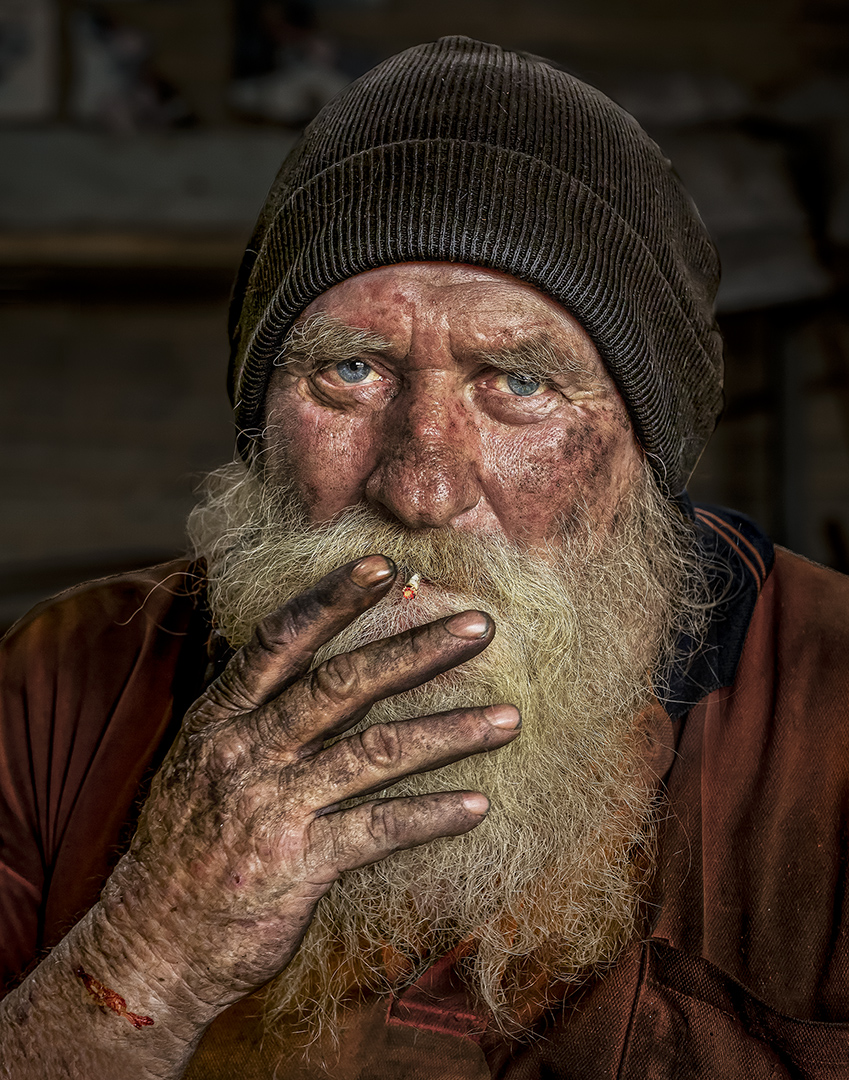
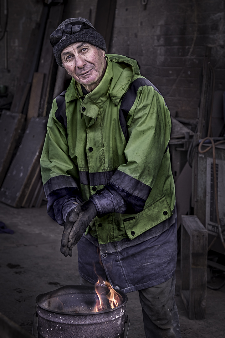
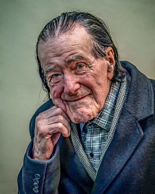
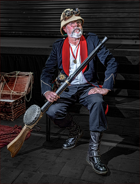
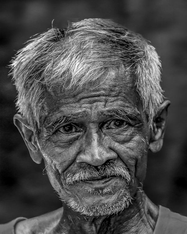
A lovely portrait. You certainly found an interesting character during your walk along the beach. His face has good split light and the shadow side of his face is nicely lit with reflected light from the surroundings. My eye goes straight to his face; where it is supposed to go.
I would not be concerned about the missing tail feathers of the parrot on the right hand side of the image. The image is nicely balanced as it is with the main character right in the middle.
The image is well exposed, sharp and rich in colour although a little "busy."
Well done.
|
Nov 4th |
| 2 |
Nov 23 |
Comment |
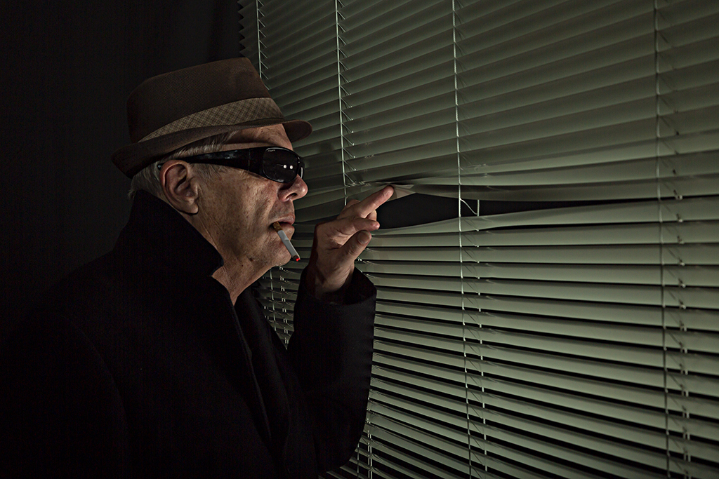
A wonderful image. I like the black and white conversion and the film noir theme. This is a well thought out image and well executed. I like the converging lines created by the Venetian blind, the model's costume and the band of light across his eyes and his expression. The image is tack sharp and well exposed and tells a story. I don't think this image could be improved upon. Well done.
|
Nov 4th |
6 comments - 1 reply for Group 2
|
6 comments - 1 reply Total
|