|
| Group |
Round |
C/R |
Comment |
Date |
Image |
| 2 |
Sep 23 |
Reply |
You are welcome, Karen |
Sep 8th |
| 2 |
Sep 23 |
Reply |
Hi Karen,
I use a technique that many regard as obsolete to dodge and burn images. It uses a 50% Grey layer .... and you just paint with a black or a white brush on the layer to darken or brighten various areas of the image. Attached is a Youtube video on how to use this technique.
https://www.youtube.com/watch?v=qjowqJGvsOk&t=197s
I dodged and burned the image on the left using this technique and your origin image is on the right. You can see the subtle changes in the dark and light areas that I have painted.
I think this lifts your image a little
|
Sep 8th |
 |
| 2 |
Sep 23 |
Comment |
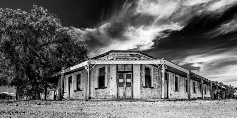
Thank you all for your comments
The idea of using a black, ominous sky was to try and reflect the contrast in the light that I noticed when I came across this scene.
From your comments, I have clearly gone too far with this concept.
The image is not doing as well as I had hoped in competitions, so I will take your comments onboard and, begin again with the sky, this time leaving it blue and less ominous and threatening.
Thank you all once again
|
Sep 7th |
| 2 |
Sep 23 |
Comment |
Welcome to the group, Terri
I like the composition of the image. In particular the strong diagonal line created by the stick with the praying mantis delicately poised on top of it.
I would not be convinced that this was a sunset image. Although the background is great it gives me the impression that there is too much orange (sunset light) comming from the front of the photo and shining onto the subject.
Although the outline of the mantis is sharp, it loses detail within it's body area.
Maybe try and soften the orange filter over the body in Photoshop and tease out a little of the detail within the image.
I am just being picky! ... It is a great image and it really caught my eye.
Well done.
|
Sep 7th |
| 2 |
Sep 23 |
Comment |
I like the crop that you have chosen, Karen.
My eye starts at the rock in the lower left corner and wanders up the fallen log before it is attracted to the lightness of the water around the centre of the image... and this is where my eye lingers.
It appears to be an overcast day or in a shady valley and so there is no light to create any highlights, perhaps, leaving the image a little flat. Maybe you can tease out a few highlights with photoshop.
Overall this is a lovely image of a serene place that you want to return to.
Well done
|
Sep 7th |
| 2 |
Sep 23 |
Comment |
A lovely image of the heron.
It is tack sharp and the lighting is wonderful and soft with the head of the bird being the brightest part of the image.
The reflection of the beak disturbs me a little. It seems too bulky and I can only assume it was caused by a slight ripple on the surface of the water.
I love the gentle colour gradient from the top to the bottom of the image.
Well done.
|
Sep 7th |
| 2 |
Sep 23 |
Comment |
Snakes are NOT my favourite creatures even though this was photographed with a 500mmm lens and through plexiglass. I think you were too close!
Well done Piers
I am immediately drawn to the eye which is lying neatly on the intersection of two "thirds lines."
The image is sharp and it has a very subtle colour palette.
I like the changing patterns of the snake's skin and I like the depth of field you have achieved. The foreground and the background are nicely out of focus putting the highlight on the creature's head and eye.
Well done and this is an excellent "Nature" photograph that I believe should do well in competitions
|
Sep 7th |
| 2 |
Sep 23 |
Comment |
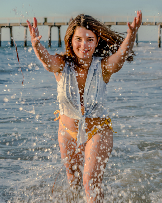
This is a great action shot, Jim.
I have to agree with Terri that the foam on right hand side of the image looks a little strange, but maybe that is how it was!
Perhaps clone a few bubbles in from somewhere else to remove this anomoly.
I like the shot. The little girl is having fun and in my opinion that overides the fact that she in not making eye contact with the camera. This is a good happy image!
Well done
|
Sep 7th |
| 2 |
Sep 23 |
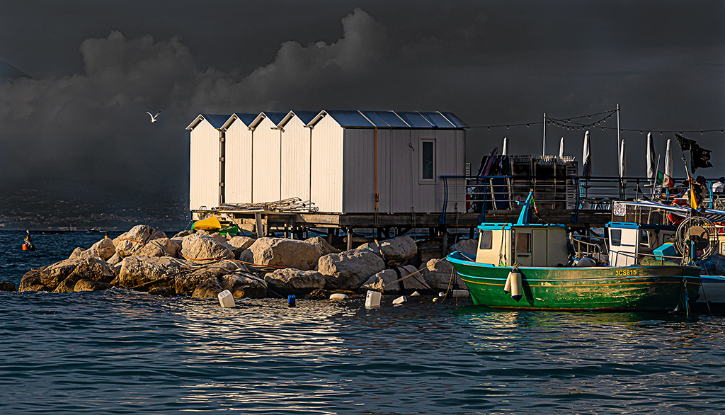
Comment |
I have put a solid dark blue colour behind the image and used the overlay blend mode. Also I have masked out the bits of blue that effected the whiteness of the boatsheds. The overlay blend mode also darkened the lower corners slightly, which effectively did what Piers suggested.
Thank you all. |
Sep 2nd |
 |
| 2 |
Sep 23 |
Comment |
Welcome to the group Terri and thank you for your comments.
The monochrome sky seems to be the current fashion at our camera club at the moment, but I take your point and agree that it might look a little better with a tinge of blue in it.
I put this image in a club competition a few weeks ago and the judge was concerned about the brightness of the walls of the boat sheds. I have toned those down a little but I will now work on the brightness of the rocks and see how that looks.
Many of my images here are a "works in progress," and sometimes after making the changes suggested by this group they go on to greater heights.
|
Sep 2nd |
| 2 |
Sep 23 |
Comment |
Hi Shirley,
Somehow your original image has been deleted. The image and your email is on my main computer which is in being repaired. I hope to have it back early next week where upon I will reinstate your image.
Sorry about that |
Sep 2nd |
9 comments - 2 replies for Group 2
|
9 comments - 2 replies Total
|