|
| Group |
Round |
C/R |
Comment |
Date |
Image |
| 2 |
Sep 22 |
Comment |
Congratulations on being able to get that low to photograph this "mushroom," but I suspect it might be a toadstool. Anyway I wouldn't eat it!
Great lighting and composition and I like your post processing to fill in the background light patch.
A great photo |
Sep 10th |
| 2 |
Sep 22 |
Comment |
Hi Jaqueline.
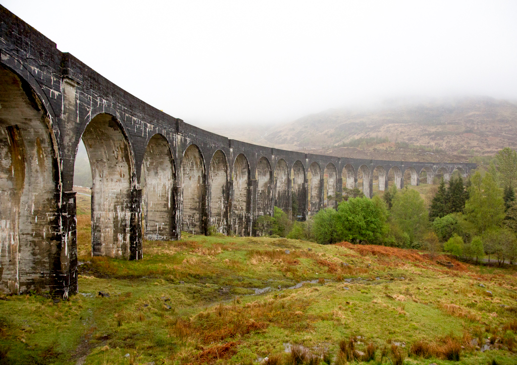
I agree with Pier's comment about the "vertically" of the bridge piers and the tower cranes in the background. The first rule of perspective is that verticals always remain vertical. I have adjusted your image using the "Perspective Crop tool" in Photoshop (located behind the crop tool in the menu bar). However the bridge pier behind the boat still seems to be leaning slightly. Maybe it is a "pin balling effect" of the lens.
I have used a graduated filter to tone down the sky and another to brighten the lower part of the image. I have desaturated and lightened the fluoro patch on the stern of the boat.
I have brightened the whole image and sharpened it.
Here is a link to one of the many summaries of the PSA definition for travel.
https://psa-programs.org/ptdsg/definition.html
I believe what I have done lies within thesed guidelines. I have not added nor deleted anything; I have just changed the brightness and the contrast of various elements
|
Sep 6th |
 |
| 2 |
Sep 22 |
Reply |
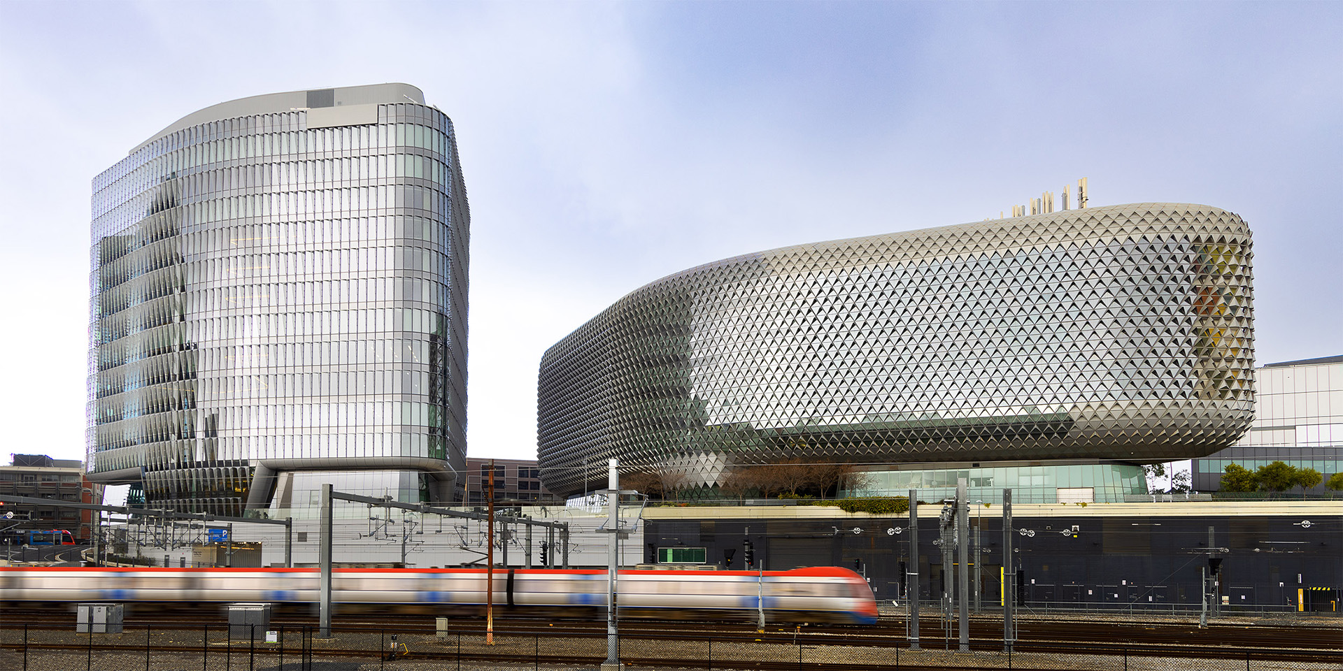
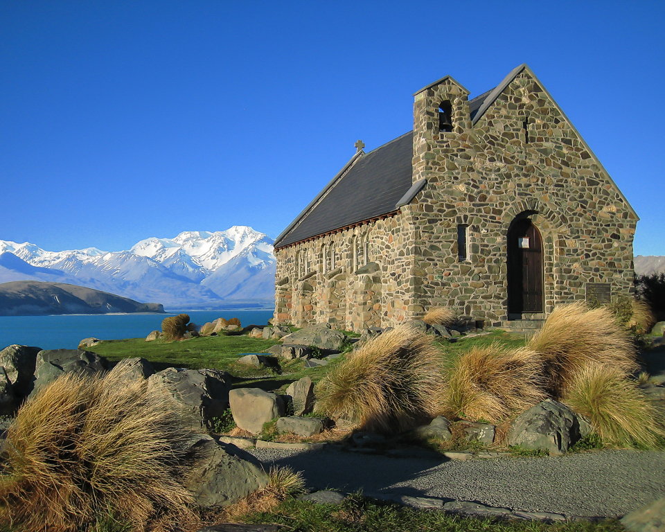
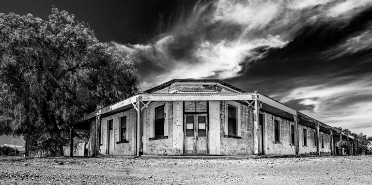
This is a great architectural shot and it deserves the accolades it has received. |
Sep 6th |
| 2 |
Sep 22 |
Comment |
Thank you for your suggestions. I have cropped out the bottom of the image and lightened the middle ground as suggested.
It saddens me a little that the foreground rock no longer lies on the intersection of a horizontal and vertical "thirds" lines, but I have to agree that the changes make for a better image. Thank you |
Sep 6th |
 |
| 2 |
Sep 22 |
Comment |
A nice bright image, Piers.
My first impression was that the iris had passed it's "used by date" and was beginning to wilt and turn brown along the edges of the petals, but I suspect that is the natural colouring of this bloom.
I like your treatment of the background and the border around the image. It doesn't worry me that the petals at the back are a little out of focus. The centre is tack sharp and that is what counts. You have included the stork which "grounds" the image.
Definitely make a print of this one! |
Sep 4th |
| 2 |
Sep 22 |
Comment |
A great photo Jim,
Maybe if you had taken one step forward when you took the photo you could have excluded the column which appears in the top right hand corner of the image.
Like Shirley, I get the feeling that a giant moth or butterfly is about to descend on me.
I particularly like how the dark lines lead me to the "eyes."
Well captured! |
Sep 4th |
| 2 |
Sep 22 |
Comment |
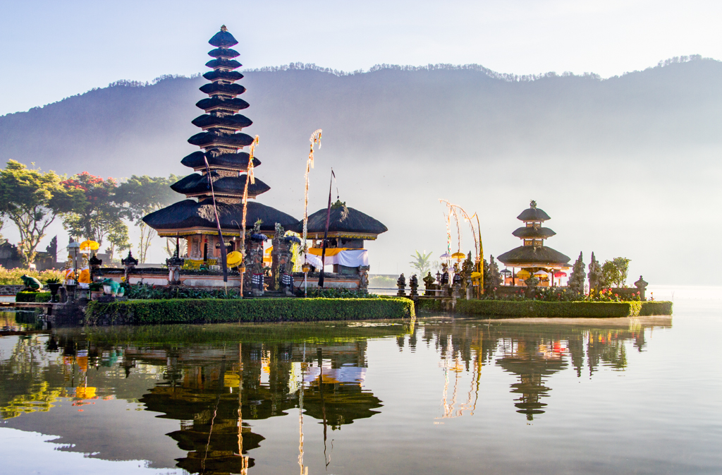
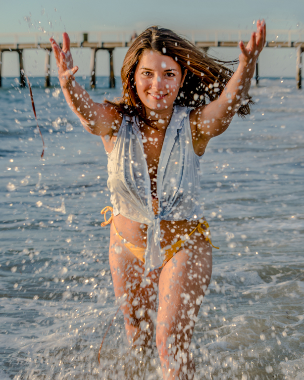
A lovely travel photo, Jaqueline. Maybe it is my screen, but both images appear quite dark and flat.
I prefer the colour version with the cranes in the background. They add a bit of "activity" to the buildings to match the movement of the cruise boat in the foreground.
I would try and tone down the fluoro strip on the stern of the boat and brighten the bridge and boat a so they stand out a little from the rest of the image.
I know the PSA and FIAP rules for travel images are strict but I am sure a bit of judicious dodging and burning to add a little contrast to the image would be allowed. |
Sep 4th |
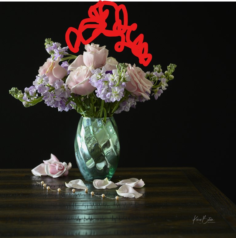
| 2 |
Sep 22 |
Comment |
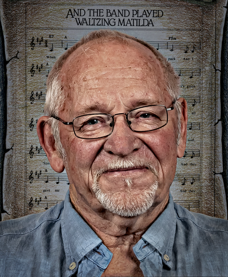
Congratulations on your 39th Wedding anniversary, and lovely flowers.
I like your lighting. I am not a flower arranger but I feel the flower arrangement lacks some height. My eye is led upwards by the vase and I want that vertical line to continue through the flowers rather than creating a T shape at the top.
A lovely photo none the less. |
Sep 4th |
 |
7 comments - 1 reply for Group 2
|
7 comments - 1 reply Total
|