|
| Group |
Round |
C/R |
Comment |
Date |
Image |
| 2 |
Jul 22 |
Reply |
Thanks Andrew .. I hadn't noticed the electric sockets .. It is always good to have another set of eyes critique an image. |
Jul 21st |
| 2 |
Jul 22 |
Reply |
Thanks Bev |
Jul 19th |
| 2 |
Jul 22 |
Reply |
Thanks Ellen |
Jul 19th |
| 2 |
Jul 22 |
Reply |
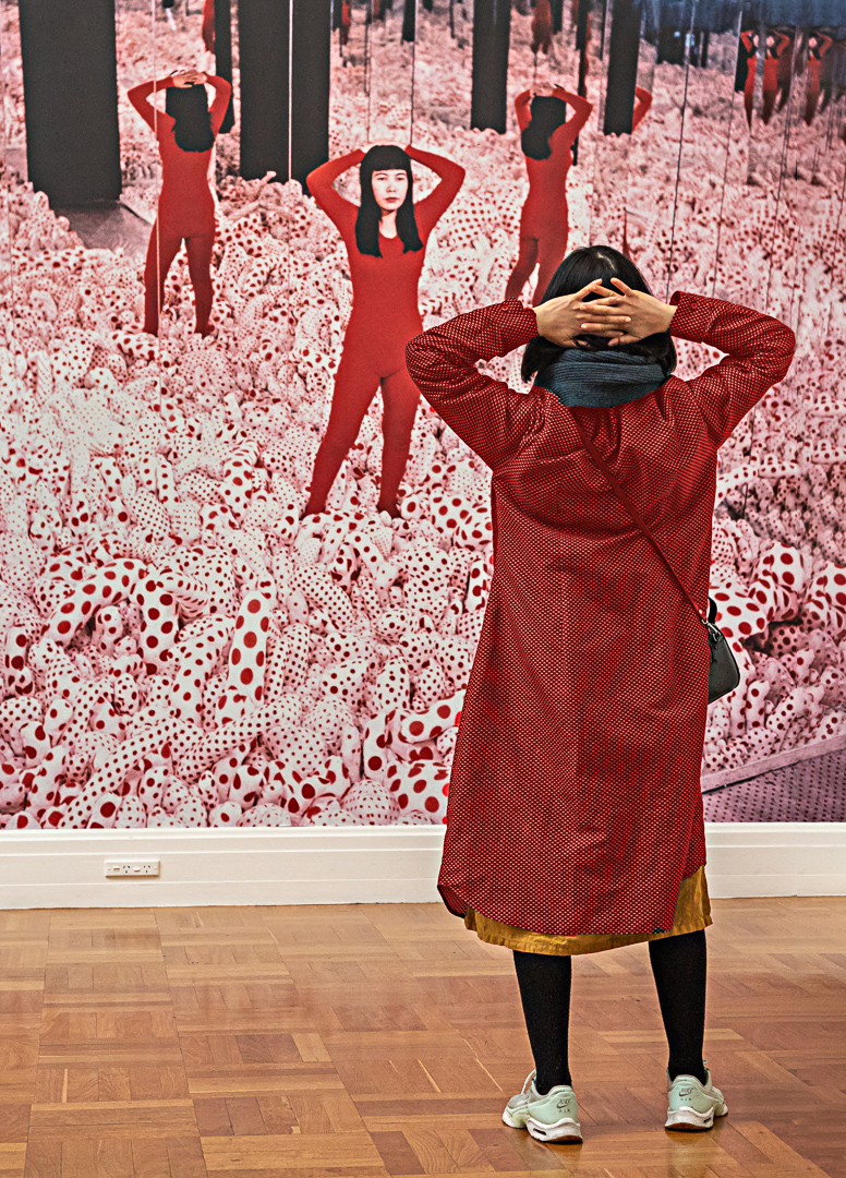
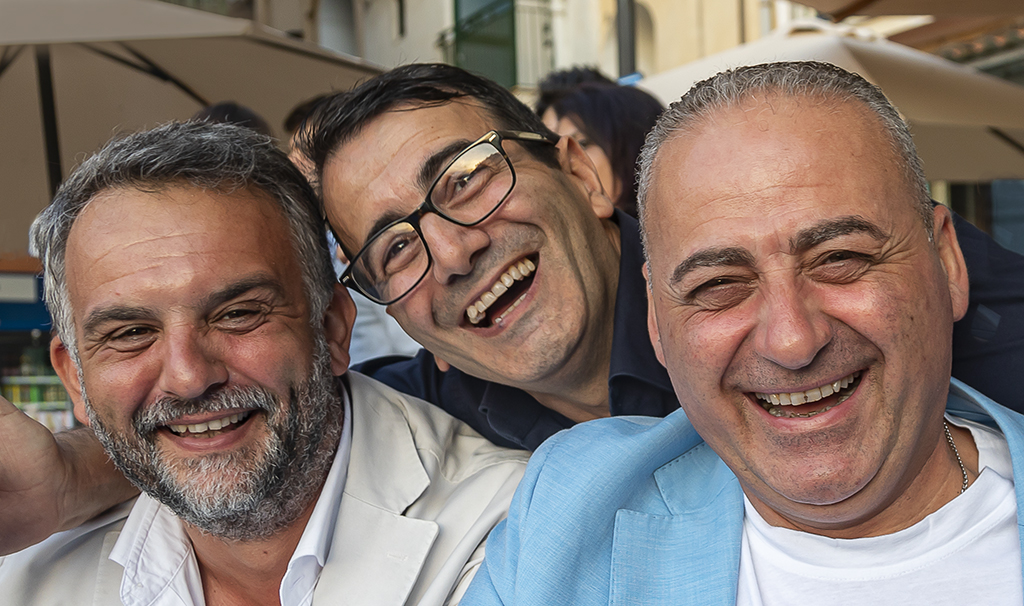
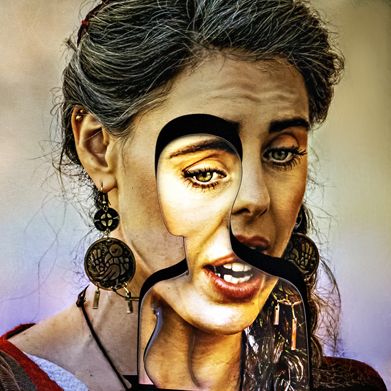
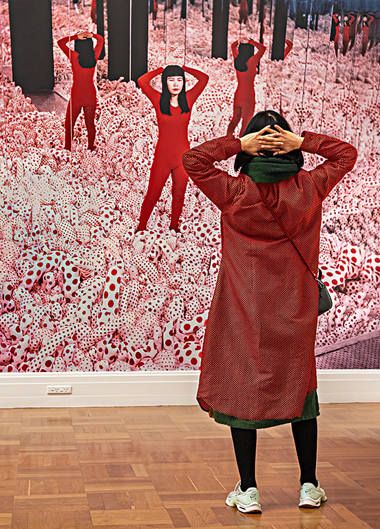
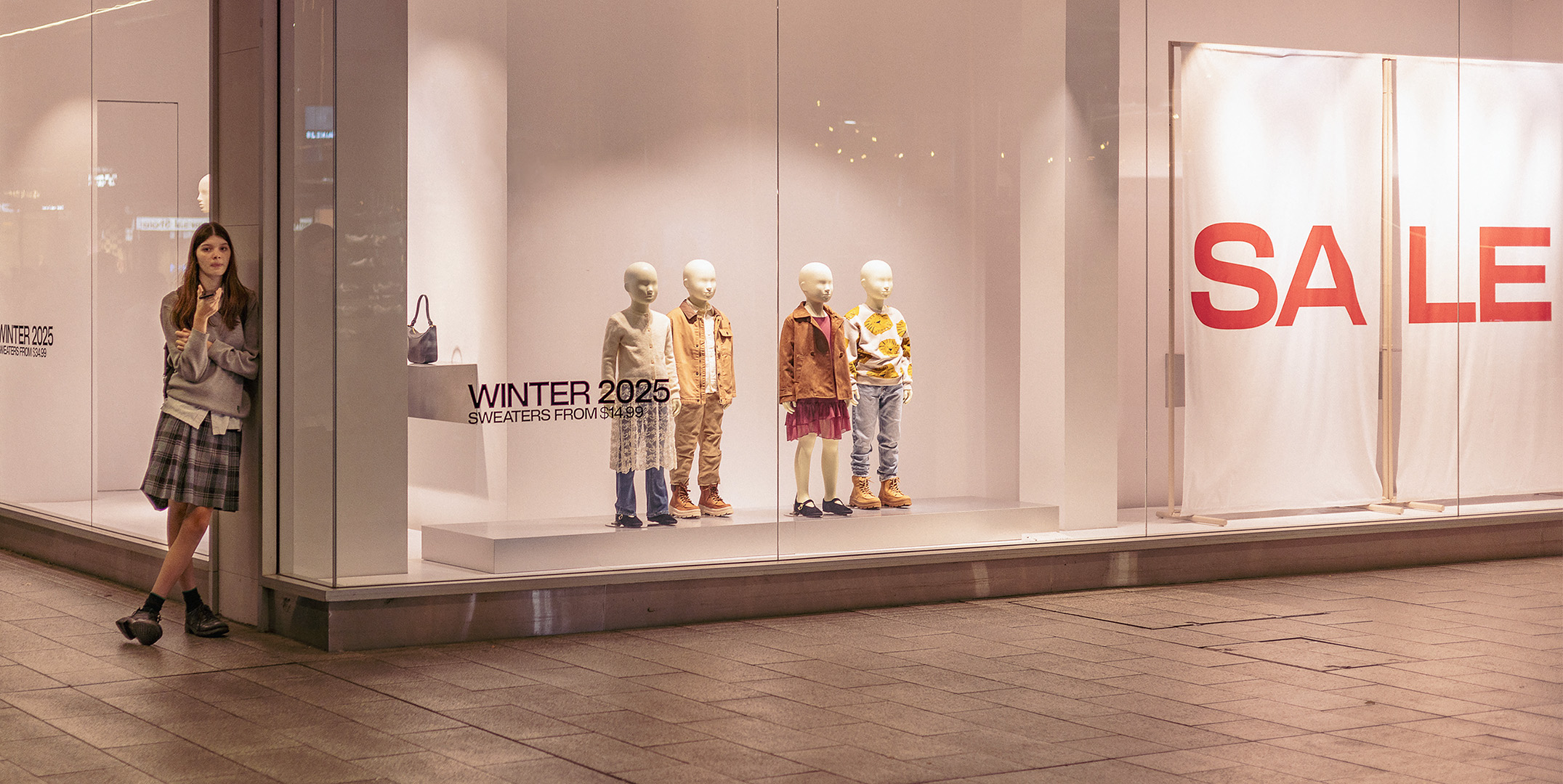
Thanks Jim. I have had the work of Stefan Draschan in the back of my mind for a couple of years now, and it was always the plan to try and replicate his work when I visited the Art Gallery. Even if is meant the 30 second secondment of an unsuspecting visitor. |
Jul 17th |
| 2 |
Jul 22 |
Reply |
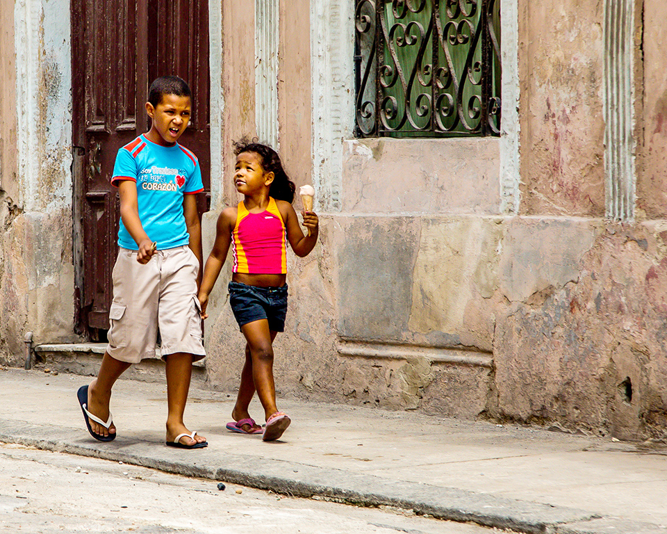
Thanks Jaqueline. I belong to a camera club that is renowned for it portraiture and I will keep on working at portraits and street photography (and anything else that gets in front of my lens). |
Jul 9th |
| 2 |
Jul 22 |
Reply |
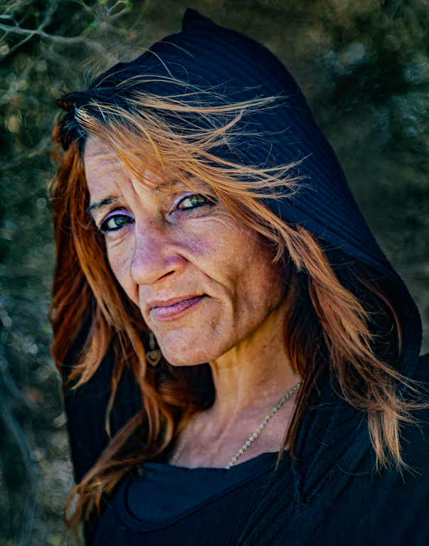
Thanks Piers. In hindsight a lower camera position might have worked better. This was a rushed shoot and was all over in about 30 seconds. It was purposely fast so that the rest of the group I was with didn't have time to realise what I was doing and copy my shot.
The mural was not perfectly lit by Gallery standards. It was a large photo of the artist (Yayoi Kusama) standing in one of her 3D creations. It was more promotional than artistic. I have already reduced the brightness in the area you mentioned, but any further reduction turns the white to a pale shade of grey. You will notice this is already happening. |
Jul 9th |
| 2 |
Jul 22 |
Reply |
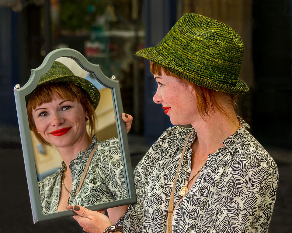
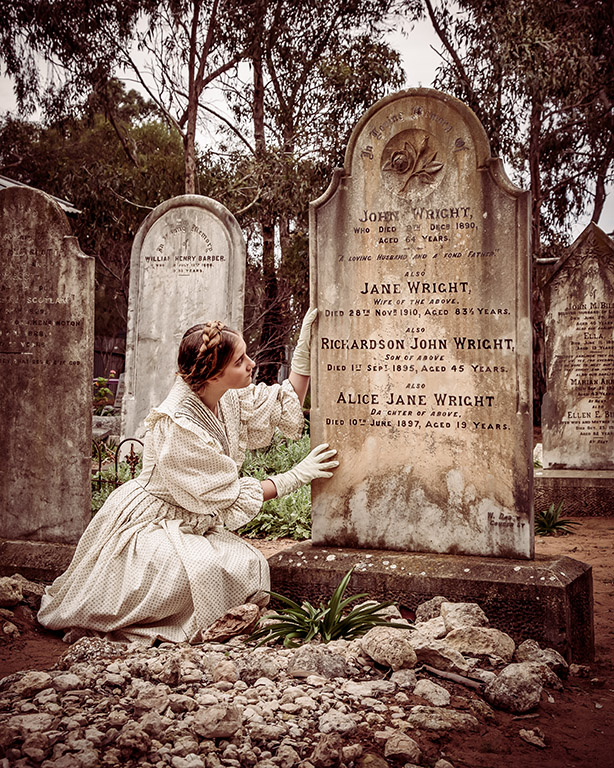
Thank you Shirley. I am not sure that I am clever enough to make your suggestion work.
When I set this shot up, I had in the back of my mind a series of photos that I found on the internet a couple of years ago. https://www.demilked.com/people-match-art-stefan-draschan/
This is where the concept came from.
I have made up my mind to go back to the Art Gallery and just sit for a few hours photographing the people as they examine the fine art. |
Jul 9th |
| 2 |
Jul 22 |
Comment |
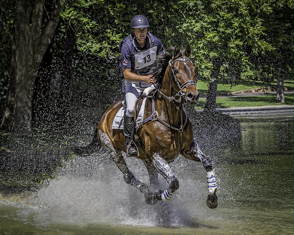
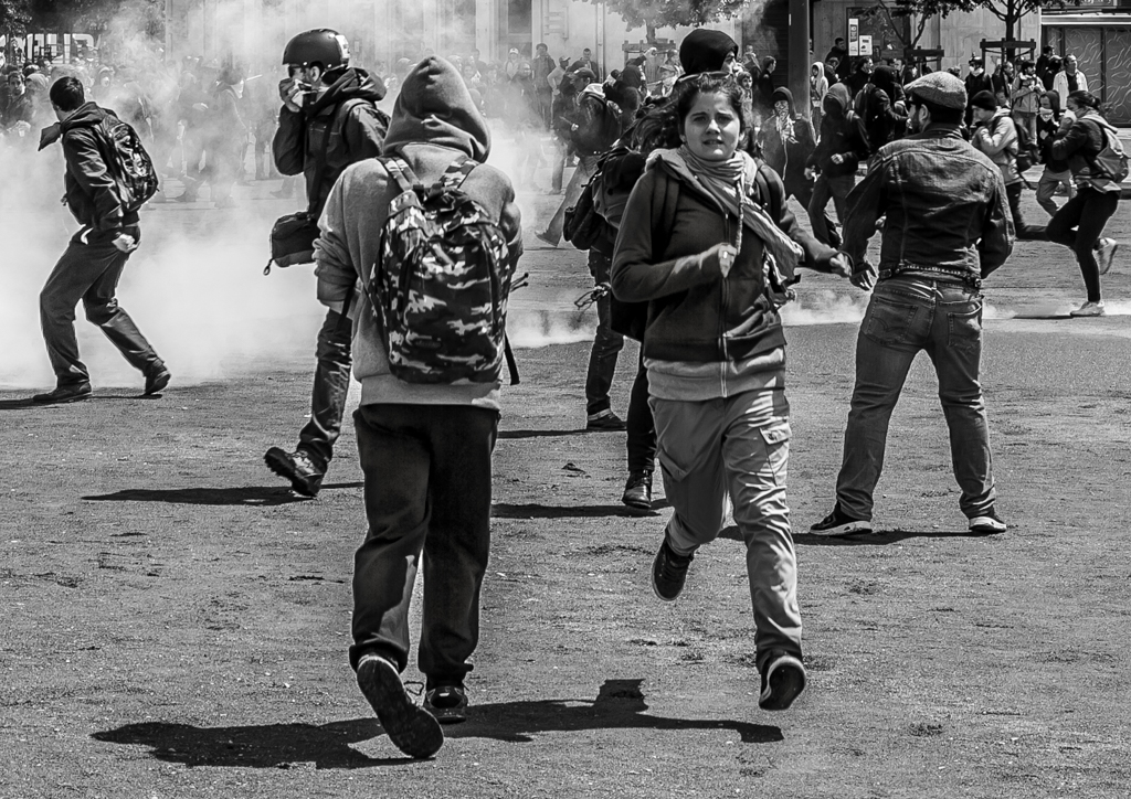
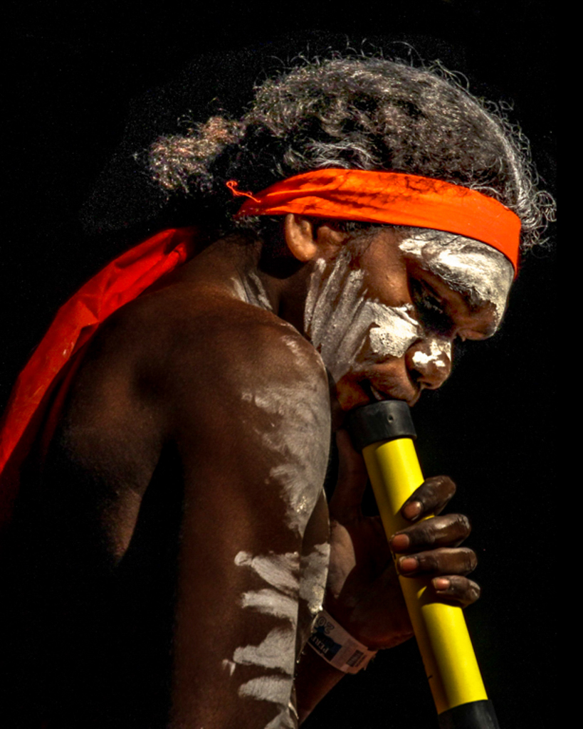
Welcome to the group Ellen. I hope you find everyone's comment helpful and positive.
*****************************
This is a good action shot. The horse and rider are headed towards some negative space on the right hand side of the image, which is good.
The exposure is good but the light is a little flat (which is out of your control) for my liking.
We will have to get you used to using manual mode rather than the "Bird setting" on your camera. A faster shutter speed (obtainable using manual mode) might have reduced the motion blur on Enzo's head.
This is a lovely action photo of a young person and their horse. Well done! |
Jul 9th |
| 2 |
Jul 22 |
Comment |
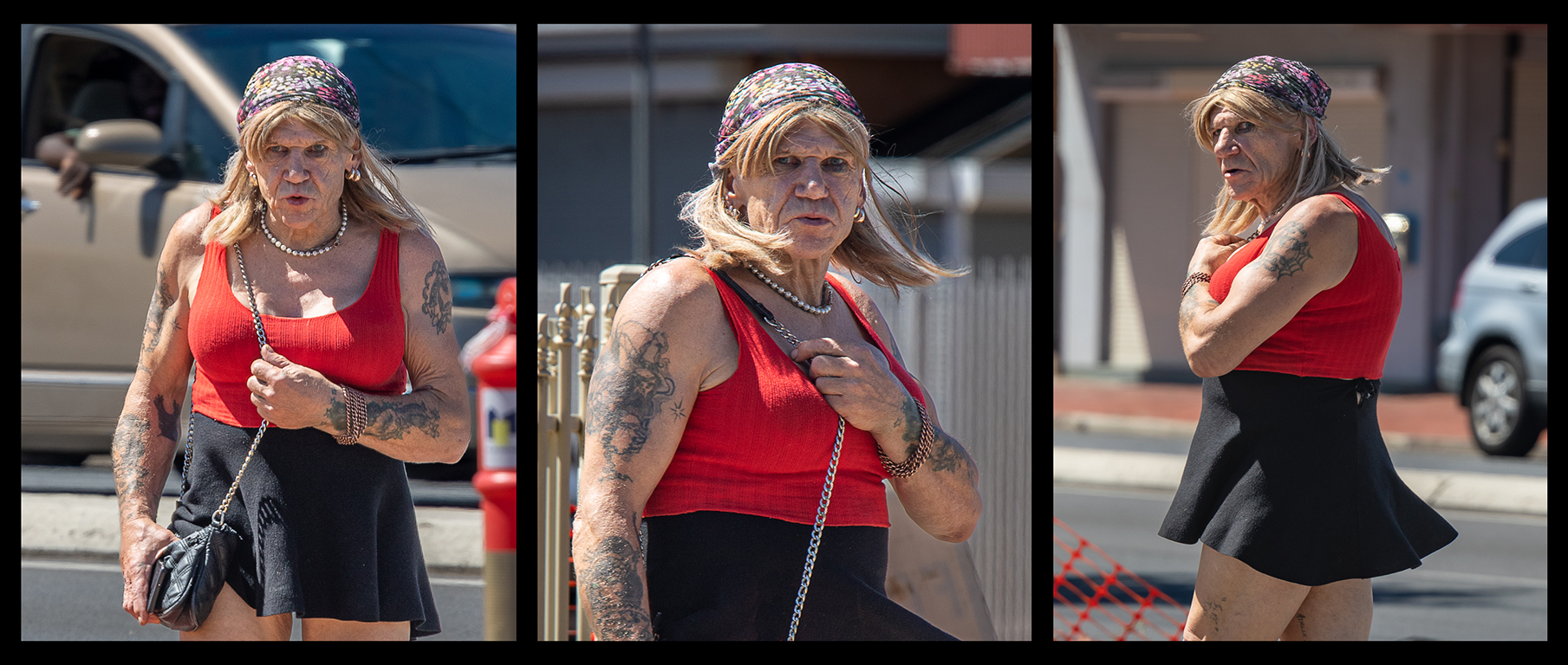
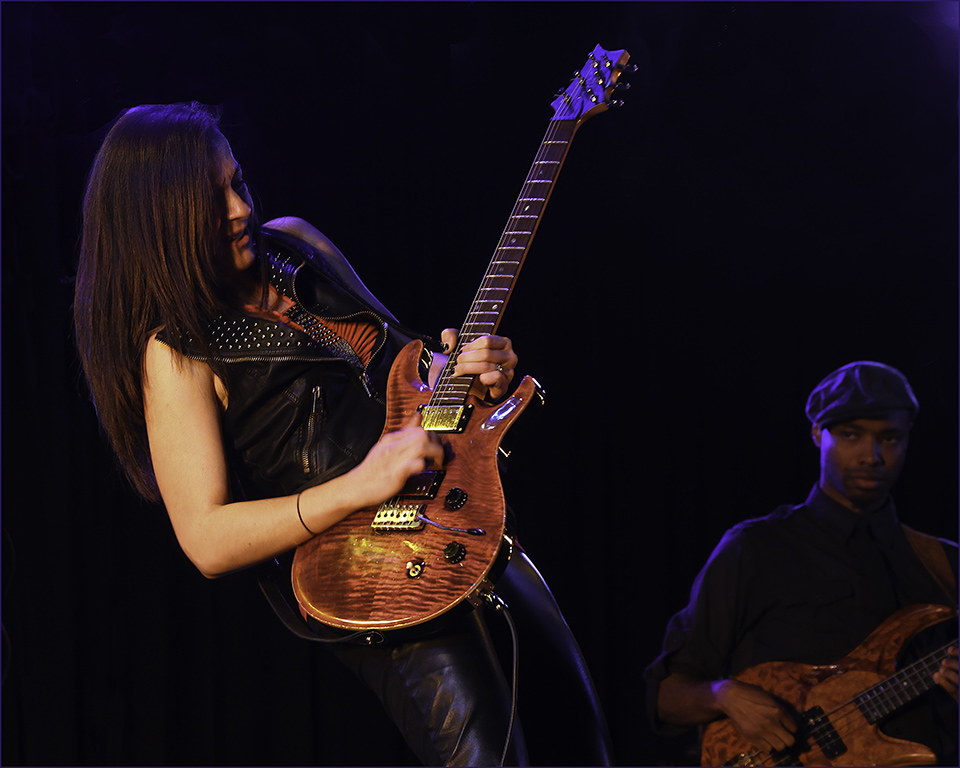
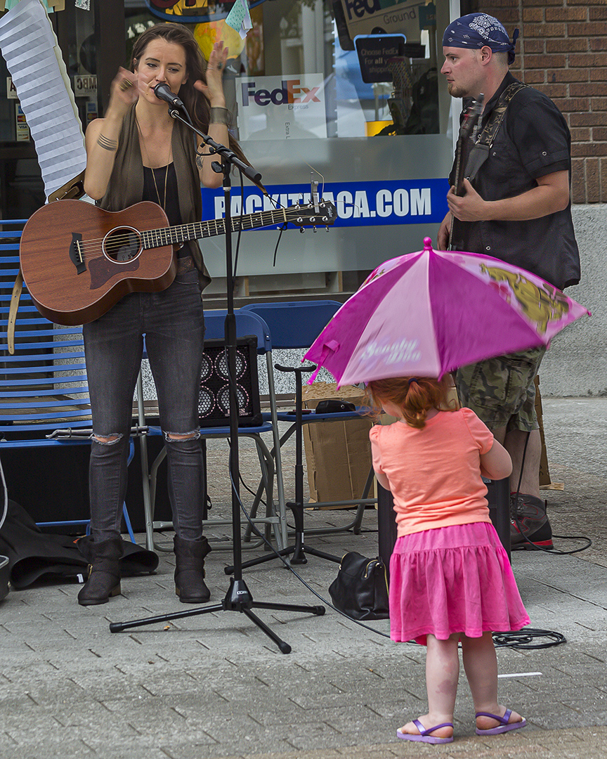
I think this is a great action shot, Jaqueline. It is a moment frozen in time and the only way you could have got the ball a little lower (or higher) is if you had taken a high speed burst and selected the previous or the following image in the burst. As an action/photojournalistic shot it is great. Well done. I like the feel that the players are about to run over the top of me and that I will become part of the action! It is nicely composed with five (an odd number) players. The main protagonist is in the centre where the action is. The eye is guided to her by the bright yellow ball. A great shot!
There is an old rule of thumb: for a 250mm focal length use a minimum shutter speed of 1/250, so for a 400mm lens focal length use a minimum shutter speed of 1/400. This rule is mainly a guide to reduce lens vibration during the shot, but for an action shot like this, I would look to increasing your shutter speed and increasing your ISO to correct the exposure. |
Jul 8th |
| 2 |
Jul 22 |
Comment |
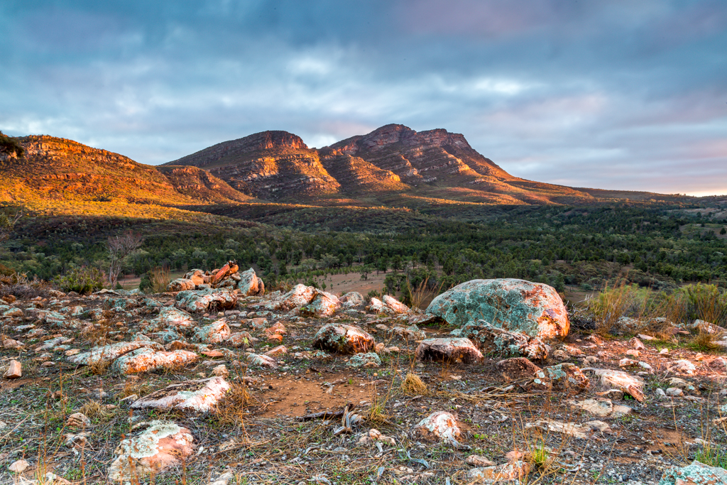
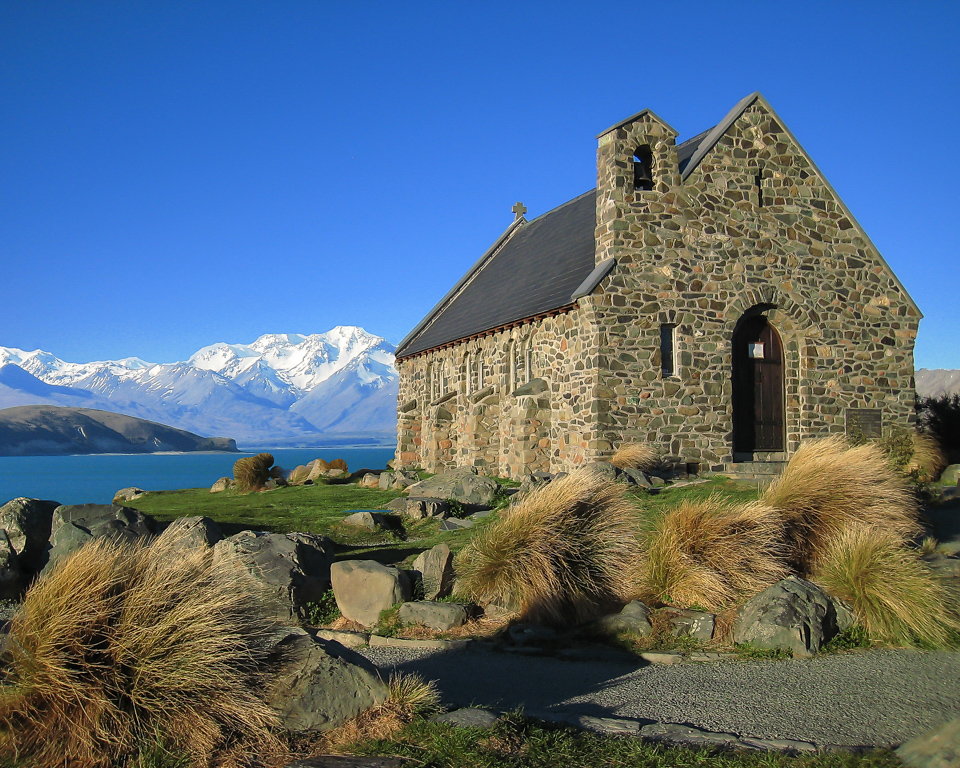
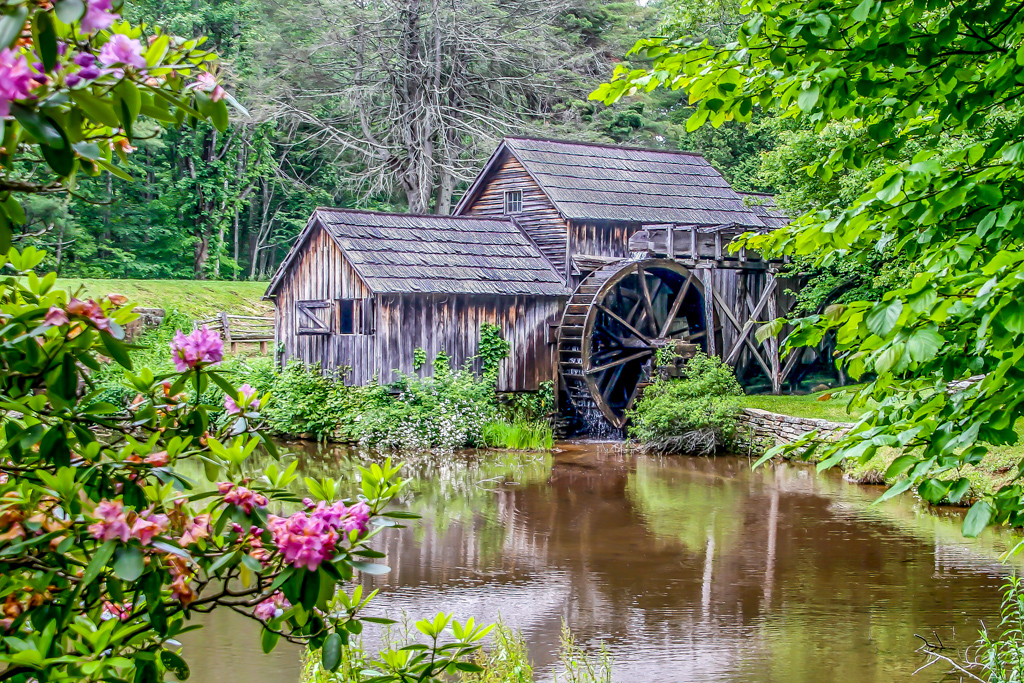
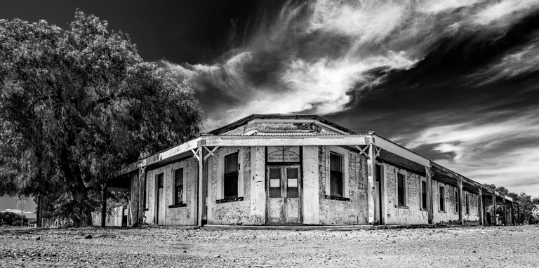
I like the way you have taken a rather bland image and added the ochre tones to it. It gives the image a rich, warm look. The new sky works well.
I would probably like to see the pink "thing-a-me-bobs" toned down or even removed. Maybe crop them out and follow Shirley's suggestion of making the dow the subject of the image. I would have a look at cropping out the right hand one third of the image, thereby removing the pink objects and reducing the sky so that the dow really does become the object of the image.
It is a lovely image and I like the reflections of the lights
|
Jul 6th |
 |
| 2 |
Jul 22 |
Comment |
I love the colours in this image. You have the complimentary reds and greens and a touch of blue around the outside.
Your adjustments have removed the "muddy" look that was evident in the original. The image is sharp and clear, and I like the subtle brightening of the centre of the image.
It is a great image that really "pops" out of the screen!
Well done! |
Jul 6th |
4 comments - 7 replies for Group 2
|
4 comments - 7 replies Total
|