|
| Group |
Round |
C/R |
Comment |
Date |
Image |
| 2 |
Apr 22 |
Comment |
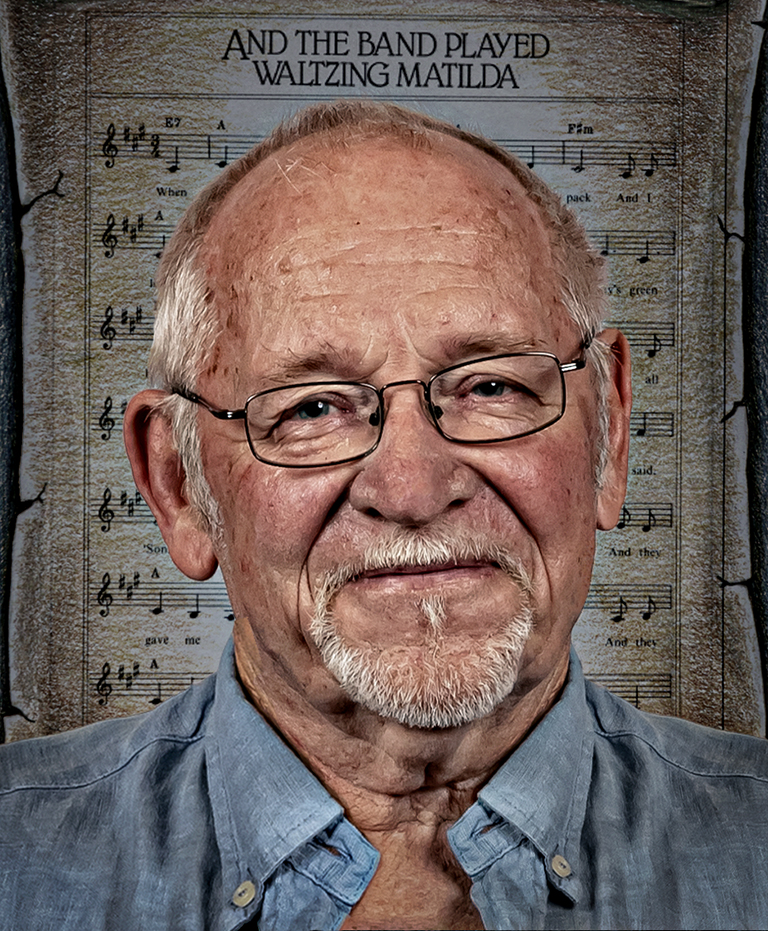
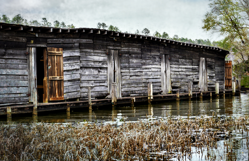
Hi Karen, I have had a play around with your image. I have removed the boat in the background (which I sort of liked, but some didn't) and removed the texture in the sky. I have brighten the timberwork in the marina.
Unfortunately I have destroyed the grunge that I enjoyed so much!
It is a little too crisp!
|
Apr 14th |
 |
| 2 |
Apr 22 |
Comment |
This is a nice series of images of the Salvador Dali Museum. You were clearly impressed by the architecture and tried to capture what you were seeing. These images will always bring back the happy memories of this visit.
I agree with Stuart's comments and his post production. However that gets away from the impression you wanted to convey, which is light and airy.
Someone once said to me, "Accept the other person's art work (or architecture) but make it your own."
This may involve taking two sets of images. One set to bring back those memories and the other to display your artwork.
You can see that I am not an artist! |
Apr 13th |
 |
| 2 |
Apr 22 |
Reply |
Thank you Shirley. The prostrate appearance of the grass is a result of long term windy conditions. That is how they grow as a result of their environment |
Apr 13th |
| 2 |
Apr 22 |
Reply |
Thanks Piers. I will have a word to the snow Gods and see if they can rectify the placement of the snow. The brightness of the rock is easily fixed! |
Apr 13th |
| 2 |
Apr 22 |
Reply |
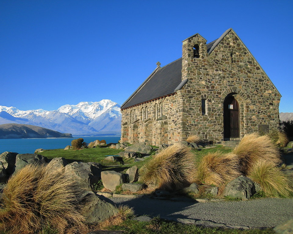
New Zealand is very picturesque and lake Tepako is no exception.
You are quite correct about the sharp transition between the foreground and the background. This was a very early attempt at cutting and pasting.
|
Apr 13th |
| 2 |
Apr 22 |
Comment |
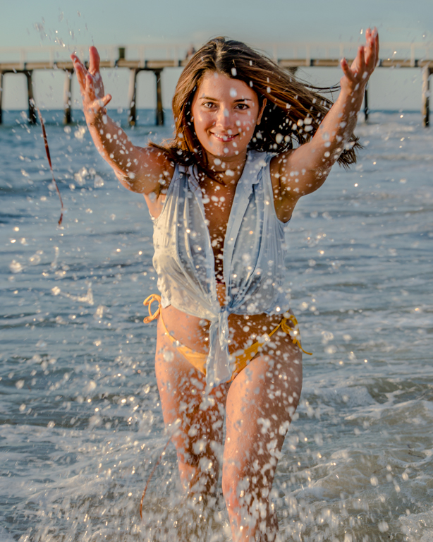
This is a nice sharp image and well composed. I especially like the tiny water droplets on the petals.
Well done.
I like the border idea from Stuart, but maybe make it with a dark green toning rather than the stark white. |
Apr 12th |
| 2 |
Apr 22 |
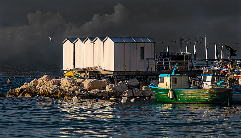
Comment |
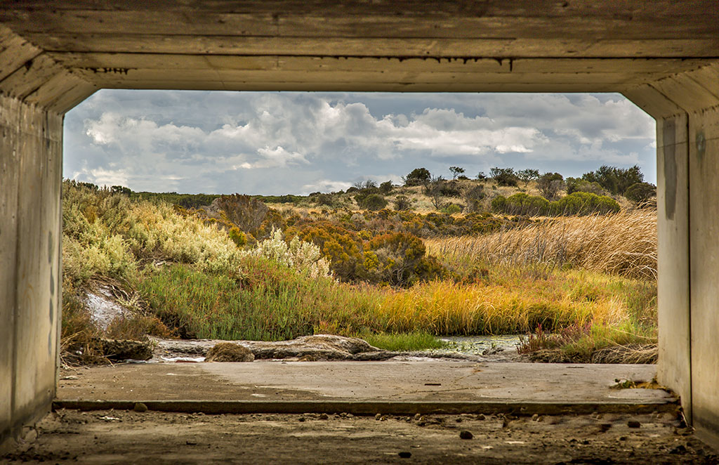
I like this image, especially the textures in the horizontal timbers of the marina. I like the way the building and the reeds create leading lines guiding the eye to the moored boat in the distance.
I like the muted tonings and the sudden contrast of the vertical brown timbers of the door
I commend you for trying the "grundge" look in the sky, but the slight textured look against the white clouds doesn't work for me. I like the "grundge" but not the texture of the overlay.
A lovely image and I am just being a bit "picky." |
Apr 12th |
| 2 |
Apr 22 |
Comment |
Nice image. It is sharp and balanced. I like Stuart's background. Well done |
Apr 10th |
| 2 |
Apr 22 |
Comment |
A great image of a lovely red brick lighthouse. Where is this lighthouse?
I think the lighthouse is too close to the left-hand side of the image. There needs to be more space there. I can only presume you have cropped it so tightly to remove some unwanted feature in the original image. The resulting image is heavily weighted to the bottom left hand corner.
I would probably lighten the image a little, remove a bit of the sky from the top and move the lighthouse towards the centre by adding in a strip of sky and land to the left hand side. Add enough so that the lighthouse lies on one of the vertical "third" lines and clone over the joint to make it appear seamless. Give it a 4:5 aspect ratio (8" x 10").
|
Apr 9th |
 |
6 comments - 3 replies for Group 2
|
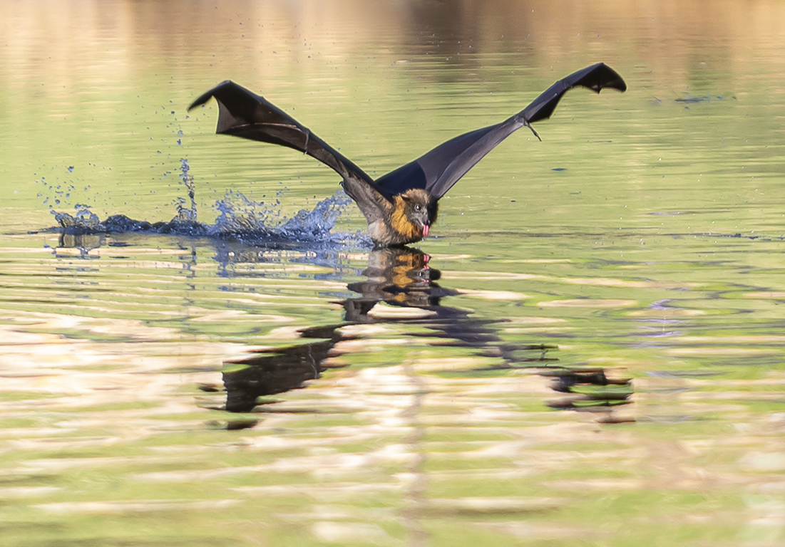
| 40 |
Apr 22 |
Comment |
Hi Julie, I am visiting from Group 2.
I think this is a great image. I like the muted tonings, the action, the sharpness and the composition. I wonder if the judges are marking it down because of the flat light and as a consequence there is a lack of detail in the filaments of the white feathers (no shadows to create detail).
Also your image seems to have a grey cast over it. I have taken it into Photoshop, (Levels layer) pulled the two outer sliders closer together (to brighten it up and remove the cast) and (Curves layer) pulled the Curves layer down a little to try and retrieve some of the detail in the white feathers on the leading edge of the bird's right wing.
I think if you work on the raw image you will have more success than I did working with the jpeg. |
Apr 4th |
 |
1 comment - 0 replies for Group 40
|
7 comments - 3 replies Total
|