|
| Group |
Round |
C/R |
Comment |
Date |
Image |
| 2 |
May 21 |
Reply |
Thanks Jim |
May 9th |
| 2 |
May 21 |
Comment |
Thank you all for your comments |
May 8th |
| 2 |
May 21 |
Reply |
Hi Jamie,
This is how I added more space on the left hand edge of the image.
Open the image in Photoshop
Click on the "Crop" tool. This should put a line around the whole image. Half way up each side of this line you will find a little rectangular tab. Put the cursor on the left hand side one and drag it to the left as far as you wish. This expands the canvas and it will appear as a series of little grey and white squares. Press enter.
Now click on the "Rectangular Marquee" tool and use it to surround the newly created area and as much of the original image as you wish Photoshop to sample.
Then, Edit>Fill. On the pop up menu make sure:-
"Contents" is set to "Contents Aware."
Mode: Normal
Opacity:100%
Press OK and let photoshop do it's magic.
Ctrl + D to deselect the area
Do any cleaning up with the clone tool
|
May 7th |
| 2 |
May 21 |
Comment |
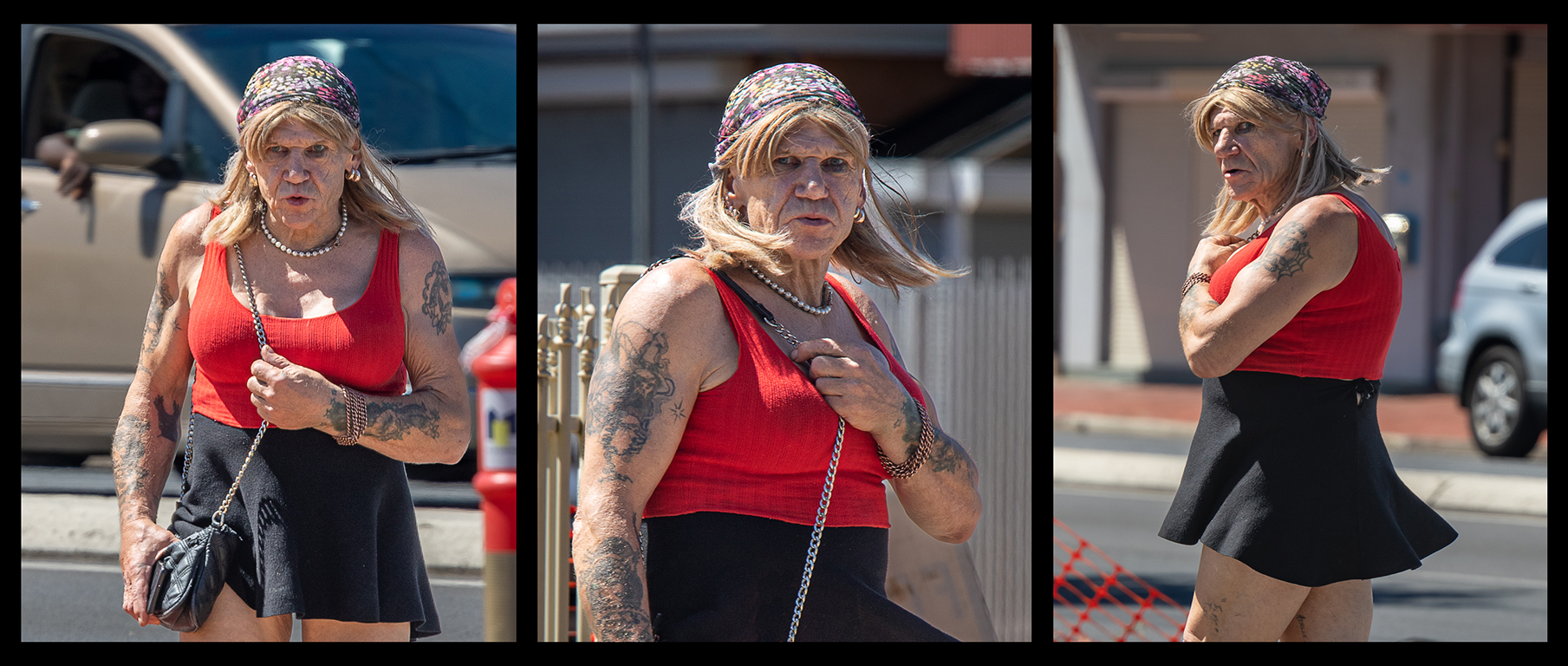
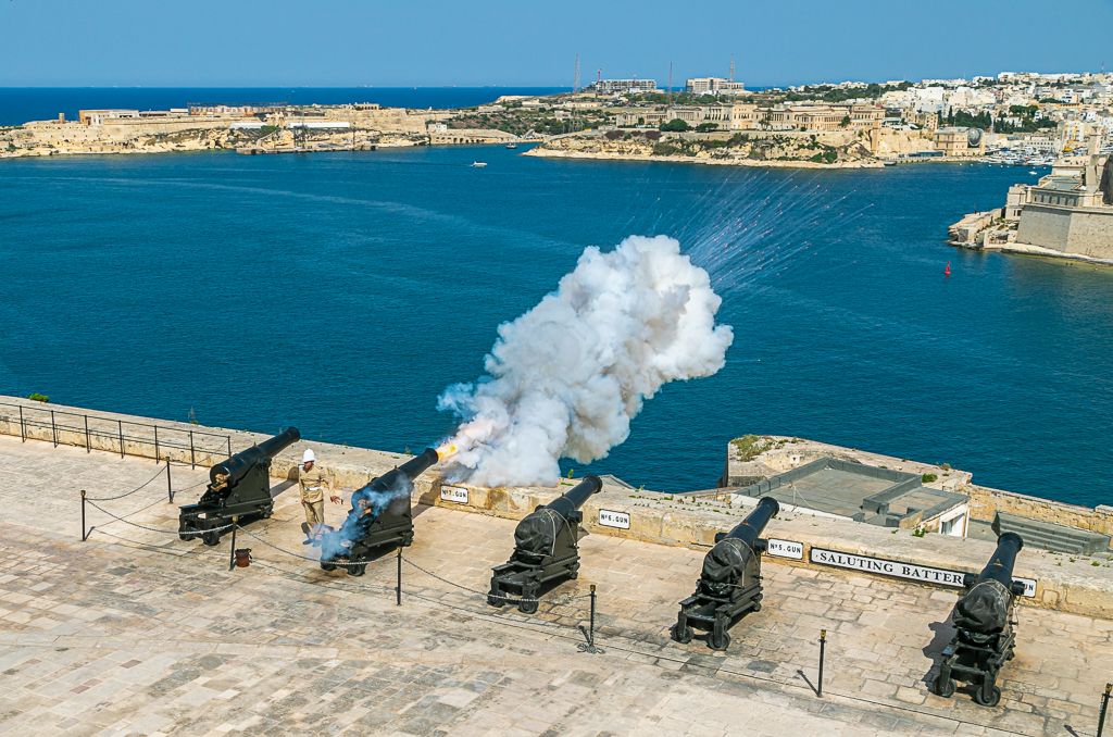
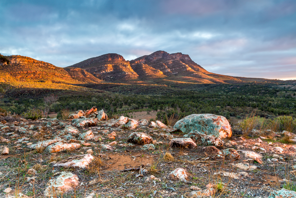
Hung, Where did you take this image? |
May 7th |
| 2 |
May 21 |
Comment |
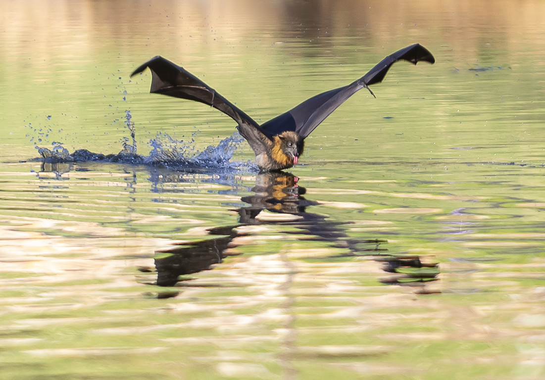
I think this is a great image. The blur of the far wing doesn't worry me as the body of the bird and the near wing are in sharp focus. I love the light on the near wing. The spread of the wings are in a perfect position for a photograph and the background is nicely blurred.
I do not see a problem with drawing out the detail in the eye. The detail was always there in the original image. You have not "created" it.
The definition for "Nature" in both the PSA and FIAP competitions is quite specific, but I am sure they allow for some adjustments in converting an image from RAW to a .jpg. i.e. brightness and and some sharpening.
The PSA has put out a really valuable document that all Nature photographers (not only judges) should read.
https://psa-photo.org/useruploads/files/nature/Nature-Photography-Judges-Guide.pdf |
May 5th |
| 2 |
May 21 |
Reply |
You pose an interesting question. Personally I find it is quicker to alter an image than to try and describe the changes I would make if the image was mine.
However, some people may find it offensive for others to alter their art work.
Maybe all that is required is a simple statement in the description like, "Please do NOT rework this image."
I look forward to the room members' comments
|
May 5th |
| 2 |
May 21 |
Reply |
I will come! Probably in about 2022-23. When we visit our daughter and meet the grand children in PA for the first time |
May 5th |
| 2 |
May 21 |
Reply |
Hi Jaqueline.
This maybe a tedious way to transfer an image to Photoshop, but it is the one I learnt by trial and error years ago.
Right click on the image you wish to work on. On the drop down menu that appears click on "Copy Image."
Open Photoshop. On the top menu click on File>New
The screen that opens has a blue square around an area that says "Clipboard." This is where Photoshop is about to work out the size of your image. Don't touch it. Click on "Create" down the bottom right hand corner of the screen.
A new screen will open with a large white rectangle.
Go to the top menu. Press Edit>Paste, and the image should now copy into Photoshop ready for you to work on.
|
May 5th |
| 2 |
May 21 |
Reply |
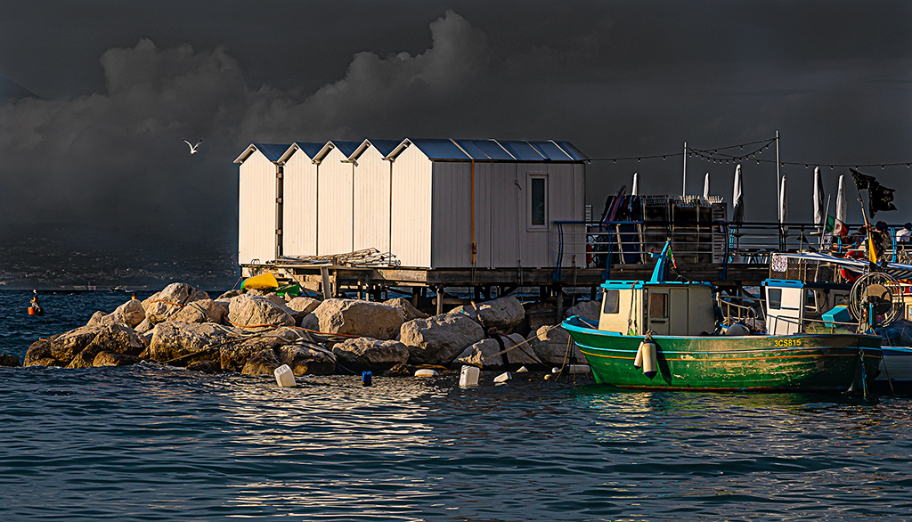
We had "Fences" as a set subject in a competition recently and this was the best I could come up with. |
May 5th |
| 2 |
May 21 |
Comment |
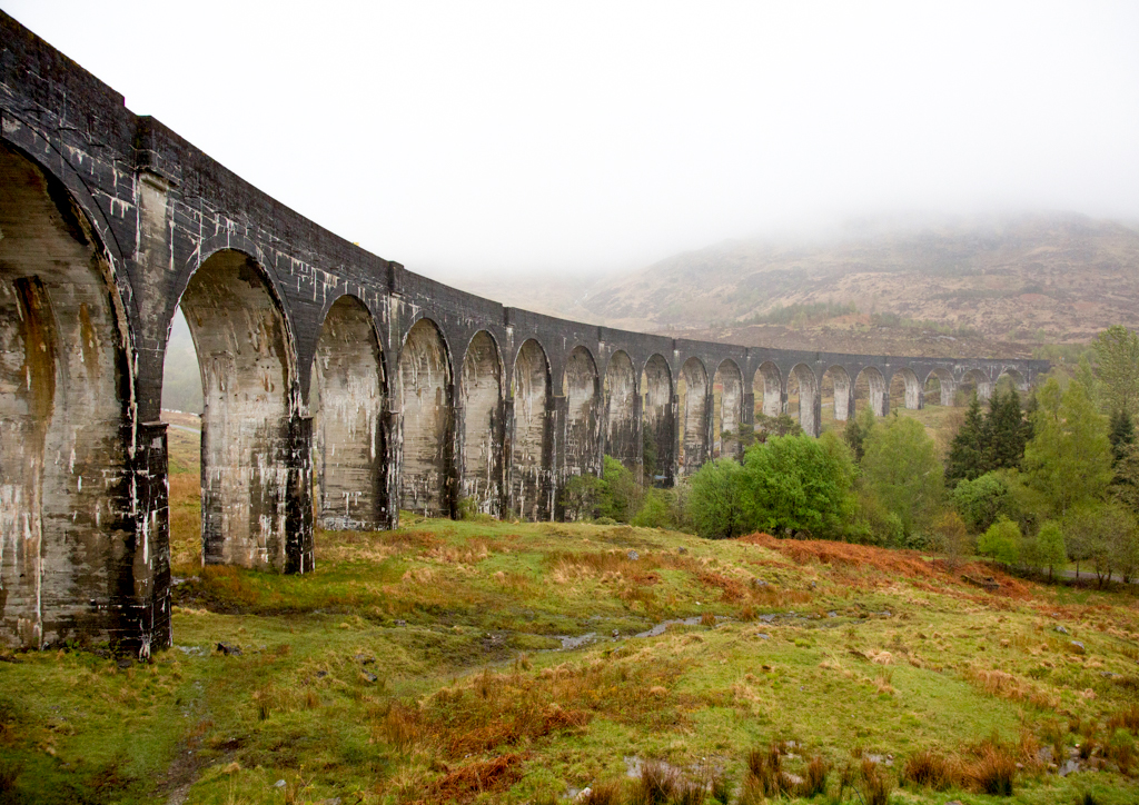
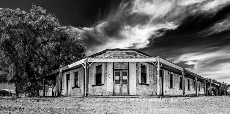
I love bridges and this is a fine example of a Pratt truss bridge. I wish there were more of them.
I would try and open up the shadows to reveal the detail of the steelwork in the shadows.
I prefer the monochrome version. The colour image seems to have a slight brownish cast over it. To fix this: Photoshop - Image>Adjustments>Levels then press Auto |
May 4th |
| 2 |
May 21 |
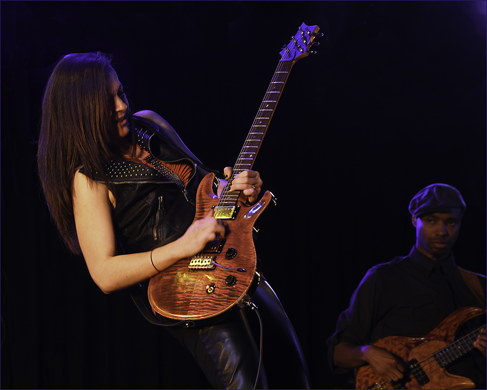
Comment |
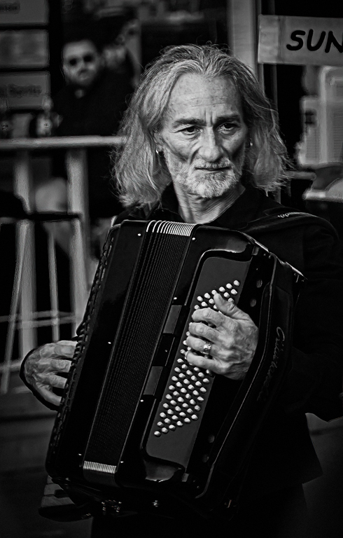
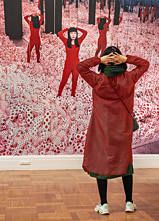
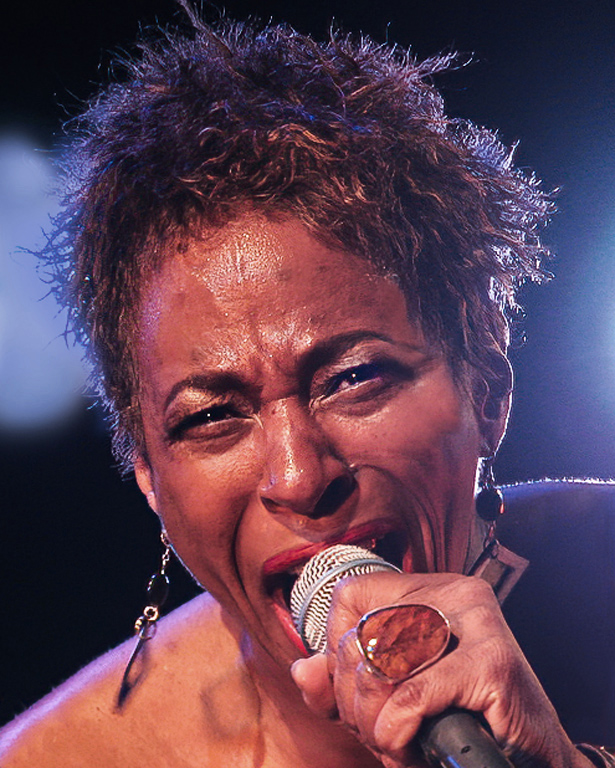
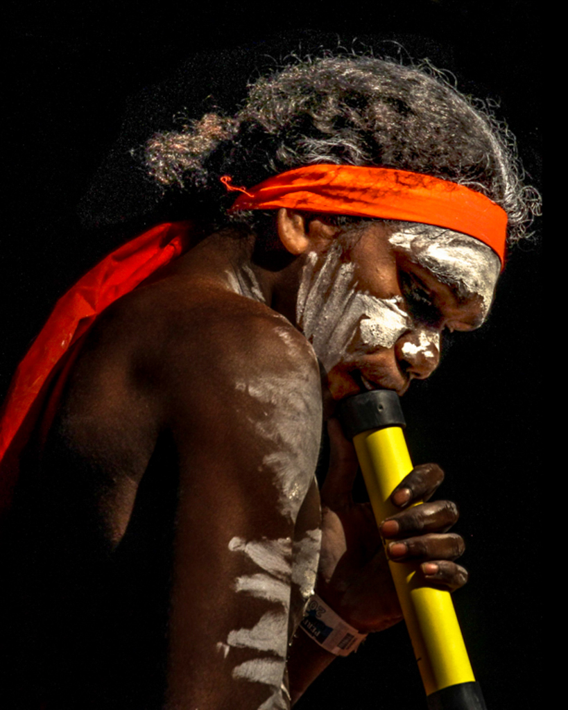
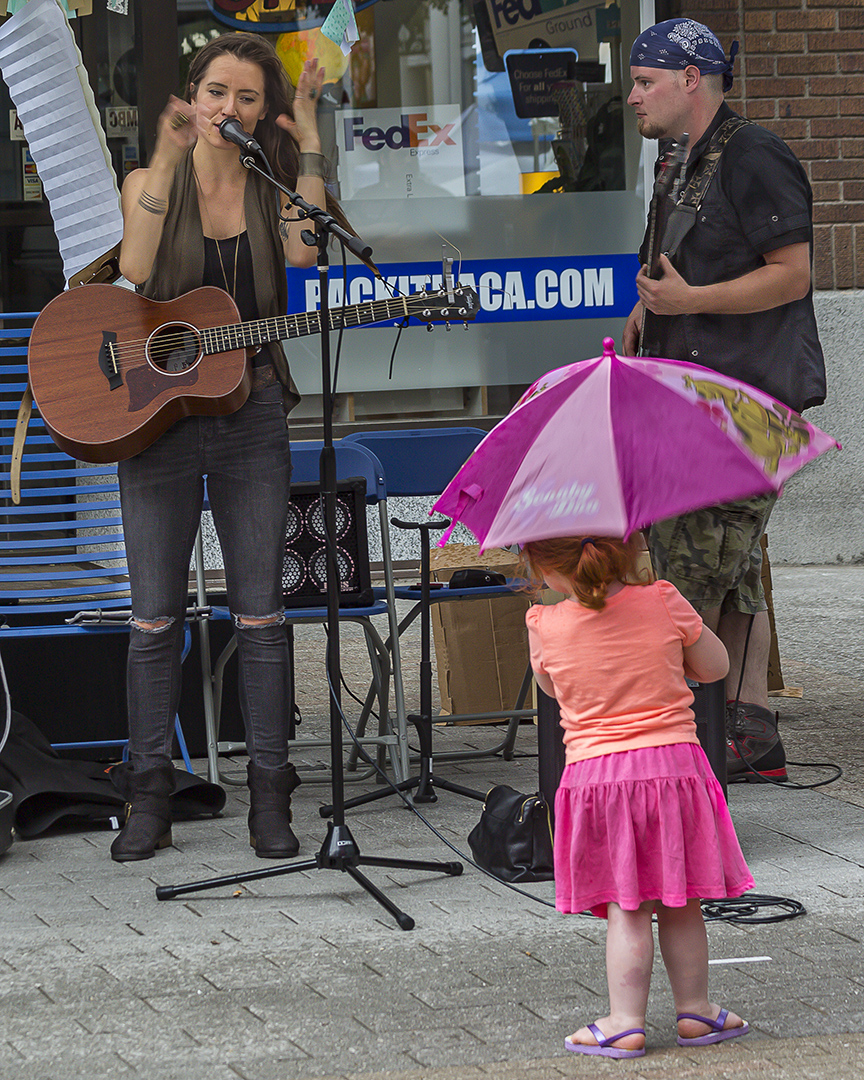
A great photo Hung! You have done really well to capture this image during the performance. The lighting is good, it is sharp and the composition is good.
It is a lovely simple image.
The roses lying on the floor are important to the story line.
The rose plays a symbolic role in Romeo & Juliet. It shows there is love and passion in the relationship but there is also a thorn.
My eye is distracted by the roses on the left of the image and so I would clone some from the righthand side over them.
This is your best image yet! Well done |
May 4th |
 |
| 2 |
May 21 |
Comment |
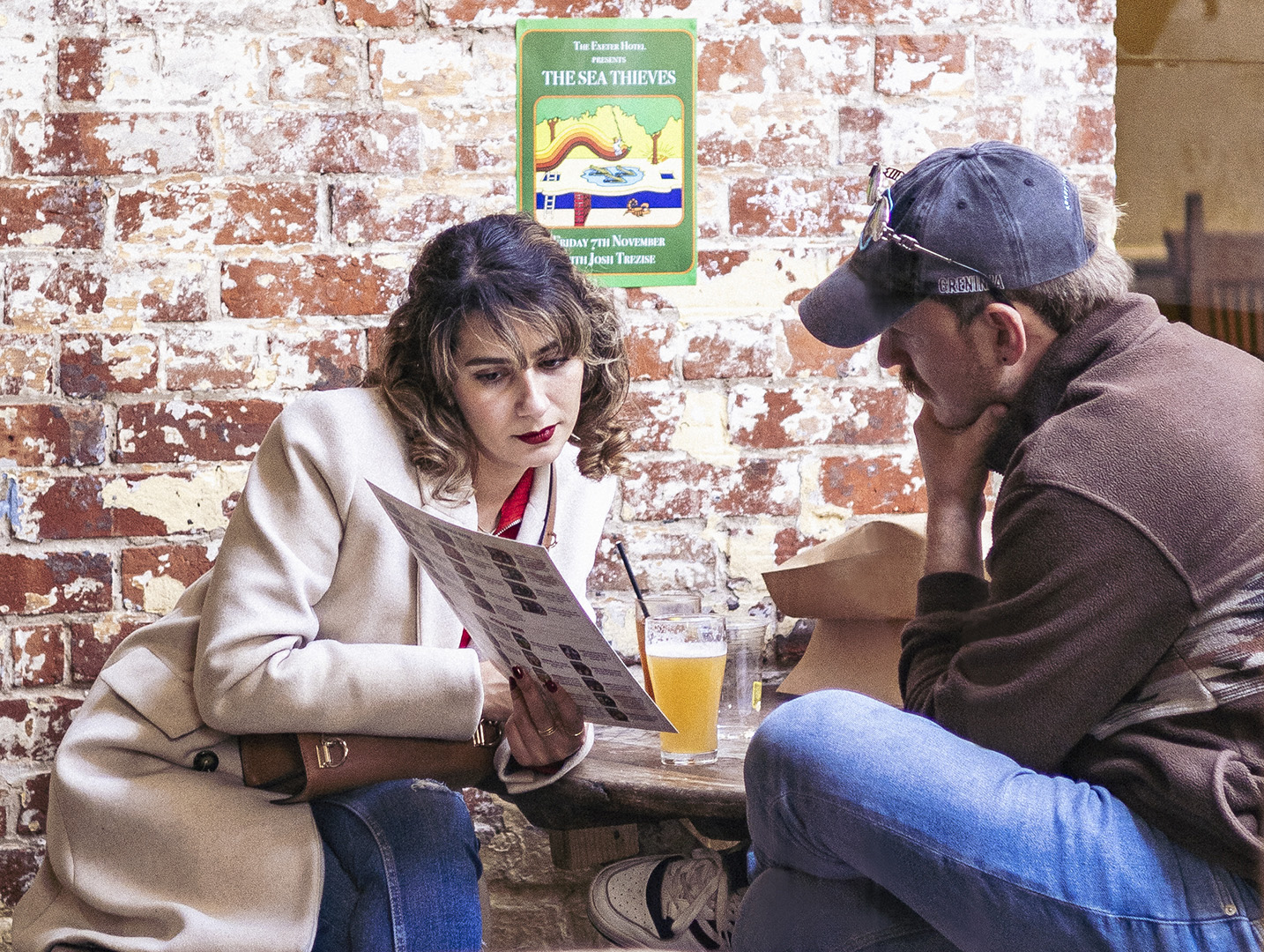
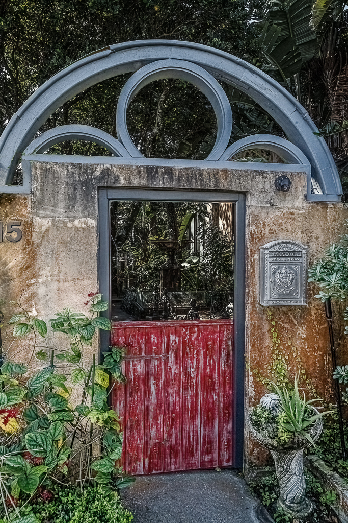
Jim this is a good image, but I don't think it will do well in competition simply because it is too busy. Judges seem to like simplicity, and this ain't simple!
I find the leaves jutting out in-front of the gate distracting, so clone those out. Also darken and desaturate the background beyond the gate. Then give that area a slight touch of Gaussian Blur (1px). That makes the eye concentrate on the lighter foreground, rather than the garden beyond.
Other than that I can't offer many suggestions, except print it and put it on your wall and enjoy it.
|
May 4th |
 |
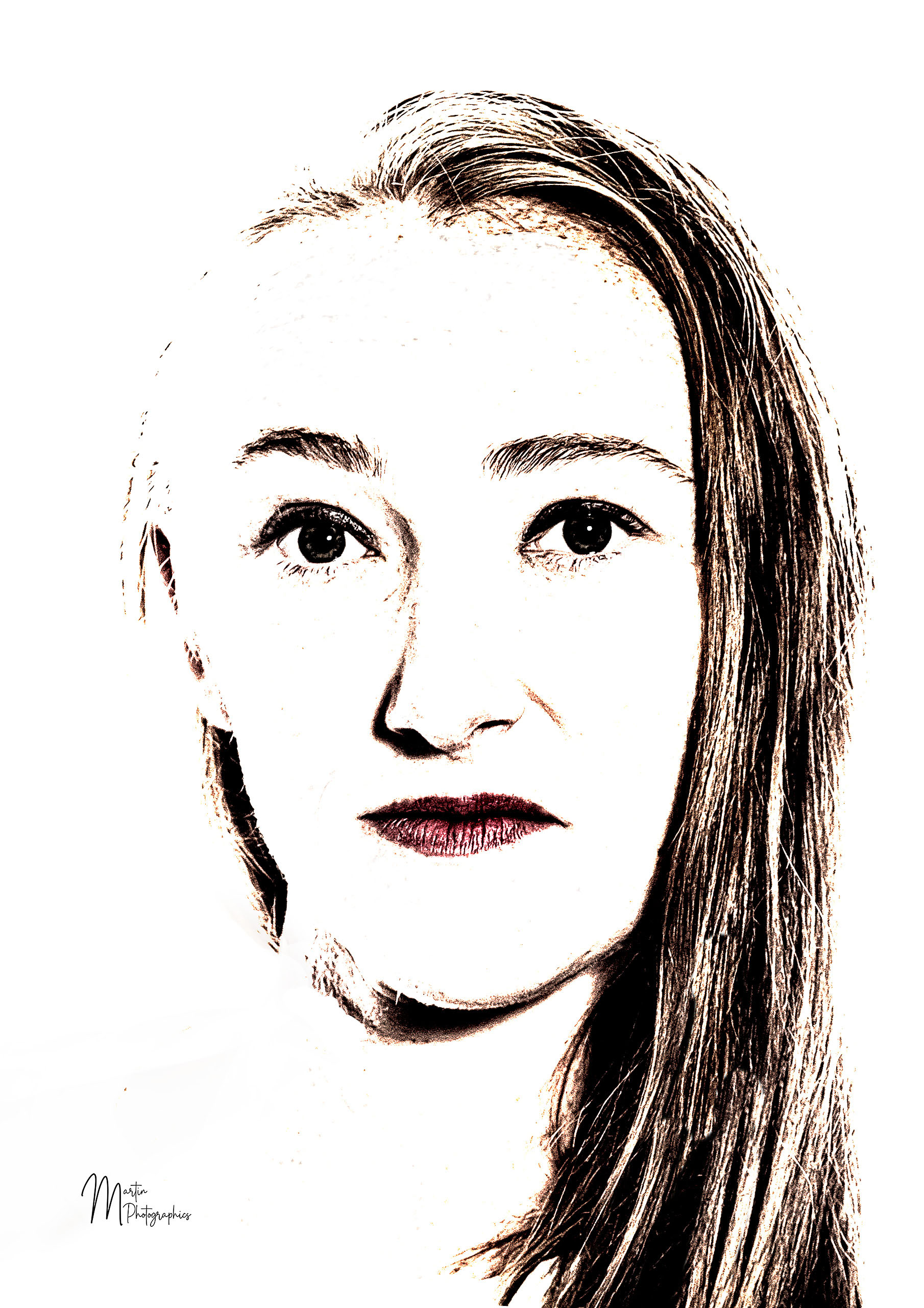
| 2 |
May 21 |
Comment |
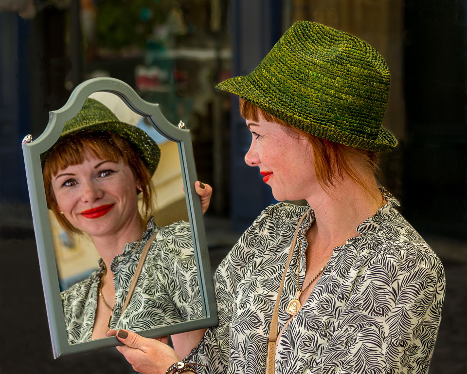
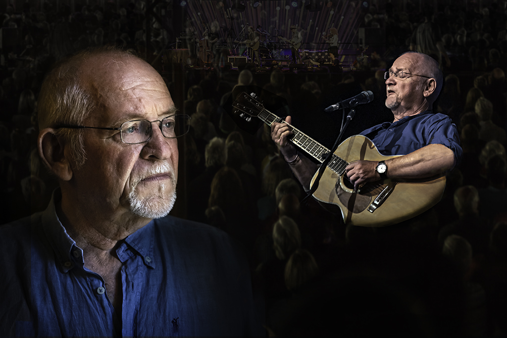
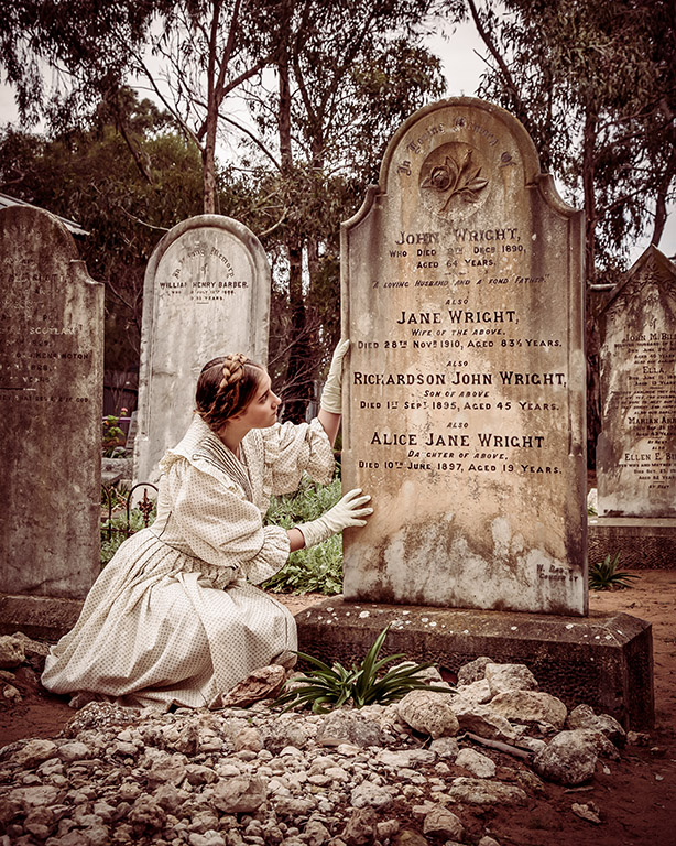
I love the composition of the image, although I feel it has been cropped a little too tightly on the left hand side.
I think it could be brightened up a bit.
So I had a bit of a play.
I have opened a curves layer in Photoshop and raised the curve about 3/4 the way up it's length. This brightened the whole image.
I then opened another curves layer and raised it at about the lower 1/4 point, until the girl's hair and face were brighter. Invert the layer (Ctrl + I) or (Cmd + I on Mac) so it was black. With a white brush painted the girl's hair and face and around the horse's eye, so that they were brightened further. I also applied a bit of this brightness to the bridle (pun intended) to bring out a bit of detail there.
I applied a dark vignette, which helped reduce the blown out part of the horses mane up in the top RH corner. I have removed the bright white thing on the bridle near the horse's eye as I found it distracting |
May 3rd |
 |
7 comments - 6 replies for Group 2
|
| 40 |
May 21 |
Comment |
Hi Julie.
A nice sharp image. I think the shutter speed could have been slightly slower to get a little more blur in the plane's propeller.
I like the colours and the diagonal line of the composition.
A great image, well done!
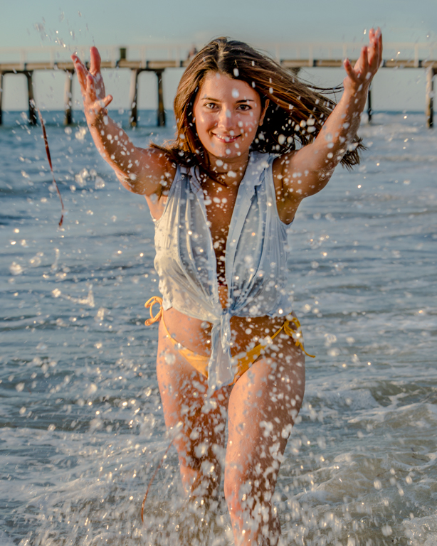
I am impressed with these measures the government will go to to prevent the human transmission of COVID 19 from Queensland into South Australia |
May 10th |
1 comment - 0 replies for Group 40
|
| 82 |
May 21 |
Comment |
Hi Ruth
I concur with Julie's comments, and in addition I would warm the image up a bit. It is quite blue and cold looking. In my opinion it is not conductive to swimming.
I would also try and draw out some more detail in the swimmers, by lifting the shadows and lightening them. |
May 7th |
1 comment - 0 replies for Group 82
|
9 comments - 6 replies Total
|