|
| Group |
Round |
C/R |
Comment |
Date |
Image |
| 2 |
Apr 20 |
Comment |
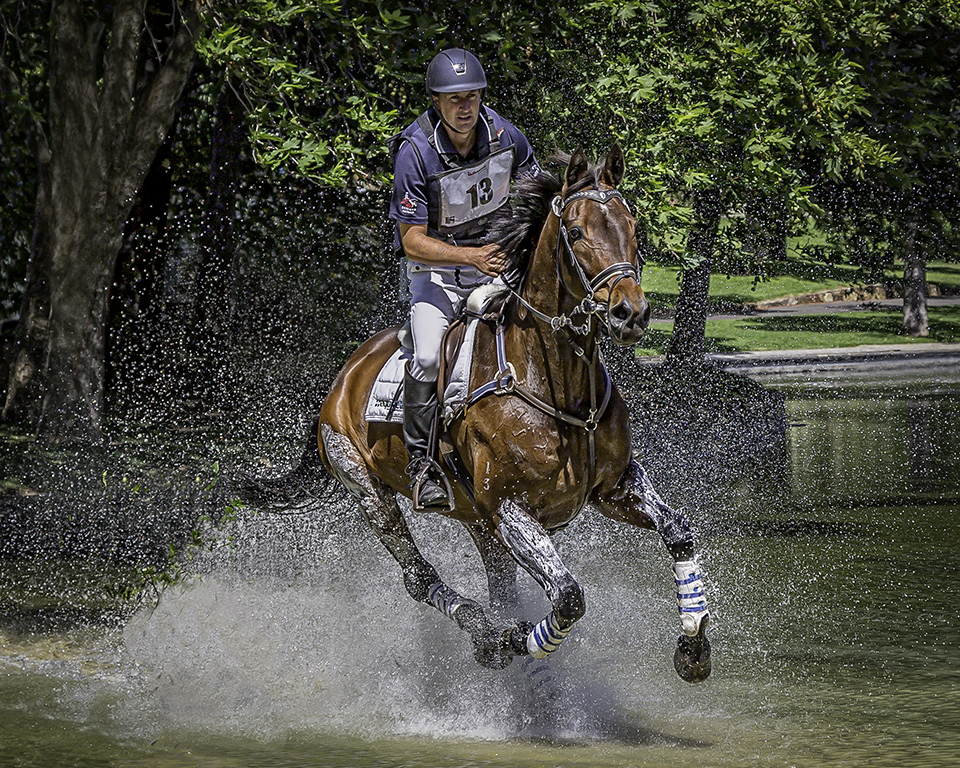
I have never been to a rodeo, but the photos I have seen taken at them usually have very busy backgrounds.
This is the case with your image. I have had a quick go at re-colorising the background to eliminate that very dominant blue colour and I have removed that white patch on the ground in front of the horse's nose. Also, I changed the colour of his chaps to red to draw the eye to the centre of the action and lightened his face.
This is a great action shot. Well done |
Apr 20th |
 |
| 2 |
Apr 20 |
Comment |
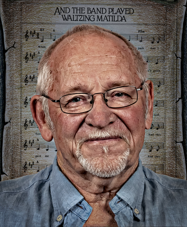
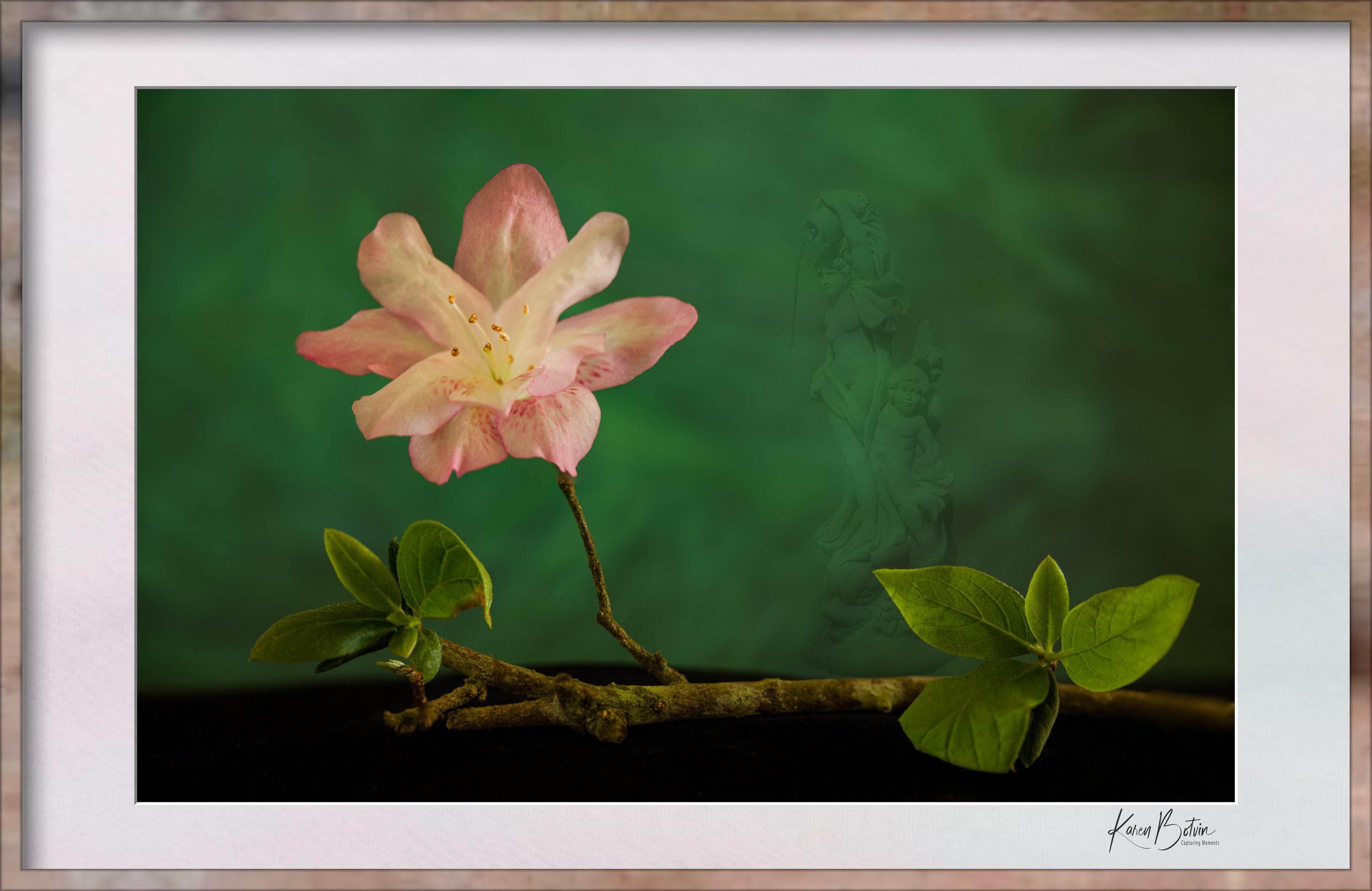
Interesting concepts by adding in the statue and the frame. They add depth. Also the statue helps balance the image by filling in the top right quadrant, but the image does become quite busy.
Maybe the frame gives it credibility. I don't know. The fact that the author framed this image leads me to think that they thought it was worthy of a frame and hence something special.
I am a little distracted by the leaves on the left hand end of the twig. They are just hanging there in space. So I have extended the twig, for my own peace of mind |
Apr 9th |
 |
| 2 |
Apr 20 |
Comment |
I like the composition in your cropped final image, with just the two yachts. Your treatment of the setting sun is excellent. One could say, it is better than the real thing. The overall "golden" tone of the whole image gives it the feel of a warm summer's evening. |
Apr 9th |
| 2 |
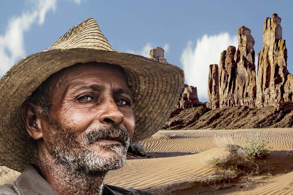
Apr 20 |
Comment |
Thank you Mark. As I mentioned in my preamble, I was working on Original 1 as a stand alone landscape when I thought of merging the two images. I think it has worked out well. |
Apr 7th |
| 2 |
Apr 20 |
Reply |
Thank you, Beverley |
Apr 7th |
| 2 |
Apr 20 |
Reply |
Thank you for your kind comments, Shirley. It was Woody Guthrie's song, The Deportee, that brought the two images together in my mind. |
Apr 7th |
| 2 |
Apr 20 |
Reply |
Thank you for your kind comments, Harry |
Apr 7th |
| 2 |
Apr 20 |
Comment |
I like the composition of the image. You have five flowers, and the "rules" tell us that an odd number of objects is usually preferable.
The image appears a little soft with the exception of the hard edge of that prominent green leaf in the lower right quadrant. Maybe the stamens of the large flower could have been tack sharp, making it the focus of the image and leading us to believe that the softness of the image was your intention. On the other hand it might be my failing eyesight.
The muted background is great and it really makes the foreground stand out.
Did you use focus stacking with this image? |
Apr 6th |
| 2 |
Apr 20 |
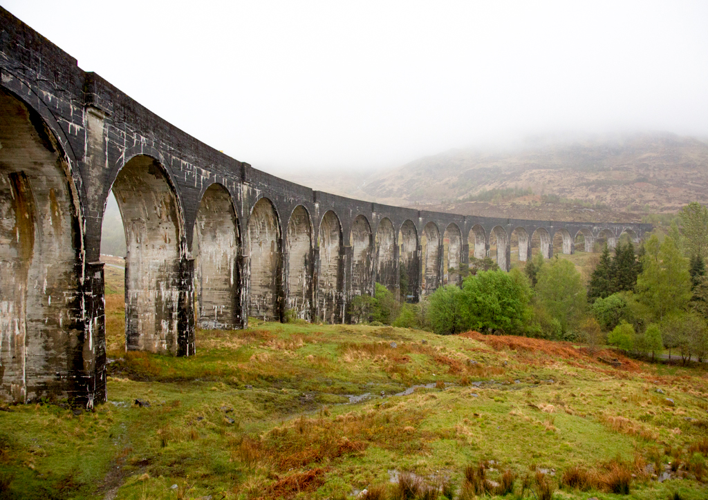
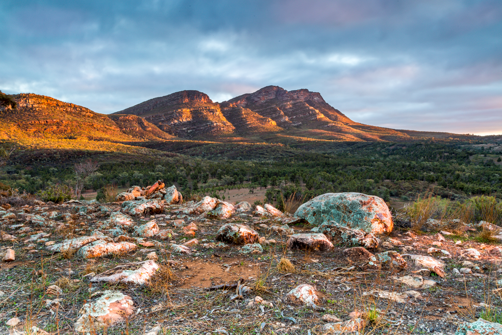
Comment |
It is not often that one has time to compose and capture such a well composed and beautiful scene like this from a moving train. Well done. I like the transformation to B&W but this has created a white halo around part of the ridge line of the mountains. This can easily be removed in Photoshop.
A lovely image. I like it. |
Apr 6th |
6 comments - 3 replies for Group 2
|
6 comments - 3 replies Total
|