|
| Group |
Round |
C/R |
Comment |
Date |
Image |
| 11 |
May 20 |
Comment |
In general I agree with all of your suggestions, but not to the degree shown in your examples. The difference probably lies in our different monitors. My monitor is calibrator to a Gamma of 2.2, White point of 6500K, with a brightness of 120. The image I originally submitted had the elements that have been suggested but slightly darker. I guess this is a downside to digital, in that viewing the same image , everyone sees it slightly different. Having said that, I will be working on making the update based on your feedback. Thanks |
May 18th |
| 11 |
May 20 |
Comment |
I like the way the flower stands out on the black background, yes retains its softness. Nice job on lightening the petals while enhancing the detail in the water drops. Good detail in the stem. |
May 18th |
| 11 |
May 20 |
Comment |
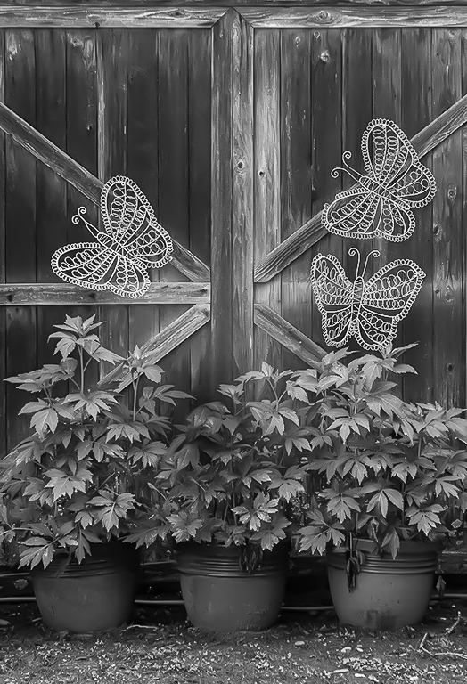
I agree with Allen's square crop suggestion and Henry's suggestion to brighten the fern. |
May 18th |
| 11 |
May 20 |
Comment |
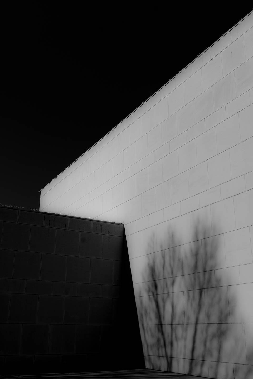
I am a big fan of texture and find this image very pleasing. B&W is much better than the color. All the elements work well with good detail in the shaddows. |
May 18th |
| 11 |
May 20 |
Comment |
Fantastic image. I love the expression on both children. I prefer the B&W to the color. It allows my eye to focus on the expressions rather than the colors. I would hang this on my wall and it would bring a smile to my face every time I looked at it. |
May 18th |
| 11 |
May 20 |
Comment |
Overall very nice image. I agree with Jim about darkening the flower in the lower right. |
May 18th |
6 comments - 0 replies for Group 11
|
6 comments - 0 replies Total
|