|
| Group |
Round |
C/R |
Comment |
Date |
Image |
| 11 |
Jan 20 |
Comment |
I like both versions. To me they make a great sequence. I first see an inviting location to sit down, relax, and enjoy the view, the the second image completes the story with a person doing just that. I feel that having these images together in one frame would incorporate time into the story. To my eye the original image has excellent contrast, interesting texture, and very nice exposure. Well done on both images. |
Jan 27th |
| 11 |
Jan 20 |
Comment |
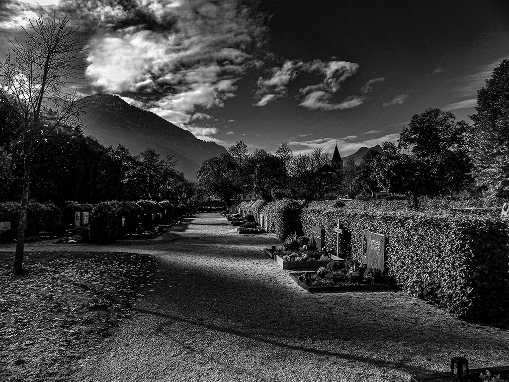
I like the IR image, to me it gives a wintry look. To my eye the hills in the background could have been lightened slightly to give then a sense of being snow covered complimenting the feeling of snow on the foreground grass , trees and shrubs. I feel the white lines emanating from the center of the X expanding the funnel to focus attention on the church and gives the foreground a look of age with its cracked appearance. My apologies for not providing an example of the modifications I am referencing. |
Jan 27th |
| 11 |
Jan 20 |
Comment |
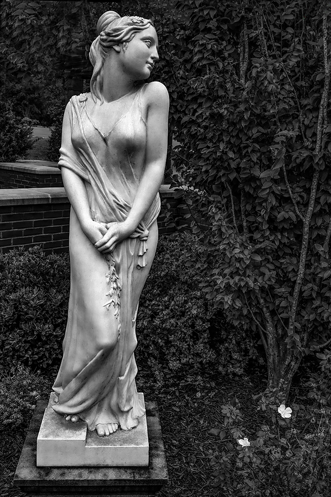
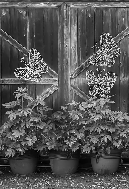
I like the overall composition and the use of thirds both in the placement of the subject and the three elements within the subject. I feel that the background is an excellent choice and compliments the tonal structure of the main subject. I agree with Tom's recommendation to remove the 2 sepals and Henry's suggestion to slightly burn-in the rose on the right. To me it is a very soothing image with the background giving it a very good sense of depth. |
Jan 27th |
| 11 |
Jan 20 |
Comment |
Great image for monochrome. I like the softness of the stems it forces my eye to the buds. Your second version incorporating Tom's recommendations is much better being more dramatic with the increase in contrast and subject stands out against the totally black background. Very nice. |
Jan 27th |
| 11 |
Jan 20 |
Reply |
Tom, thank you. I see what you mean by boosting the color saturation prior to the conversion. One lives and learns. |
Jan 6th |
| 11 |
Jan 20 |
Comment |
You have succeeded in achieving your goal. The increase in sharpening gives the subject that weathered look of a warrior who has fought many battles. Looks like he is part of the Game of Thrones. Good detail in the shadows and good tonal structure. His shoulder looks like he is wearing a shirt. The dark color adds to the overall image. The face is sharp and there is just enough detail in the background to simulate a stockage. I like it.
|
Jan 1st |
| 11 |
Jan 20 |
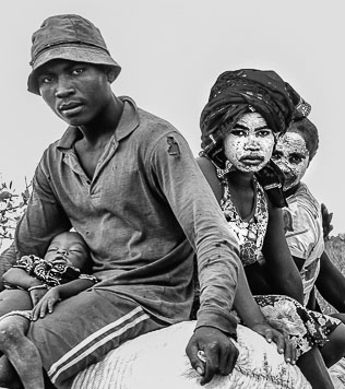
Comment |
I like the concept but to my eye there are too many elements in the image. My eye keeps moving up and down the convoy. I feel that the tonal rage is good and the image is sharp in the left corner and then gets softer moving to the upper right. I think that by focusing on just one element in the image it becomes a stronger statement. Here is one example.
|
Jan 1st |
 |
6 comments - 1 reply for Group 11
|
6 comments - 1 reply Total
|