|
| Group |
Round |
C/R |
Comment |
Date |
Image |
| 20 |
Apr 23 |
Comment |
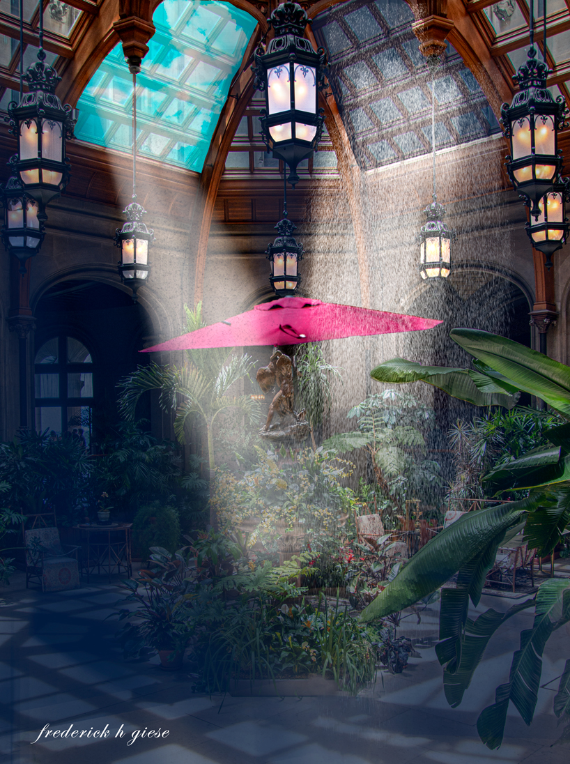
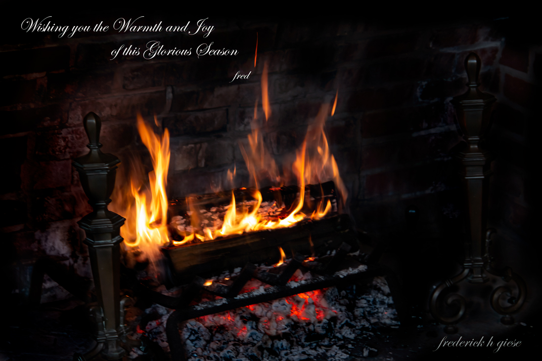
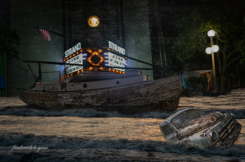
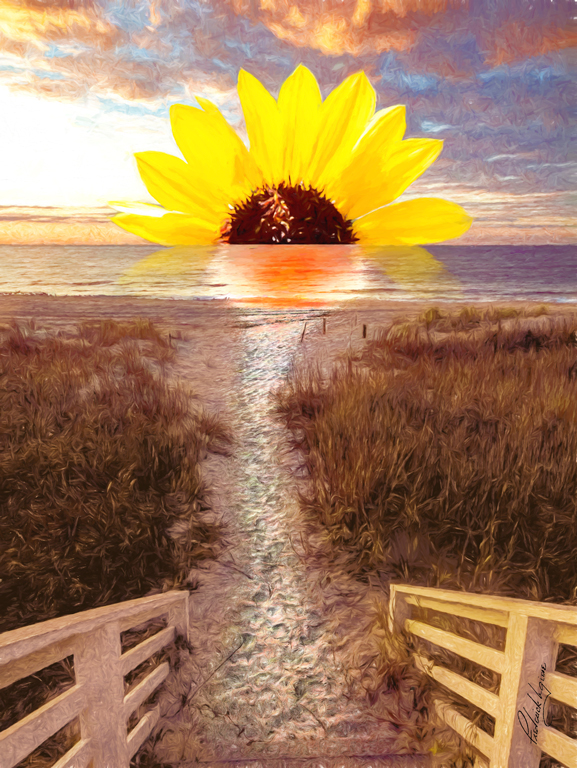
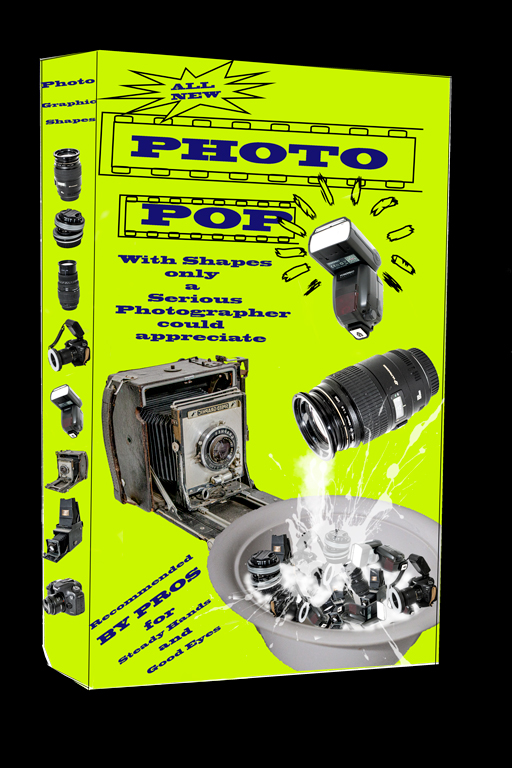
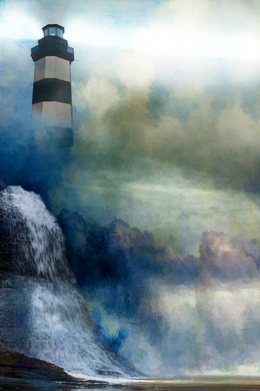
Hi Bob, I am not sure what program you use. I brought your image into PSCC, then using the brush tool went to select subject. It did a pretty good job of selecting the image, but needed some help. Using the quick selection tool added in or subtracted where necessary. Then increased the size to 300% and at a pixel level started deleting some of the black areas to bring out the water drops and splashes. If you have PS that would be the way I would do it. |
Apr 24th |
 |
| 20 |
Apr 23 |
Reply |
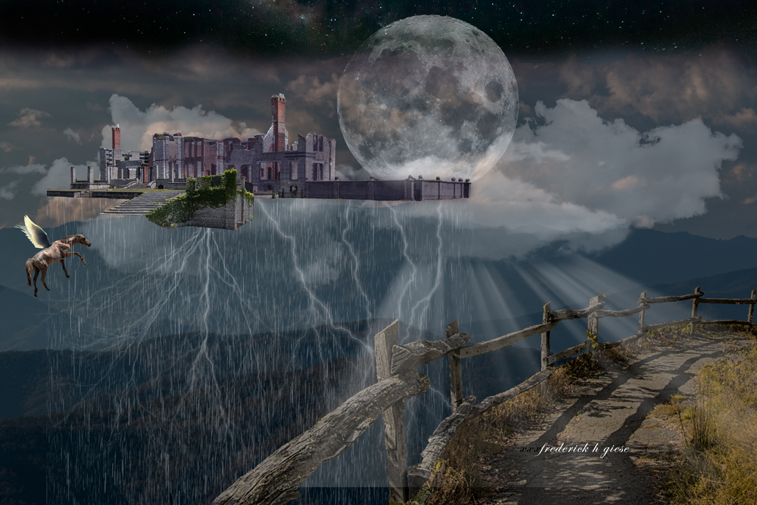
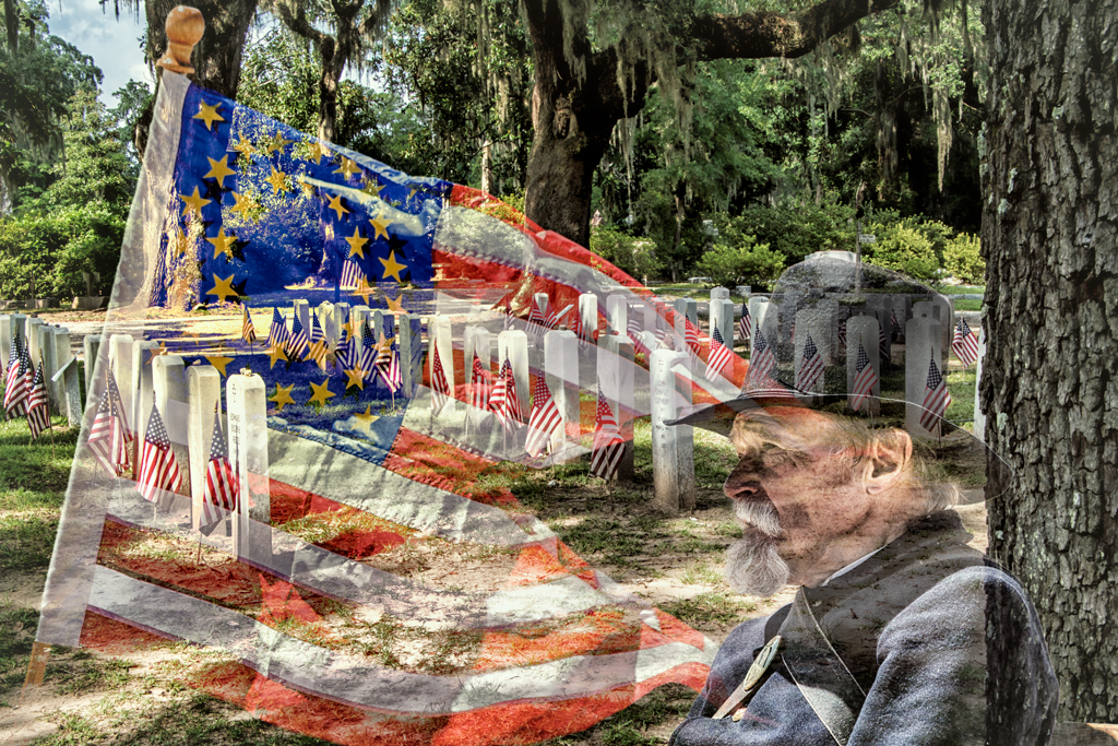
If I am putting thoughts in your head, you are in serious trouble. :} Seriously, text might not be a bad idea. Maybe just his name on top center then dates under or on the side of the other images. Just one of those thoughts entering your head. |
Apr 23rd |
| 20 |
Apr 23 |
Comment |
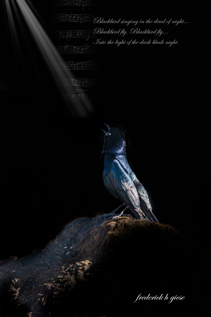
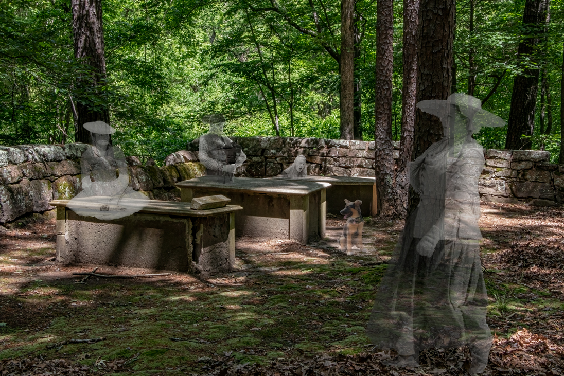
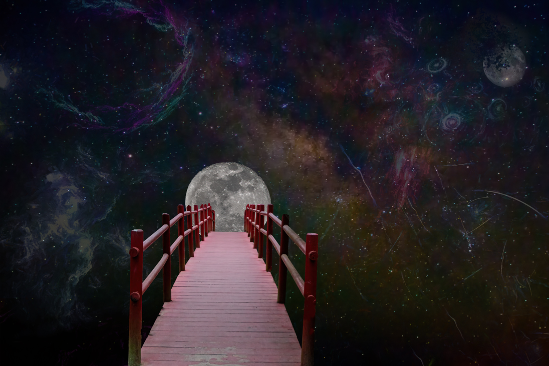
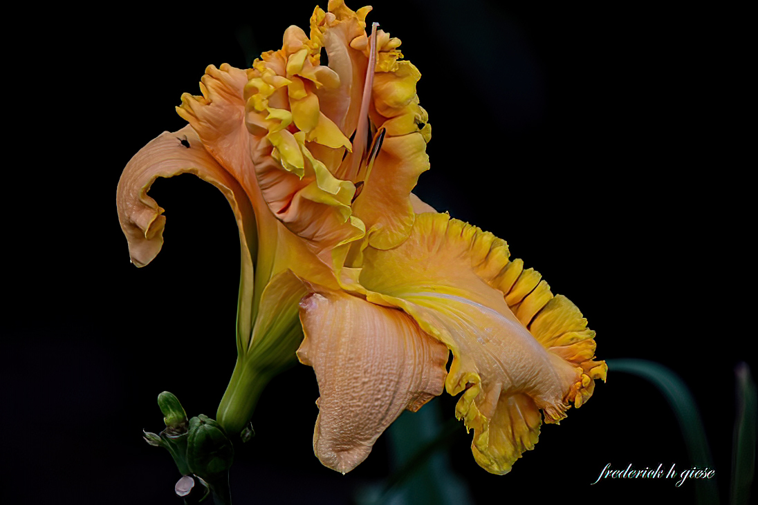
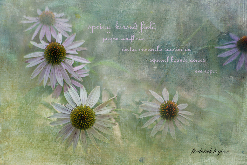
Hi Bob, To begin with, I am not a fan of this type of collage. Having said that, I think you did a really good job in creating this, especially using a consistent tonality. I agree with Angela as to the bottom left image. It would be nice if it were larger by placing the man in the corner, rotating the image to the right and then enlarging as much as feasible. But good job. |
Apr 23rd |
| 20 |
Apr 23 |
Comment |
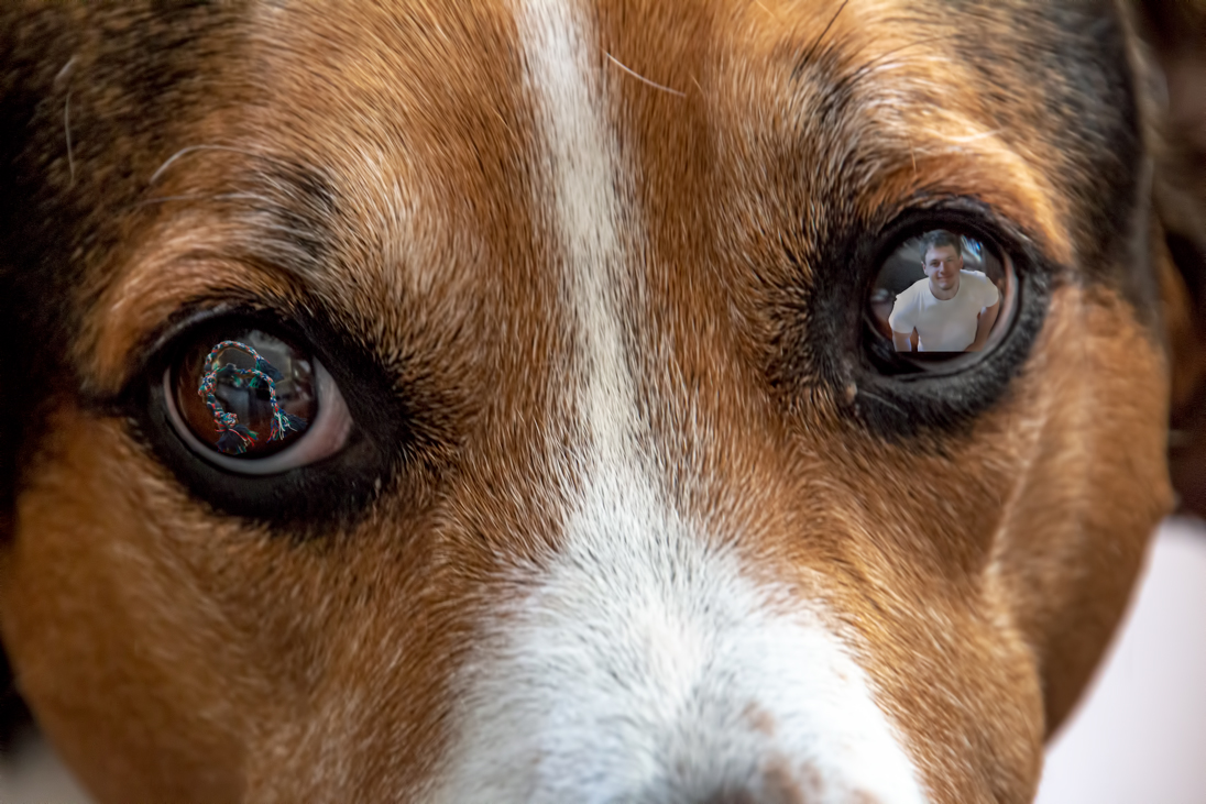
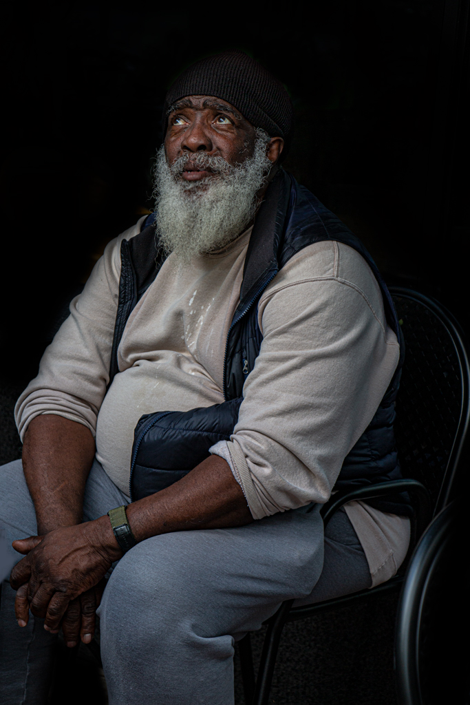
I too liked the color pallet. As to the nose thing, I thought it was a wart. What do I know! Thought it was a great capture.
I liked Sam's rendition. It really did bring out the eyes. Nice job.
|
Apr 4th |
| 20 |
Apr 23 |
Comment |
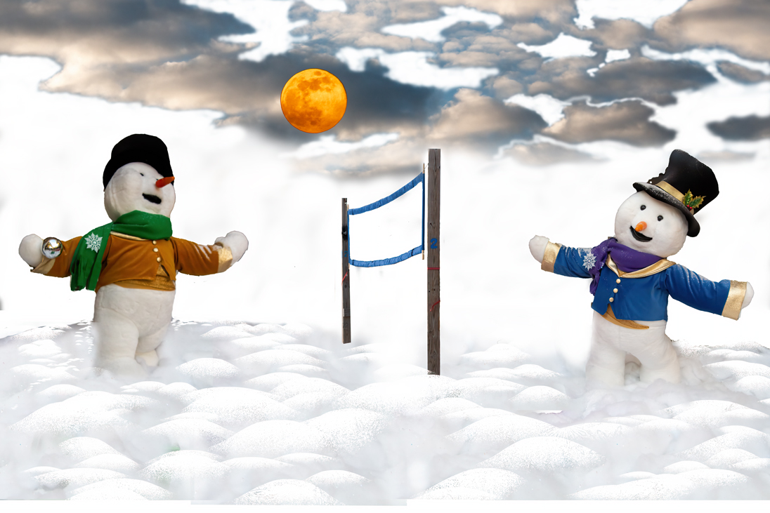
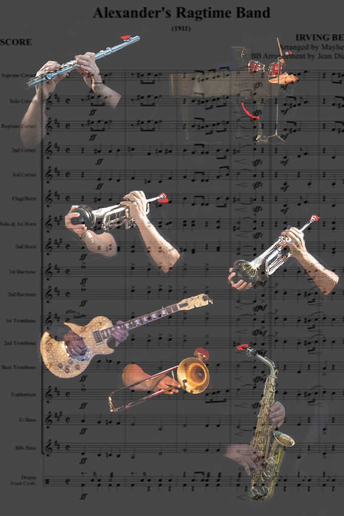
I love it! Especially with all the various poses. The hands are a great plus. Cute fun images. Can't wait for Halloween. |
Apr 4th |
| 20 |
Apr 23 |
Comment |
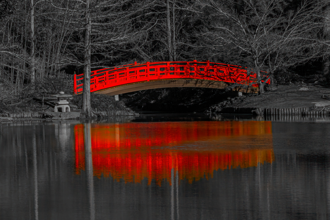
Beautiful rendition of two very nice color images. The B+W is really striking and a good story being told. |
Apr 4th |
| 20 |
Apr 23 |
Comment |
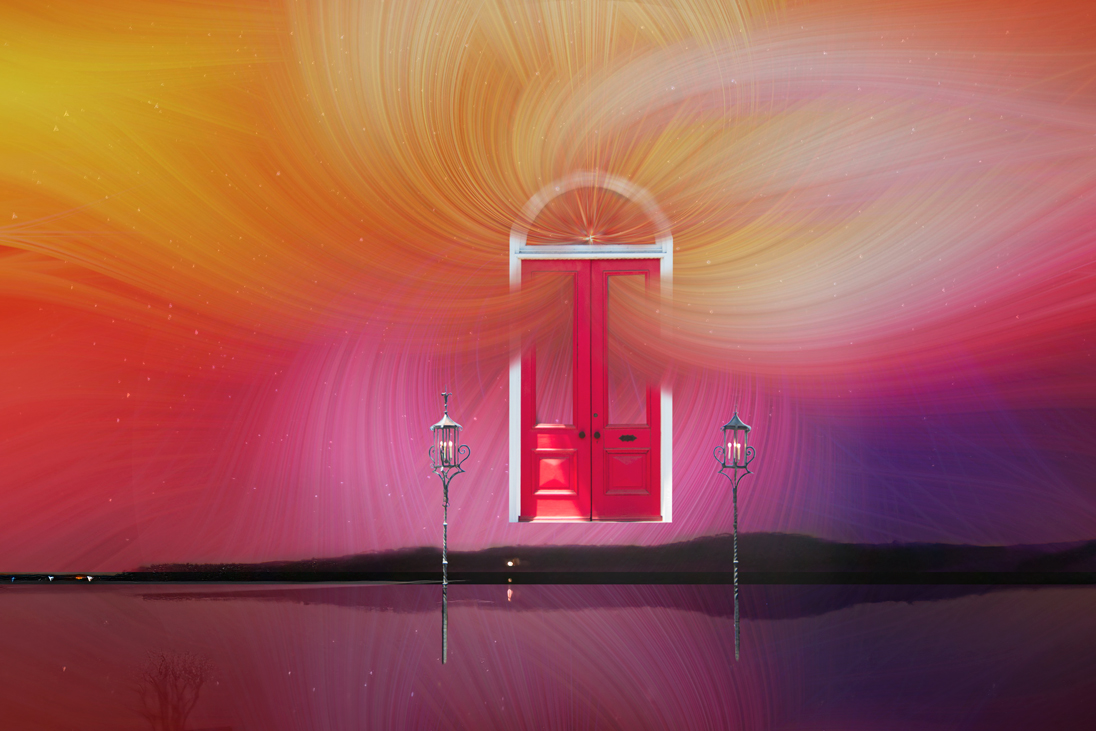
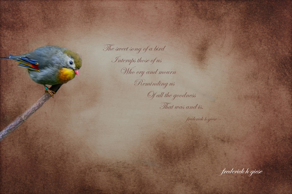
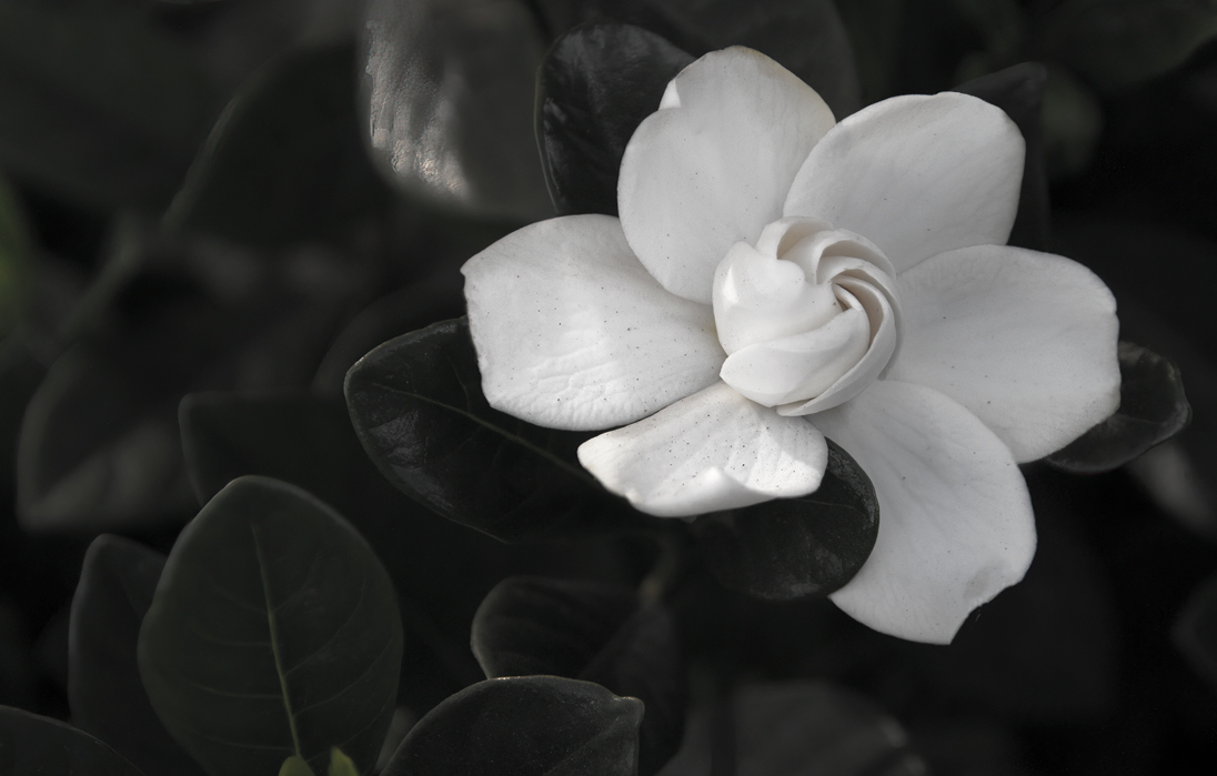
I like this. Very bright and well defined. Good job Shirley! |
Apr 4th |
6 comments - 1 reply for Group 20
|
| 24 |
Apr 23 |
Reply |
It's a small world. Please say hi to the "old timers" for me. I am a Past president of the club. And you are right, it is a great club with lots of expert photographers and down right nice people. |
Apr 23rd |
| 24 |
Apr 23 |
Comment |
Very nice image, well balanced keeping the eye moving in a triangular pattern. It does need some cleanup as Bev pointed out but, Nice Job. |
Apr 23rd |
| 24 |
Apr 23 |
Comment |
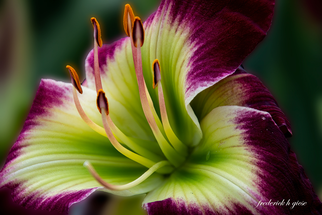
Hi Yvonne and welcome to the group. I used to live in Mesa and Sun Lakes as well, SC now. Love your image, but as already said the flower in front of the wood, reduced highlights, tighter crop and as Lance said "Work the subject" Lance talks more than me :}. Again Welcome! |
Apr 23rd |
| 24 |
Apr 23 |
Comment |
Would not suggest a thing. Beautiful image! |
Apr 23rd |
| 24 |
Apr 23 |
Comment |
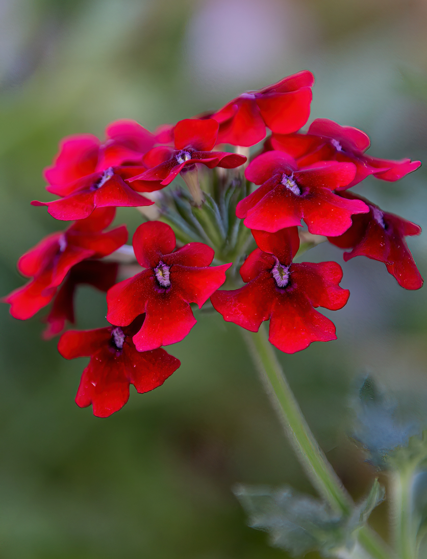
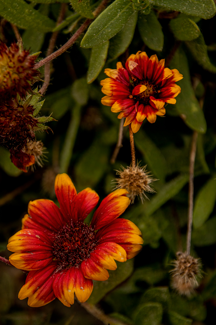
Nice image Lance. Normally I would say there is too much grain and the background is too busy. However, attempting to understand your concept, I think you did a great job in achieving what you wanted to do, |
Apr 23rd |
| 24 |
Apr 23 |
Comment |
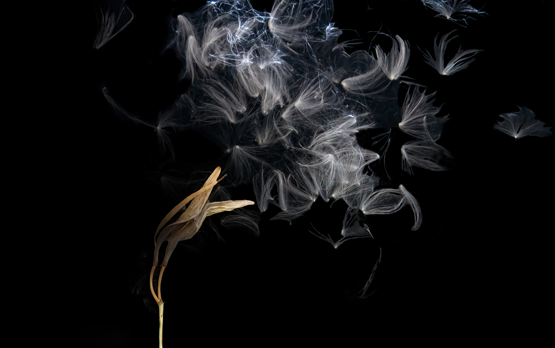
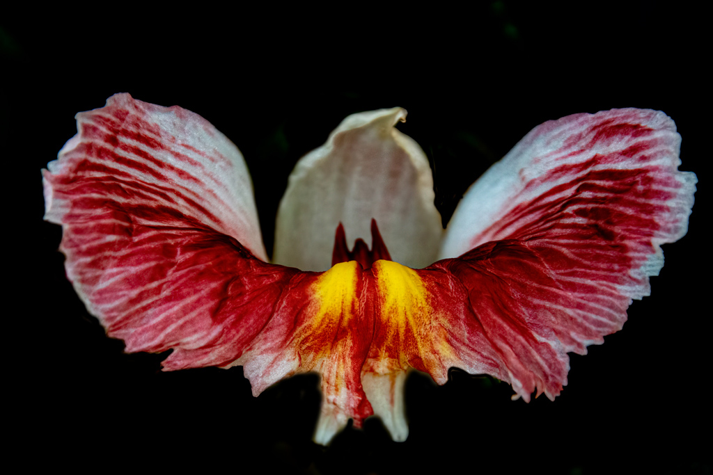
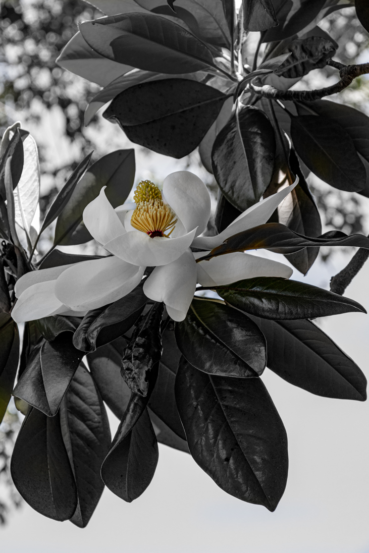
Beautiful image! Sharp, clean, detailed. Everything you would want in a minimalistic image. Nice job! |
Apr 23rd |
| 24 |
Apr 23 |
Comment |
|
Apr 23rd |
 |
| 24 |
Apr 23 |
Comment |
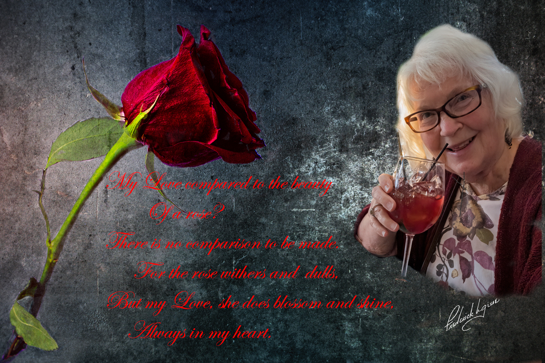
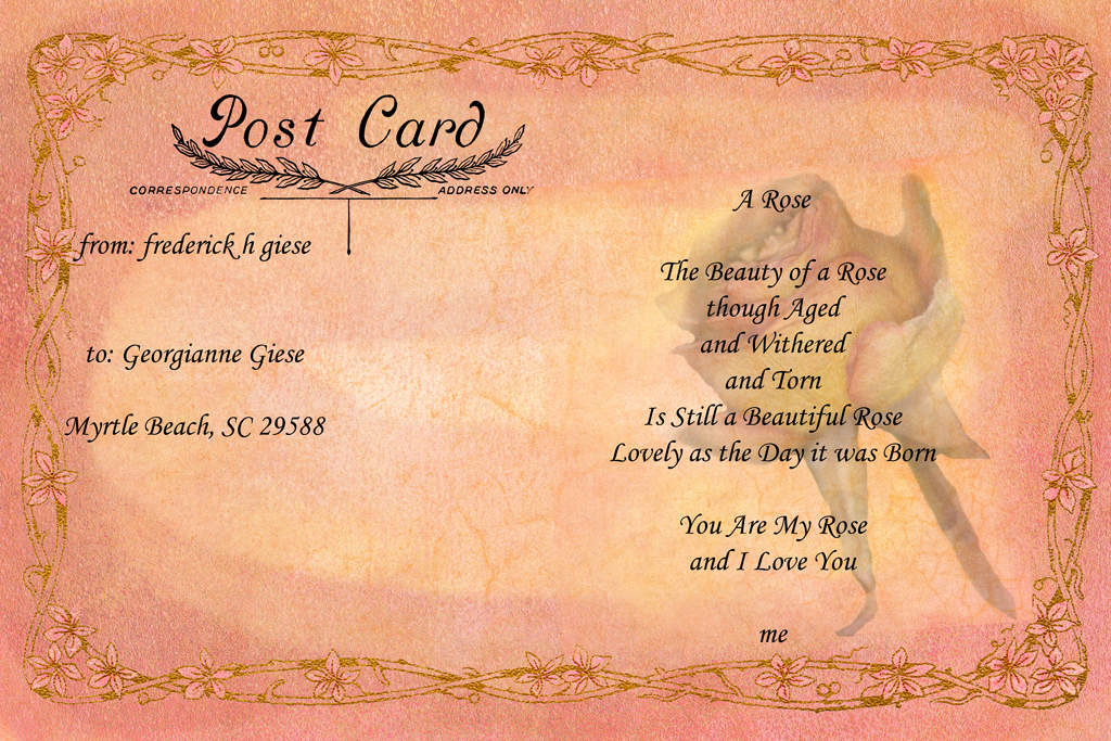
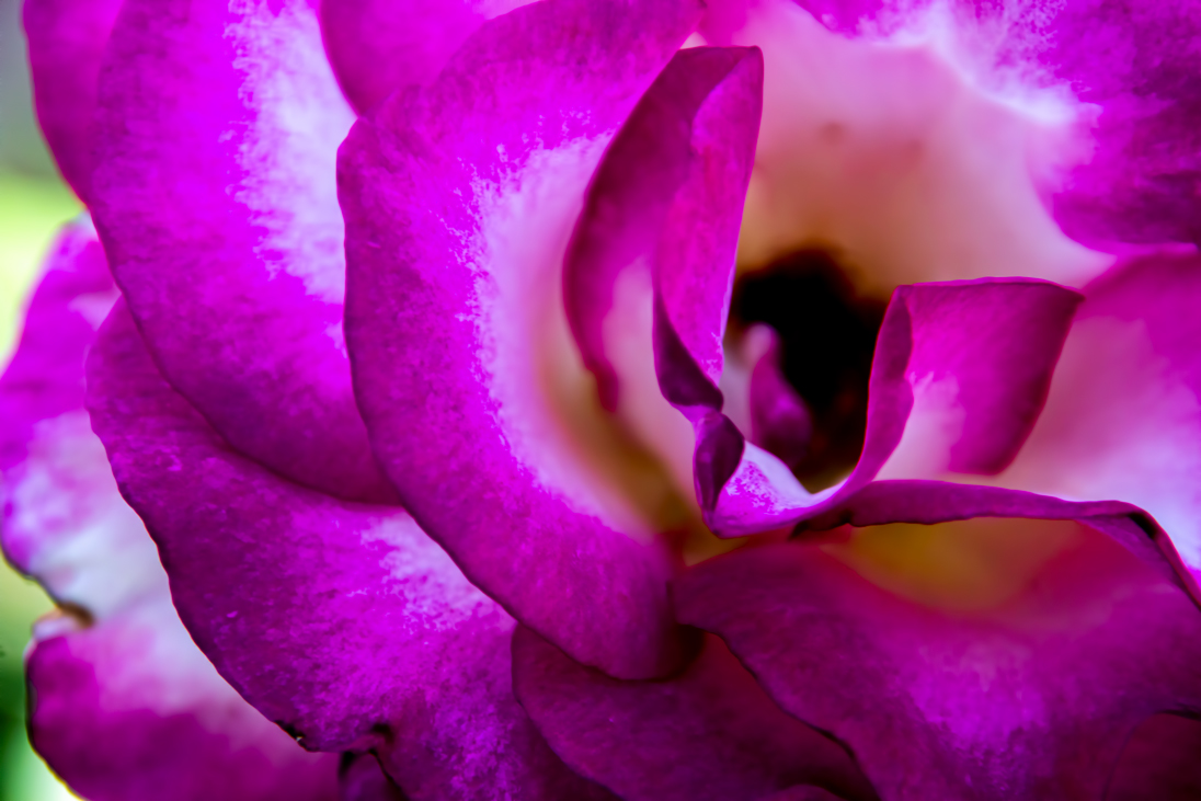
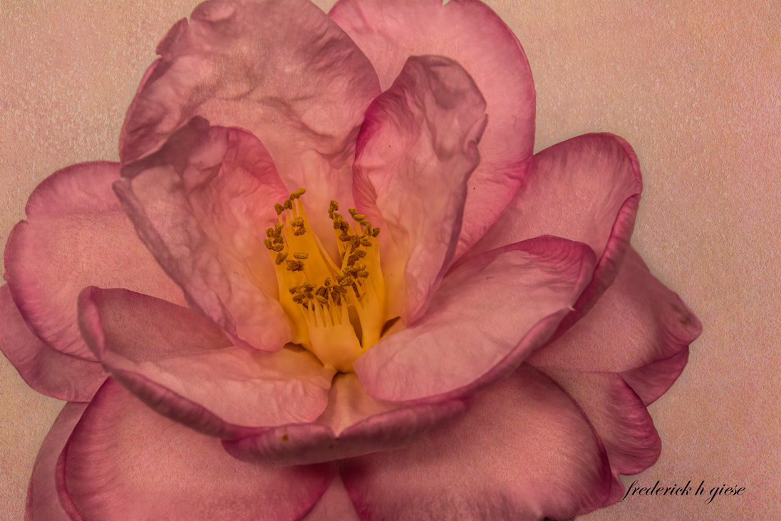
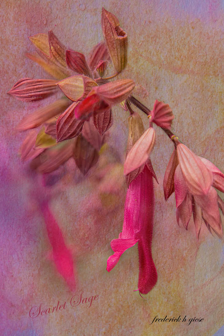
As stated, it is a beautiful rose. I agree with Lance as to the toning down of the pink. I also think that the texture is the wrong one for the color of the rose and looks as if the rose is cut and paste on to it. You might be better off placing the texture over the rose, reducing the opacity of the texture (so you can just see the rose) painting the texture off the rose with a soft brush at 30-40% opacity several times, leaving the edges slightly covered, then upping the opacity of the texture until you find something you like. Also, the stem is very animated. I would suggest going to another image, copying the a stem and positioning it the way you did. I see you wanted to ground the rose, which is good, but need to look natural. |
Apr 23rd |
7 comments - 1 reply for Group 24
|
13 comments - 2 replies Total
|