|
| Group |
Round |
C/R |
Comment |
Date |
Image |
| 20 |
Nov 22 |
Reply |
Hi Bob, Kinda liked what you did with the color grading, just seems a little too dark. But thanks for working on it. Question: What is EAP? |
Nov 8th |
| 20 |
Nov 22 |
Comment |
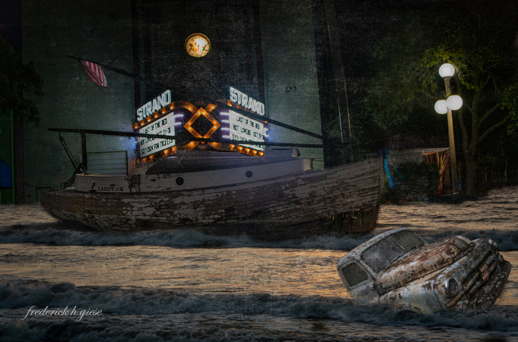
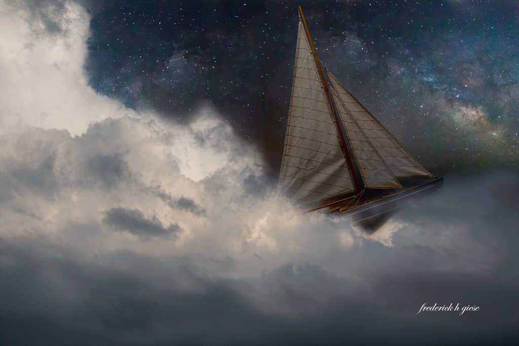
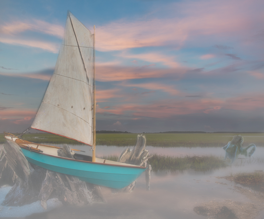
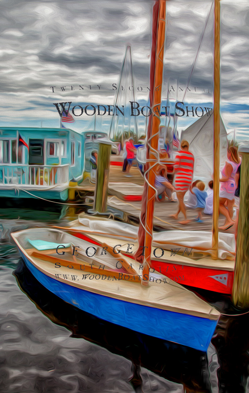
Bob, love the concept and the colors. I think you did a really good job with the blending. Two things I would suggest is at the bow of the boat you can see what I believe is the stand the boat was sitting on (which can be easily content awared out) (just made up a word). The other thing I would do is take a splash brush and apply just a little to the tip of the bow and then feathered down towards midships. Good job. |
Nov 3rd |
| 20 |
Nov 22 |
Reply |
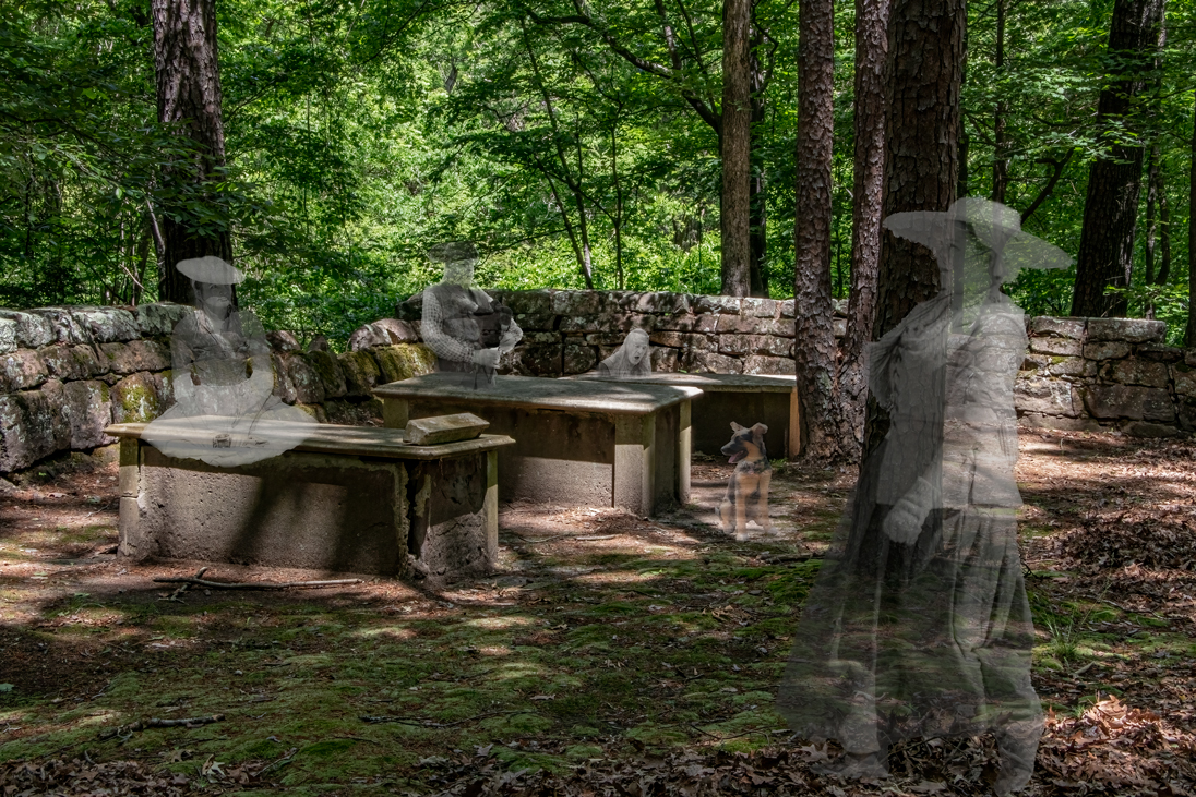
Only the old ghosts, nighttime is past their bedtime. |
Nov 3rd |
| 20 |
Nov 22 |
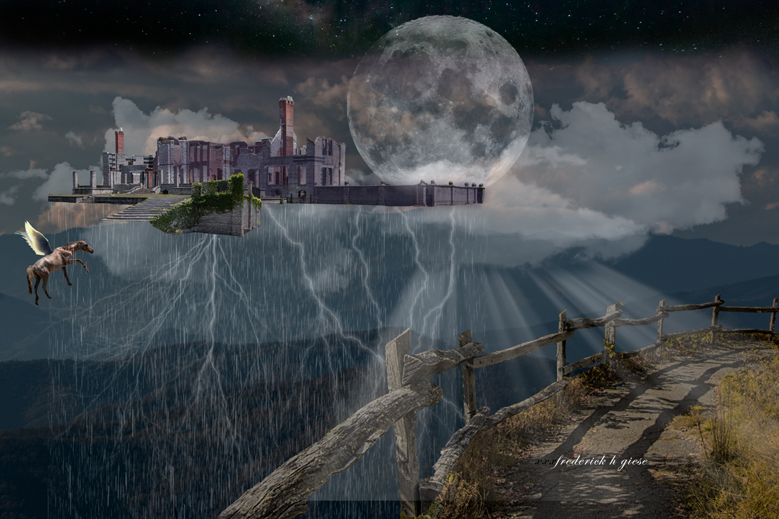
Comment |
Great image Angela. Straight out of camera, right? Nice job with the day to night and positioning of the witch. I agree with Sam that the moon should probably be slightly darker, otherwise the landscape would be much brighter, being almost full. Having said that, the brightness of the moon aids in the silhouette really standing out. Flip a coin. BTW excellent job on the lights in the windows and door. |
Nov 1st |
| 20 |
Nov 22 |
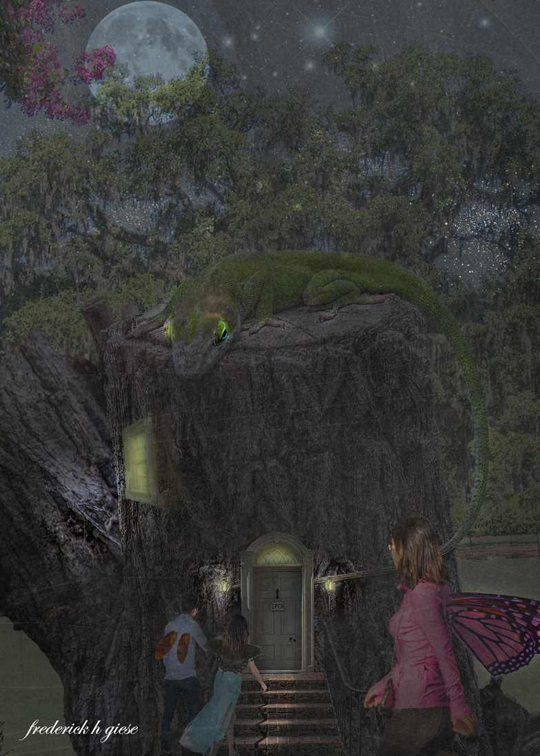
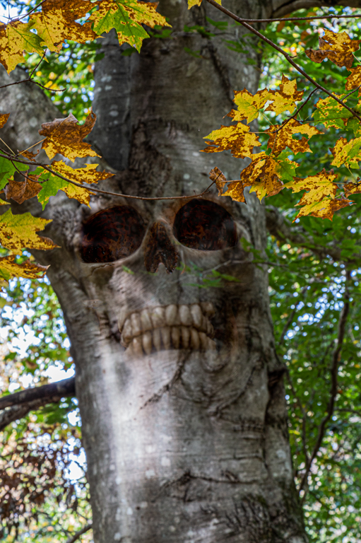
Comment |
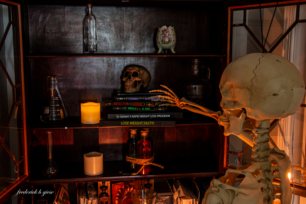
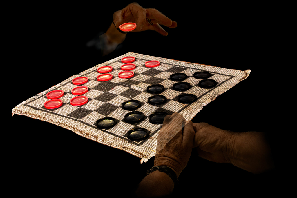
There used to be a bar I would go to after four-wheeling all day, which had the same décor. Old hats left behind and dollar bills on the walls and ceiling, Loved that place, love your image. Really brought back good times and fond memories. The texture application really adds, in my opinion. |
Nov 1st |
| 20 |
Nov 22 |
Comment |
Sam, I love this one. Believe it or not I like minimalistic images. This one reminds me a little of Don Quixote. I agree with Angela about the separation of the horses neck and body. Looking at your original, the arms are raised higher and there is more of an opening with the horse, not that it makes any difference, but could you have used a different image?Whatever, love the image and concept. |
Nov 1st |
4 comments - 2 replies for Group 20
|
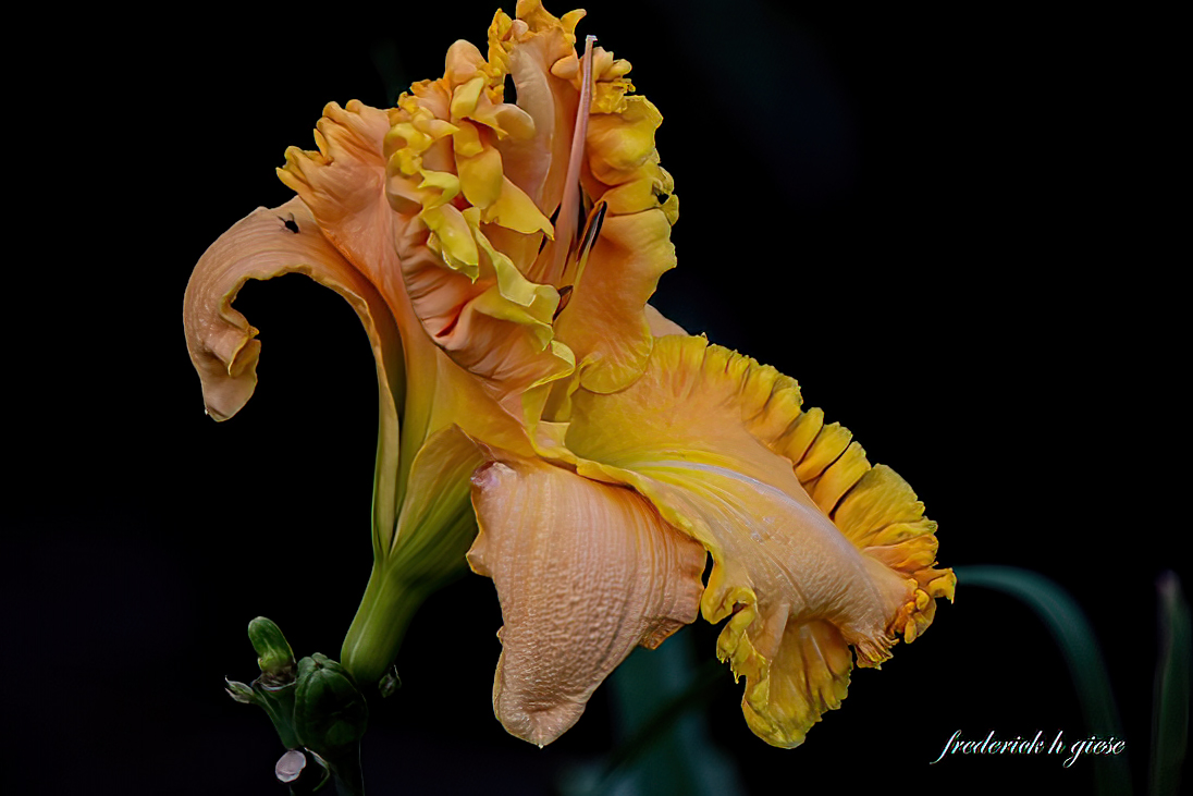
| 24 |
Nov 22 |
Comment |
I agree with Lance on the clarity issue. I noticed that clarity with ICM is less important with the vertical movement (up and down of the camera) than horizontal (sideways). I guess it is just the way the brain thinks. However, I commend you for trying and working at a technique that may look easy to do, bus is not. |
Nov 19th |
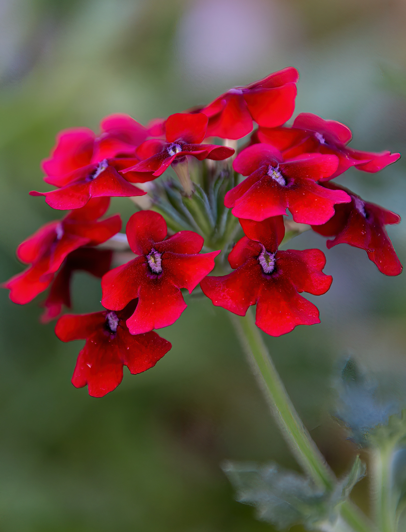
| 24 |
Nov 22 |
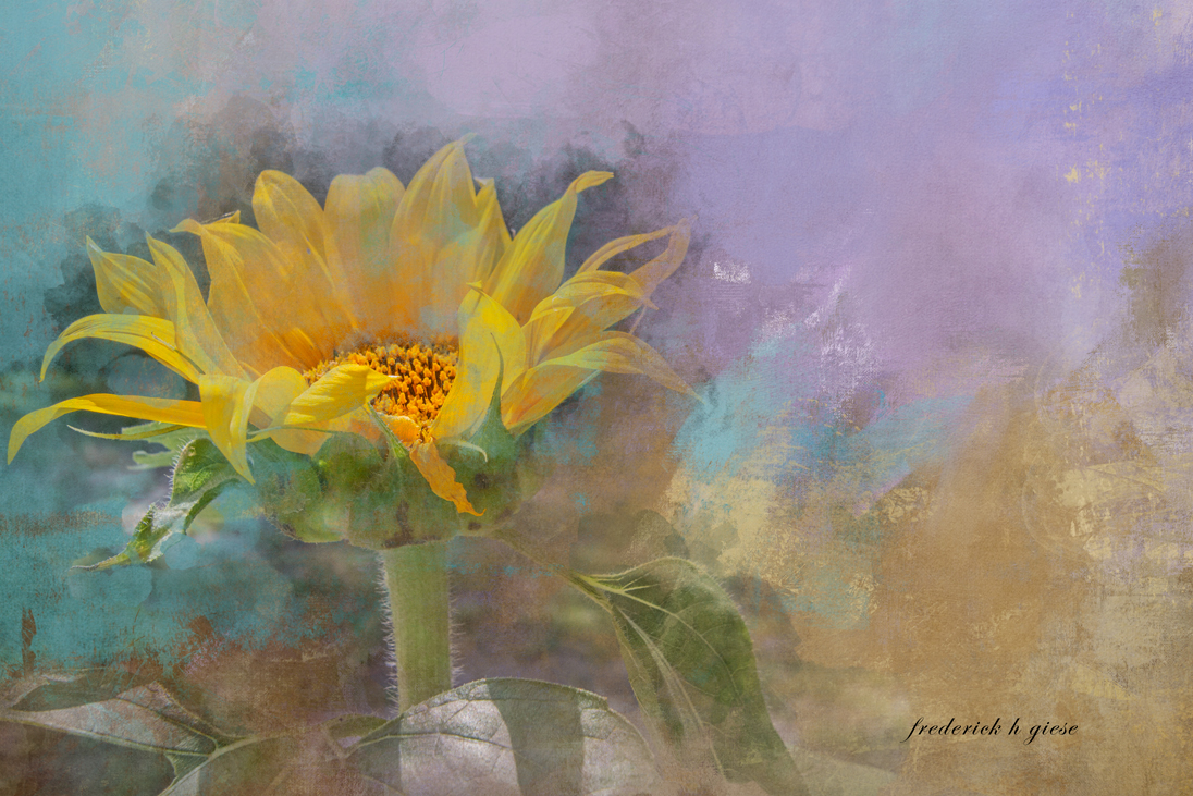
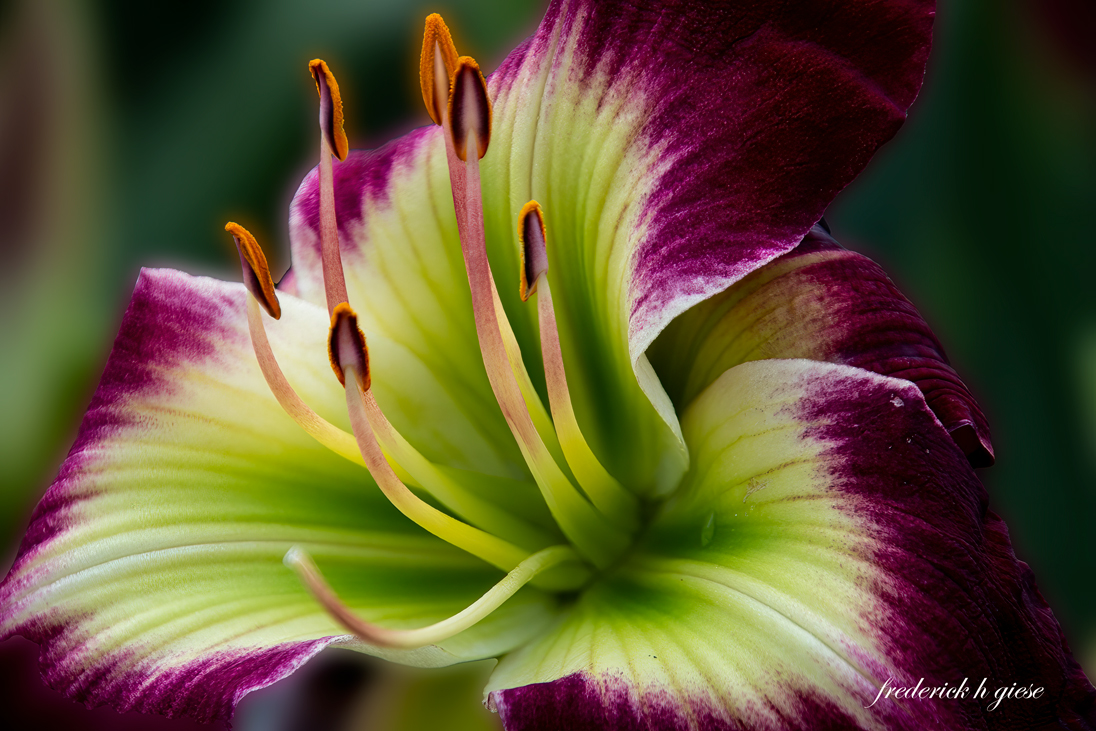
Comment |
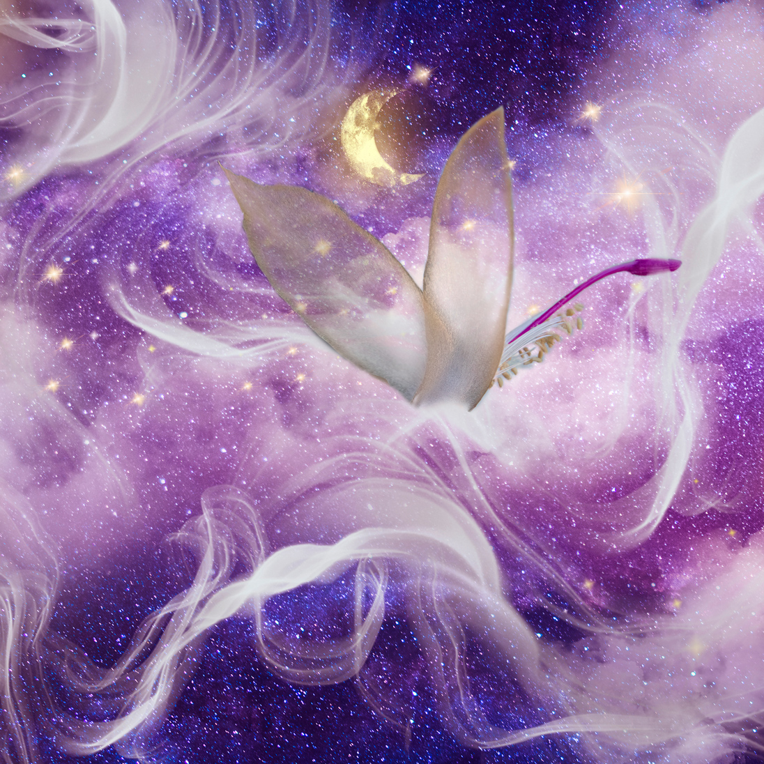
Interesting image. First of all, I love yellow, bright yellow. However, in my opinion, surrounded by these pinks and reds it just jumps out too much. I think I would lower the saturation a small amount and then selecting the yellow flowers, lower the highlights and increase clarity to bring out all the nuances in the center of the flowers. |
Nov 19th |
| 24 |
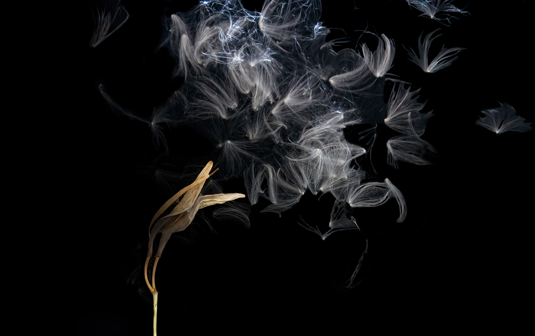
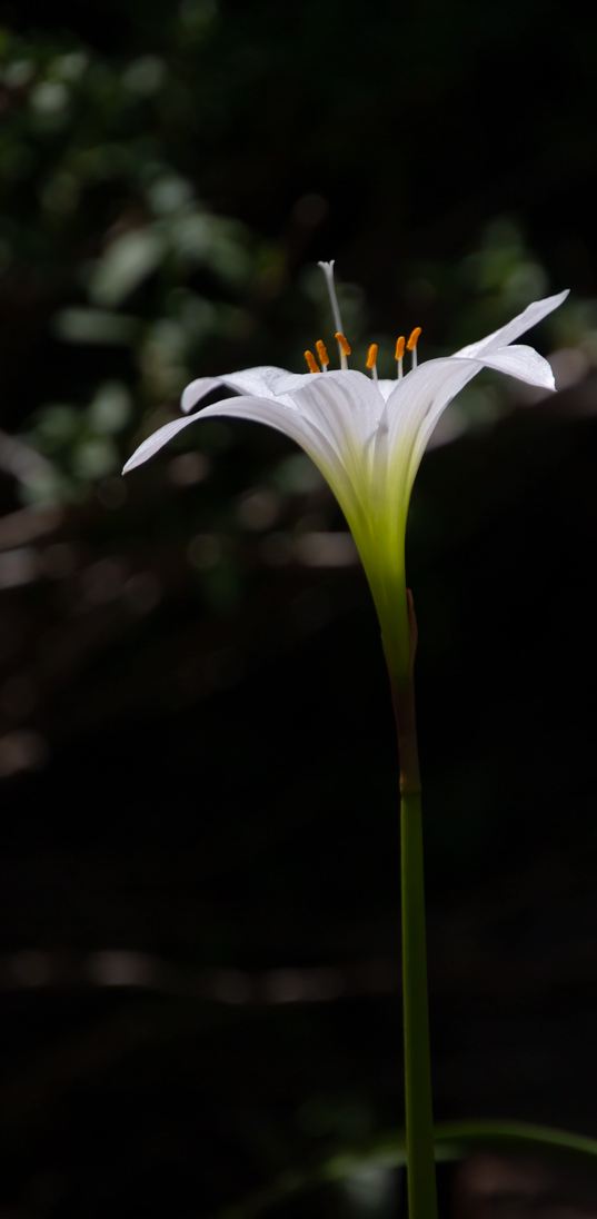
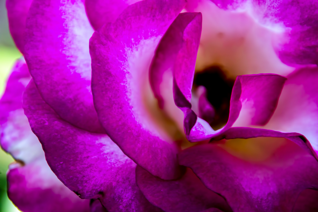
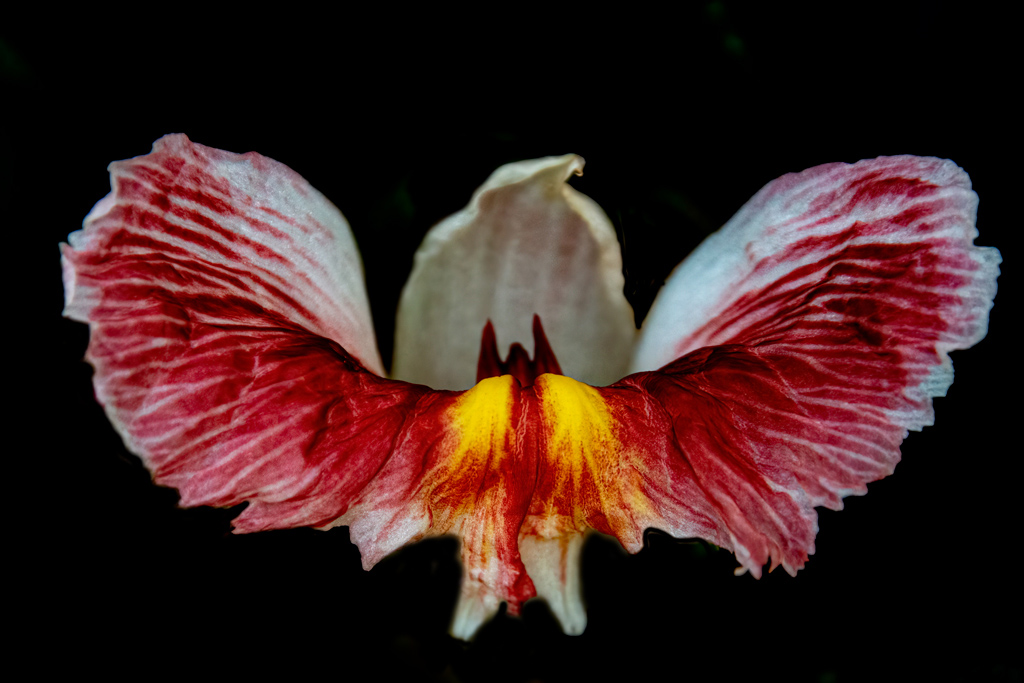
Nov 22 |
Comment |
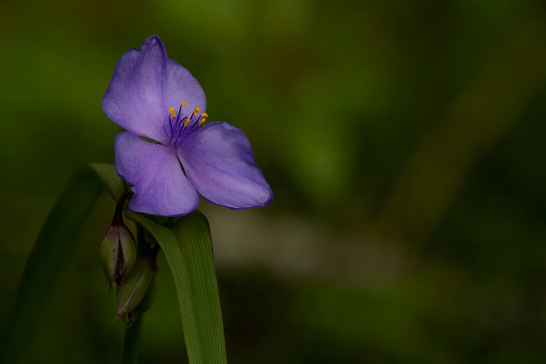
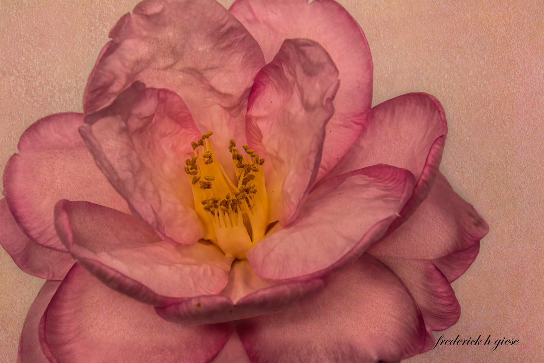
Nice image. I agree with the rest on the background being black or dark. It seemed to me to bland originally and it is too beautiful of a flower to be looked at blandly. |
Nov 19th |
| 24 |
Nov 22 |
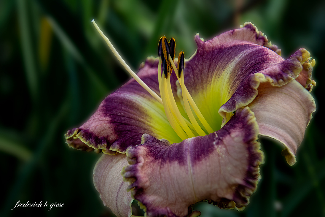
Comment |
Lance, I don't care what you say...I like it! The three dimensional aspect is really great. I think I would have liked the forefront flower just a tad bit sharper but that is nitty. This image is visually captivating. BTW Thanks for the bracketing article. Very interesting. |
Nov 19th |
| 24 |
Nov 22 |
Comment |
Hi Bev, I like your orchids however I am not a fan of the green background, nor the glitter. I also think that the orchid should be anchored somehow. Sorry. |
Nov 1st |
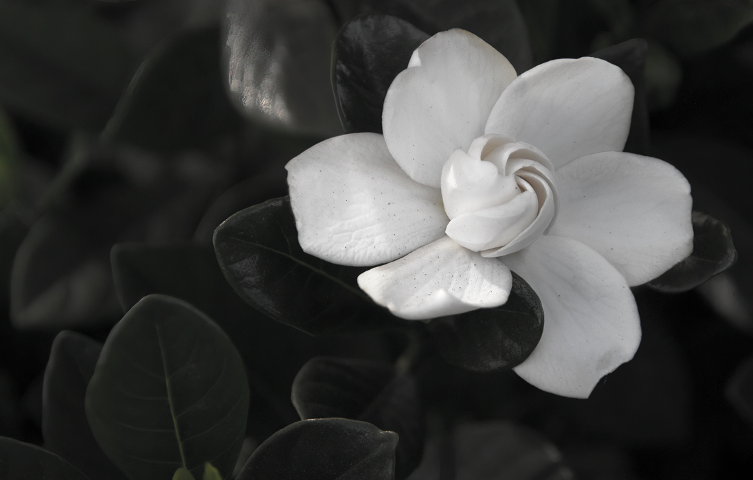
| 24 |
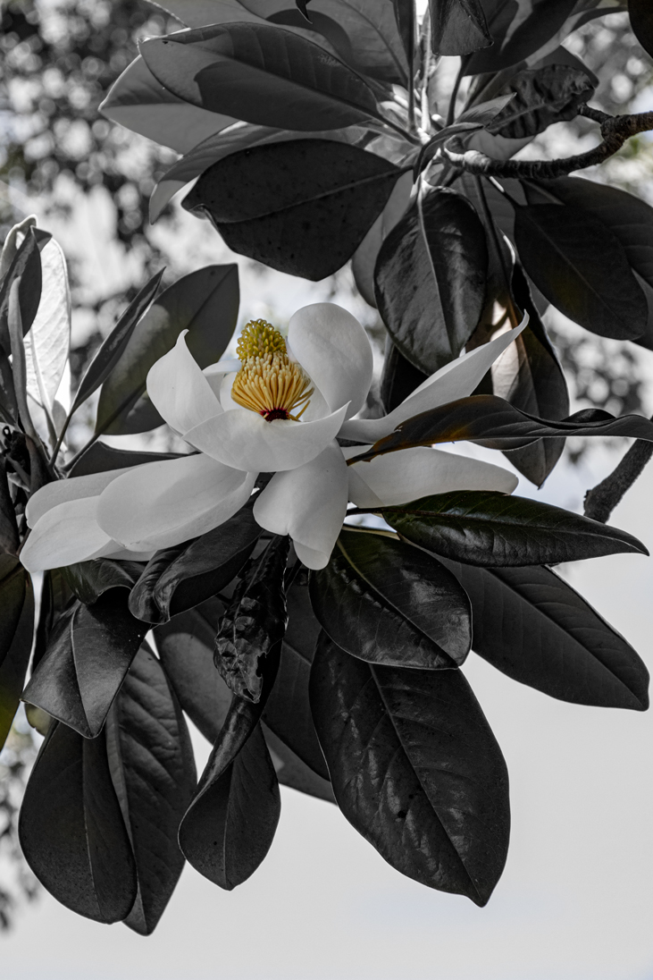
Nov 22 |
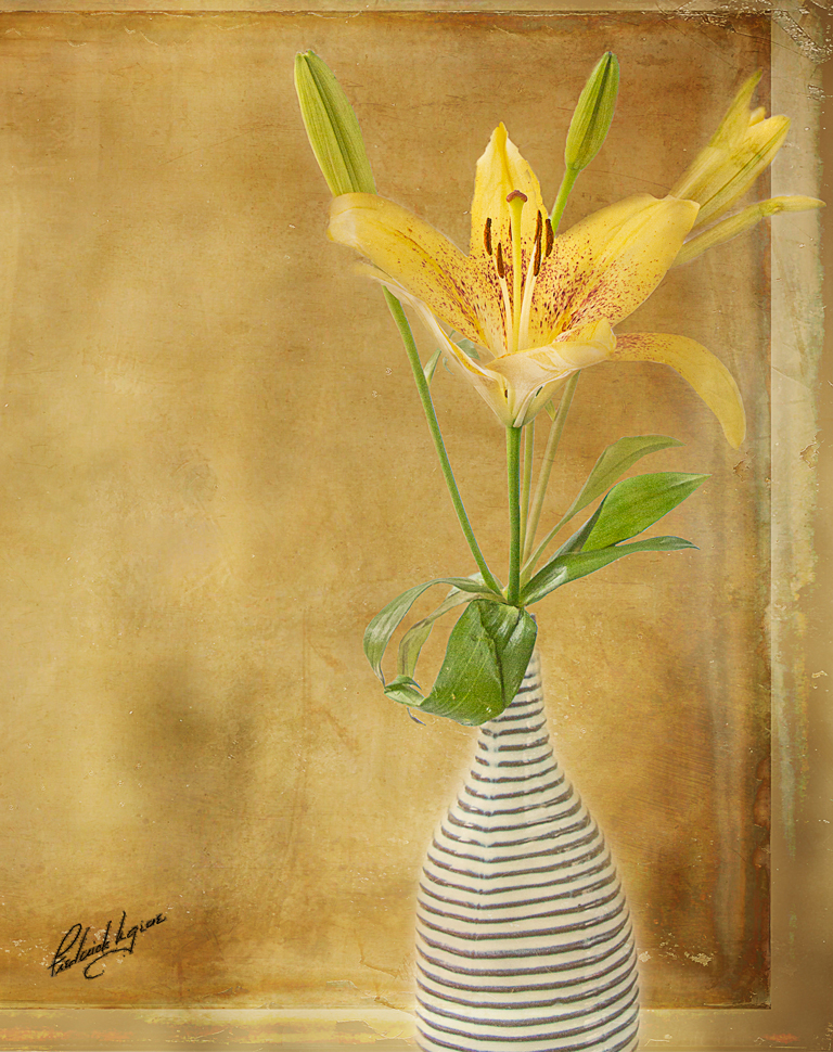
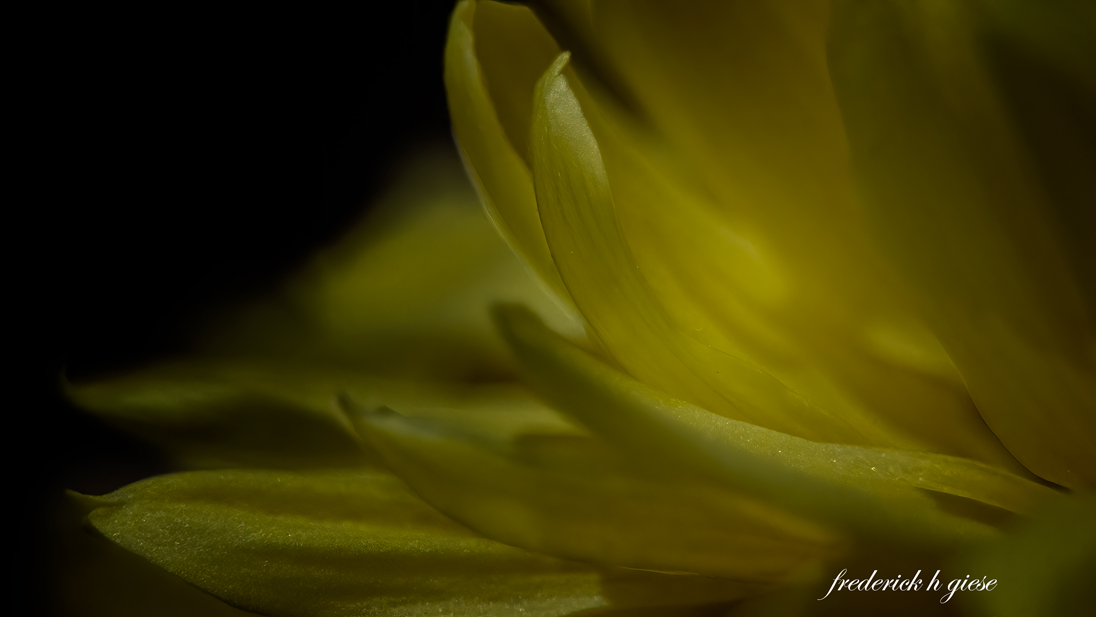
Comment |
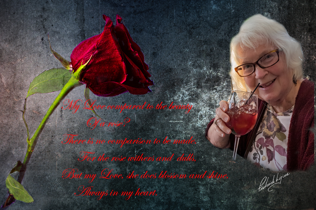
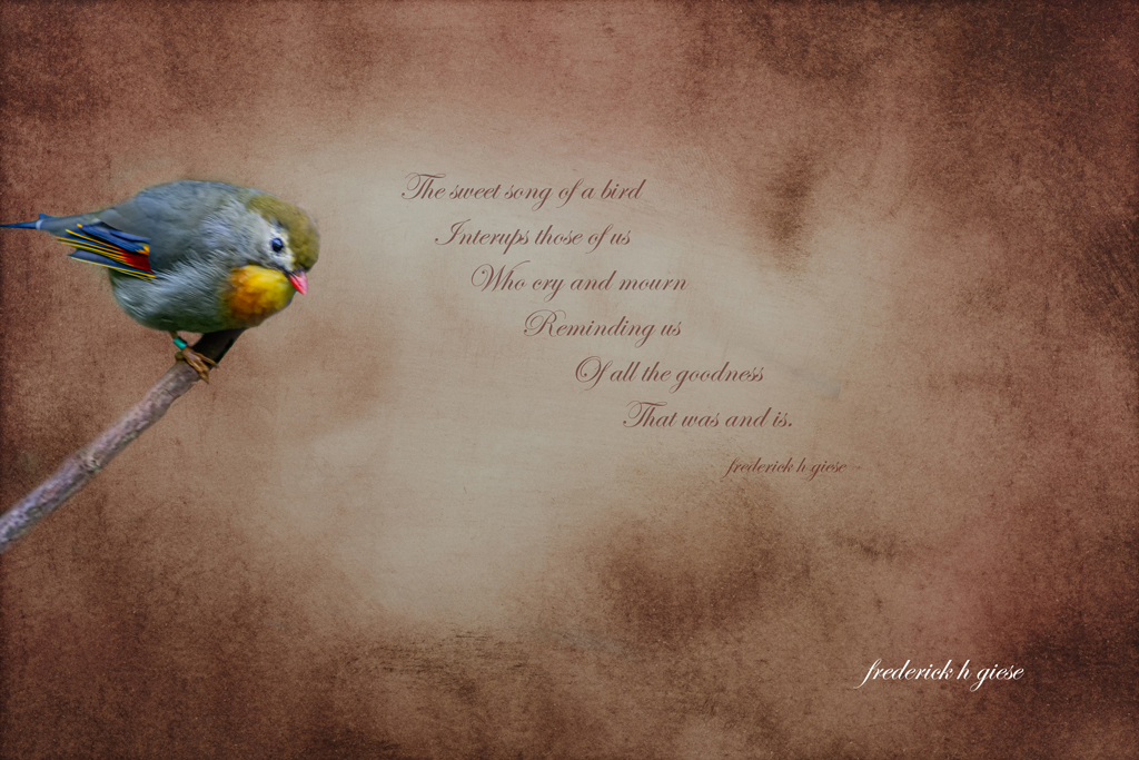
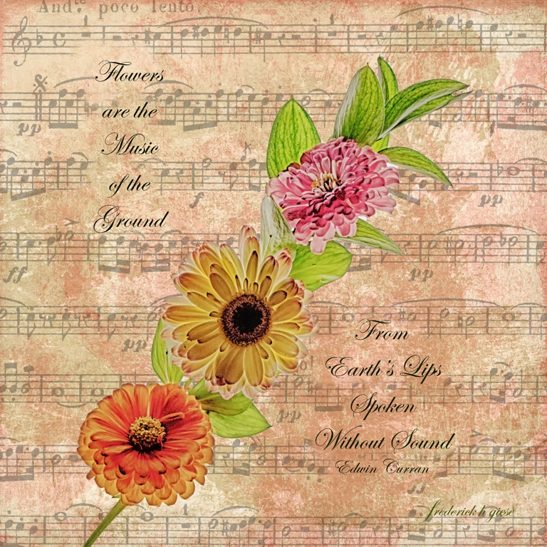
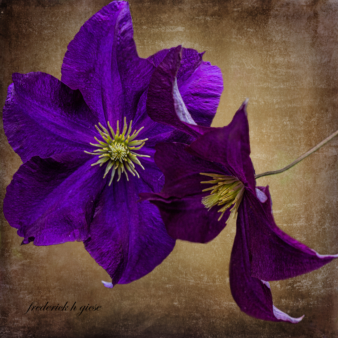
Gorgeous image, beautiful flower, background, textures, all very nicely done.
|
Nov 1st |
6 comments - 0 replies for Group 24
|
10 comments - 2 replies Total
|