|
| Group |
Round |
C/R |
Comment |
Date |
Image |
| 20 |
Jul 22 |
Reply |
Just a quick comment to Bobs' reference to PSA Guidelines. Remember this is a "Creative" group which means anything goes to enhance your creative vison. |
Jul 13th |
| 20 |
Jul 22 |
Reply |
Thanks. Nice play on words. I have more external hard drives then I care to think about. At times it makes it difficult to find what you want or need. That is why I normally use a new or semi-new image for all my DD20 stuff, so much easier to find.
|
Jul 13th |
| 20 |
Jul 22 |
Reply |
Thank You |
Jul 13th |
| 20 |
Jul 22 |
Comment |
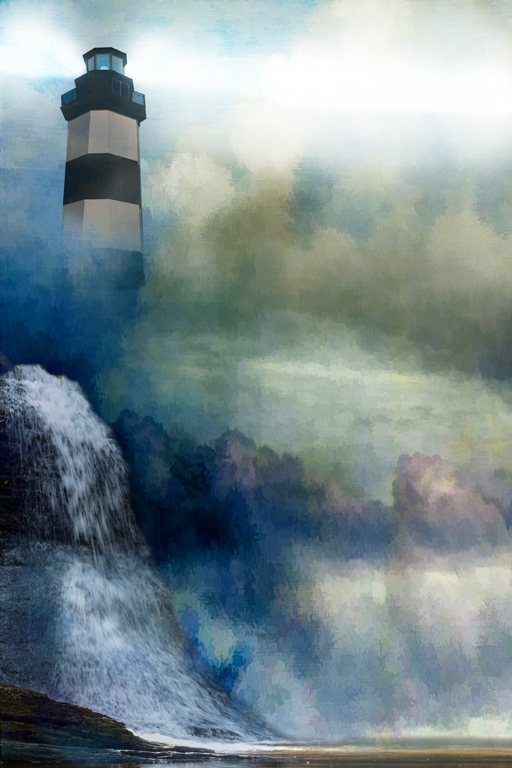
Hi Ham, Nice job on the lighthouse. Bringing out the texture and adding the lights really added to the overall feel. |
Jul 8th |
| 20 |
Jul 22 |
Comment |
Hi Shirley, I really like what you did to this to bring out some excitement. If anything, I think I would put it through a noise reduction program. Otherwise, very, very nice. |
Jul 7th |
| 20 |
Jul 22 |
Comment |
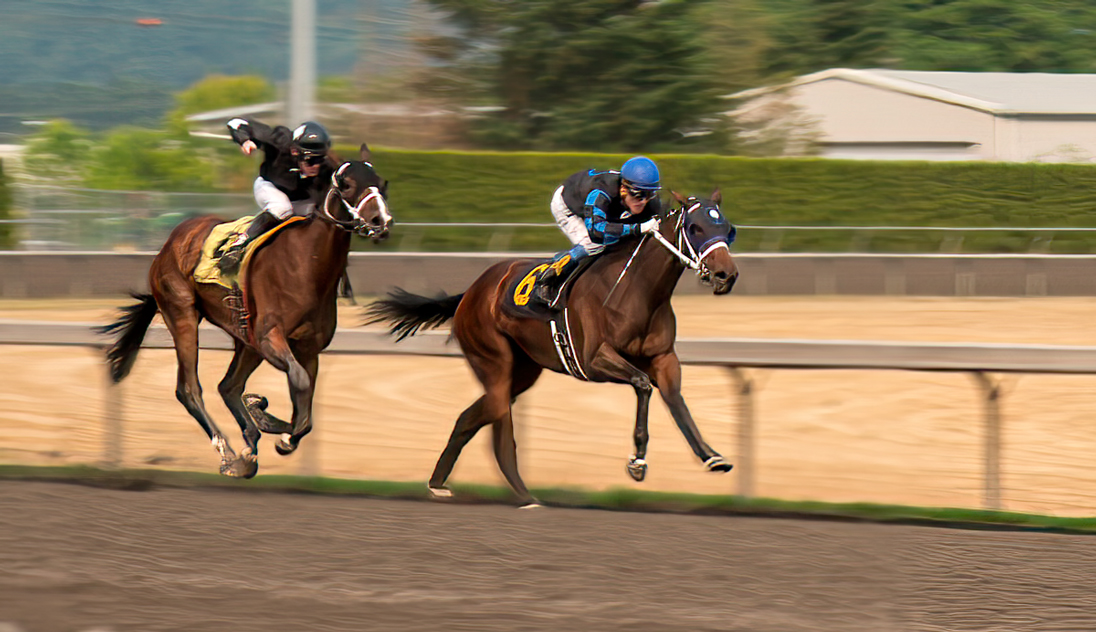
Hi Bob, It is nice to see that you are trying composites. I like that. I think you have captured motion well, especially the background and the rail. However there are a couple of things I think need improvement on during the taking of the shot which would be a faster speed of at least 1/250 sec while panning. I also think you could get by with something like f/8 or f/11 since you are capturing the foreground and trying to blur the background anyway. I believe by do this, you would not get the severe motion on the horses legs and making them look a little meatier than they appear. I hope I said that clearly.(BTW in the redo I followed the outline of the motion to create a meatier look, then used the smudge tool to fill it in. I'm sure a lot of it is perspective, but I did it anyway)
As to ?1 I normally use quick selection first, then go back, increase the size and with the polygonal tool trace around the area I want to include or vise/versa. In the case of the hooves I was at 600 to 1000% when I redid yours. I also did the same thing with the tails and then used the smudge tool to fill in some.
?2 I think the background is fine and shows the movement you want. You can see that the bar is a continuation so I would leave it in.
As to the texture, I would darken the bright area in the right corner just a bit.
I only use the normal blend mode as I like to get it my way, not someone else. Having said that, take my suggestions with a grain of salt and do what pleases you! |
Jul 4th |
 |
| 20 |
Jul 22 |
Reply |
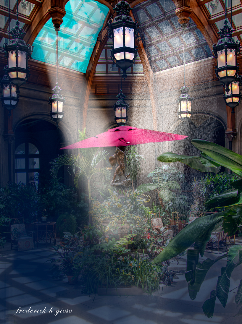
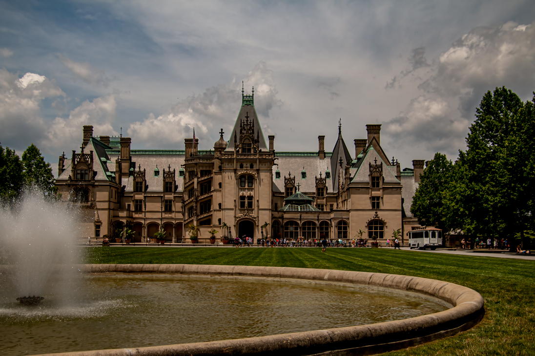
Hi Sam, Here is a picture of Biltmore, located in Ashville, NC. The image does not do the enormity of the place justice. It is 250+ rooms and was built by the son of Vanderbilt who was single at the time. Nothing like a little place to strech.
|
Jul 4th |
 |
| 20 |
Jul 22 |
Comment |
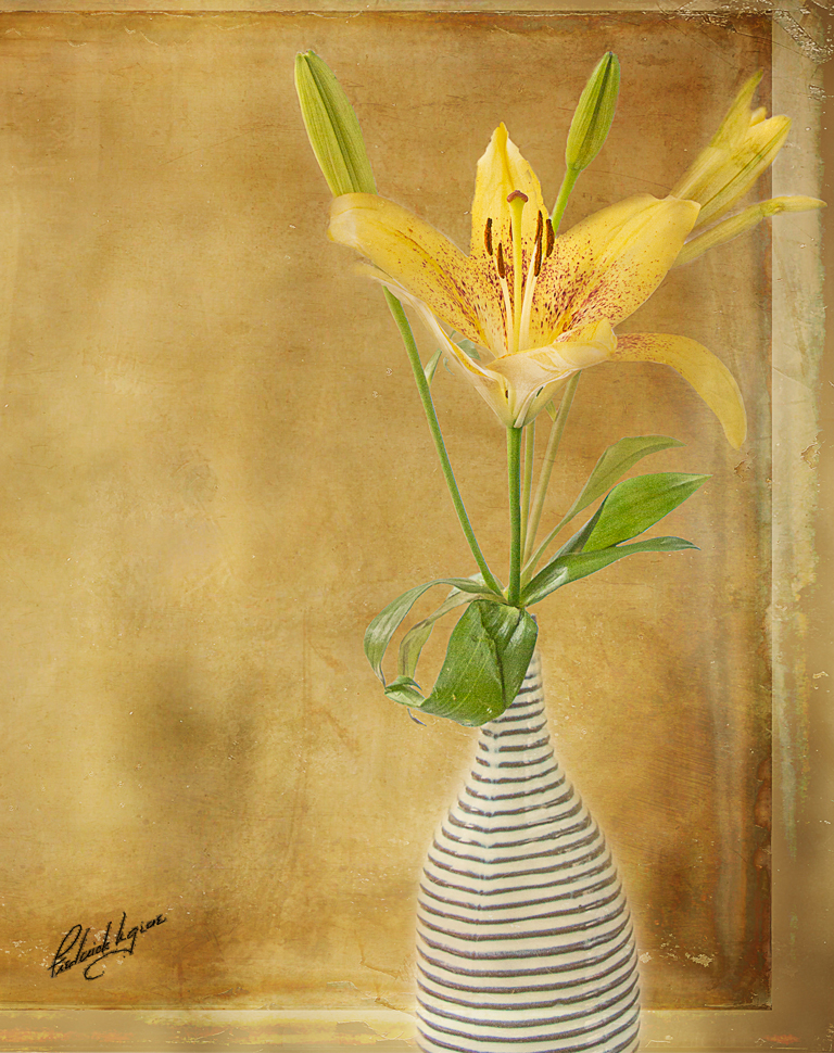
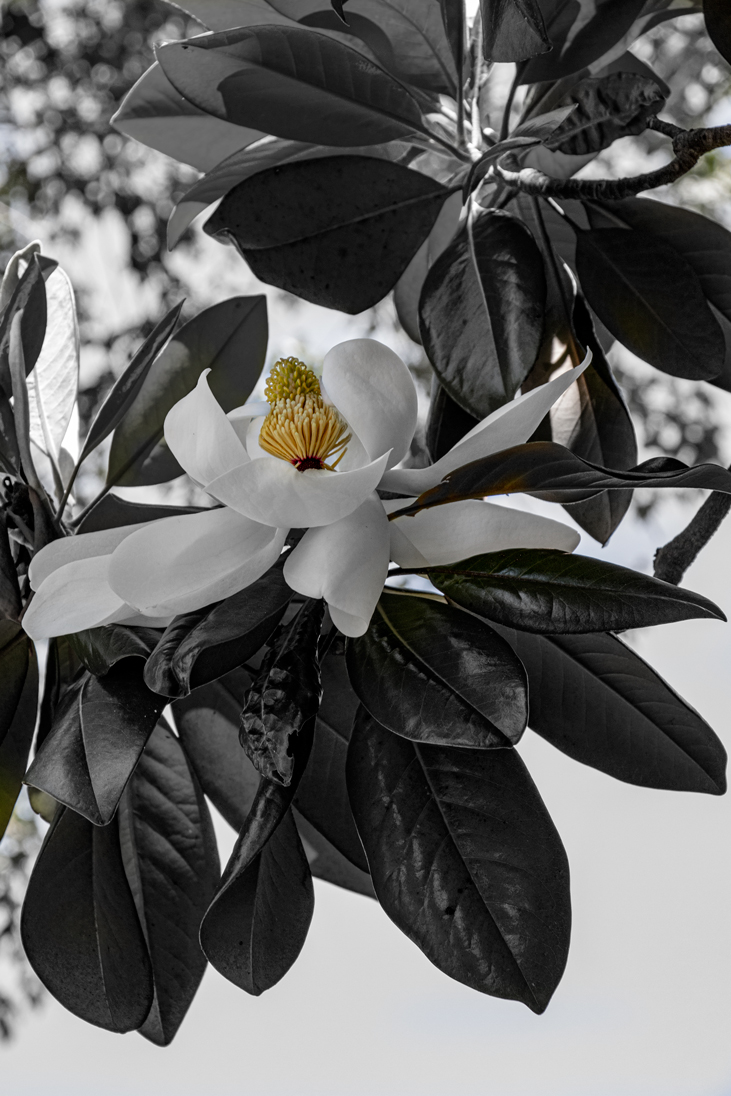
Beautiful job. I love the simplicity of this image. The sharpness of the flower and leaves is spot on, the framing perfect and I love the out of frame root. This is an image I would hang on my wall. |
Jul 4th |
| 20 |
Jul 22 |
Comment |
I agree with Angela. It's funny, I noticed the light right away but never noticed the shape of the building on the right. It is a very good and sharp image and I was impressed with the shape of it. Is it an office building or for housing? It sure is in contrast from your last image. It looks really good in Mono. |
Jul 2nd |
5 comments - 4 replies for Group 20
|
| 24 |
Jul 22 |
Reply |
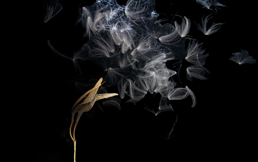
Hi Lance, this one I love. The petals dancing in the torrential "rain" while the stem is sturdy and sharp. I like it the way it is, if anything I might get rid of some of the clutter at the bottom to simplify, but it also adds to the story. I'm not sure. But it is very nice |
Jul 18th |
| 24 |
Jul 22 |
Reply |
I was trying to go for a BOLD almost Black and White, but I like yours better. Thanks |
Jul 17th |
| 24 |
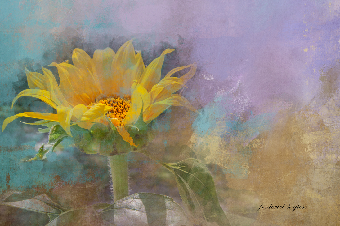
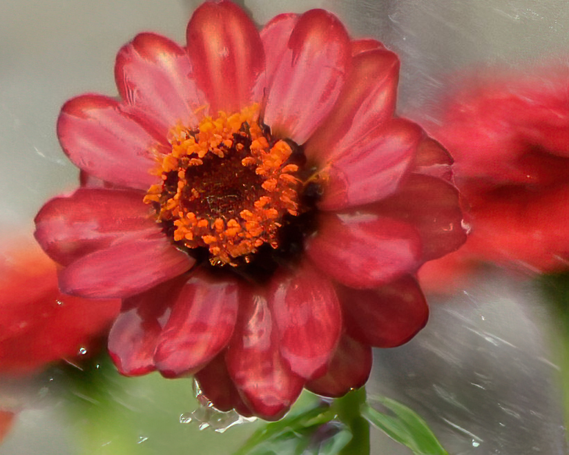
Jul 22 |
Comment |
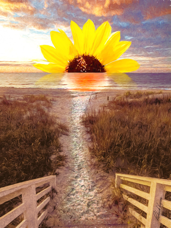
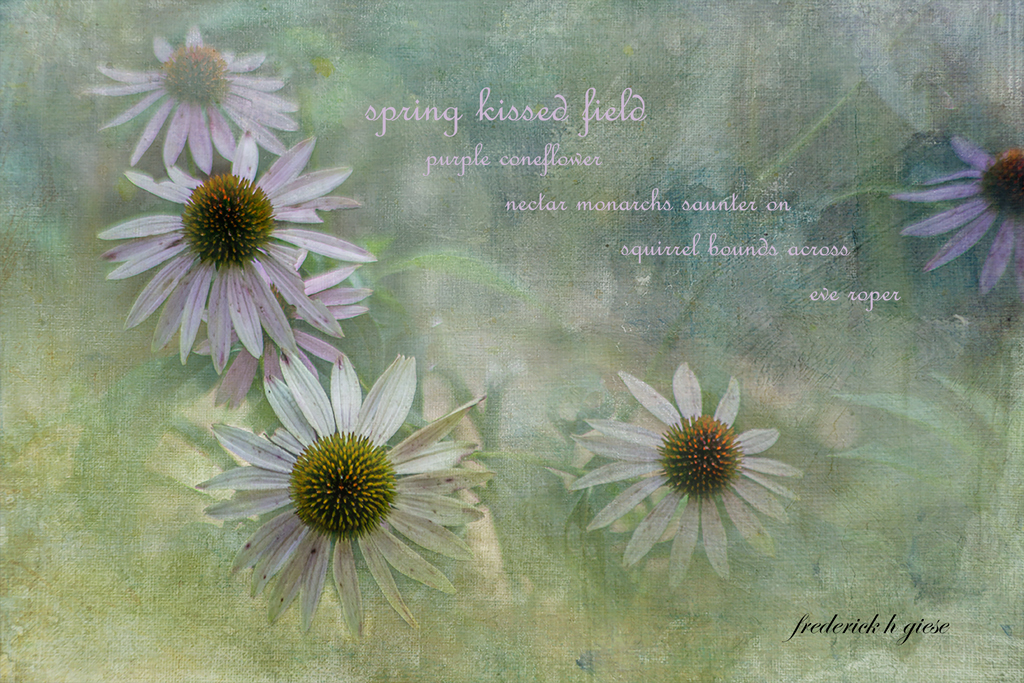
Hi Lance. As Bev said, it is a very interesting image. Obviously taken in a torrential rain or with a garden hose. I see what you are saying about the painterly effect, and it works. However, there are certain areas that I would do differently where it mine. I would change the crop ratio from 16:9 to 10X8 which would be a normal hang size for a floral and crop in from the right to mid background flower. I would also reduce the brightness of the petals and if possible sharpen the center of the flower. As I said, that is what I would do. Your vison - my vison. Neither right or wrong, just different.
|
Jul 17th |
 |
| 24 |
Jul 22 |
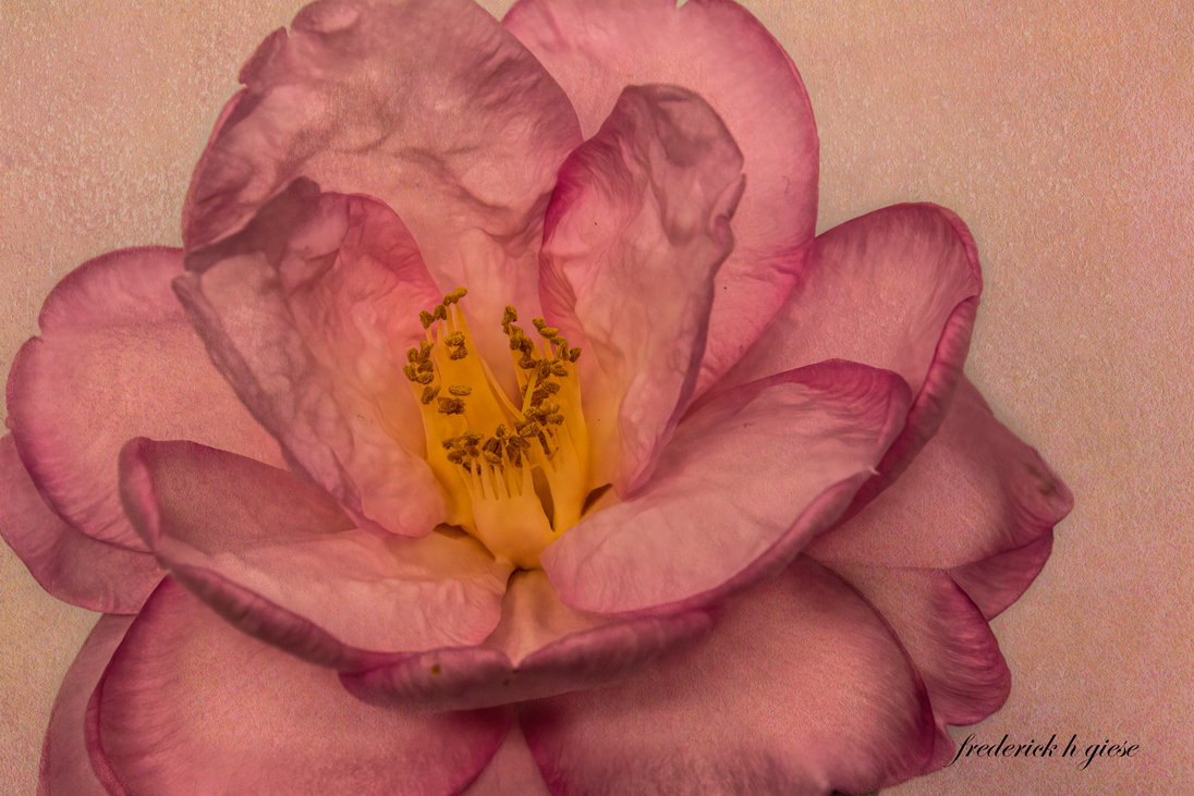
Comment |
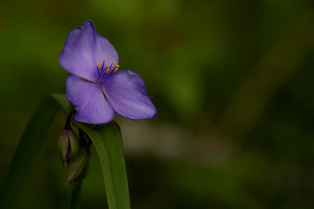
Hi Bev. A very nice, warm, gentle, calming pastel flower, with a nice selection for a background. If it were mine I would clean up the ragged areas along the sides of the flower especially by the lower green area. |
Jul 17th |
| 24 |
Jul 22 |
Reply |
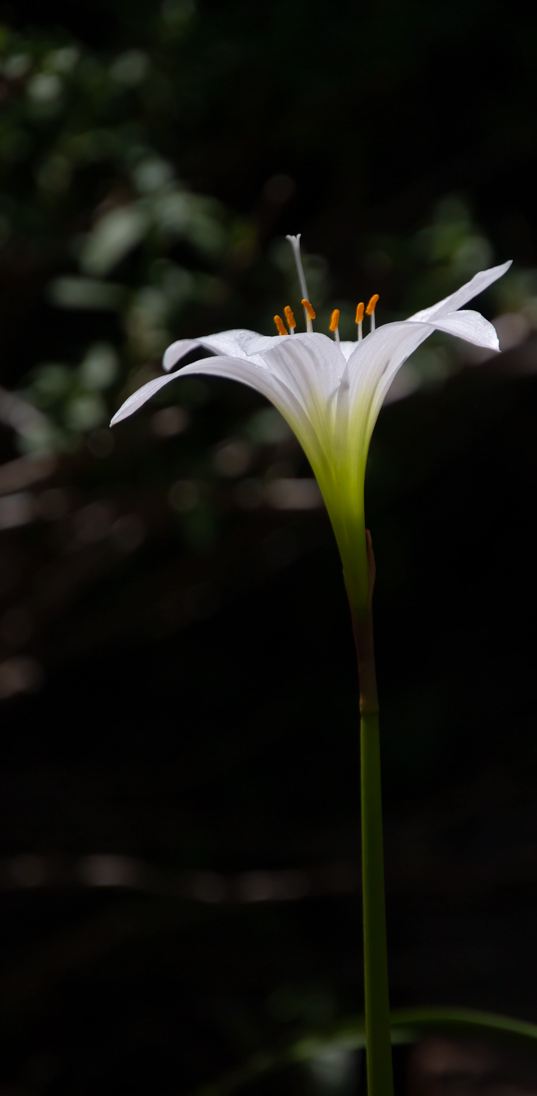
Thank you Lance, Glad you liked it. Just to let you know, there were no filters used. I simply took it into the saturation adjustment layer and decreased it all the way. Then painted back the yellow. I made it real simple this time do to the time limitations. Normally I would go into NIK as well.
|
Jul 15th |
2 comments - 3 replies for Group 24
|
7 comments - 7 replies Total
|