|
| Group |
Round |
C/R |
Comment |
Date |
Image |
| 45 |
Jan 19 |
Reply |
They certainly do look very sharp. No additional sharpening was used. |
Jan 17th |
| 45 |
Jan 19 |
Comment |
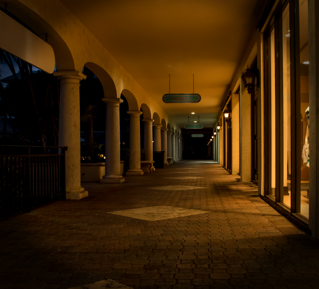
Welcome Bai: Glad you are here. I immediately liked your photo, the bright and colorful lights are very attractive. You have good exposure and everything is sharp. I would join with others about cropping in from the left. |
Jan 11th |
| 45 |
Jan 19 |
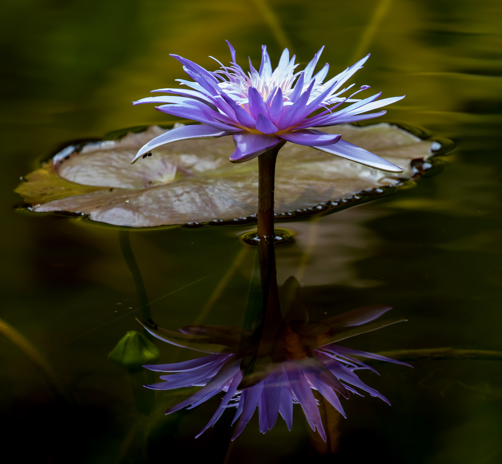
Comment |
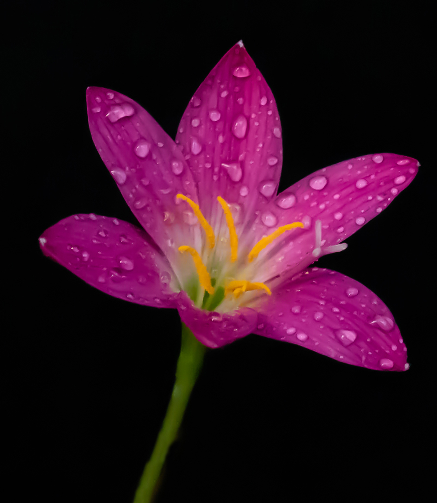
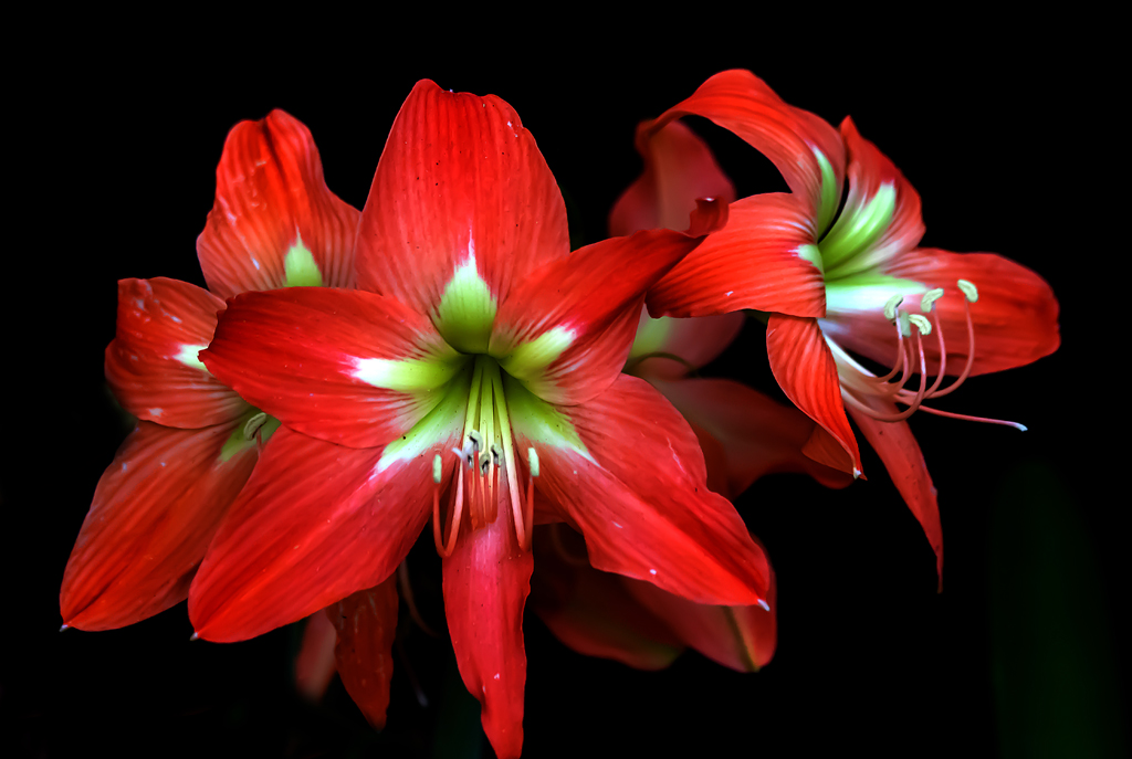
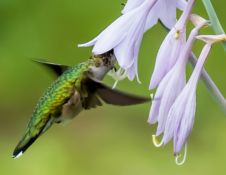
Very nice water lily! Could not be sharper (seems I could reach into the photo and touch it!), back-lit(?) petals that are not washed out and good composition with a leaf on the water on the left and a curdled one on the right. The shadows on the left of a stalk or two and then something green protruding out of the water on the left I don't like. They don't seen to add to the pleasantness of the photo. The photo you added in response to Ed's comment I like better than your original. |
Jan 2nd |
| 45 |
Jan 19 |
Comment |
A very well done black and white photo!! Everything about it seems to join together for a pleasing whole. I love the horizontal lines on the boy's shirt in contrast to vertical lines elsewhere. For me, the boy is the subject. I can easily imagine a variety of stories with him standing among men, hands in pockets, head bowed and back from the wall and not against the wall as others are. Very sharp photo while hand-held and at only 1/60 of sec. Nice balance with the boy in the center and other pieces of the photo almost equal distance left and right. |
Jan 2nd |
| 45 |
Jan 19 |
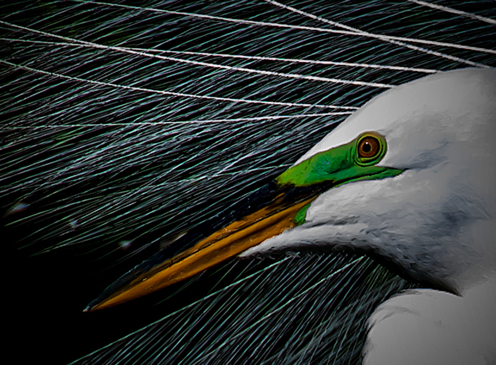
Comment |
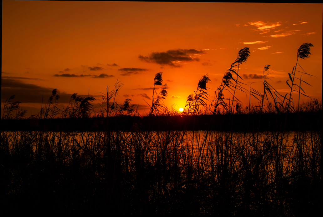
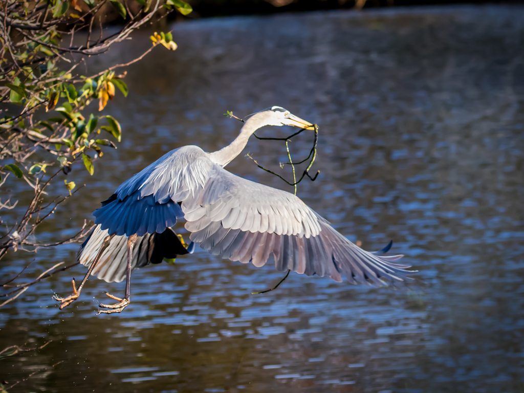
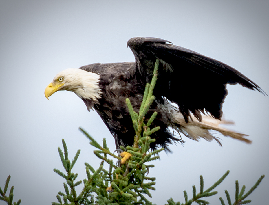
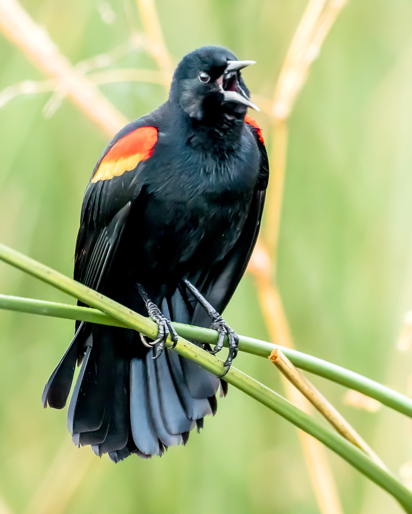
Nice back-lit Snowy Egret. Plenty of action, bird is sharp. What are the "spots" in the background? For me they are distracting. You could crop at the top and remove most of them down to a little above the wings. Using 1/2000 sec. did the job of freezing the action. |
Jan 2nd |
| 45 |
Jan 19 |
Comment |
Good picture--lots of colors including red which is always an attraction, different textures and patterns makes for a pleasing pic. Exposure is good and I would say "sharp" except that fabric usually doesn't look sharp when it is. But the bottom line of fabric bothers me. It seems an add-on, yet not knowing what the entire wall of fabrics looked like, I can not suggest a better capture. |
Jan 2nd |
| 45 |
Jan 19 |
Comment |
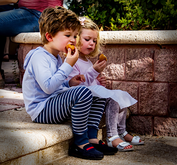
I like it. Nice expressions on faces, lots of color, subject almost fills the space, sharp. The one change I would suggest is to crop out the Phillips sign. Too distracting. A tight crop around the subjects would be better. |
Jan 2nd |
6 comments - 1 reply for Group 45
|
6 comments - 1 reply Total
|