|
| Group |
Round |
C/R |
Comment |
Date |
Image |
| 45 |
Nov 17 |
Reply |
Thanks for your comments. I think that cropping on the bottom reduces the sense of depth and places the horizon almost in the middle, which reduces some of the interest in the photo. |
Nov 16th |
| 45 |
Nov 17 |
Comment |
I wonder if this would look good as a black and white? There is lots of texture and very little color. The focus is good and the bridge leads us into the photo. To me, it is a little bland because of the lack of color or some element on the bridge. |
Nov 12th |
| 45 |
Nov 17 |
Comment |
Your right about the lower, right-hand corner being too dark. I should have lightened it. I was one week early getting there, so the colors were not as good as when I was there last year. |
Nov 8th |
| 45 |
Nov 17 |
Comment |
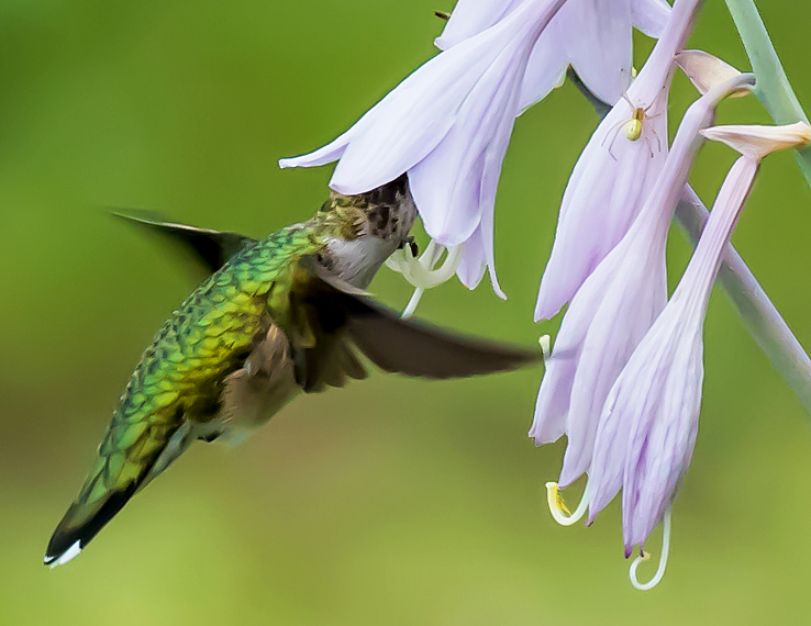
Hi Charlie: Good fall colors, leaves on the ground all say its fall! The photo is colorful and no dead space. I like that you tried using the pathway as a lead-in. But with a shutter speed of only 1/20th and not using a tripod, the photo is less sharp than what it could be. Either use a tripod or increase the shutter speed and ISO and focus 1/3rd of the way in for a much sharper photo. |
Nov 6th |
| 45 |
Nov 17 |
Comment |
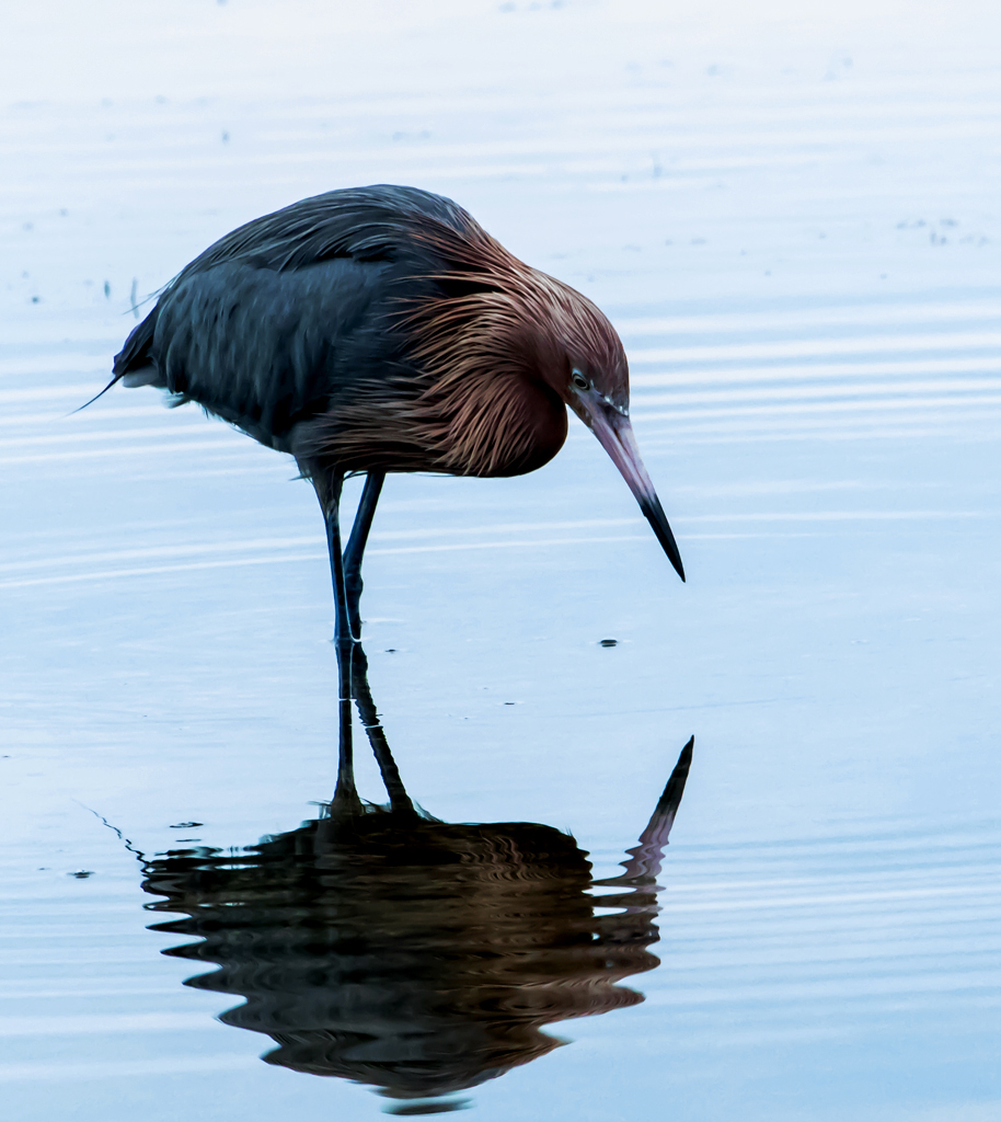
Very sharp, Ed. Good demonstration of patience on your part. The photo seemed kind of lifeless until I enlarged it and cropped out some of the left side and front leaving the entire animal and reflection of legs. Enlarged, the eyes and nose become prominent adding a stronger connection between animal and viewer and shifts the animal from center to slightly left. |
Nov 5th |
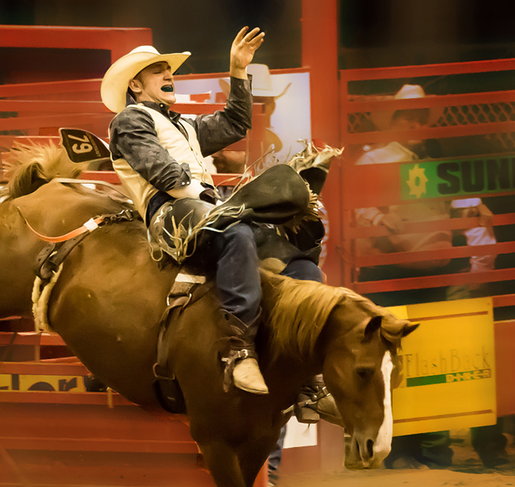
| 45 |
Nov 17 |
Comment |
If you like horses, I suspect this is a photo for you. Nice "head-on" shot, both eyes open and subject separated from background. I continue to be impressed with your technical expertise. If it was my photo, I would make two changes: delete the shinny ball on the left and crop from the bottom up to the top of the two white lines. These two items distract me. |
Nov 2nd |
| 45 |
Nov 17 |
Comment |
Good use of existing conditions--bright day shinning on the mother and child leads to a nice silhouette. Image is sharp. But there are two things I would change. First, I would crop on the left, too much dead space. Secondly, the feet of both have been cut off! Tilting the camera down would both keep the feet in the photo and give mother and child a space on which to stand. Question: did the original show the water with more definition? Without your comment about the Columbia River, I would not have known for sure if that was water or what. |
Nov 2nd |
| 45 |
Nov 17 |
Comment |
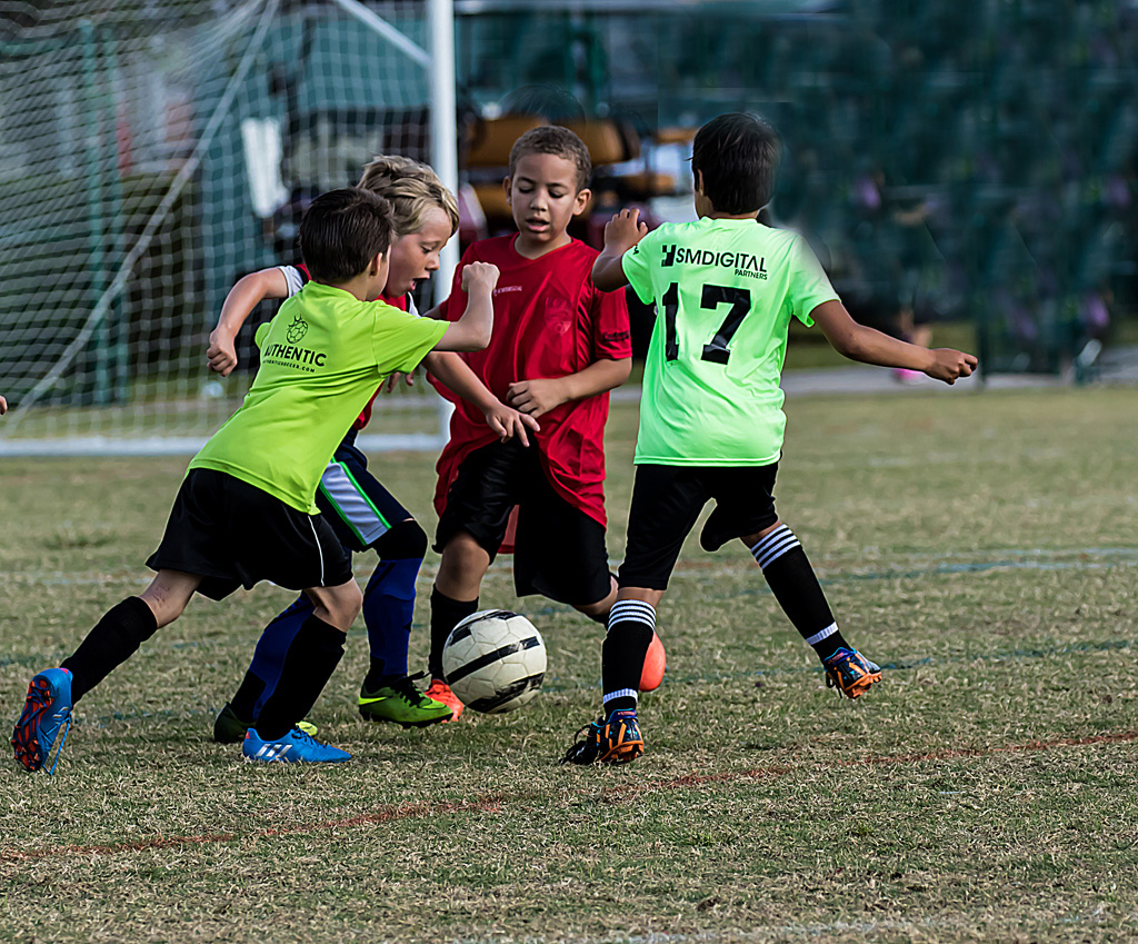
I love it! Well done Richard. You used the entire screen, image is sharp, a great look on the boy's face, subject is a little to the left leaving space for his continued ride and plenty of action and story. |
Nov 2nd |
7 comments - 1 reply for Group 45
|
7 comments - 1 reply Total
|