|
| Group |
Round |
C/R |
Comment |
Date |
Image |
| 11 |
Jul 24 |
Comment |
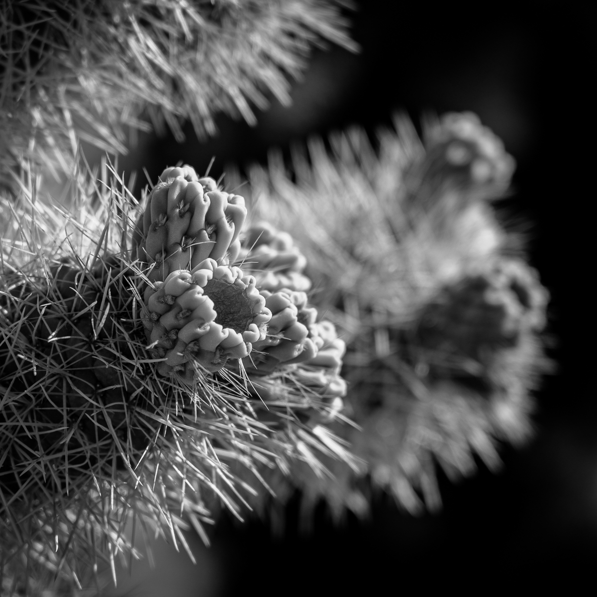
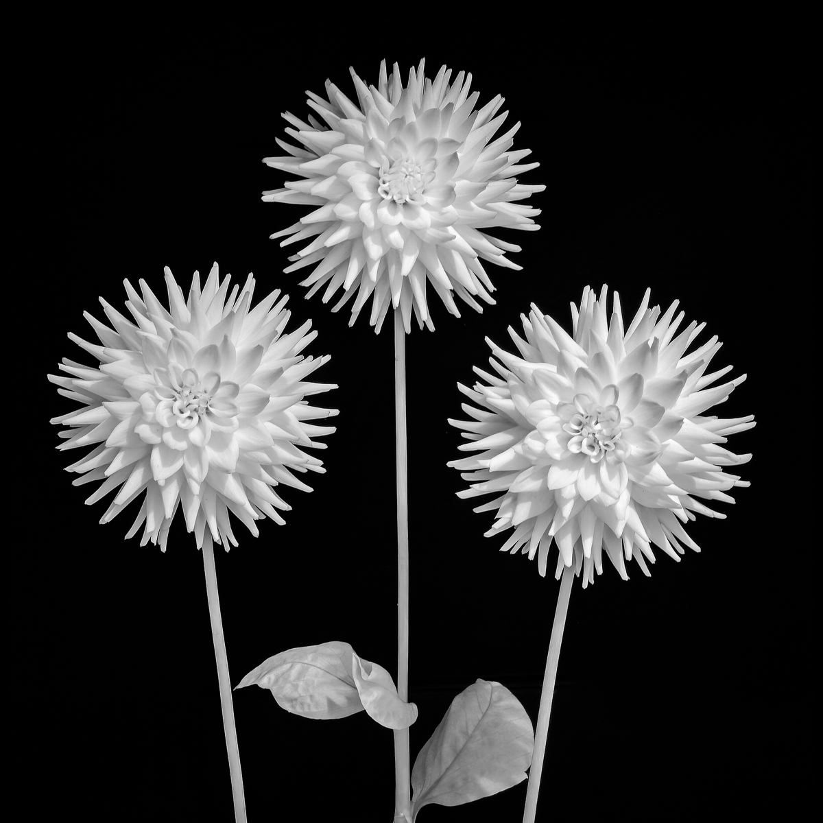
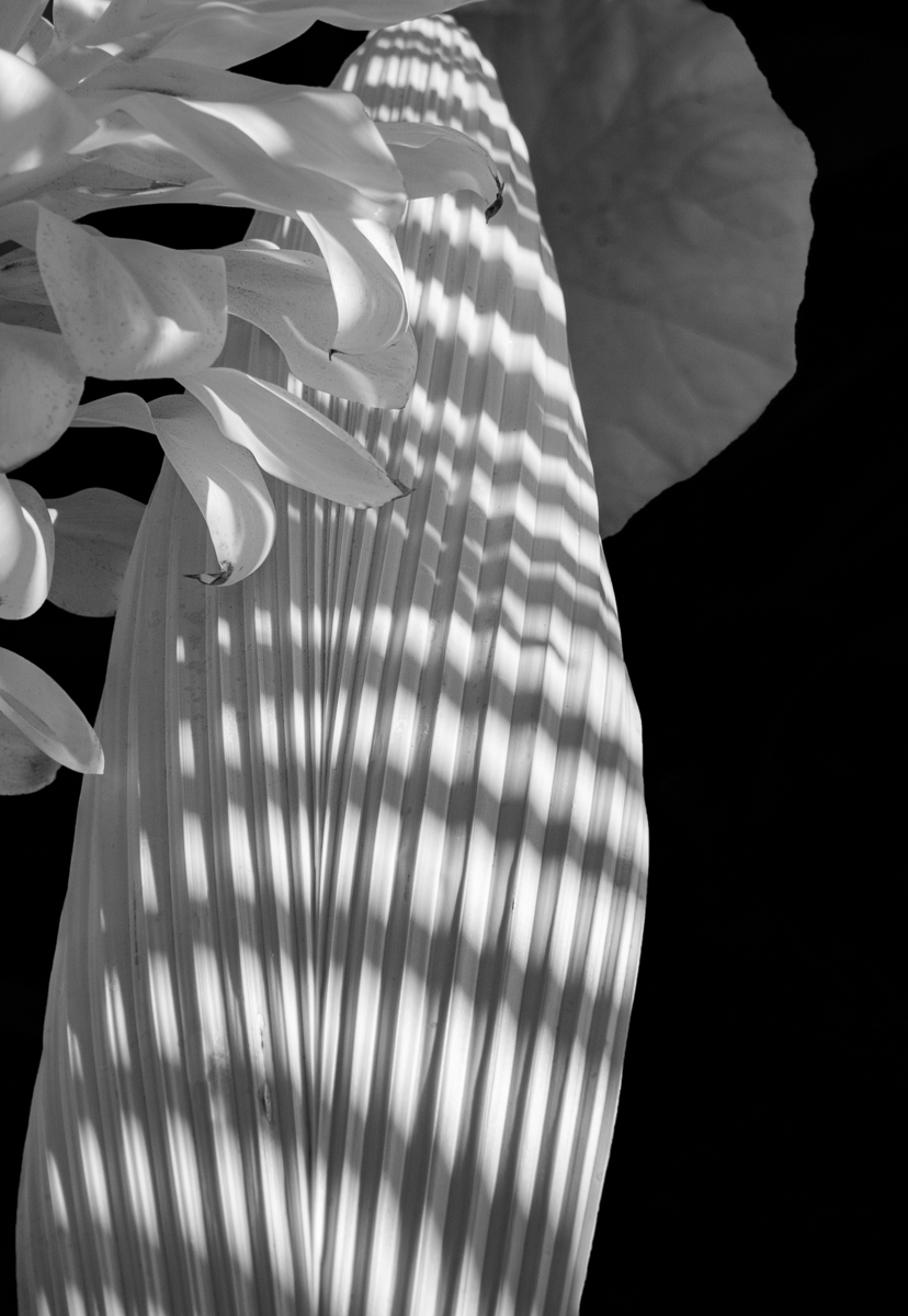
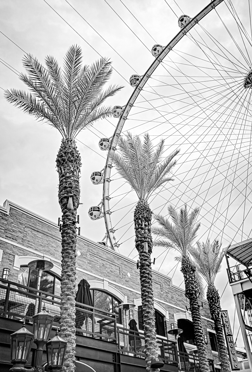
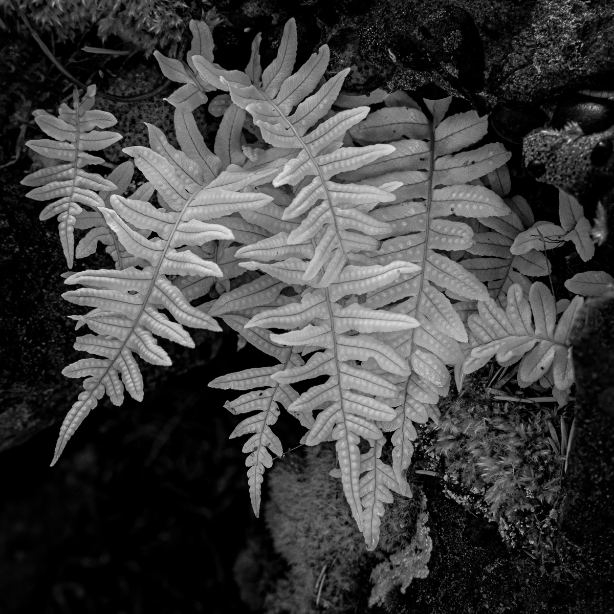
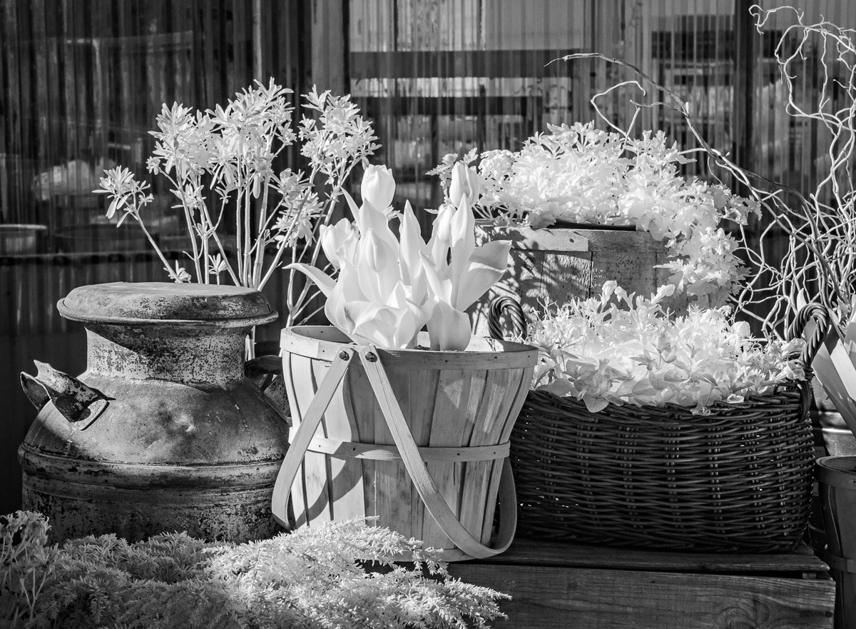
I love photographing succulents. The patterns and textures make them natural subject for monochrome (and IR, for that matter).
This is excellent. I agree with Christian's suggestions, but understand your concerns about PSA standards. |
Jul 24th |
| 11 |
Jul 24 |
Comment |
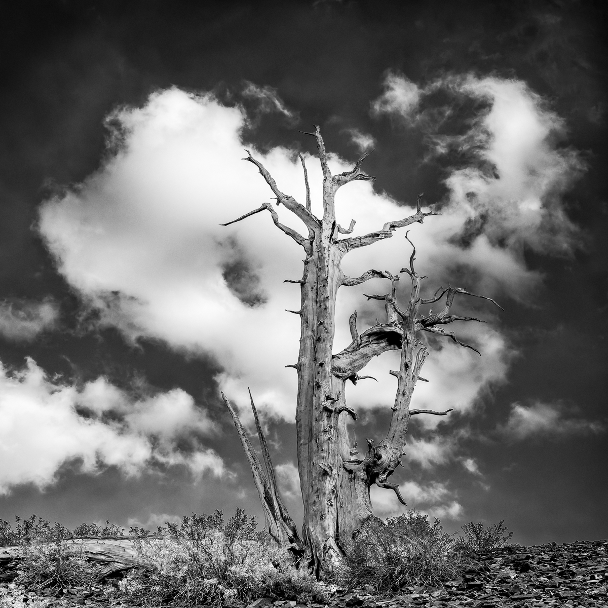
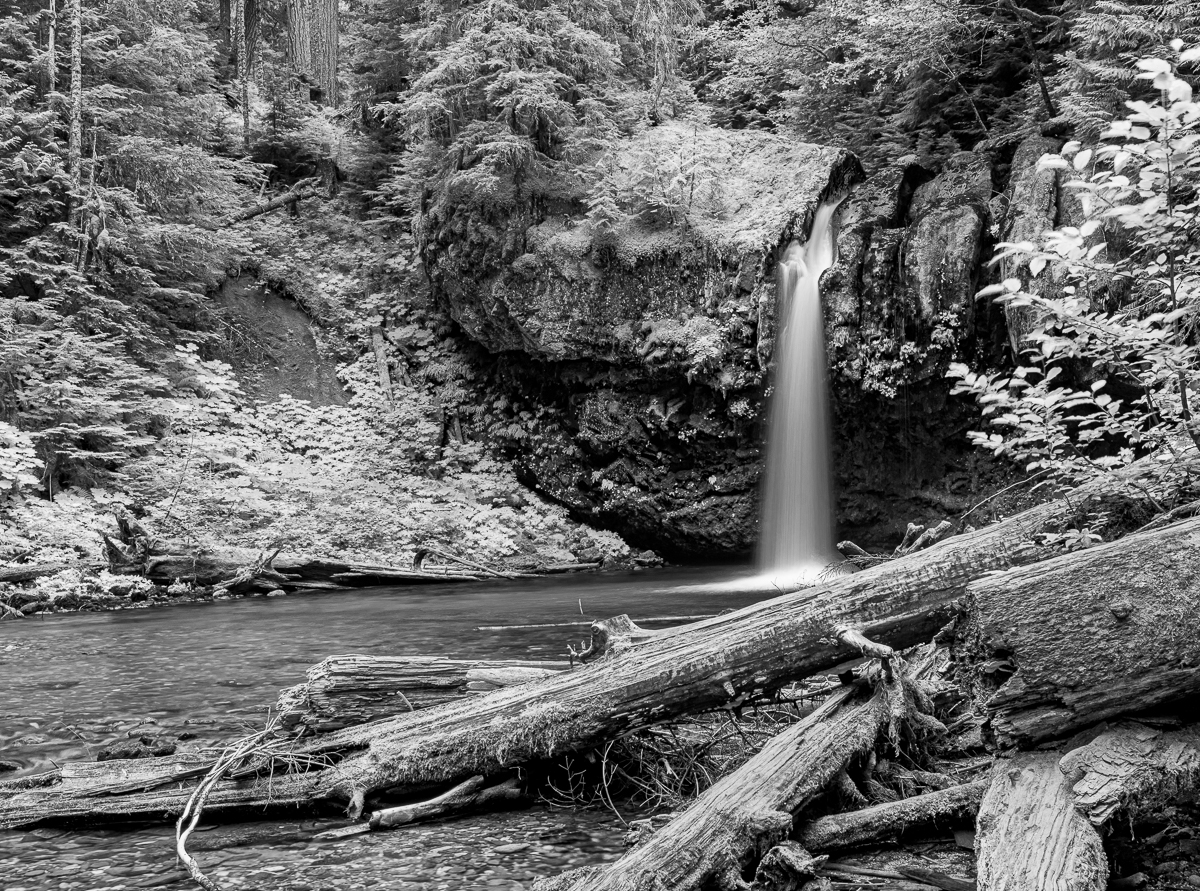
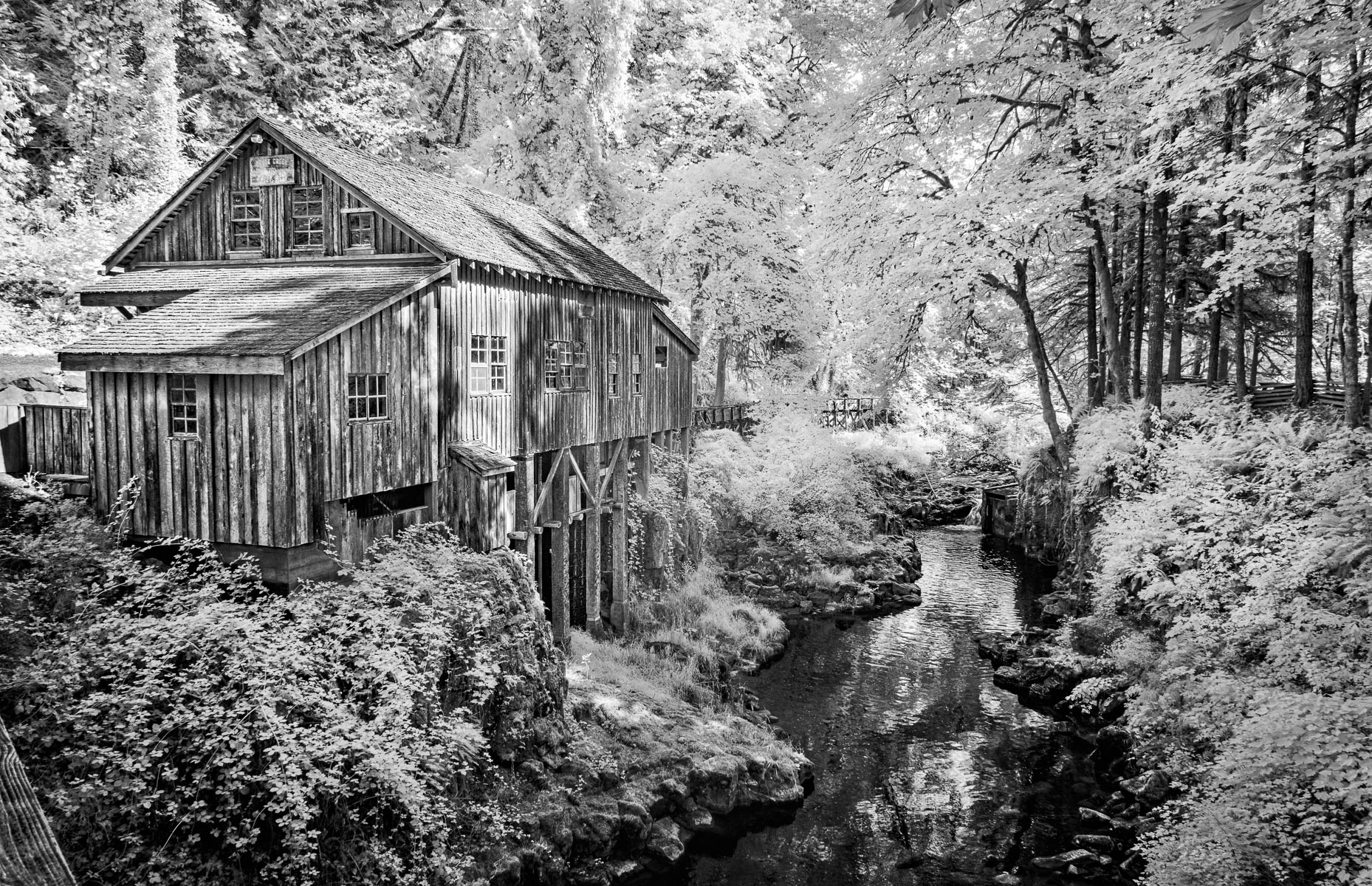
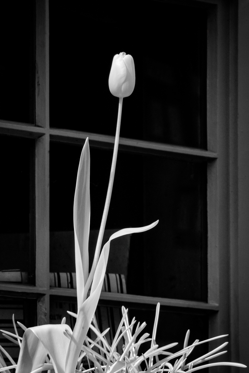
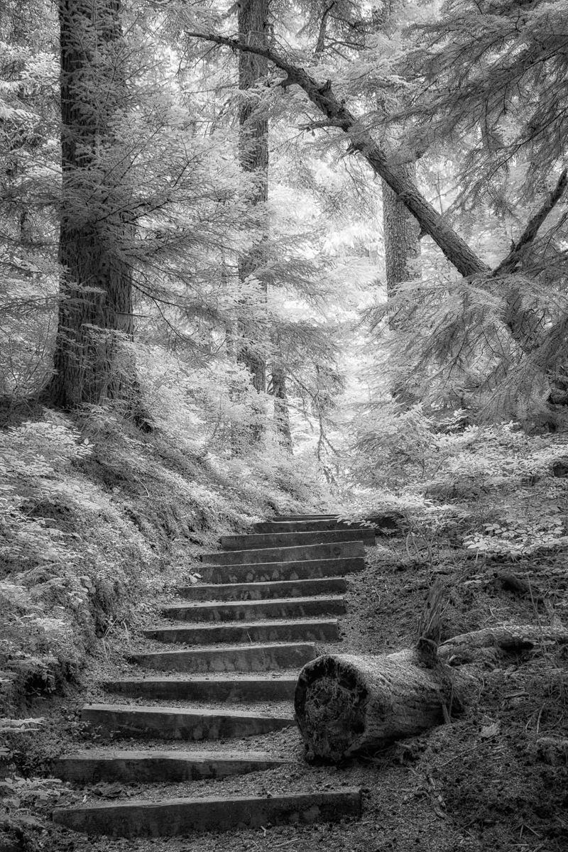
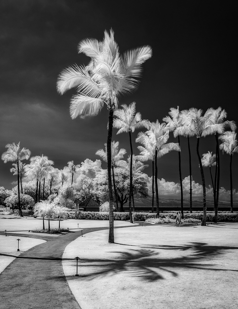
I like this very much. Your black and white processing along with the selective removal of branches was spot on. |
Jul 24th |
| 11 |
Jul 24 |
Comment |
Overall I really like this except for the loss of gradation around the sun. The processed version makes it more defined which I find distracting. Perhaps layering in the original upper left (converted to monochrome) to bring back the softer edges? |
Jul 24th |
| 11 |
Jul 24 |
Comment |
Welcome to the group!
Great timing with the expression and monochrome is spot on for this portrait. No suggestions. |
Jul 24th |
| 11 |
Jul 24 |
Comment |
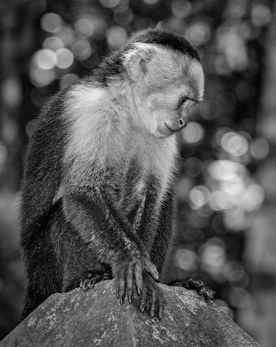
Overall, I really like this. I can't add much to what the others have contributed, but I really like where you were going with this. One possible thing to try when dealing with harsh light is to bracket exposure. Have one normal and one 1-2 stops over and layer in the lighter bits in post. If the gorilla was moving quickly that wouldn't work but if he's moving slowly you can often get away with it. Otherwise, Christian's excellent tutorial is the way to go. |
Jul 24th |
| 11 |
Jul 24 |
Comment |
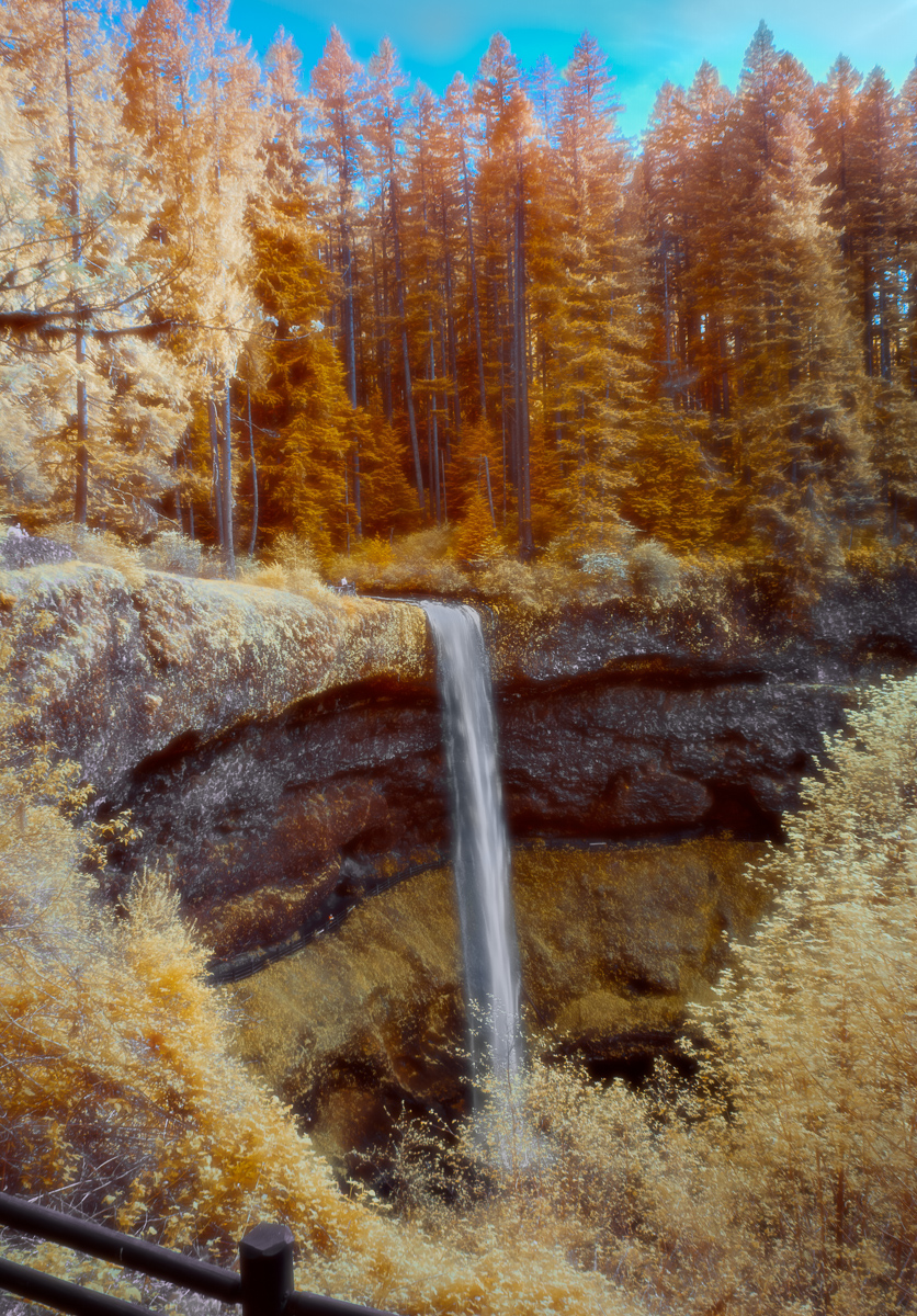
I have to say that I really like the color version. It's like something out of the Hudson River School of painting. The monochrome version is very nice, though I do like what Jim H. did with the shadows. I'm a big B&W fan, but sometimes color is just the way to go. |
Jul 24th |
| 11 |
Jul 24 |
Reply |
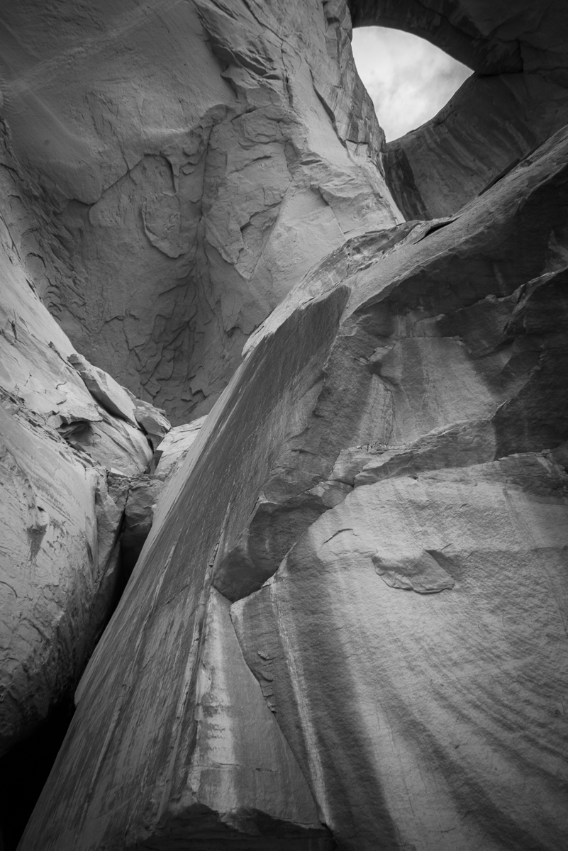
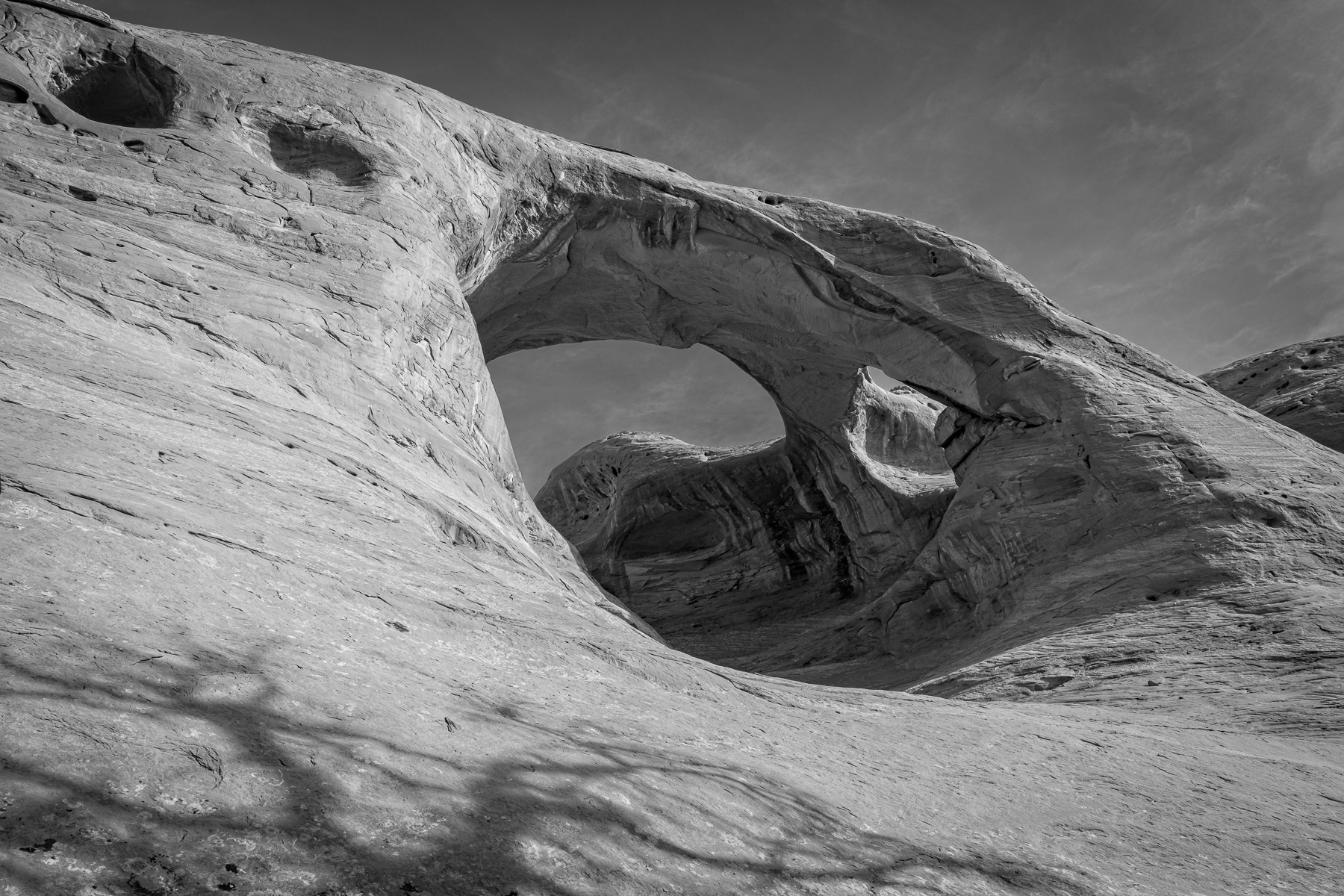
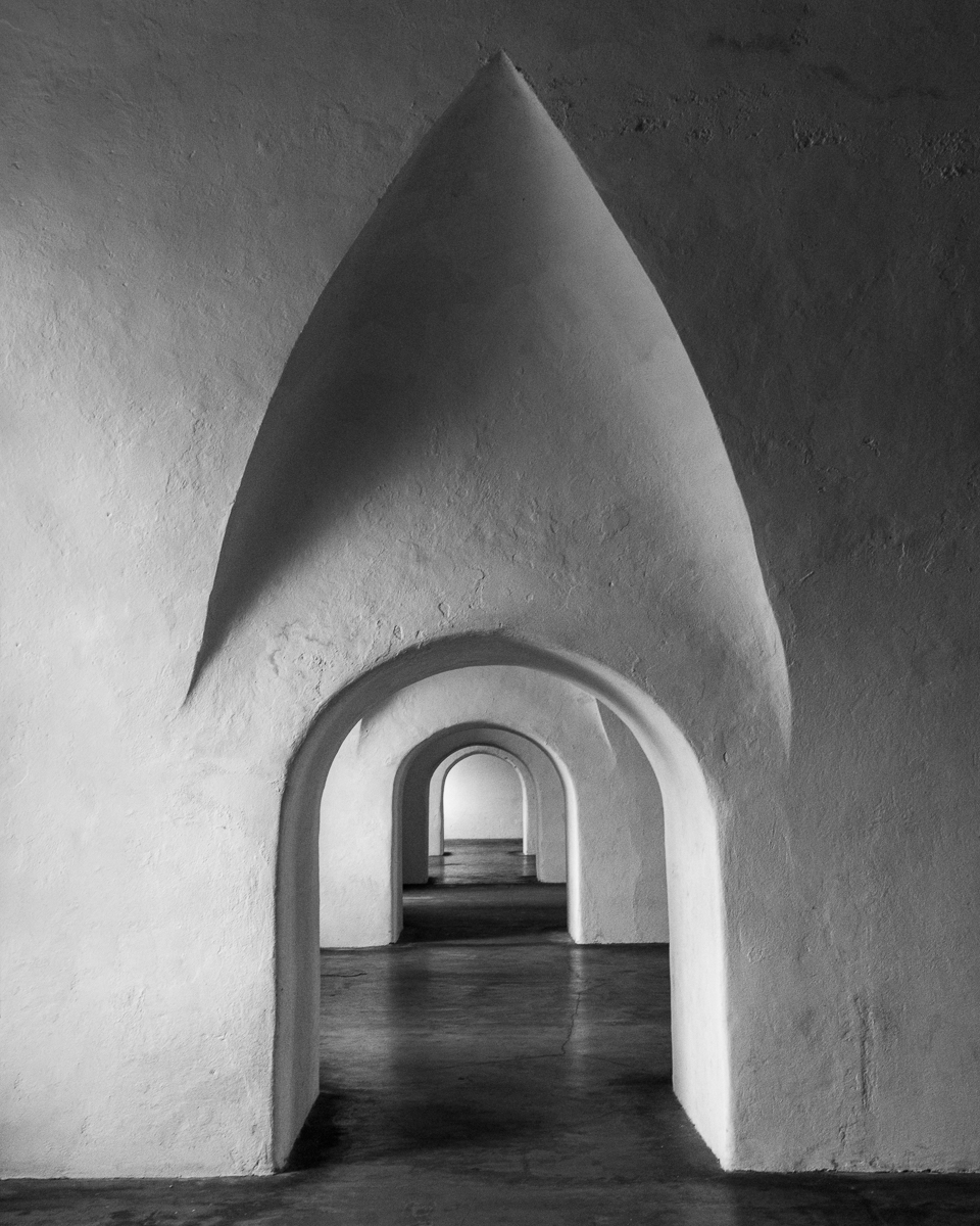
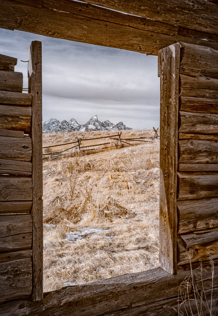
Thanks, Jim. I think you're right about the ceiling. I'm less convinced about the sloping angles, but I appreciate the time you put into your version. Lots to think about there. |
Jul 24th |
| 11 |
Jul 24 |
Reply |
Thanks, Christian. |
Jul 24th |
| 11 |
Jul 24 |
Reply |
Thanks, Jim. |
Jul 24th |
6 comments - 3 replies for Group 11
|
| 66 |
Jul 24 |
Comment |
Emil,
First of all, the processing here is outstanding. I love the colors and textures. I agree with Jack about all the different directions you could have gone with the crop. |
Jul 4th |
| 66 |
Jul 24 |
Comment |
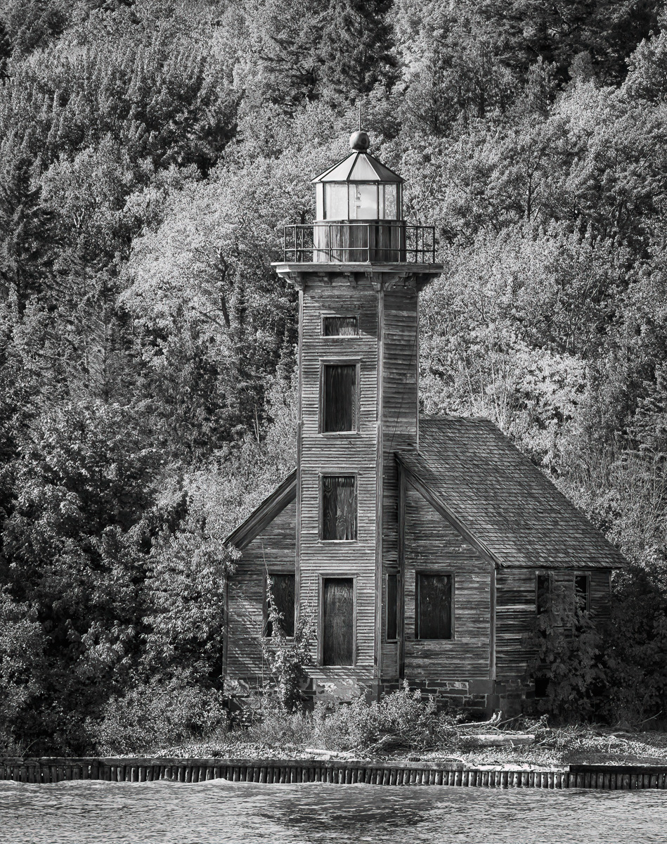
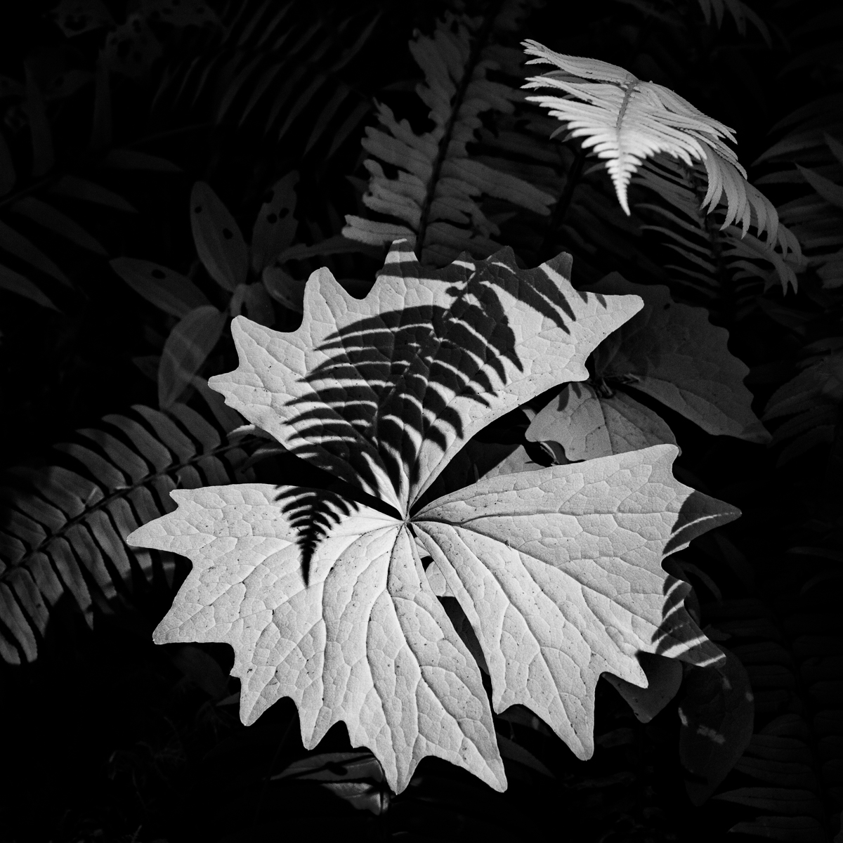
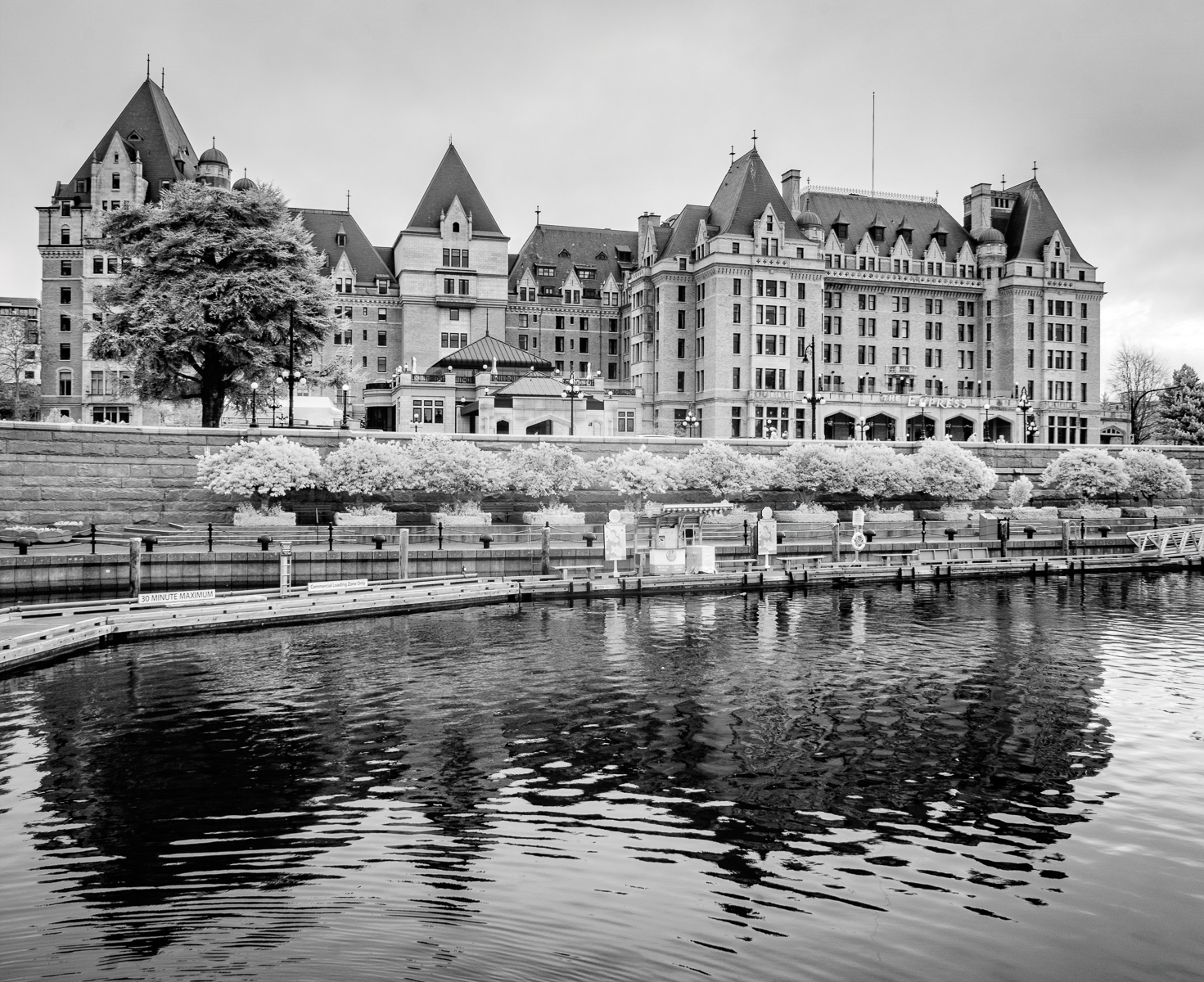
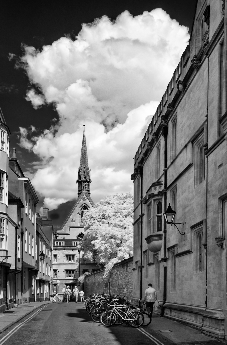
Palli,
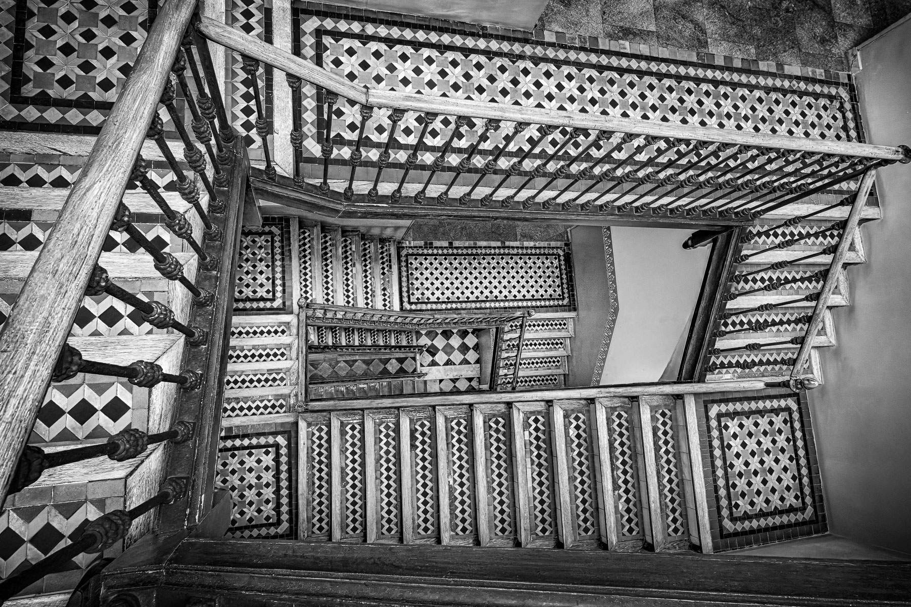
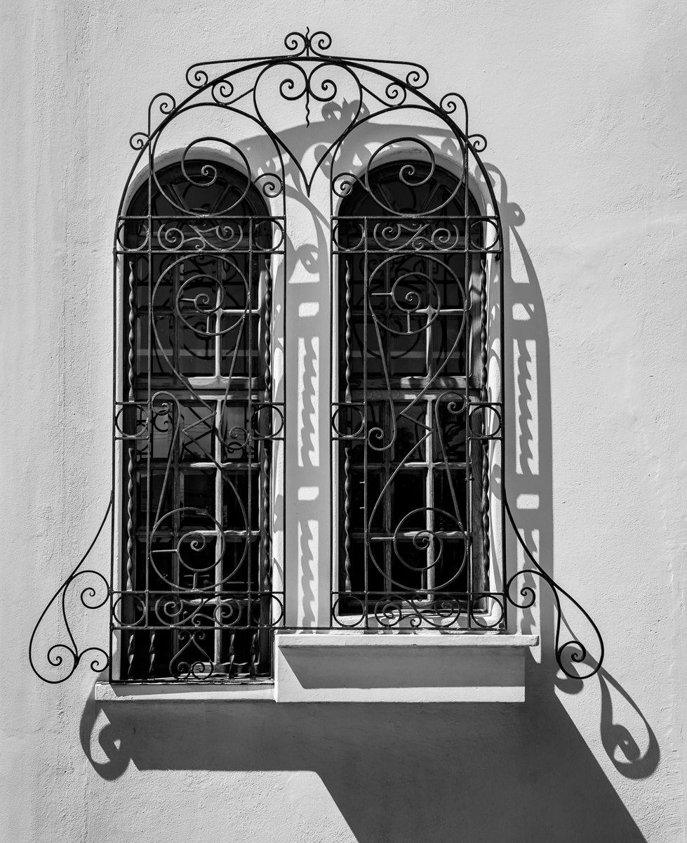
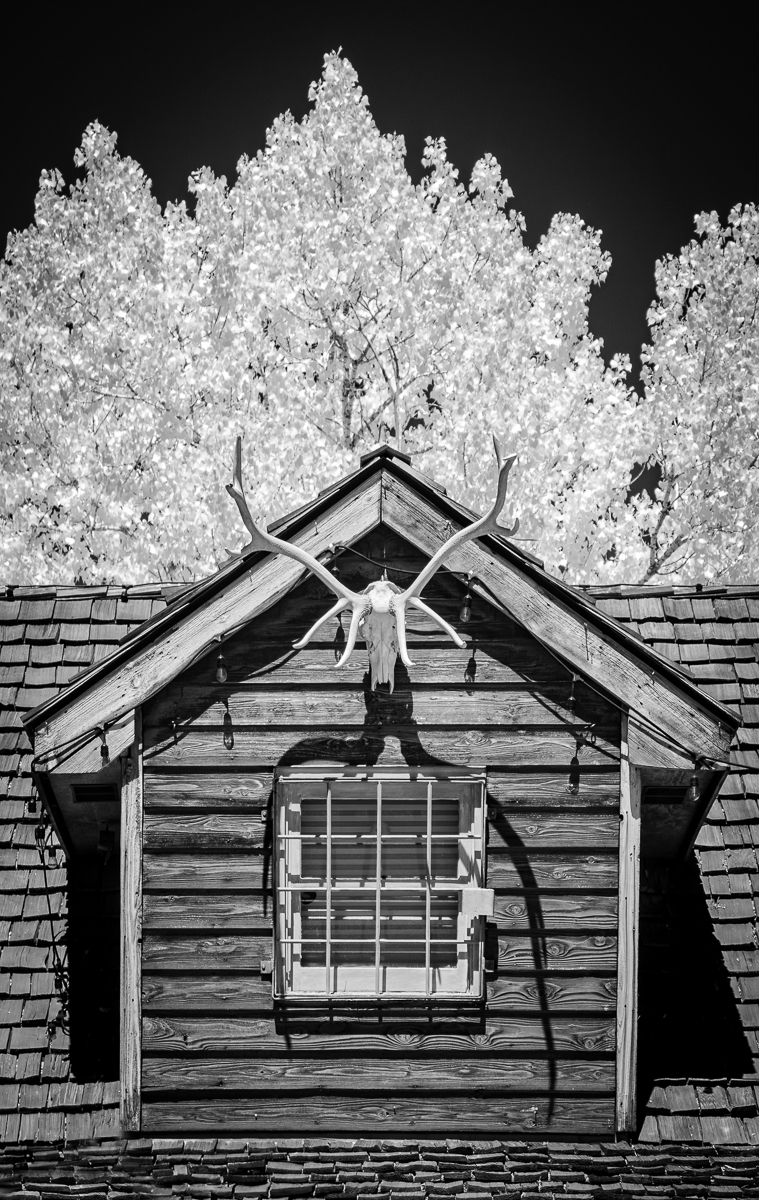
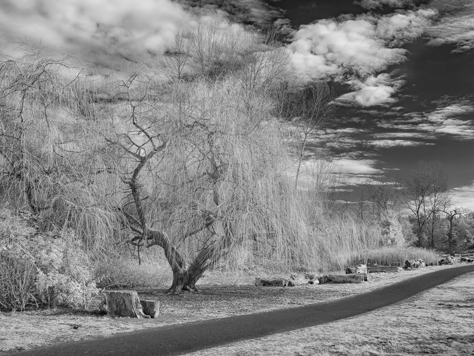
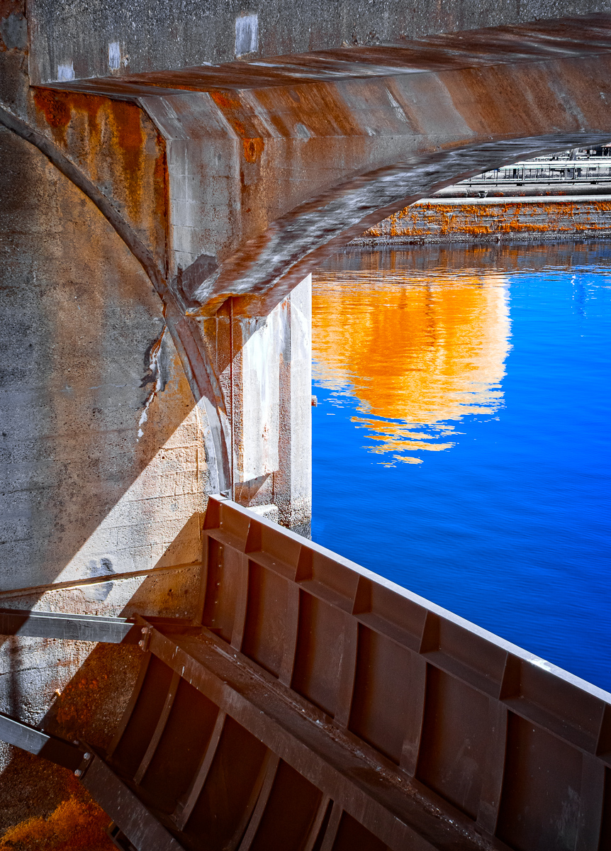
Wonderful study of shape and texture. IR, plus use of my favorite Silver Efex Pro preset came together beautifully here. One suggestion might be to crop in a bit on the right side to remove that light spot in the rightmost window. I find it draws my eye to it. Another, more ambitious thing to try is to remove the railing. It's a the least interesting part of the scene and I think the overall composition would be strengthened without it. |
Jul 4th |
| 66 |
Jul 24 |
Comment |
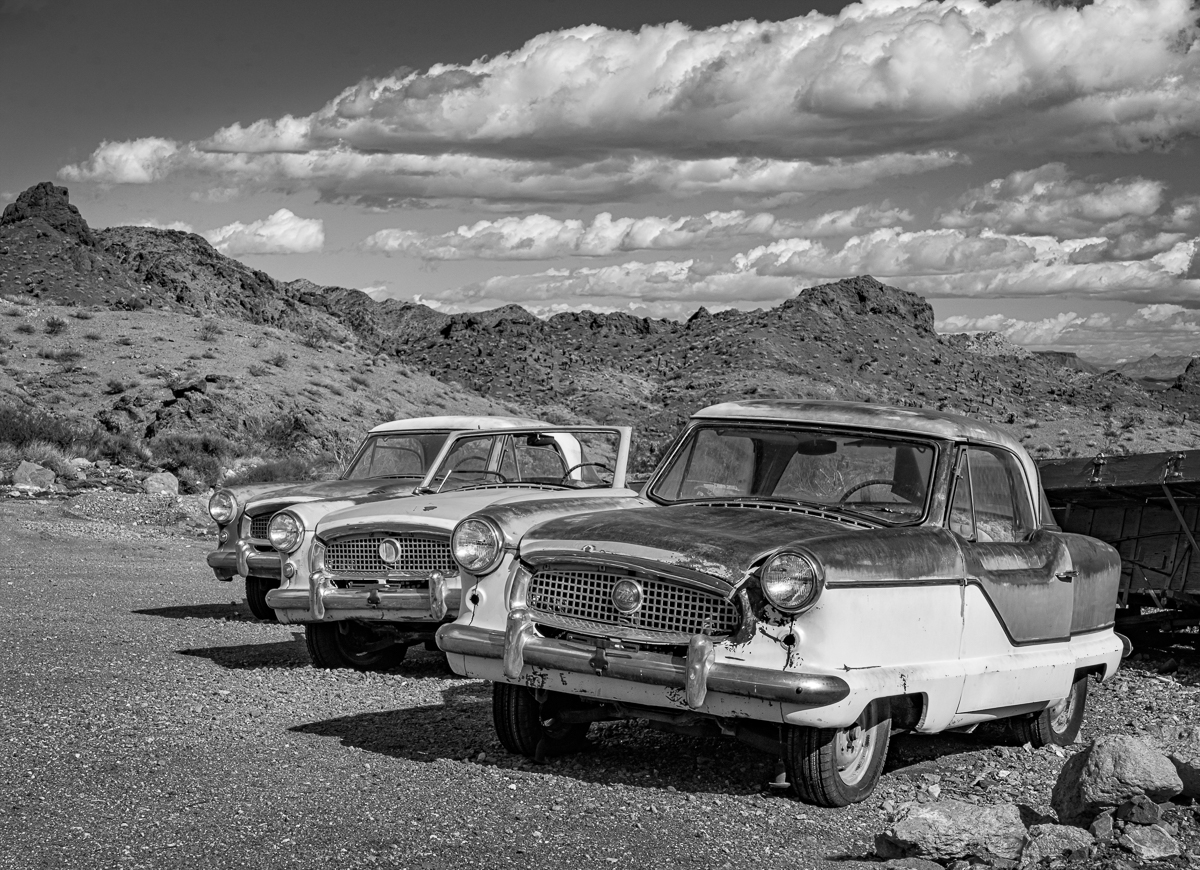
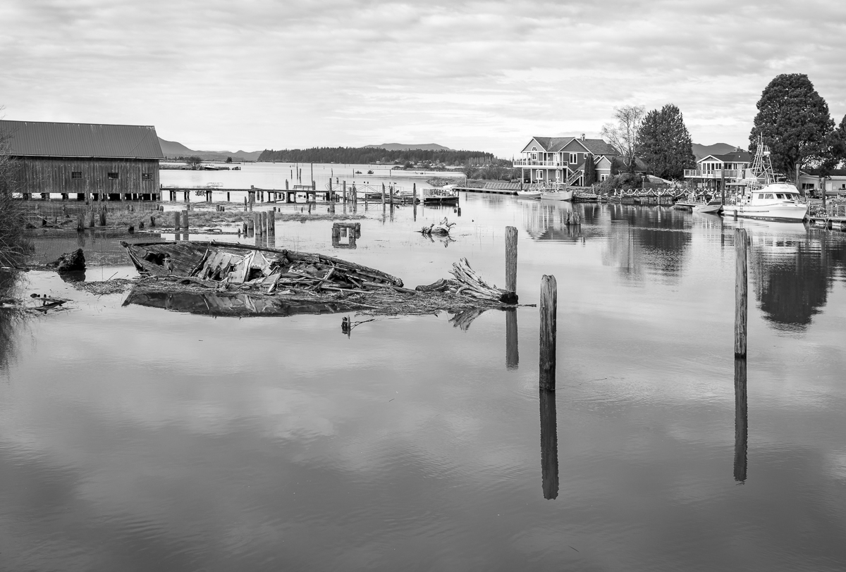
Hi Gary,
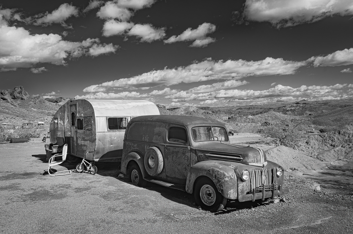
Fun image of a subject I enjoy as well. I really like what you did with the car itself as well as the distant background. I'm not fond of the blurred border or the toning, but otherwise like it. |
Jul 4th |
| 66 |
Jul 24 |
Comment |
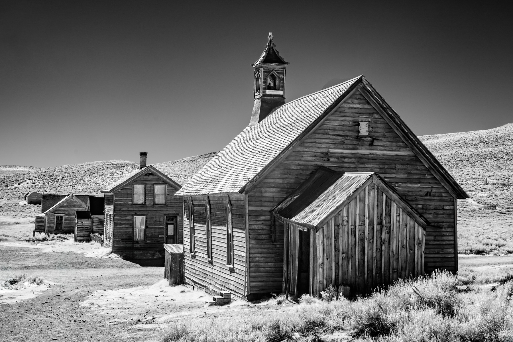
Charles,
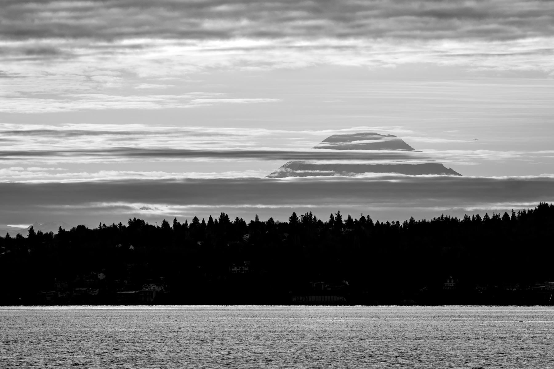
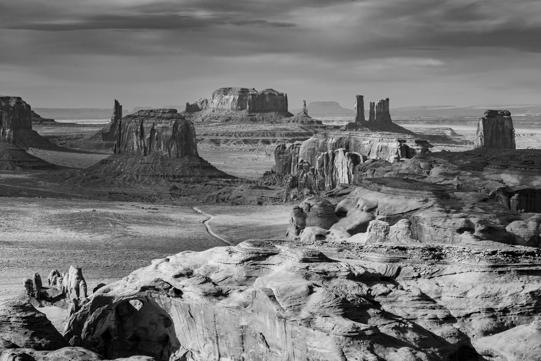
This is excellent. The composition and processing are first-rate, creating a very unique take on a well-known landscape. I do have to agree with Gary that it would benefit from straightening along the top of the clouds. The crop works for me, but I think a pano-cropped version would be equally good. |
Jul 4th |
| 66 |
Jul 24 |
Comment |
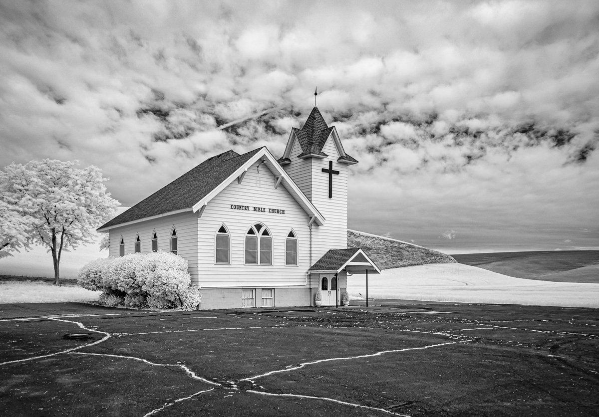
Jack,
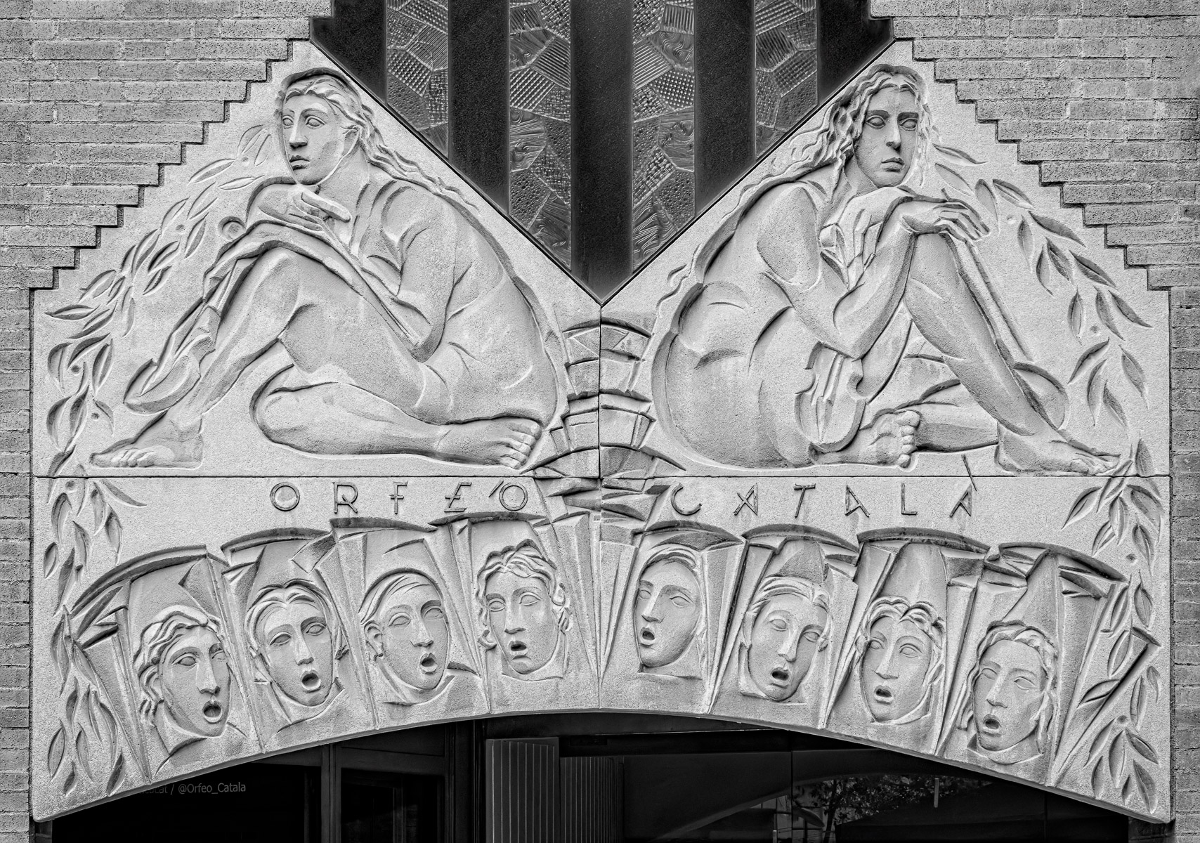
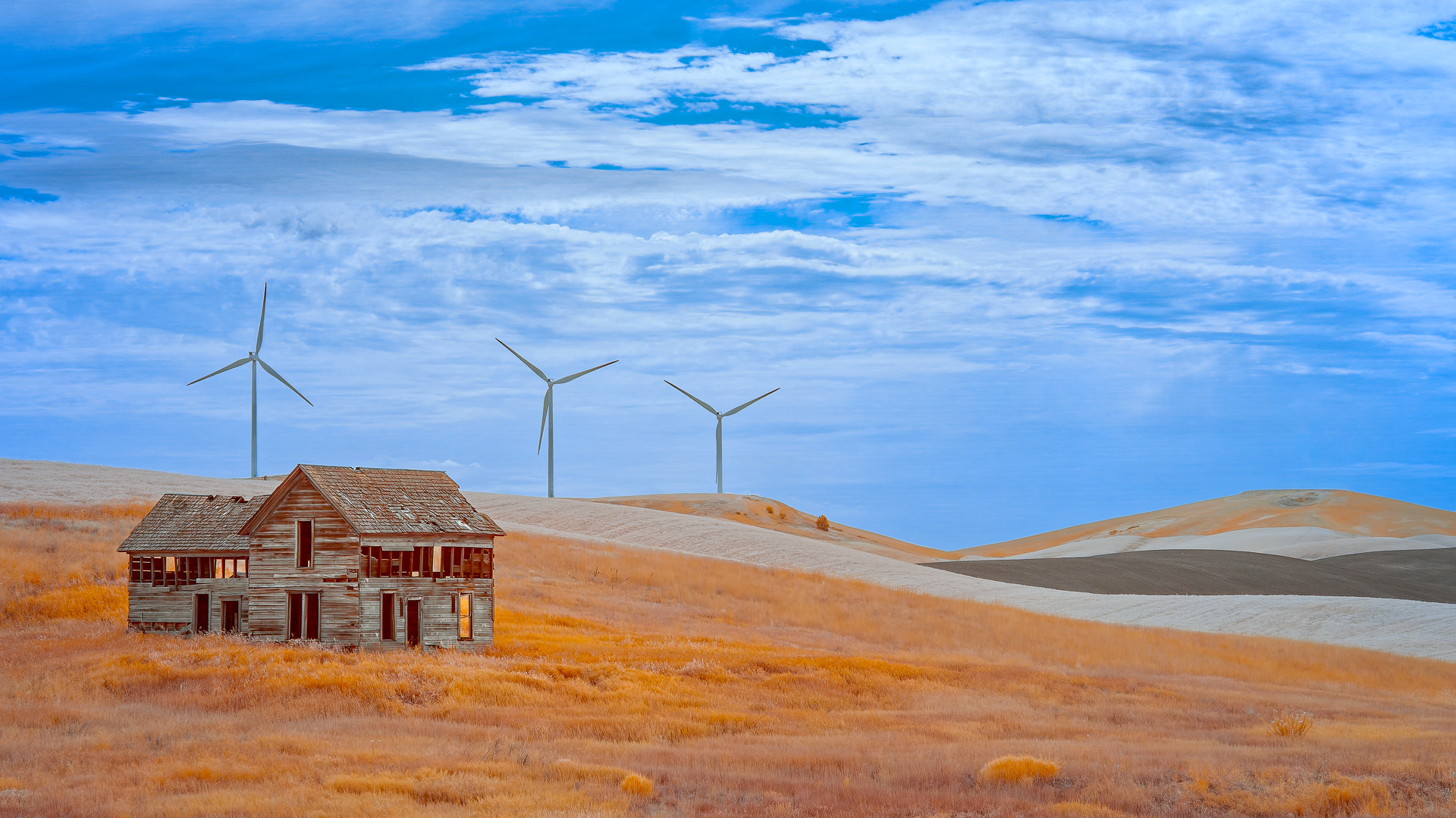
Very nice! This rendering is much more dynamic than the other image you posted. The sky radiating from structure really works well. I agree with Gary and Palli about extending the image and punching up the sky.
By the way, it's actually a schoolhouse and I can attest that it is leaning even more now than when you shot it. That truck chassis can only do so much! |
Jul 4th |
| 66 |
Jul 24 |
Comment |
Arik,
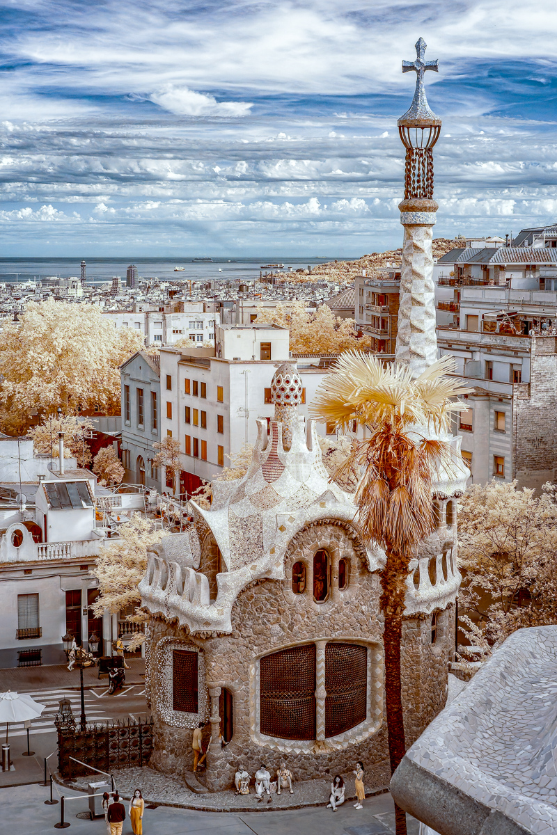
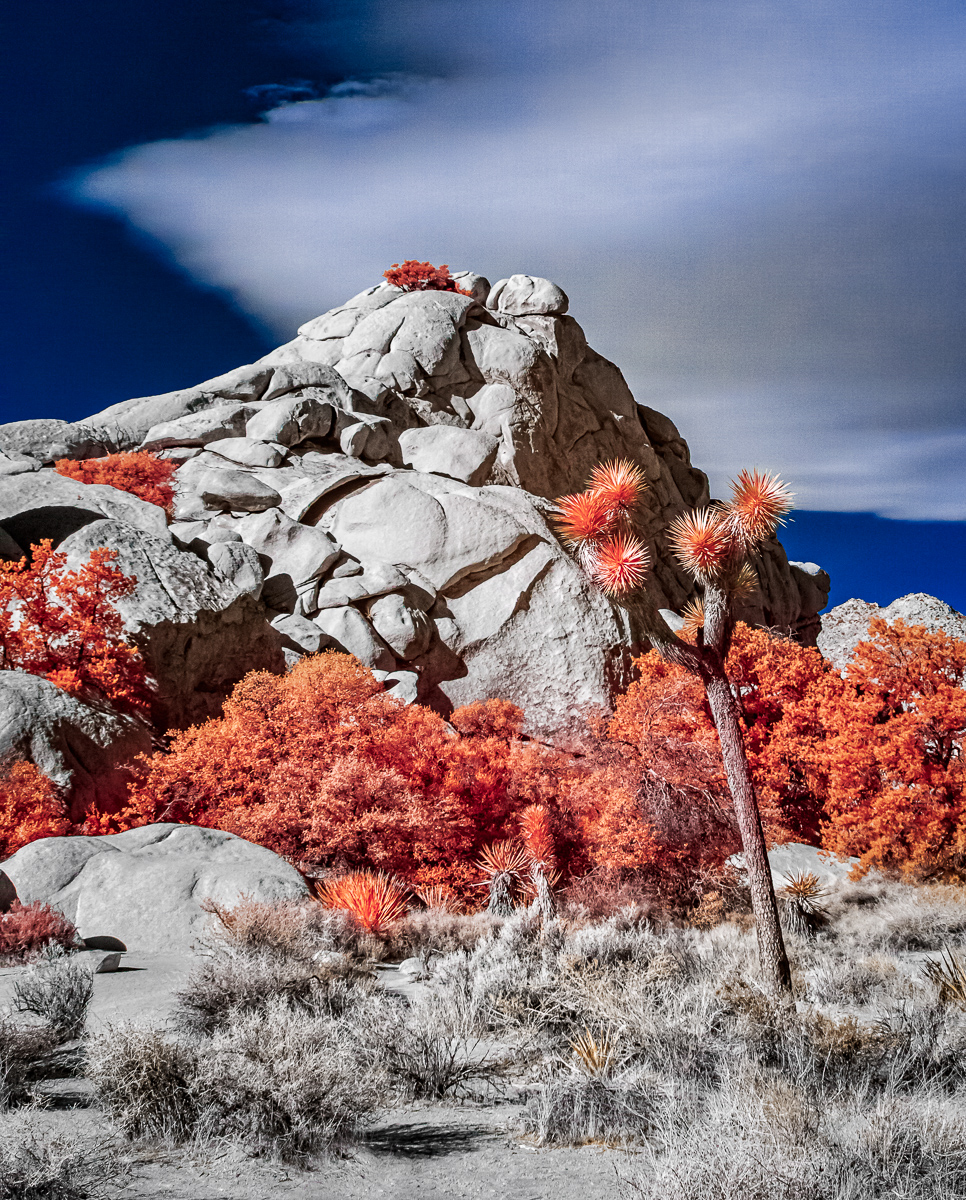
Really nicely done. At the risk of seeming overly whimsical, the composition brings to mind an army of trees (Ents?) following a battle-scarred general while the villagers stand at the sidelines. The color IR helps give it an other-worldly feel. |
Jul 4th |
| 66 |
Jul 24 |
Comment |
Melanie,
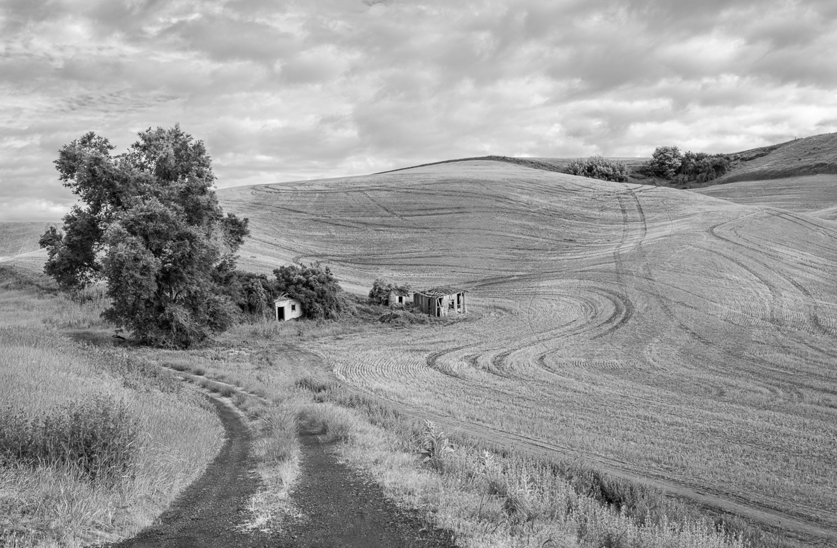
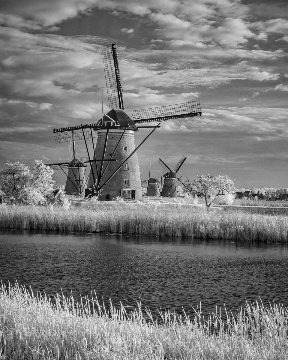
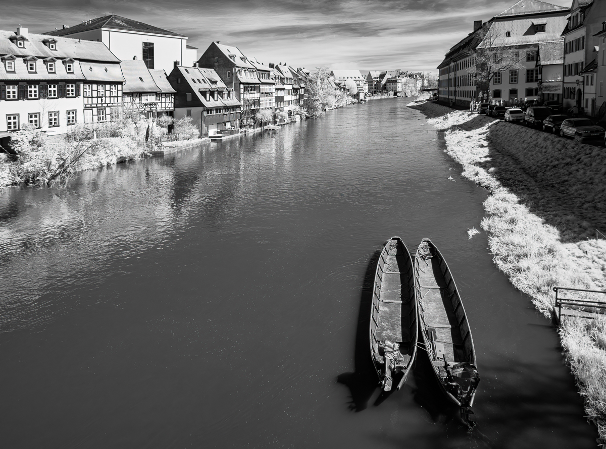
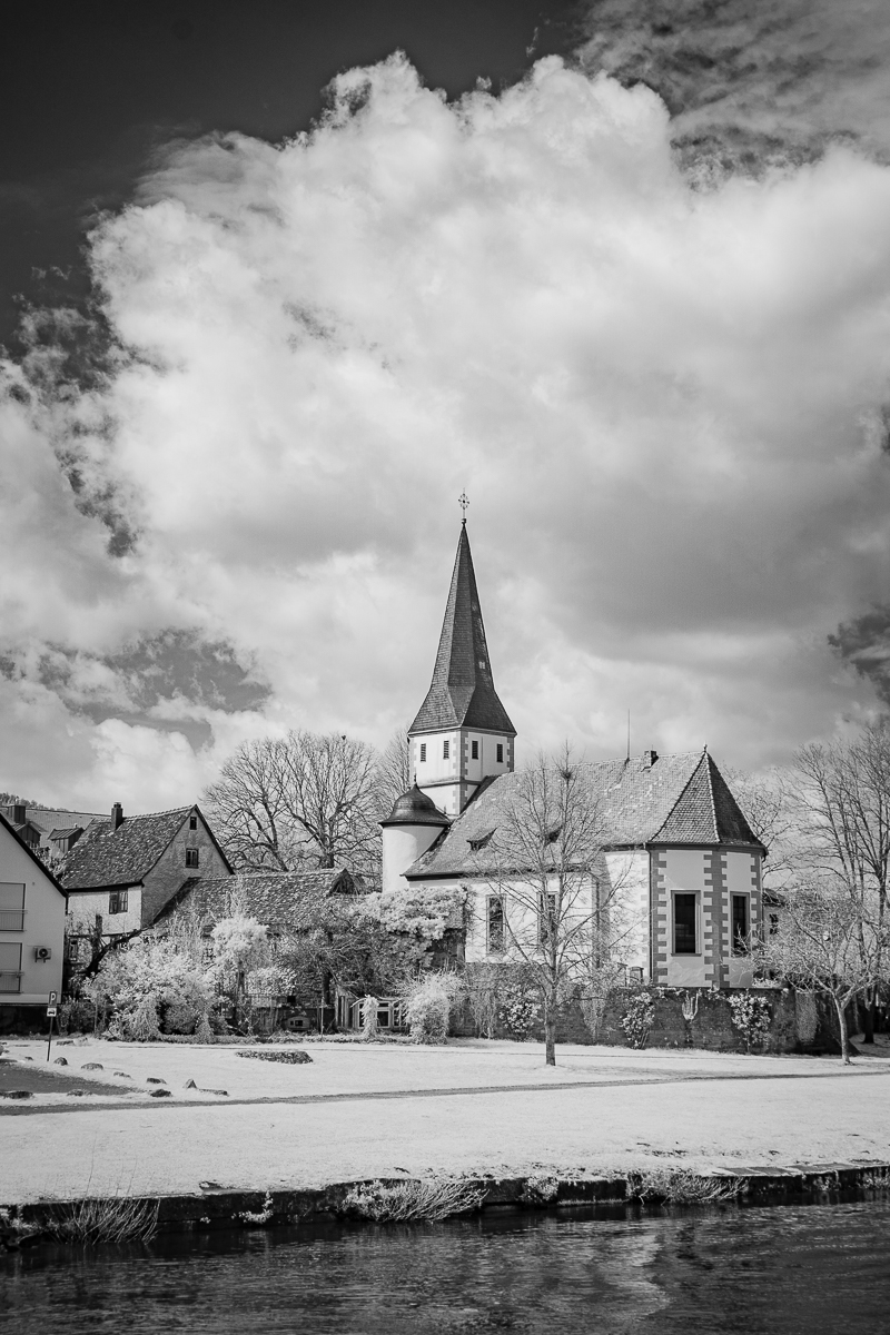
First of all, you found a terrific location for an IR landscape. The riverbend is perfect here and you included just enough sky for interest without it pulling the eye away from those wonderful hills. As to which version I prefer, I vote for the BW version. I find the blue in the color version draws my eye away from the textures of the vineyards while the monochrome version underscores them. |
Jul 4th |
7 comments - 0 replies for Group 66
|
13 comments - 3 replies Total
|