|
| Group |
Round |
C/R |
Comment |
Date |
Image |
| 11 |
Mar 24 |
Reply |
I did struggle with that arch debating whether to include all of it or non of it. I guess I compromised when I went with half of it, but I did like it as a framing device. |
Mar 5th |
| 11 |
Mar 24 |
Reply |
Thanks, Christian. That camera does a great job in situations like this. |
Mar 5th |
| 11 |
Mar 24 |
Comment |
Jim,
I've long been drawn to scenes like this and I really like yours. I think your crop was a good move as it makes the bench and the first train silhouette the first things I notice. If I was to recommend anything, it would be to clone out that odd stain on the wall to the right just under the window. It's a bit distracting and doesn't lend anything to the image. You should resubmit this to some competitions. I suspect it would do well. |
Mar 2nd |
1 comment - 2 replies for Group 11
|
| 66 |
Mar 24 |
Reply |
Thanks, Jack. I was drawn to that pair of ferns as well. It does give the perception that there are three "things" in the composition. |
Mar 5th |
| 66 |
Mar 24 |
Reply |
Thanks, Gary. |
Mar 5th |
| 66 |
Mar 24 |
Reply |
Thanks, Charles. Ferns are one of my favorite subjects in IR but can be very challenging. I was pleased with how well this particular image came out and I appreciate your thoughts. |
Mar 3rd |
| 66 |
Mar 24 |
Reply |
Thanks, Palli! |
Mar 3rd |
| 66 |
Mar 24 |
Reply |
Thanks, Arik! |
Mar 3rd |
| 66 |
Mar 24 |
Comment |
Emil,
This is terrific. It's as though this road led to something absolutely earth-shattering as we move toward those clouds. |
Mar 2nd |
| 66 |
Mar 24 |
Comment |
Wow. I love this. I agree with Gary (something I'm doing a lot this month) - crop down from the top to put the gulls even more front and center. |
Mar 2nd |
| 66 |
Mar 24 |
Comment |
Gary,
It's just so . . . ordinary! <g>
Seriously, it's a nicely composed b&w image of an interesting sight. I agree with Arik - the IR pulled out detail and your processing made the metal structure all the more worthy of notice. |
Mar 2nd |
| 66 |
Mar 24 |
Comment |
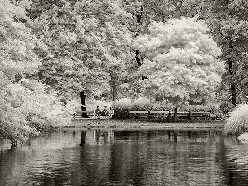
I concur with Gary on everything except the crop. I think this would benefit from a more aggressive crop though you might need to use one of newer enlargement tools to make it usable. I wanted to make that one tree more important to the image. Here's my version. I added Detail Extrator to the trees and went with a slightly different toning. Just food for thought. |
Mar 2nd |
 |
| 66 |
Mar 24 |
Comment |
Jack,
Reading your reply to Arik and Gary, I wouldn't worry so much about correcting the leaning towers if losing the foreground is the result. I'd leave that alone and concentrate on improving your exposure and contrast. By the way, that foreground umbrella is the star of the show and I really like how you processed it. |
Mar 2nd |
| 66 |
Mar 24 |
Comment |
Arik,
Lovely image, even if the main subject is kind of decrepid. The color contrast between the blue shack and the brownish foliage works well. The composition is spot on. About the only thing I'd suggest would be a light vignette to darken the corners and the grass along the bottom. |
Mar 2nd |
| 66 |
Mar 24 |
Comment |
Melanie,
Nice image, well composed. I largely agree with Gary about the foliage and the leaning buildings. I think it might be worth toning down the brightness on the buildings just a bit to put more emphasis on the foliage. Just a thought. |
Mar 2nd |
7 comments - 5 replies for Group 66
|
8 comments - 7 replies Total
|