|
| Group |
Round |
C/R |
Comment |
Date |
Image |
| 11 |
Nov 23 |
Reply |
If you are using Photoshop or a program with a similar clone stamp tool, this is my preferred method. Set the clone stamp brush blend mode from normal to darken. Set the opacity to 80%. Zoom in on the image (200% isn't a bad place to start) and sample areas similar in color and tone to the fringed area. Brush over the fringed area, resampling frequently. Adjust opacity as needed or use the fade tool (in the Edit menu) to reduce the effect. This technique (which I swiped from Mark Johnson many years ago) works most of the time. Here's a version of your image after using it. |
Nov 19th |
 |
| 11 |
Nov 23 |
Comment |
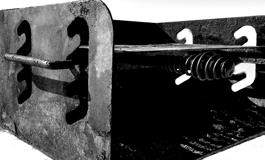
I love stuff like this, Jim, and I agree that the subject really benefits from simplifying. I do think you may have gone a bit too far on the left side of the image. It bothers me to see the spokes of the background gear end abruptly when they go behind the foreground piece. The gears at the top are just right, in my opinion. Generally, I don't love borders, but a thin stroke around the image might also be called for in this case. |
Nov 8th |
| 11 |
Nov 23 |
Comment |
I concur with Jim. I like your versions, but I'm not a huge fan of toned black and white as a general rule. I also agree that you can crop in from the right without losing anything vital to the image. I'd say you are off to a great start doing this kind of work! |
Nov 8th |
| 11 |
Nov 23 |
Comment |
I went a different than Jim and made it more stark black and white image using a levels adjustment in Photoshop, emphasizing the black and white slots on either side of the grill. I cropped it quite a bit, creating a more graphical representation. |
Nov 8th |
 |
| 11 |
Nov 23 |
Comment |
I agree with Jim, Peter. Composition and processing are spot on. |
Nov 8th |
| 11 |
Nov 23 |
Comment |
Wonderful composition and processing choices, Darlene. You do have a bit of white fringing along the transition between the dark rocks and the light sky that should be touched up. Otherwise, this is excellent. |
Nov 8th |
| 11 |
Nov 23 |
Reply |
Thanks for the comments, Jim. It really does slope in like that. Your contrast and sky-darkening are good suggestions, however, and I will take another look. |
Nov 8th |
5 comments - 2 replies for Group 11
|
| 66 |
Nov 23 |
Comment |
Interesting treatment. The only thing that doesn't quite work is the reflection of the siding of the original house. Otherwise, it's quite convincing. I need to spend some time figuring out this new medium. |
Nov 8th |
| 66 |
Nov 23 |
Comment |
I agree with the others. Great composition, but the sky doesn't work. |
Nov 8th |
| 66 |
Nov 23 |
Comment |
As with everyone else, once the highlights have been tamed this will be a standout image. |
Nov 8th |
| 66 |
Nov 23 |
Comment |
Lovely image all around. I concur with the others. |
Nov 8th |
| 66 |
Nov 23 |
Comment |
I like this as well. The angle you chose works well with this subject. I like what Gary did to the roof, but I'm not sold on his sky replacement. A tighter crop from the top and right side would also be in order, in my opinion. |
Nov 8th |
| 66 |
Nov 23 |
Reply |
Hi Gary,
Thanks for your feedback. I did indeed take a lot of images of this church. We also visited another favorite of Ansel Adams as well as Georgia O'Keefe: San Francisco de Asus just south of town. I have an image of that in my Monochrome group (#11) this month.
Personally, I liked the divider and scrapes as they give the overall subject character, but it's interesting to see the difference. I do like your contrast adjustment. |
Nov 4th |
| 66 |
Nov 23 |
Reply |
Hi Palli. Good thought. How about this version? |
Nov 2nd |
 |
5 comments - 2 replies for Group 66
|
10 comments - 4 replies Total
|