|
| Group |
Round |
C/R |
Comment |
Date |
Image |
| 11 |
Nov 22 |
Reply |
I like that, Allen. Good insight. |
Nov 22nd |
| 11 |
Nov 22 |
Reply |
Thanks, Michael. It's the first time for us. Fabulous place for fall color. |
Nov 5th |
| 11 |
Nov 22 |
Reply |
I see your point, but it's not what I was going for. |
Nov 3rd |
| 11 |
Nov 22 |
Reply |
I debated about the light streaks, but finally decided that they were a distraction. Perhaps I was wrong? |
Nov 3rd |
| 11 |
Nov 22 |
Comment |
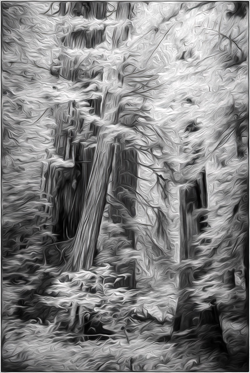
The redwoods are a tough subject under the best of circumstances. I like your composition and I like the lines you created. I agree that the softness of the image is a distraction. You could try running the image through a painterly-type filter to abstract the detail yet preserve the structure of the image. Just for fun, I ran it through Photoshop's Oil Paint filter and upped the contrast quite a bit. I did something similar to an IR photo of a dahlia I created a number of years ago. It ended up winning at a couple of local art shows and I sold a couple of prints. |
Nov 3rd |
 |
| 11 |
Nov 22 |
Comment |
Beautifully done, Jim. I like everything about this image - posing, cropping, processing all combine to create a classic portrait image. |
Nov 3rd |
| 11 |
Nov 22 |
Comment |
Nicely done, Michael. Composition is dead on and your processing works well here. |
Nov 3rd |
| 11 |
Nov 22 |
Comment |
I love this and have no suggestions other than to address some noise in the sky, especially in the lower left part of the frame. |
Nov 3rd |
4 comments - 4 replies for Group 11
|
| 66 |
Nov 22 |
Reply |
Thanks, Arik. |
Nov 3rd |
| 66 |
Nov 22 |
Reply |
Thanks, Jack. I think the empty space more as negative space so it appealed to me. |
Nov 3rd |
| 66 |
Nov 22 |
Comment |
I like this a lot. Honestly, I think the amount of sky adds a good balance to the amount of foreground and I would leave it alone.
I will say, however, that this image doesn't have a strong IR look to it, but it's a lovely B&W in any case. It would print beautifully. |
Nov 3rd |
| 66 |
Nov 22 |
Comment |
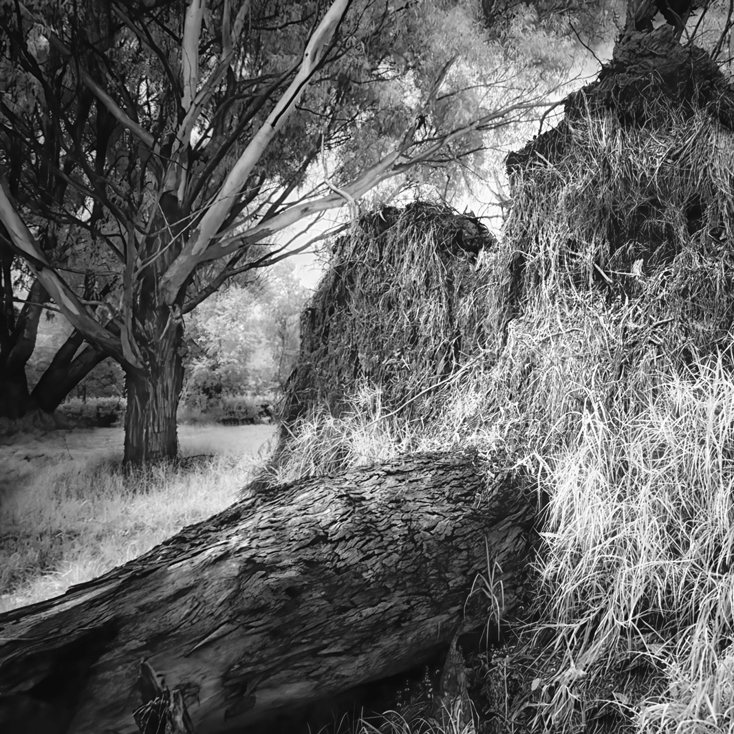
Interesting scene, but my eye kept going to that healthy tree in the upper left corner. My thought was that the overturned tree could act as a frame for the intact one, so I cropped out the rightmost part of the image to create a square frame. I lightened the healthy tree a bit and added a slight vignette to the overall picture. What do you think? |
Nov 3rd |
 |
| 66 |
Nov 22 |
Comment |
Very creative, Gary. You have a terrific "mind's eye" for this kind of work. I agree with Arik about the fringing around Taylor, but am otherwise enjoying this. |
Nov 3rd |
| 66 |
Nov 22 |
Comment |
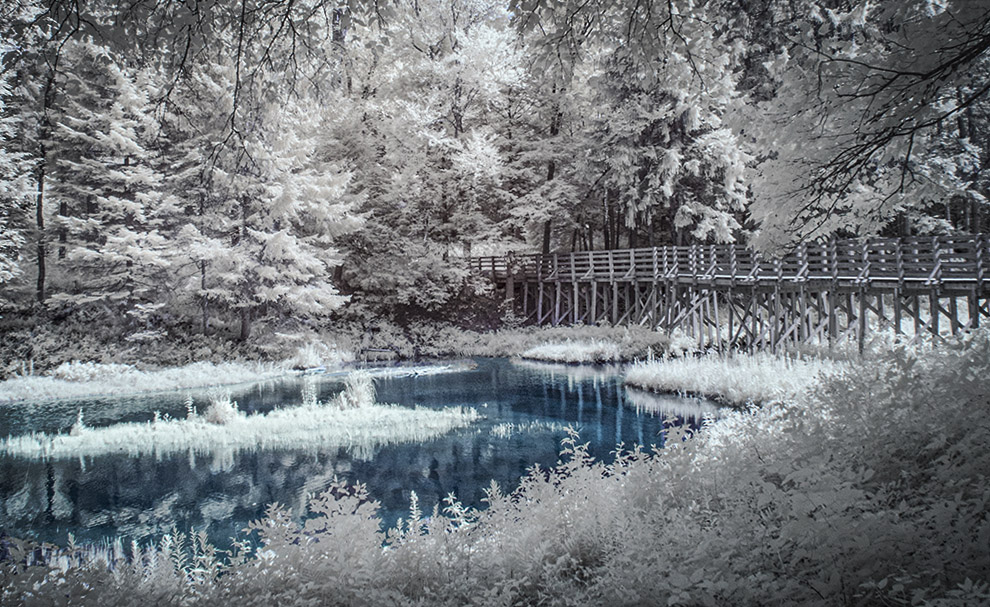
I like the scene, but I agree about the busyness of it. I do like what you did with the pond color, but (this seems to be a theme with me this month) it feels a bit tilted. I took it into Photoshop and straightened to what looked right in my eye. I also desaturated the bridge and applied some dodging and burning to balance the bright and dark areas a bit. |
Nov 3rd |
 |
| 66 |
Nov 22 |
Comment |
Great subject, terrific sky. I do prefer your edited version in terms of contrast. |
Nov 3rd |
| 66 |
Nov 22 |
Comment |
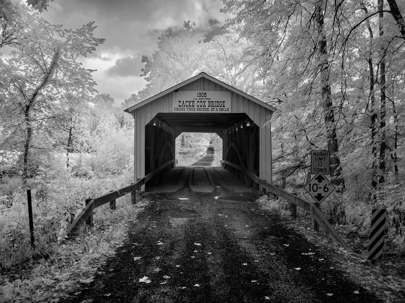
Wonderful scene and perfect for IR. I like where you were going here, but I decided to play with it a bit just to see the possibilities. I converted it to B&W, straightened it slightly (the structure seemed to lean to the left, and did some dodging and burning to direct the eye more down to the distant road. It also deals with the blue sky bleeding onto the tree tips. What do you think? |
Nov 3rd |
 |
| 66 |
Nov 22 |
Comment |
Nicely composed and processed. Well done, Melanie! |
Nov 3rd |
7 comments - 2 replies for Group 66
|
11 comments - 6 replies Total
|