|
| Group |
Round |
C/R |
Comment |
Date |
Image |
| 11 |
Apr 22 |
Comment |
Wow. This is terrific! I agree with Allen. I like your first choice, but I also really like the color version. No suggestions. |
Apr 29th |
| 11 |
Apr 22 |
Comment |
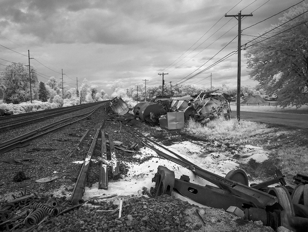
I also think you should preserve the foreground elements though I also agree with cropping out the stuff on the left side of the image. For whatever reason, those springs really grab my attention. Here's my crop. I also increased contrast, cloned out that sign in the lower right corner, did a bit of dodging, especially the debris in the foreground, and finally added a slight vignette. |
Apr 29th |
 |
| 11 |
Apr 22 |
Comment |
Great image! I really like the way the sidelight creates a series of arches that echo the main composition. I concur that a bit more straightening is called for. I hope you get a chance to print this as it would look terrific on the wall. |
Apr 29th |
| 11 |
Apr 22 |
Comment |
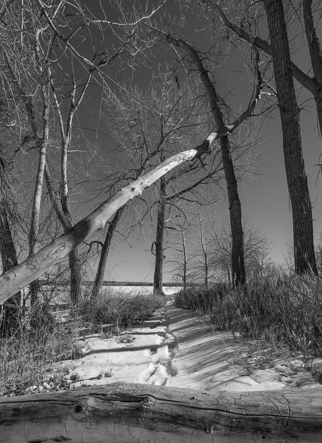
Pathways are one of my favorite subjects and I like this one a lot. I do, however, think it might benefit from a tighter crop. I find the area below the horizontal log distracting. I also really like the sunlight on the diagonal tree and would like to see it become more front and center to the composition. In my version, I've cropped in from all four sides, but especially from the bottom. |
Apr 29th |
 |
| 11 |
Apr 22 |
Comment |
I love the simplicity of this image, Peter. It has an abstract quality that really draws me in. Very minor suggestion: I could clone out that first partial step in the lower right corner. It's a bright area surrounded by a dark ring and, in my opinion, distracts from the overall composition. |
Apr 29th |
| 11 |
Apr 22 |
Comment |
Dead trees are one of my favorite subjects for black and white and this fine image is a great example why. I have no suggestions. |
Apr 10th |
6 comments - 0 replies for Group 11
|
6 comments - 0 replies Total
|