|
| Group |
Round |
C/R |
Comment |
Date |
Image |
| 11 |
Sep 21 |
Reply |
Good suggestion, Jim. Thanks.
|
Sep 19th |
| 11 |
Sep 21 |
Reply |
Thanks, Albert. I like your adjustments. |
Sep 10th |
| 11 |
Sep 21 |
Comment |
I like where you went with this though I found the final product a bit lacking in contrast. I improved contrast a small amount plus I did a bit more dodging and burning in the trees than you did. Finally I added a slight vignette. |
Sep 6th |
 |
| 11 |
Sep 21 |
Comment |
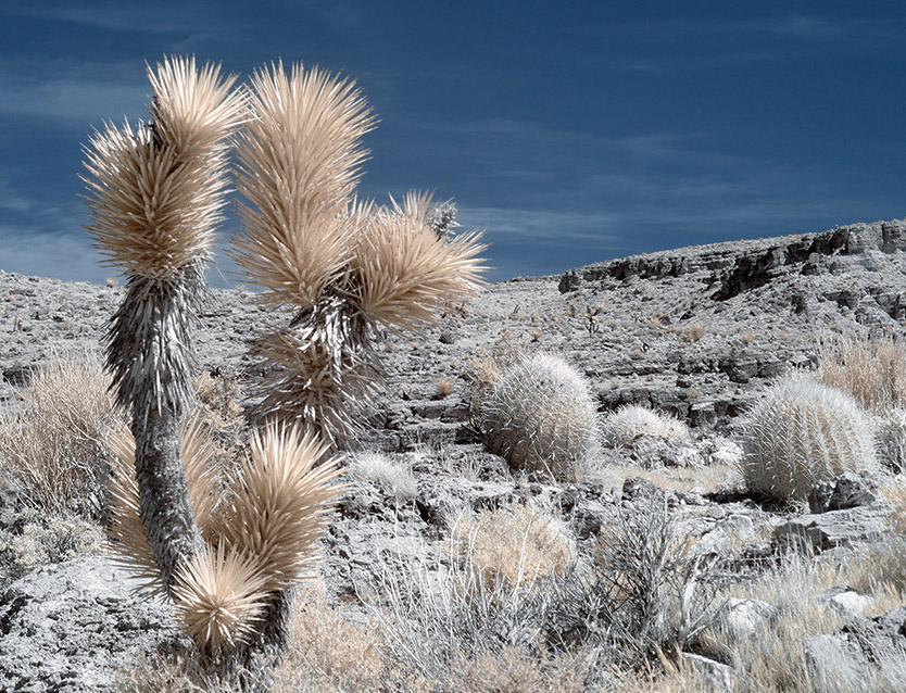
I like this scene and IR was a great choice, especially with those wonderful clouds. I do find the image too dark for my taste. I went in and lightened it overall while darkening the walkway in the foreground. I then selected the sky and upped the contrast in the clouds. Finally, I darkened the sky in the upper right to mirror the upper left. |
Sep 6th |
 |
| 11 |
Sep 21 |
Comment |
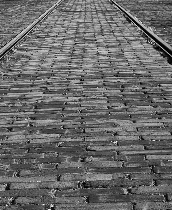
You were successful in highlighting the patterns and textures in the scene. I do find my self distracted by the partial line in the foreground and the dark bit in the very back. I went in and cropped it to eliminate those elements. |
Sep 6th |
 |
| 11 |
Sep 21 |
Comment |
This is a terrific image and nicely processed. I only have one nit to pick. The highlighted line next to the corner of her mouth is accentuated by your processing and I eye is drawn to it. I'd suggest either toning it down or removing it altogether. Since you don't have an ongoing relationship with the subject, I don't see any problem with tweaking her face a small amount. |
Sep 6th |
| 11 |
Sep 21 |
Comment |
I like this a great deal, Peter. The leading lines created by the row of torches, the light fixtures, and the paving stones all lead me back and around to the rear of the image. The processing is excellent. |
Sep 6th |
| 11 |
Sep 21 |
Comment |
Nice one, Allen. Definitely keep the leaf. It's a nice study of contrast between the dark leaf and the light flower. I also really like the way the veining stands out in monochrome. |
Sep 6th |
6 comments - 2 replies for Group 11
|
| 91 |
Sep 21 |
Comment |
I agree with Gary about it needing a bit more contrast. I also think it benefits from a somewhat tighter crop. I went in a did those two things plus I pushed the yellow a bit more toward the red side and largely desaturated the blues and cyans in the non-sky areas. I think it gives a bit more energy. |
Sep 19th |
 |
| 91 |
Sep 21 |
Comment |
I have to agree with Gary about the bright red spot on the middle tree. It looks like you may have had a hotspot on your lens. It would be fairly easy to tone that down in post.
I like the composition very much and I don't find the lack of detail in the tree trunks to be too much of an issue. It would be a lot of work, but you might try desaturating the blue in the cart, making it more of a neutral gray. |
Sep 19th |
| 91 |
Sep 21 |
Comment |
I like your use of false color to create a "fairyland" interpretation of the scene. The green water combined with the bits of blue and magenta on the rocks all serve to create this illusion. The only significant change you might consider is either cropping down from the top or cloning in some of the brush to eliminate the fence in the background. I find it draws my eye away from the important parts of the image. |
Sep 19th |
3 comments - 0 replies for Group 91
|
9 comments - 2 replies Total
|