|
| Group |
Round |
C/R |
Comment |
Date |
Image |
| 11 |
Apr 21 |
Comment |
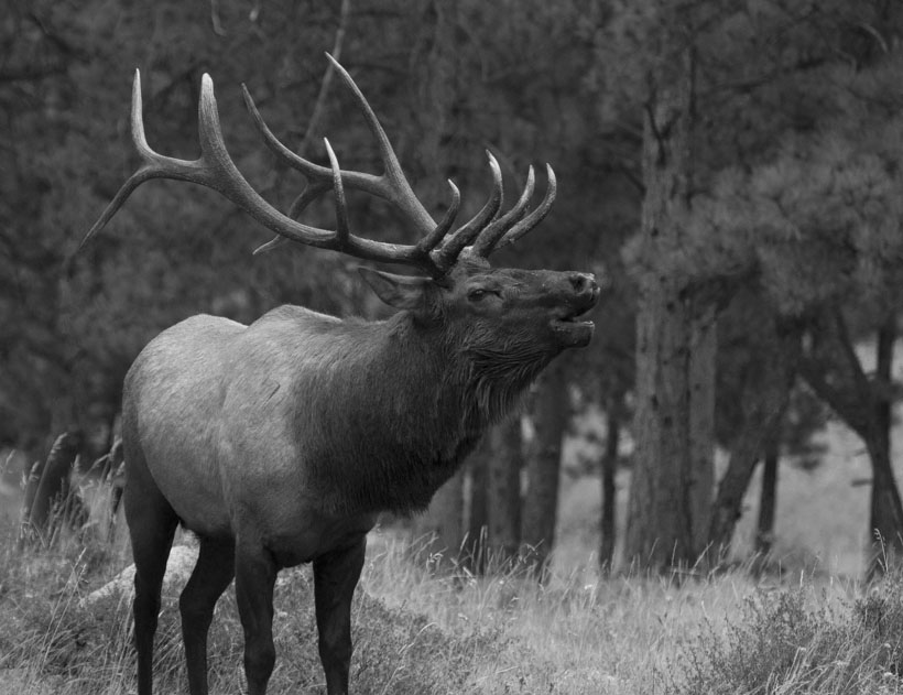
Great image and excellent processing. As to the crop, I don't mind the legs, but I think you should have left more room in front of the elk. Give him something to bugle at.
My image shows an different crop without trying to match your fine processing. |
Apr 7th |
 |
| 11 |
Apr 21 |
Comment |
I love images and subjects like this. Your processing is spot on. No suggestions. |
Apr 7th |
| 11 |
Apr 21 |
Comment |
An amazing capture and I think monochrome was exactly right for this image. I tried a version with a bit tighter crop and a bit more contrast. What do you think? |
Apr 7th |
 |
| 11 |
Apr 21 |
Comment |
I like this a great deal. The leading lines and shadows play nicely against the clouds in the sky. One small suggestion: take out that tiny white bit at the rear center of the bridge. |
Apr 7th |
| 11 |
Apr 21 |
Comment |
Flowers are great in monochrome. Tulips in particular work well in monochrome. I haven't really tried daffodils too much as I'm not fond of photographing them. Your image, however, has me rethinking that and I might give them a try myself.
I like your treatment quite a bit, especially with Jim's cleanup. |
Apr 7th |
5 comments - 0 replies for Group 11
|
| 91 |
Apr 21 |
Comment |
I really like this. The almost-perfect reflection with the tree coming up from it is marvelous. I also like the bit of grass in the foreground. The processing is effective, with subtle bits of red in the trees. The natural blue works well against the trees. One possible suggestion might be to desaturate the red in the central tree trunk. |
Apr 11th |
| 91 |
Apr 21 |
Comment |
Very creative use of selective color. The blue in the tree and sign set off very nicely with the otherwise monochromatic image. Compositionally, I like the play between the vertical and diagonal lines as well as the decorative columns. |
Apr 11th |
| 91 |
Apr 21 |
Comment |
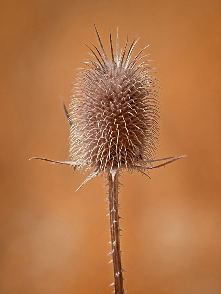
An interesting take on an easily overlooked subject. I like the simplicity of this "portrait" and the color choice works well. I was wondering about a more contrast version so I took this into Photoshop and played with a black and white adjustment layer and brought down the red channel. Then I changed the blend mode to luminosity to apply the changes to the color version. What do you think? |
Apr 7th |
 |
| 91 |
Apr 21 |
Comment |
Palm trees are one of my favorite subjects in IR and I really like your intense B&W processing. Excellent job. |
Apr 7th |
4 comments - 0 replies for Group 91
|
9 comments - 0 replies Total
|