|
| Group |
Round |
C/R |
Comment |
Date |
Image |
| 11 |
Jan 20 |
Reply |
Thanks, Lisa. |
Jan 21st |
| 11 |
Jan 20 |
Reply |
Sharron - thanks for your comments. That's a good point about the vapor trail. |
Jan 21st |
| 11 |
Jan 20 |
Reply |
Thanks for your thoughts, Jim. I'll be looking at this image with fresh eyes. |
Jan 8th |
| 11 |
Jan 20 |
Reply |
Thanks, Allen. I guess I'm going to have to take another long, hard look at those lines. |
Jan 8th |
| 11 |
Jan 20 |
Comment |
Nice photo and a great subject for monochrome. Tom addressed my personal nits. The brighter eyes really make for a stronger overall image. |
Jan 8th |
| 11 |
Jan 20 |
Comment |
I'm a sucker for shooting empty benches. There's something about them that feels lonely and expectant. I think your monochrome processing of this image really brings those kinds of emotions out.
I've shot that same interior a number of times and have not found my photos very satisfying. I don't think I ever tried converting any of them to black and white. I'll have to go back to my catalog and take another look. |
Jan 8th |
| 11 |
Jan 20 |
Comment |
I don't think I have much to add to what others have offered. It's a terrific piece of photojournalism that you should be rightly proud of. Unfortunately, there are too many technical issues that competition judges will pick apart. |
Jan 8th |
| 11 |
Jan 20 |
Comment |
Nicely done. As Tom says, your crop worked really well here, particularly creating two sets of three (plants and butterflies). Monochrome is also a great choice with this image. I like the direction Tom took it, but I'd tone down the leaves a bit. They seem a bit too bright to my eye. |
Jan 8th |
| 11 |
Jan 20 |
Comment |
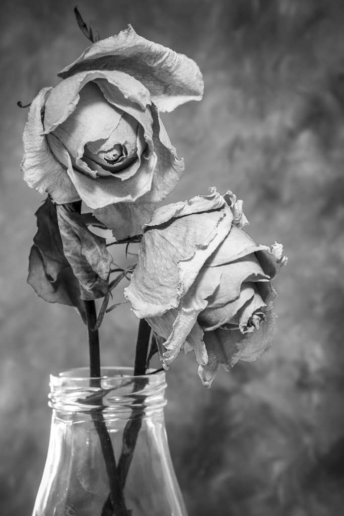
Nice composition. I like the placement of the bottle and roses to the left side of the frame, giving the rose on the right room to "look" into the right side. Great overall balance. The monochrome conversion really brings out the texture of the roses, so good choice there.
I wondered if the rose on the right wasn't a bit too bright in relation to the left rose and the leaf, so I took it into Photoshop and burned it a bit. I also dodged the leaf. What do you think? |
Jan 8th |
 |
| 11 |
Jan 20 |
Comment |
This is a great subject for monochrome. The conversion really brings out the tones, textures, and shapes of the buds. I especially like the interplay between the reds and greens. Tom's version addresses several of my concerns, including the white-ish area in the upper right corner.
I do wish the original photo had greater depth of field. I'm distracted by the out of focus buds, especially the one on the right. |
Jan 8th |
| 11 |
Jan 20 |
Reply |
Love the "woodblock". I've played with the patterns in that new tool, but not the shapes. I'll definitely be spending way too much time in Photoshop this week. |
Jan 6th |
| 11 |
Jan 20 |
Reply |
Thanks for your comments, Tom. I confess to really liking that X in the parking lot and am reluctant to give it up, but I can see your point. I don't love putting the church in the center of the image, but I do like what you did with contrast. |
Jan 5th |
6 comments - 6 replies for Group 11
|
6 comments - 6 replies Total
|