|
| Group |
Round |
C/R |
Comment |
Date |
Image |
| 11 |
Dec 19 |
Reply |
Thanks, Victor. I think you captured what I was going for in this image. |
Dec 31st |
| 11 |
Dec 19 |
Reply |
Jim - thanks for taking the time to comment and process the image. I'm coming around on cropping in from the right. I think you may have cropped in too much from the bottom, at least to my taste. As to the change in contrast, I find it changes the overall mood of the image to something other than what I intended. It certainly shows how much post-processing can affect the mood of an image. Still, it gives me much to think about and that's what I was hoping for in joining this group. |
Dec 18th |
| 11 |
Dec 19 |
Reply |
Thanks, Sharron. I debated about that bush, but was reluctant to lose too much of the boathouse. I'll take another look.
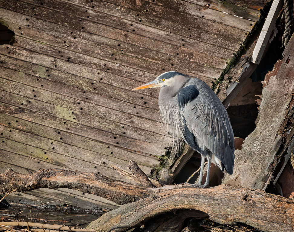
I'm planning on printing this for our club's print competition next month, so we'll see how many elements my fellow members pick up on. It's always fun for me to take a photo like this, get home, and discover lots of details I didn't see at the time. I almost missed the Great Blue Heron standing by the wreck near the bow. Fortunately, I spotted him in time to take several photos with him as main subject. |
Dec 15th |
 |
| 11 |
Dec 19 |
Reply |
Thanks for the kind words, Tom. |
Dec 14th |
| 11 |
Dec 19 |
Comment |
This is beautifully done! Your processing is outstanding, eliminating the distractions and really bringing out the lizard and his branch. I only have one minor nit: that little bit sticking of the bottom of the branch on the right edge of the image is distracting to me. You might consider either cropping in just a bit or cloning it out.
Otherwise, I'm super impressed and am thinking I need to get to the reptile house at our local zoo... |
Dec 11th |
| 11 |
Dec 19 |
Comment |
As someone who loves shooting old cars, particularly details of old cars, I like this very much. You did a very good job of shooting straight on, creating a terrific study of lines, angles and circles. Very sharp as well. Given the limited color palette of the image, monochrome was a great choice.
The only thing I can suggest is that you might consider lightening the Auburn logo at the center of the hub. As it stands, it's hard to read. |
Dec 11th |
| 11 |
Dec 19 |
Comment |
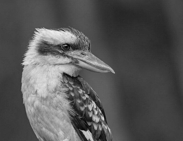
Lovely photo of what is to us North Americans a very exotic bird. Very nice job of getting the bird's eye and feathers tack sharp while blurring the background. Your black and white processing of the bird is very nice and you brightened his eye just right.
Two things you might consider: 1. crop the image with more space to the right, giving him some space to look into. 2. I don't think your background processing was as successful as your main subject's processing. I find the background looks too artificial. The original background works pretty well to my eye.
I've taken your original and tried processing the bird as close to what you've done as possible. I mainly wanted to illustrate a different crop and what it looks like with the original background preserved. |
Dec 11th |
 |
| 11 |
Dec 19 |
Comment |
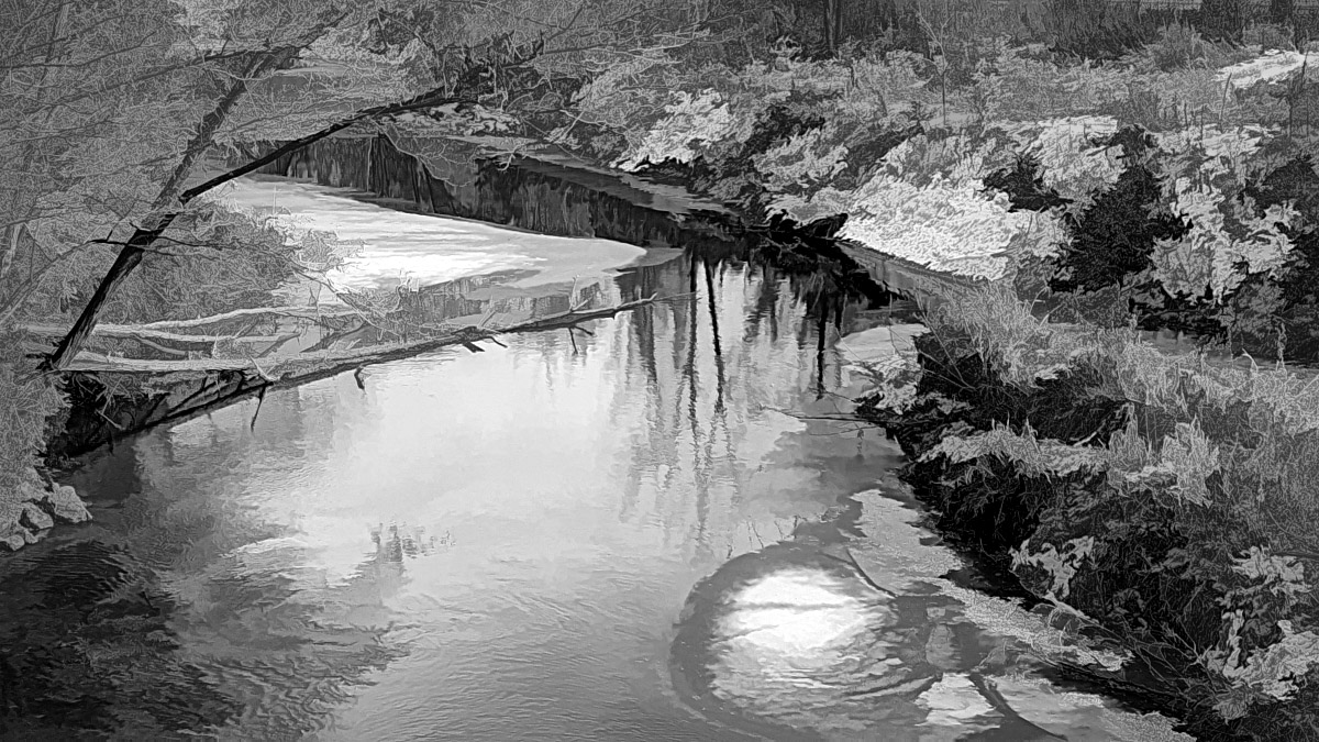
I think you had the right idea in attempting to simplify a lovely, but chaotic scene. I think you may have gone too far with the Topaz filter.
To illustrate a different approach, I decided to take both the original and the final images into Photoshop as layers. I put the original image on the bottom of the layer stack and converted it to black and white. The final image was moved to the top of the stack and I dropped the opacity of the layer to 70%. I then used a levels adjustment layer to increase overall contrast and finally applied a light vignette. It preserves most of the simplification but brings back just enough detail to make the scene more recognizable.
This is something I do a lot when I play around with "painterly" type processes. |
Dec 11th |
 |
| 11 |
Dec 19 |
Comment |
Monochrome was a great choice for this image. It's not nearly as impactful in color. In particular, I like the way the processing really brought out the water spray and feather detail. About the only suggestion I have is to consider adding a vignette to darken the lower corners of the frame. |
Dec 11th |
| 11 |
Dec 19 |
Comment |
A very dramatic image which, as you say, really brings out the texture and shapes. You've done a great job of presenting a seemingly chaotic scene in a well ordered way.
I do think, however, that I prefer the sky in "Original 2". The uniform gray in the final image doesn't look natural to me and, I believe, detracts from the overall composition. |
Dec 11th |
6 comments - 4 replies for Group 11
|
6 comments - 4 replies Total
|