|
| Group |
Round |
C/R |
Comment |
Date |
Image |
| 41 |
Dec 19 |
Reply |
I wonder if you might find the whole scene to coalesce a bit more if you took this image, stamped a new layer (ctrl-alt-shift E) and then ran the resultant later through a filter. Something like NIK or Topaz? With a treatment applied to the full image may smoothe the transitions between the layers. Just a thought. |
Dec 6th |
| 41 |
Dec 19 |
Comment |
Nice work! I've seen a few of these small planets and it's rare to get one to come out this clean. Very well done. 60 image Pano HDR is called commitment!!! |
Dec 6th |
| 41 |
Dec 19 |
Comment |
A lot of work compositing all of these images together. The result is an interesting image that feels more like a painting than a photograph. Compositing is something I haven't typically been very strong in, but I would like to learn it a bit better. |
Dec 6th |
| 41 |
Dec 19 |
Comment |
Interesting concept. I appreciate the message you are conveying here. The burning tree is really well done, and I like the brilliant skies in the background as well. For me, I struggle with images that border on the illustration style. Incorporating the different images into one is challenging to get them all to blend together seamlessly. In this case, the monkey fits conceptually, but to me it doesn't blend in to the scene as well as I'd have liked. That may just be my perception though, as I have never been very good at compositing like this.
|
Dec 6th |
3 comments - 2 replies for Group 41
|
| 61 |
Dec 19 |
Reply |
I appreciate your thoughtful response and detailed feedback. I wouldnt be surprised if there was some negative feedback based on the content. As you said, it could be somewhat uncomfortable for some. I havent shown this image much in public circles as of yet, so I havent really encountered it yet. We'll see! |
Dec 21st |
| 61 |
Dec 19 |
Reply |
Thanks! Its fun to try to create outside the box sometimes. Working with models who share that passion is very rewarding. |
Dec 21st |
| 61 |
Dec 19 |
Reply |
Thank you so much! I always enjoy sorking with Breana to see what we can come up with. She does a good job conveying emotion. |
Dec 21st |
| 61 |
Dec 19 |
Reply |
I appreciate your comment! I really enjoyed trying to make my vision come to life. Thanks |
Dec 21st |
| 61 |
Dec 19 |
Reply |
Hey thanks! I apprecciate it! |
Dec 21st |
| 61 |
Dec 19 |
Comment |
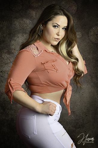
I really like the color harmony here with the warm tones of the wood and the warm skin tones, complimenting the red shirt and matching hat. The contrast with the dark shadows is dramatic. Overall a really strong image. |
Dec 15th |
| 61 |
Dec 19 |
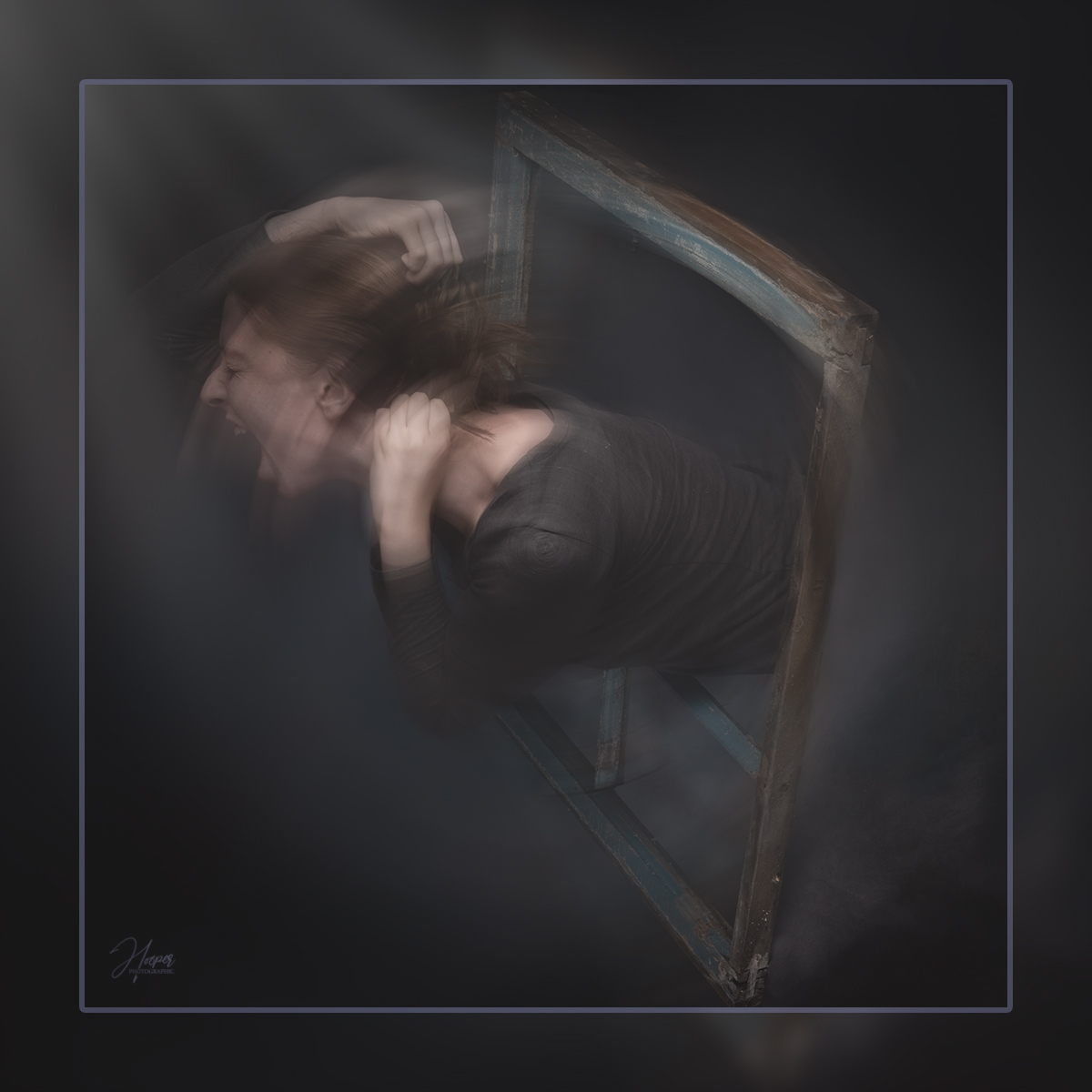
Comment |
I like the emotion youve caught here. Well done. I think id suggest lightening the black sleeve just a touch, as noted above. Additionally, and this might be a result of the size requirements here, but the background and facial tones seem noisy. With 2 off, you might have been able to up the power and drop the iso. |
Dec 6th |
| 61 |
Dec 19 |
Comment |
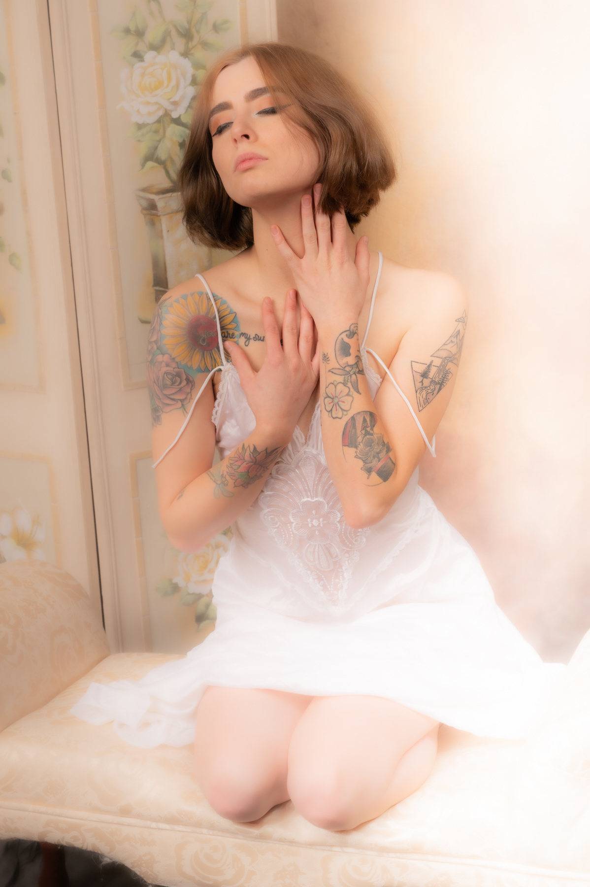
I might also suggest softening the bend of her fingers a bit.
And as much as I enjoy a peekaboo of cleavage, I'm not sure it makes sense here. The rest of the wardove doesn't support the splash of sexy. Seems a bit distracting rather than supportive. |
Dec 6th |
| 61 |
Dec 19 |
Comment |
I like the lighting youve used here. It woeks well to illuminate the eyeshadow and the smoke.
I'm not sure how large your studio is, but I think it might help if you moved your model away from the backdrop a bit more to let the background go softer. |
Dec 6th |
| 61 |
Dec 19 |
Comment |
Great capture. I really like how you have the two "manikin" interacting with one another, while also preserving their inanimacy. Great job retouching the makeup on the human model to pop out in contrast. |
Dec 6th |
| 61 |
Dec 19 |
Comment |
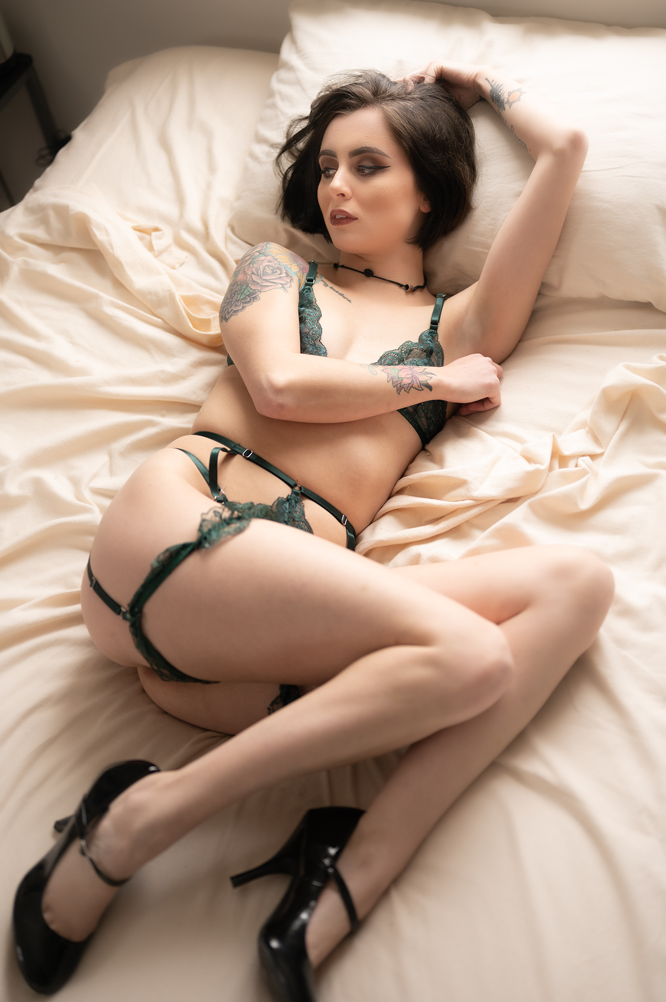
Nice capture. Black on black can be tricky to get separation but your strip lights have done the job well without overdoing it.
Two thoughts. One, I think if you raised your key just a touch higher, the shadow falling off the nose would point downward a little bit for that Rembrandt look. |
Dec 6th |
| 61 |
Dec 19 |
Comment |
Secondly, I was looking for something to serve as a contrast to the black on black. Maybe a belt with a small silver buckle would give your eye something to circle around to. Just a thought. |
Dec 6th |
7 comments - 5 replies for Group 61
|
10 comments - 7 replies Total
|