|
| Group |
Round |
C/R |
Comment |
Date |
Image |
| 40 |
Feb 24 |
Reply |
Hi Don, Yes, it is much better without the tree. I think your effort of cloning out the windows looks good. Well done. Because the bottom yellow part of the building juts out at us, it seems to give the image depth. |
Feb 13th |
| 40 |
Feb 24 |
Comment |
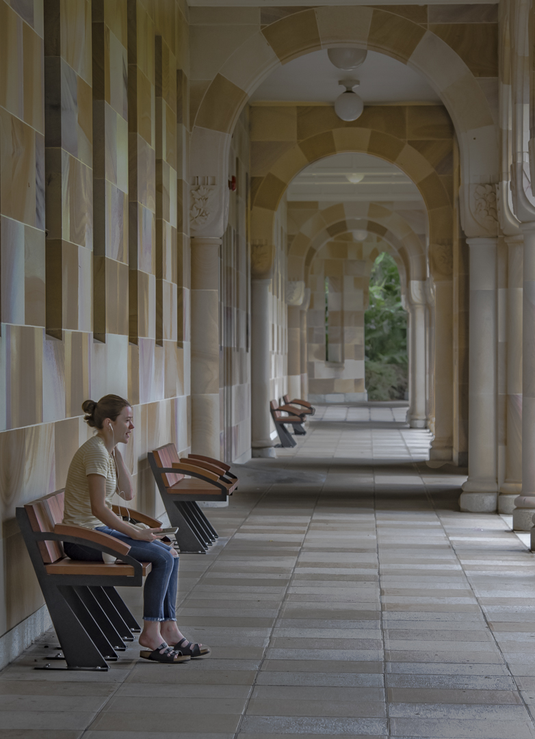
Hi, This is an interesting shot of the house. I feel that you have cropped in a bit too tight. I think I would try to leave some of the staircase as a leading line. I would try cropping the window on the far right. I do think that your crop on the left is good and I would not mind seeing some of the dirt in the foreground. Love the green house in Greenland! |
Feb 13th |
| 40 |
Feb 24 |
Comment |
Hi Janice, What an interesting shot! I find my eye being drawn to the blue sky though. Is it possible to select the sky and reduce the blue a bit? |
Feb 13th |
| 40 |
Feb 24 |
Reply |
Hi Henry, This is what I did to your image. I think the adjustments are subtle. The orange seems clearer to me. |
Feb 13th |
 |
| 40 |
Feb 24 |
Comment |
Hi Andrew, These devotees certainly do put a lot of work into their costumes. I think Lady Blue Hair is a little close to the edge of the frame. If you cropped a little more diagonally from the top right corner, you could crop the entire badge on his hat. This would also bring Lady Red Hair closer to the edge of the photo, but it would balance well. |
Feb 7th |
| 40 |
Feb 24 |
Comment |
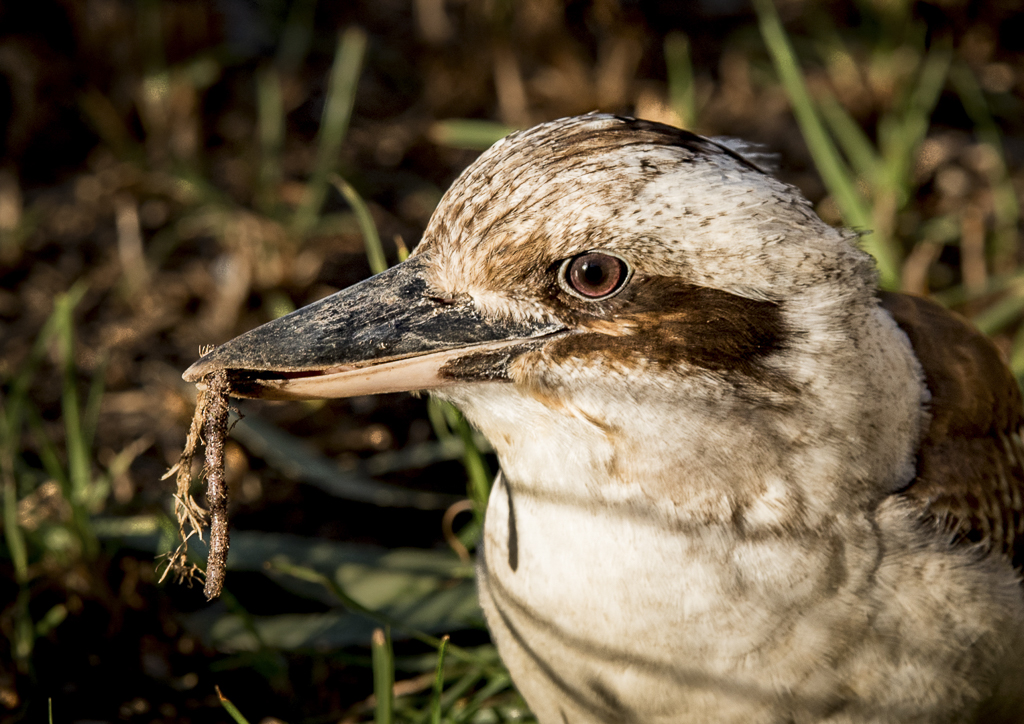
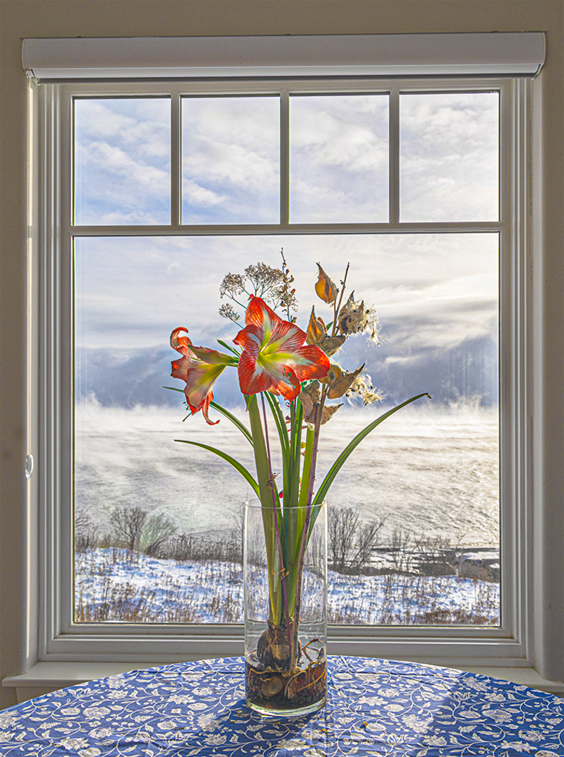
Hi Henry, I love the concept of your photo. In Lightroom, I dropped the highlights and added a moderate amount of texture. I also added a touch of vibrance. This brought the flower to life. Living in Australia, I cannot understand how people conduct day to day business in such cold conditions! |
Feb 7th |
| 40 |
Feb 24 |
Comment |
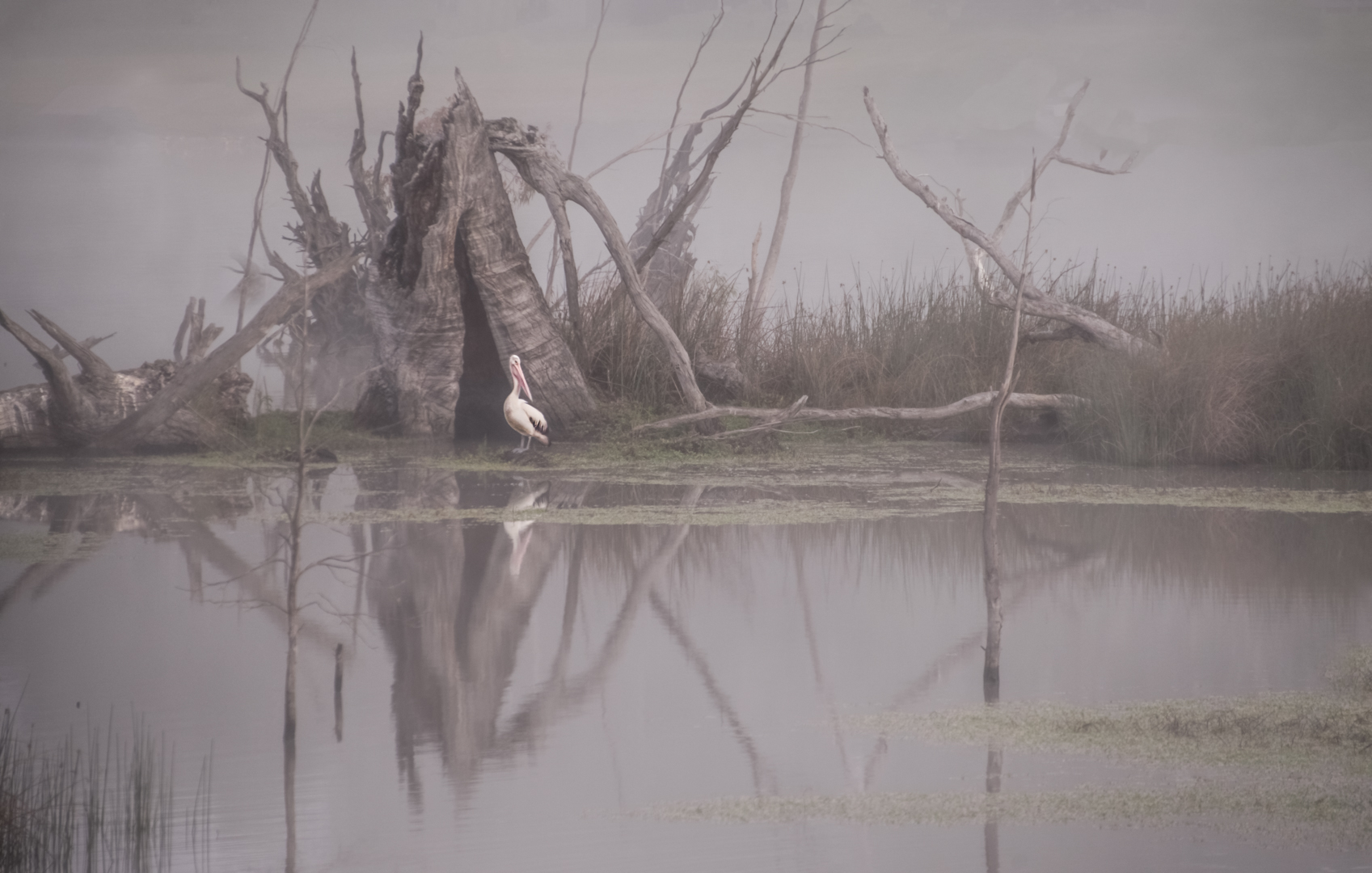
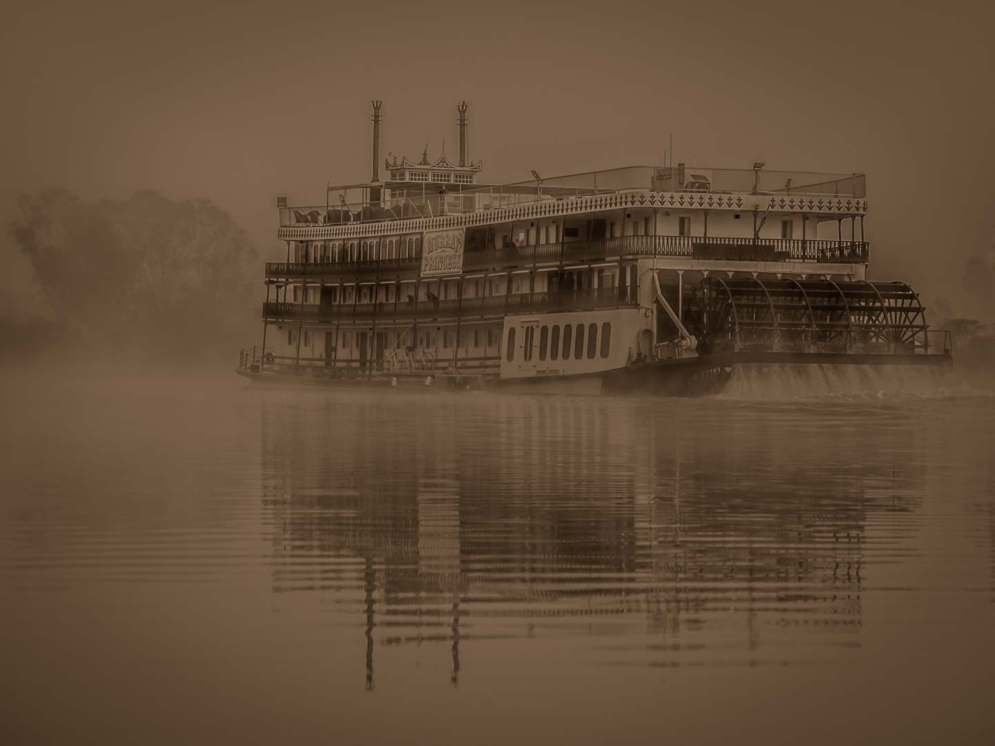
Hi Catherine, I copied your photo and tried dropping the highlights. I was surprised to find some clouds hiding there. I also added a little more contrast and reduced the texture a bit. The way the mist is lying so low is very interesting. |
Feb 7th |
| 40 |
Feb 24 |
Comment |
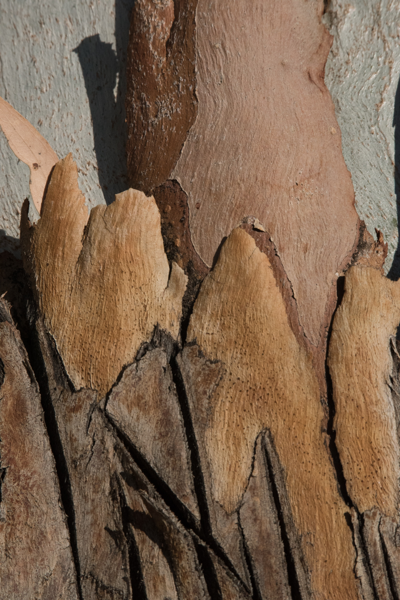
Hi Dan, Well seen. I like the colours you were able to find here. They work well together. Have you considered cropping from the left to make it a squarish format. I find the tree distracting. The squarish format would take the large vertical line off the centre too. |
Feb 7th |
6 comments - 2 replies for Group 40
|
6 comments - 2 replies Total
|