|
| Group |
Round |
C/R |
Comment |
Date |
Image |
| 40 |
Jan 22 |
Reply |
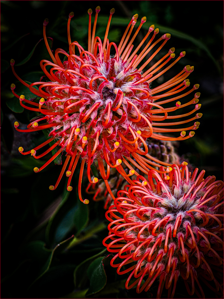
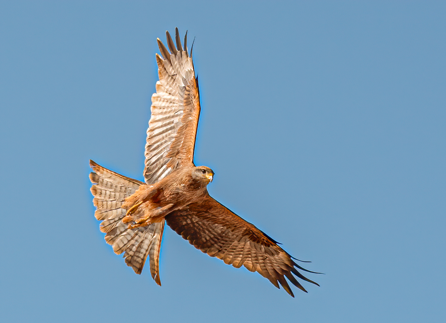
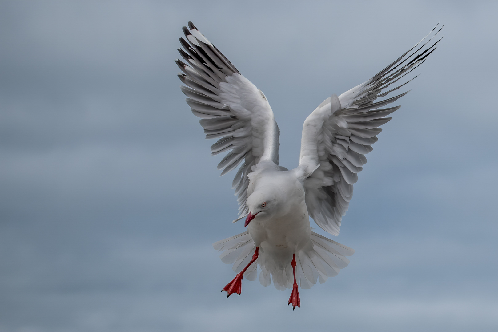
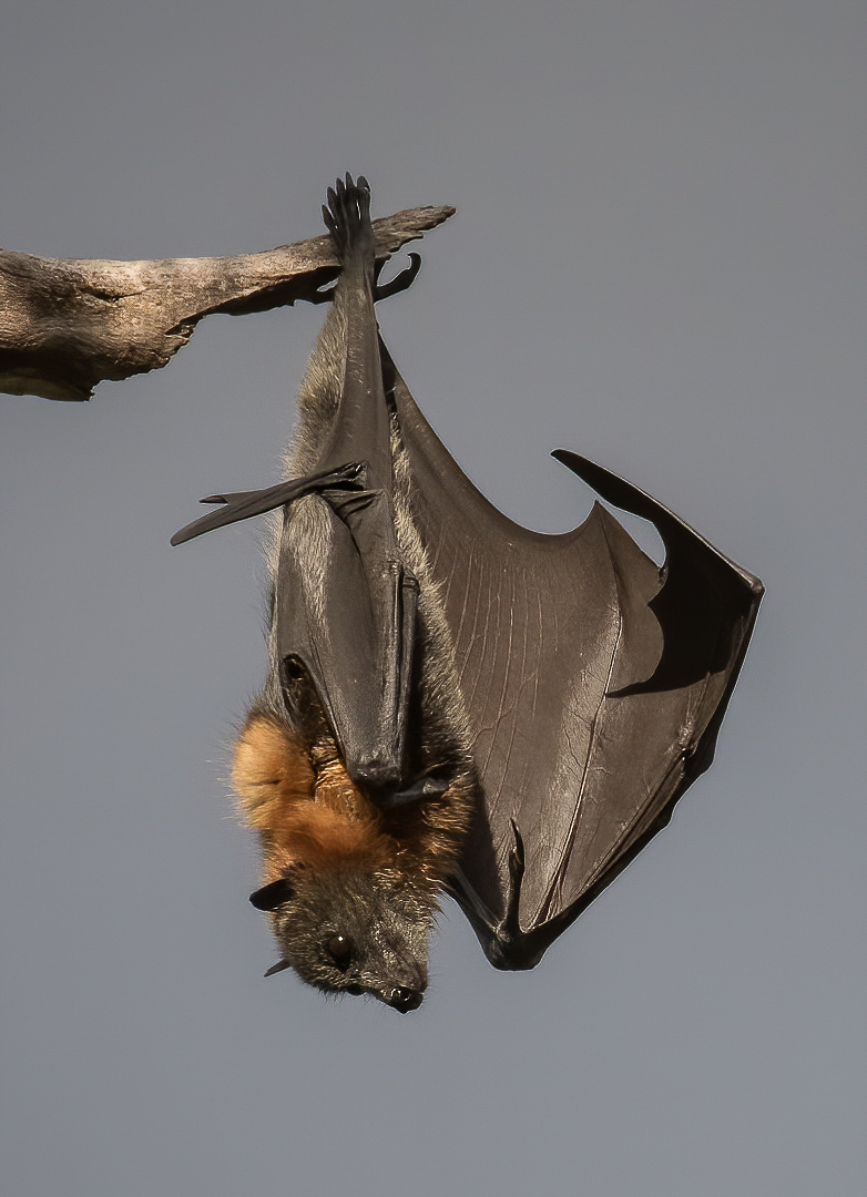
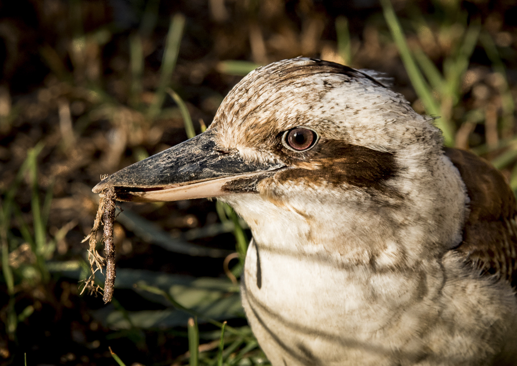
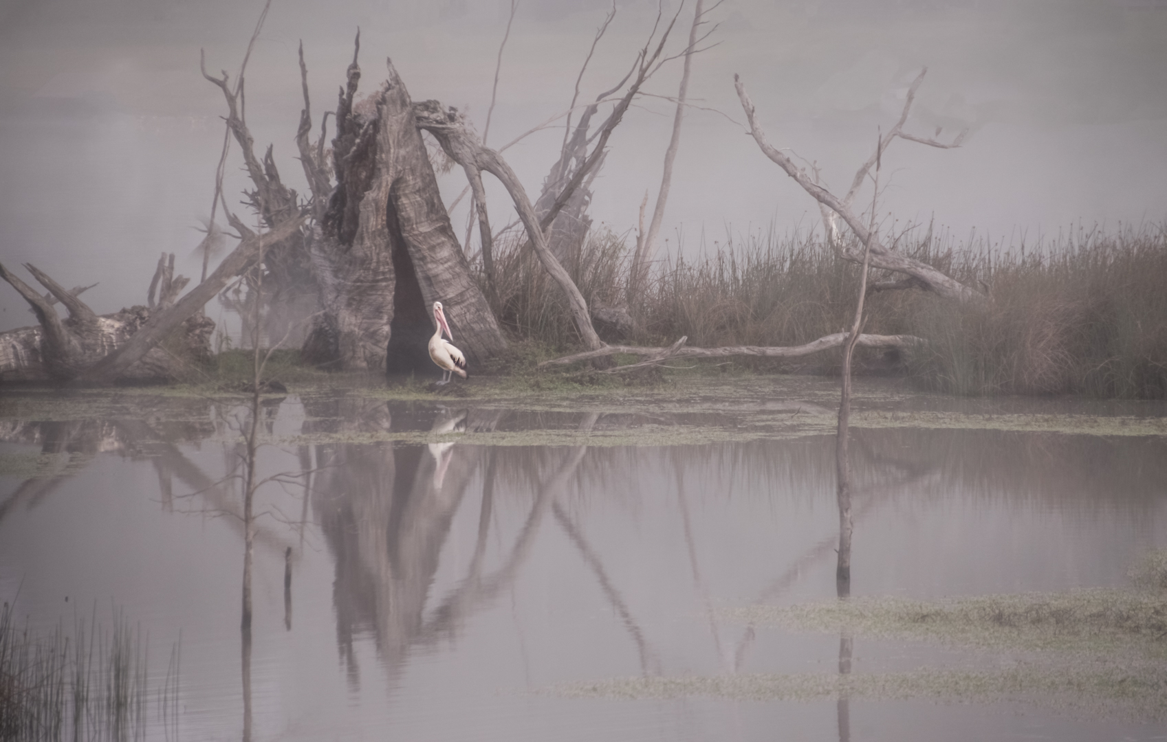
Thanks for your comments Henry. I have added a bit more contrast and space around him as you will see in the photo above in reply to Alison. |
Jan 20th |
| 40 |
Jan 22 |
Reply |
Hi Alison, thanks for your comments. I have reworked the image giving him a little more space. I wanted to keep it a nature image, so had to be careful with what I did. I have darkened the background a little and used Henry's suggestion of a bit more contrast. |
Jan 20th |
 |
| 40 |
Jan 22 |
Reply |
Thanks Andrew, I have not put it into a Club competition yet, but I certainly will do it soon.
|
Jan 17th |
| 40 |
Jan 22 |
Reply |
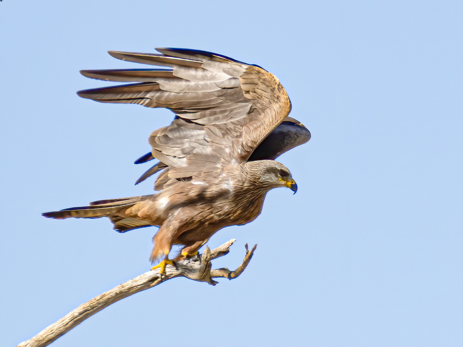
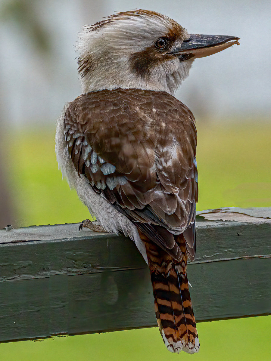
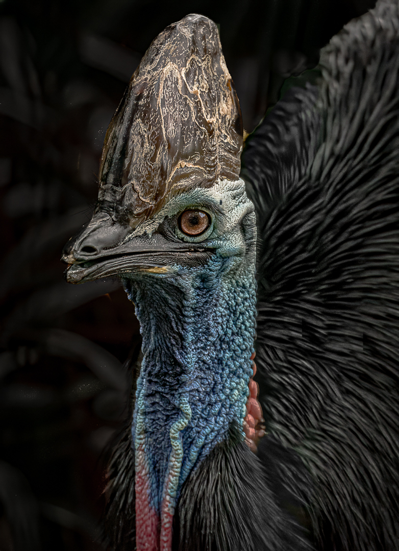
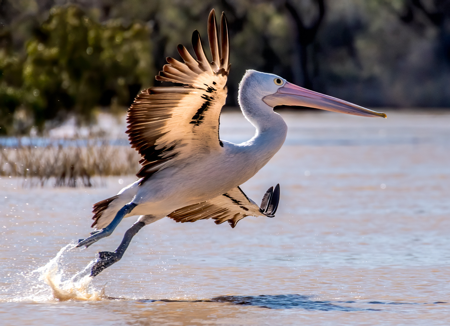
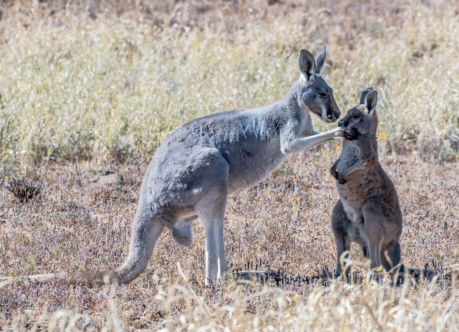
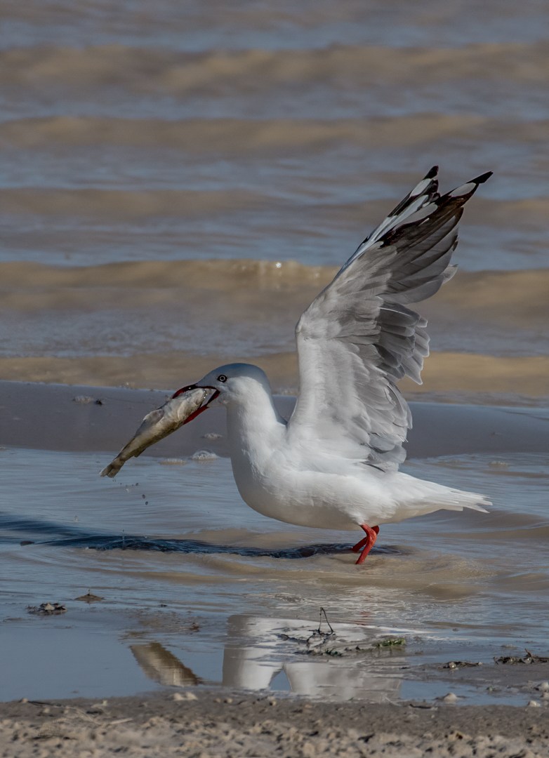
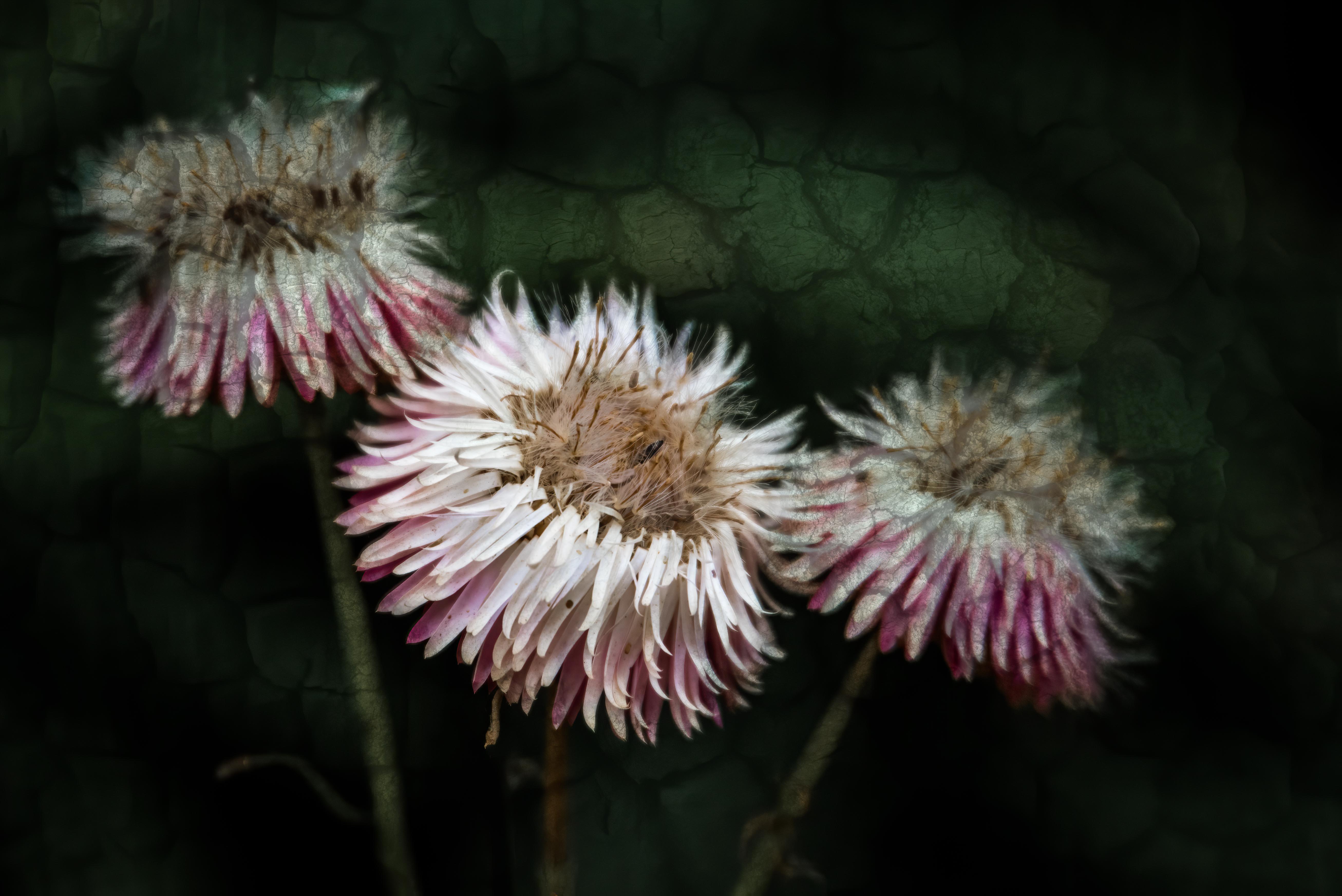
Thanks Catherine, I'm glad you enjoyed my picture of Mujambi. |
Jan 17th |
| 40 |
Jan 22 |
Comment |
Hi Catherine, What an interesting idea. Are you able to use contrast or clarity on the top ball to bring our]t more of the texture? I like the reflections on the smooth balls, but feel that the centre piece of the image needs a little more work. The colours are lovely. |
Jan 14th |
| 40 |
Jan 22 |
Comment |
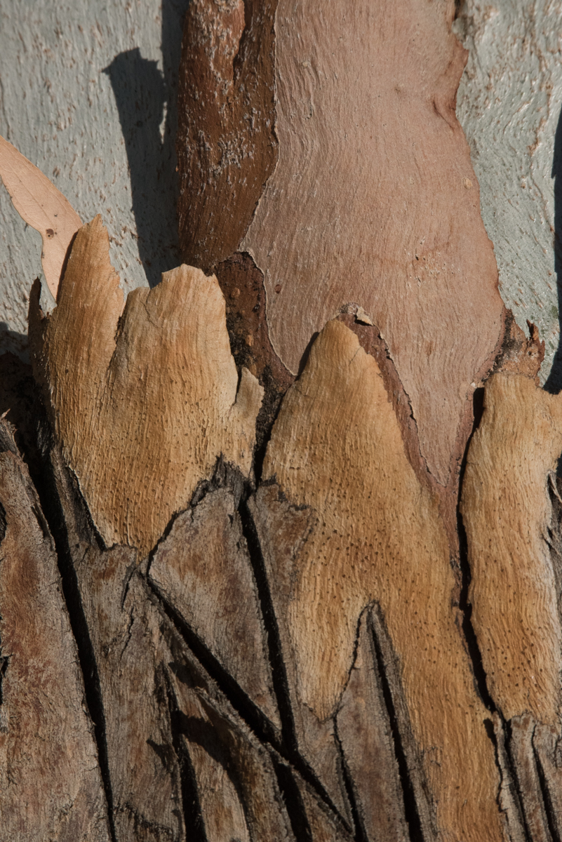
Hi Alison, I really like the original version. I like the diagonal of the three things in the light. I would darken some more of the background. It makes a great abstract. With that said, your lighter version shows much more detail. Don's version brings out the warmth in the wood. The circles in the background (dust spots / flare / bokeh??) keep taking my eye. I wonder what content aware in PhotoShop would do in that area. |
Jan 14th |
| 40 |
Jan 22 |
Comment |
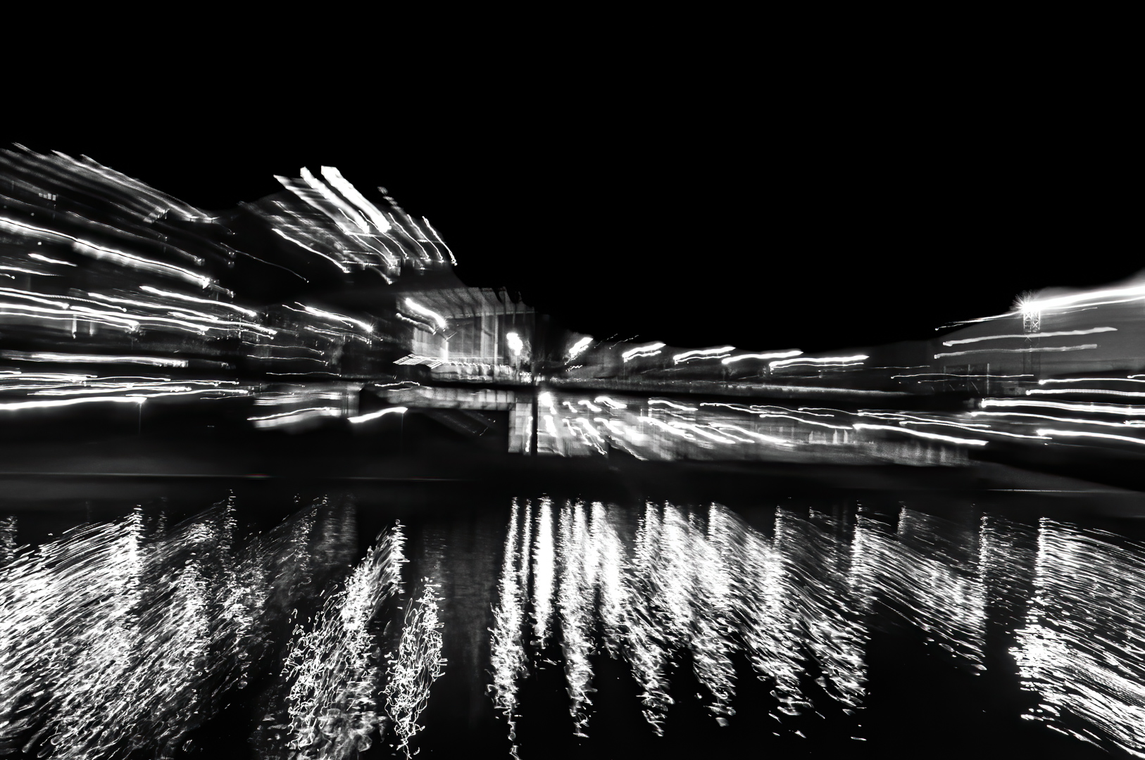
Hi Jamie, This is a beautiful photograph! I really like the cross between the milky water and the textures that you have managed to capture in it. I would drop the highlights on the rocks at the bottom or darken them. By doing this the only light parts in the image would be the water. I like the original crop and colourings. I do like monochrome images, but I think this one is better in your dreamy original version. I would hang this one on a wall. |
Jan 14th |
| 40 |
Jan 22 |
Comment |
Hi Don, I love the story behind the image, but unfortunately it does not come through in your image as I can't see any of the truck. I really like the treatment that you have done. I love the colour as it now looks very rusty. I would not add other colours. Perhaps consider straightening the image slightly to make the black line of the door on the left appear straight. I would also clone out the diagonal line in the top right hand corner. I can only imagine what was happening when the door was shot to pieces! What a shame that the truck is no longer around for you to take more photos of. |
Jan 14th |
| 40 |
Jan 22 |
Comment |
Hi Henry, and it is a YES from me too! The colours in the image make me feel cold, which is probably your intention. I do like your editing. |
Jan 14th |
| 40 |
Jan 22 |
Comment |
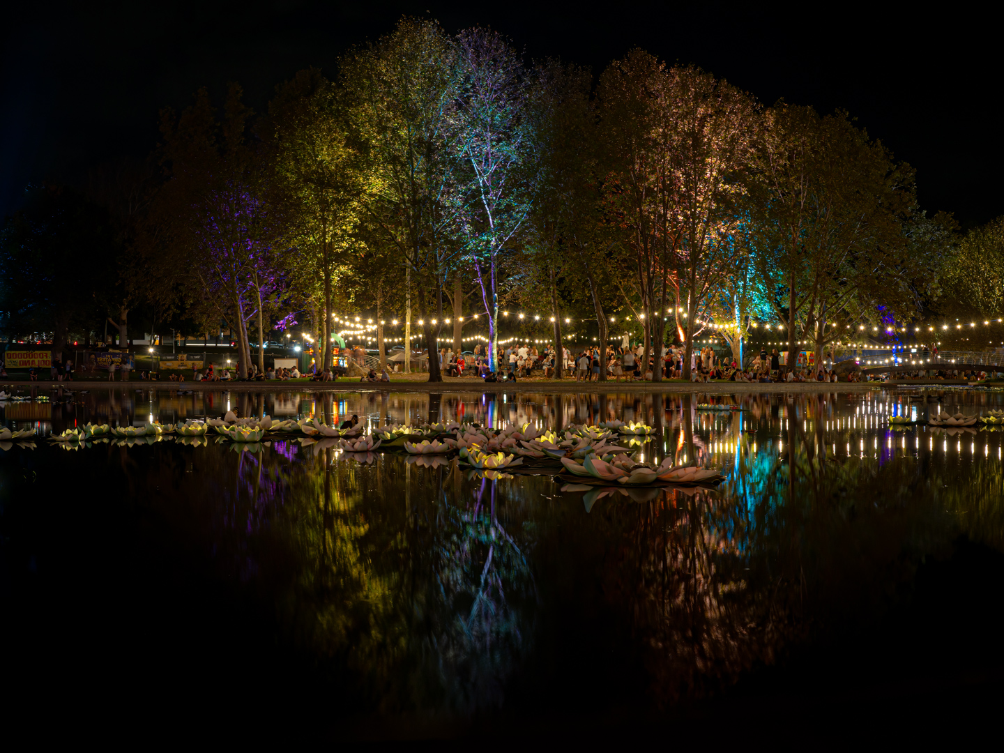
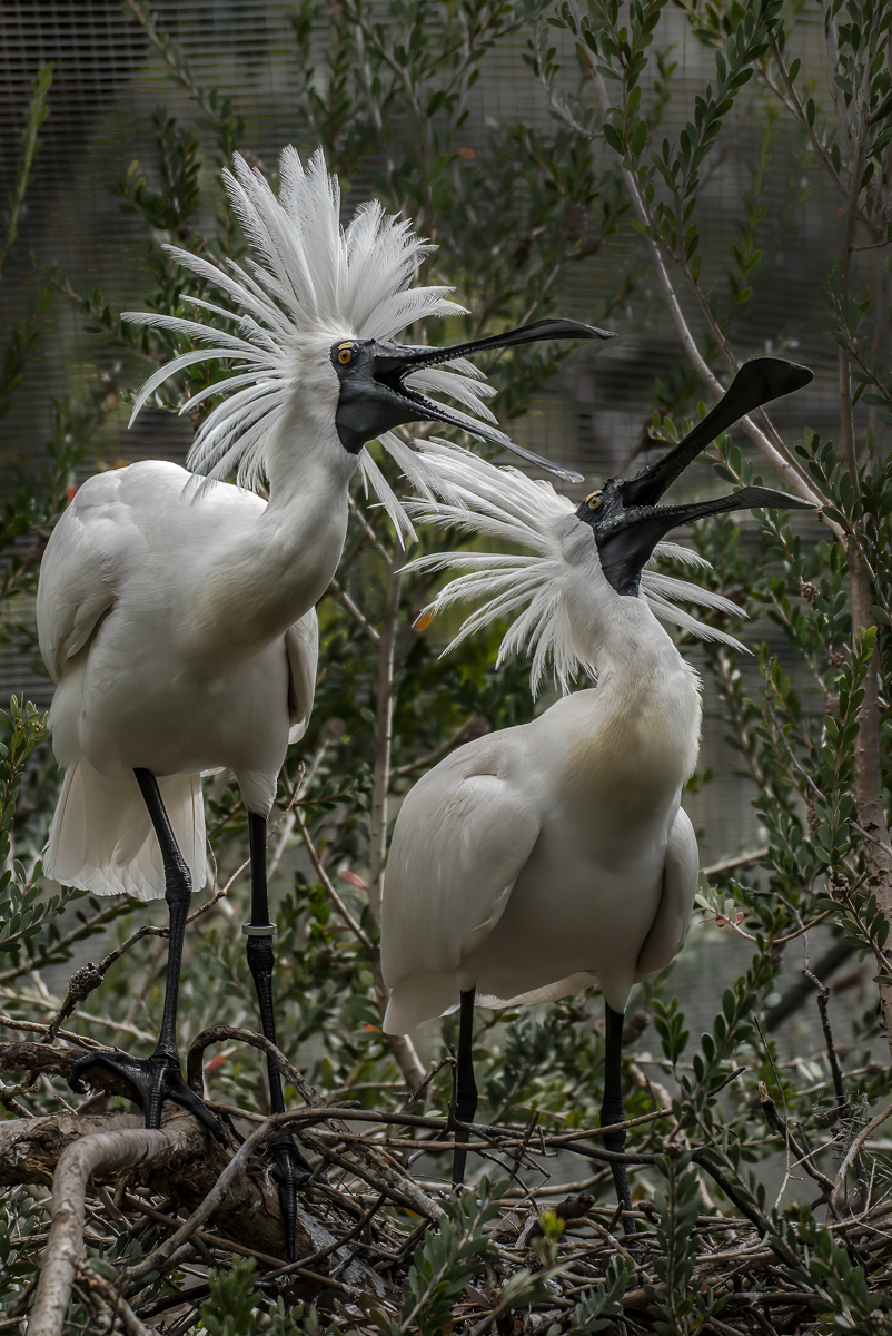
Hi Andrew, You have managed to capture some great reflections and interest in this image. I would crop out the man peeking in on the left side. I find it very distracting as there is not enough of him showing. |
Jan 14th |
| 40 |
Jan 22 |
Reply |
Hi Jamie, Glad you enjoyed the background story of beautiful Mujambi. He does get excited at feeding time! |
Jan 14th |
| 40 |
Jan 22 |
Reply |
Thanks Don, My husband and I are members of the zoo, which gives us free entry. This means that we can go for an hour or so and then go home if we want to. Yes, I cropped tightly to remove the background mess. |
Jan 14th |
6 comments - 6 replies for Group 40
|
6 comments - 6 replies Total
|