|
| Group |
Round |
C/R |
Comment |
Date |
Image |
| 14 |
Aug 21 |
Comment |
Hi Kamal, Thank you for your comments! Take care!
|
Aug 29th |
| 14 |
Aug 21 |
Reply |
Hi Karen, Thank you for your comments and suggestions! |
Aug 18th |
| 14 |
Aug 21 |
Reply |
Thank you for your comments and suggestions! |
Aug 12th |
| 14 |
Aug 21 |
Comment |
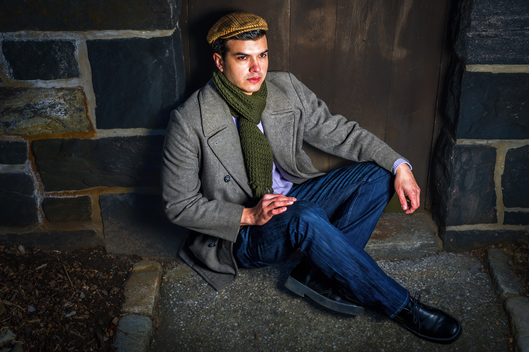
Every time when I see your photos, I have to read your description to understand what you are trying to present. You are in a different style, photojournalism? As a rule of photojournalism, the original photo should not be altered or digitally manipulated, but you can crop it. Interesting story! Thanks for sharing. |
Aug 10th |
| 14 |
Aug 21 |
Reply |
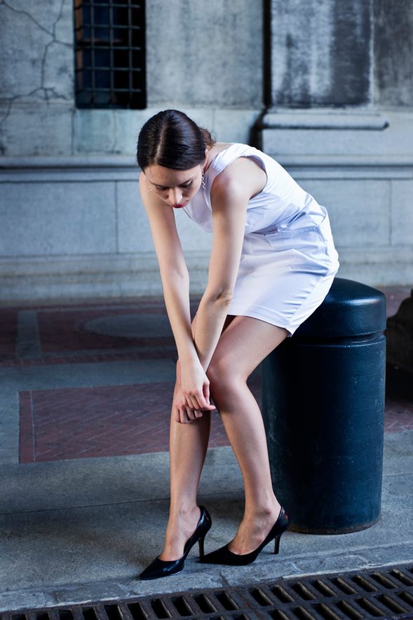
Hi Darcy, thank you for your comments and suggestions! I tried to make the background building a little dark before, but not successful as I wanted because I don't want to overdone to lose the contrast with the model's face. I like the current contrast between the model's face and background, a "black and white" feel, and a catching viewers' eyes point. |
Aug 5th |
| 14 |
Aug 21 |
Reply |
Hi Gregory, Thank you for your comments! |
Aug 4th |
| 14 |
Aug 21 |
Comment |
Beautiful Portrait! Very nature! you process very well! But I like the original image better: the first, the light only shows in the face, and the hat and clothes are in shadow part, which more contrast with the face, and the new image, the face lost in the colorful environment; the second, I like the snow mountain, which indicates the environment better. It is just my personal taste.
Thank you for sharing! |
Aug 4th |
| 14 |
Aug 21 |
Reply |
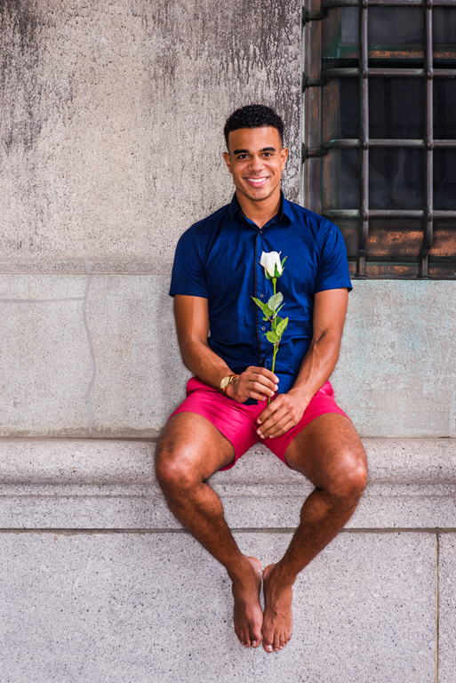
I compare this image with my original work. I like my original one better: the white rose with background has more simple black and white contrast and a suddenly eye-catching effect. |
Aug 4th |
| 14 |
Aug 21 |
Comment |
Hi Tom, Thank you very much for your comments! I agree with your comment about the rose handling. I made some adjustments about the rose as following. Thank you again! |
Aug 4th |
 |
| 14 |
Aug 21 |
Comment |
Beautiful Image! I like the composition and color tune, very dramatic and moody. The one thing that is not suited to my taste is that it seems a little over-sharpened, and I don't like everything that is sharp in an image (I know landscape shots usually everything in sharp). Also, it seems a little noises. I like the original image better. Thanks for sharing. |
Aug 1st |
| 14 |
Aug 21 |
Comment |
Beautiful image! You did it very well. I like the moody environment. If I have to point out something, I think the fogs and sky are not handled perfectly. I know they are hardly handled in this image. If this image is mine, I will probably underexpose the image a little bit and increase contrast (or using image curves) to make fogs and clouds more dimensional, dramatic feels. It is just my opinion.
Thanks for sharing! |
Aug 1st |
| 14 |
Aug 21 |
Comment |
It is a wonderful sunrise! I am not sure it is the filter effect or the shooting problem, and the biggest issue here is the focus. I don't think the focus is good, too soft and blurry, and the second is the high light sky, and it is blow out. I am not good at landscape shooting, but I think shooting this kind of situation should pay attention as follows: 1. Using High ISO, at least it should be ISO 800. 2. Using High shutter speed because the ocean wave and clouds are moving. 3. Using a tripod to shoot landscape. 4 Shooting at a raw file, making the image a little underexposed, and adjusting it later in the Lightroom. It is just my opinion.
Thanks for sharing! |
Aug 1st |
| 14 |
Aug 21 |
Comment |
Such a beautiful image! I like the moody environment. The focus is very good, and the post-work is well done. I wish I could have this kind of skill to do such an excellent image. Thanks for sharing! |
Aug 1st |
8 comments - 5 replies for Group 14
|
8 comments - 5 replies Total
|