|
| Group |
Round |
C/R |
Comment |
Date |
Image |
| 14 |
Jul 21 |
Reply |
Thank you for your comments! I have some thoughts about this image in the following comment. |
Jul 21st |
| 14 |
Jul 21 |
Reply |
Thank you for your comments! Answer your question: I like the curve line here. Usually, I don't care about the title. Most time I only look at images, don't read titles and descriptions. LOL. About this image, I have some thoughts in the last. |
Jul 21st |
| 14 |
Jul 21 |
Reply |
Thank you for your comments! Please see my thoughts in the last. |
Jul 21st |
| 14 |
Jul 21 |
Reply |
Thank you for your comments. Please see my thoughts in the last. |
Jul 21st |
| 14 |
Jul 21 |
Reply |
Thank you for your comments! |
Jul 21st |
| 14 |
Jul 21 |
Reply |
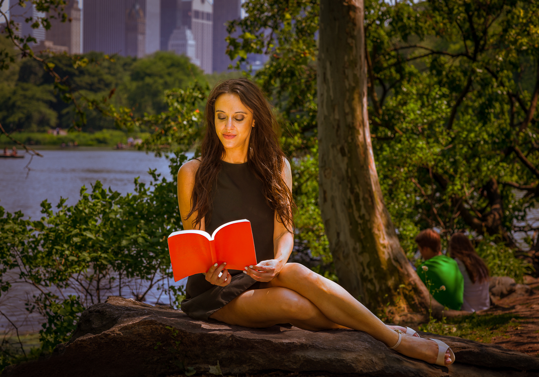
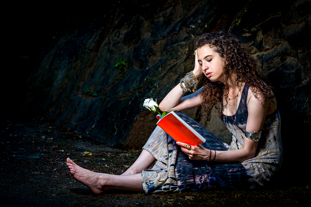
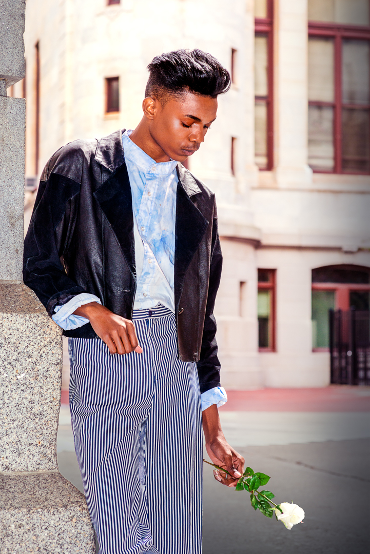
Thank you for your comment. My main focus here is the white flower, not the girl's face. |
Jul 21st |
| 14 |
Jul 21 |
Comment |
Thanks!
I deliberately emphasize the green color here, which has several purposes: the first it interacts with the white flower, which indicates a natural environment; the second the green color is a red complementary color, which could help to make the girl's skin to incline a red tune a little bit because I feel the girl skin too white; the third I mainly do stock photography, I like color pop to make it have a little bite commercial favor. |
Jul 21st |
| 14 |
Jul 21 |
Comment |
Thank you for everyone's comments! |
Jul 16th |
| 14 |
Jul 21 |
Comment |
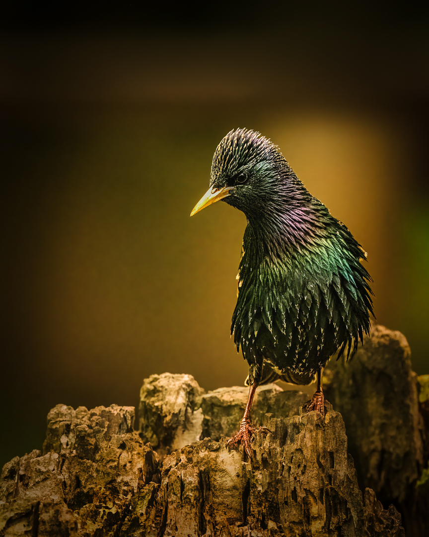
Interesting image! I like the color tune. Clouds are very detailed presented. The shadows in mountains seem lost details. I don't understand why outlines of mountains are so white, look like white snow?
You show us a new world. I enjoy view it. Thanks! |
Jul 10th |
| 14 |
Jul 21 |
Comment |
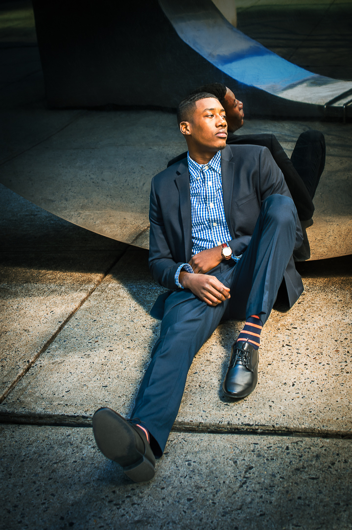
Interesting shot! I like the environment, very moody, looks like a black and white image. The only place I don't like is the blue color on the low right side, too much distraction. I think to make it a black and white image and increase contrast, probably much better. |
Jul 9th |
| 14 |
Jul 21 |
Comment |
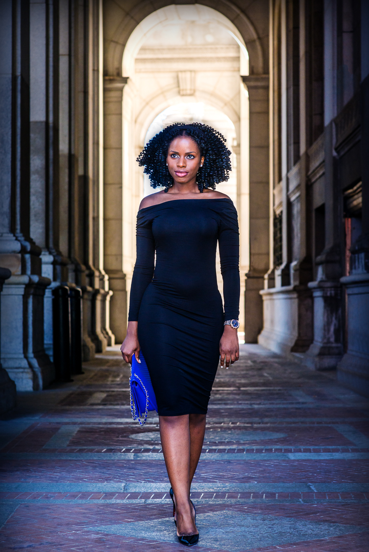
Interesting image! You did the post-process very well, very clear and sharp. I like the location and environment in the original shot - a journalistic style. Thanks for sharing! |
Jul 9th |
| 14 |
Jul 21 |
Comment |
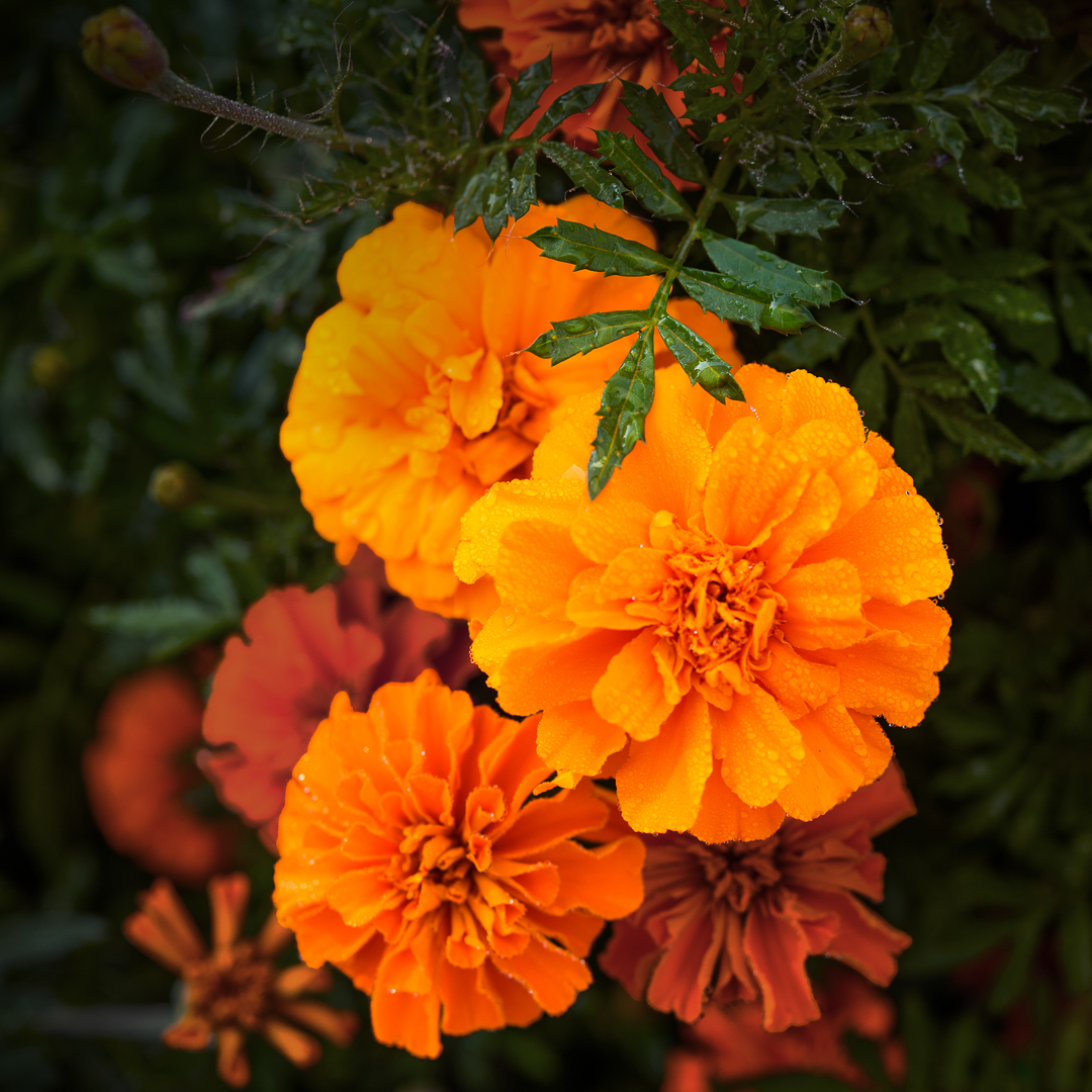
Interesting flowers! You did very well. I like the focus, very clear and sharp. Because the lighting is not good, probably you need to increase the contrast to make the high light more white; also need to increase vibrance and saturation to make the color pop. |
Jul 9th |
| 14 |
Jul 21 |
Comment |
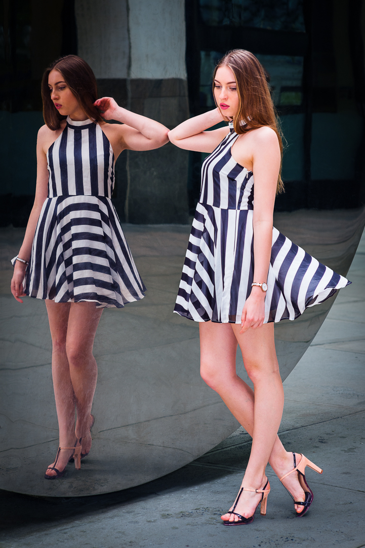
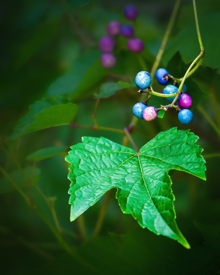
Interesting shot! You did very well! Now the problem is, I am not sure which is your main subject: blueberries, wine, glass or flower pattern on the glass? the blueberries and the flower pattern on the glass are competing with each other.
I compared your two images, and they are not the same image. I like the original image, the background has more space for the glass |
Jul 9th |
| 14 |
Jul 21 |
Comment |
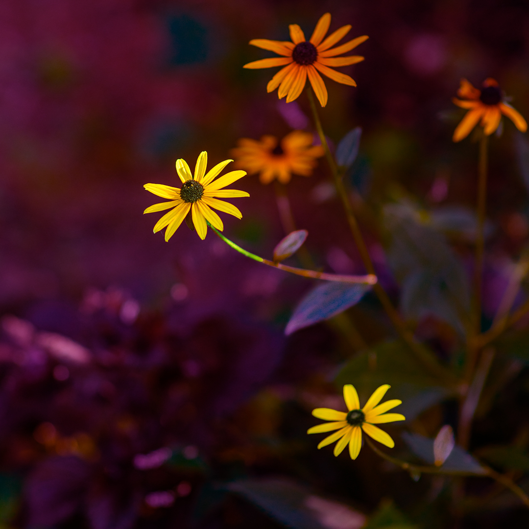
Beautiful flowers, very colorful. I think that the focus is not so good, not sharp, a little grainy. I don't like the composition, too center, and the background is too much empty space. |
Jul 9th |
8 comments - 6 replies for Group 14
|
8 comments - 6 replies Total
|