|
| Group |
Round |
C/R |
Comment |
Date |
Image |
| 82 |
Dec 19 |
Reply |
Thank you Laurie, that's very kind. |
Dec 5th |
| 82 |
Dec 19 |
Comment |
I love this image with it's lines converging to almost a vanishing point. The subtle colours and texture of the tiles and columns increase the impact and the reflection of the light on the tiles make me think about the image and I wonder if the tiles were wet, if it has been raining or if the tiles have just been washed.
To increase the focus into the distance even more, I would try cropping both the bottom and the top of the image, but this may make the image a bit square - you would need to "play" with it to see what looks best. It is a beautiful image with or without cropping. |
Dec 5th |
| 82 |
Dec 19 |
Reply |
Thank you for this feedback. I have not actually seen the five layers in this image and am really interested to learn about that. I am glad that you do not find the background too dark. I think it is just ok on a computer when the image is backlit. I have tried to print it and felt that it was way too dark. |
Dec 2nd |
| 82 |
Dec 19 |
Reply |
It makes you the better photographer if you do not have to rely too much on post processing! |
Dec 2nd |
| 82 |
Dec 19 |
Reply |
Thank you Andrew, I am not sure about the dark background. |
Dec 2nd |
| 82 |
Dec 19 |
Reply |
That's very kind Kathleen. I am not entirely happy with the background - I feel it may be a bit too dark. Unfortunately there is not much detail in it as it was very hazy at the time I took the photo. |
Dec 2nd |
| 82 |
Dec 19 |
Reply |
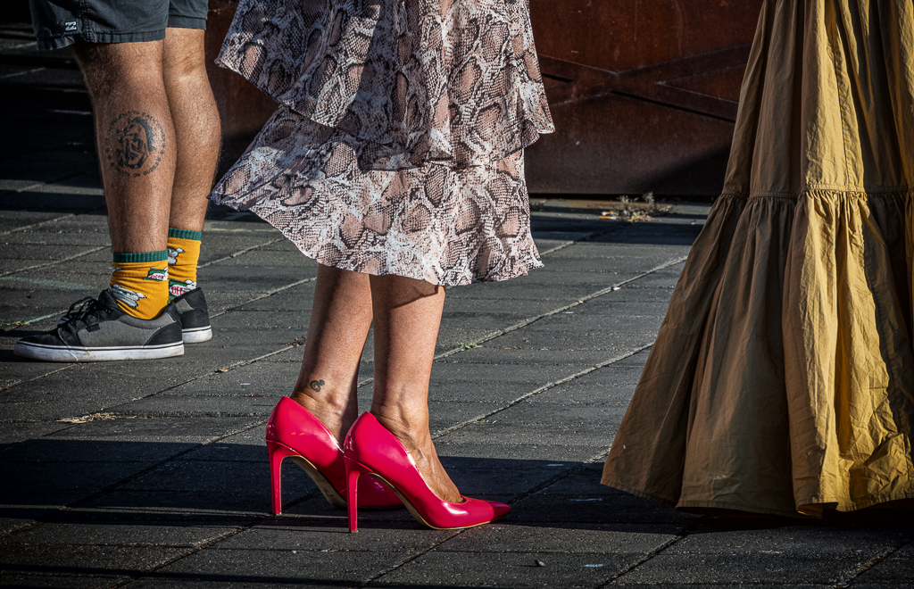
Hi Xiao, In comparison your original image looks much better. Please remember that I can only tell you what I would do, it's not what you have to do, it's really a personal choice. Your original is a very nice image, I have just pointed out that I would try and separate the window from the person by fading it more into the background.
You could try making the window a bit lighter (gives you more contrast against the person) and depending on the software you use, you could try reducing the clarity and sharpness so it blends more into the background. My advise is if you don't like the adjustments, stay with your original, it's a very nice photograph and the window itself is lovely. |
Dec 2nd |
| 82 |
Dec 19 |
Comment |
What a beautiful image. I like the window being slightly off-centre and agree that the brick walls leading to the window benefit the image. The grid over the window seems to add interest and the subdued colours of the image are very pleasing.
If you use Lightroom you could use the "Luminance" or "Noise" tools to remove some of the noise and if you are experienced with Photoshop you could remove the most prominent part of the stucco work covering the church tower. Even without these adjustments it's a lovely photo.
|
Dec 1st |
| 82 |
Dec 19 |
Comment |
Yes, I understand your point and the window is lovely.
For portraiture it is important to separate the subject from the background. Moving the subject to the left would have separated him from the window. With a high aperture setting and focus on the subject's face you may have got the window slightly out of focus. This would still allow for the feel of the place, but would put more focus on the subject. |
Dec 1st |
| 82 |
Dec 19 |
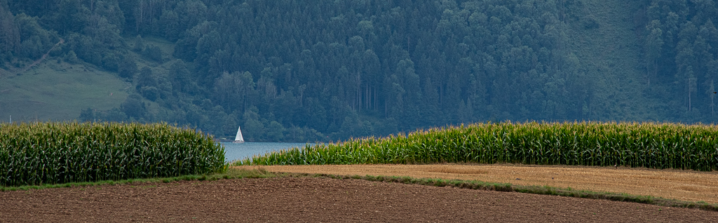
Comment |
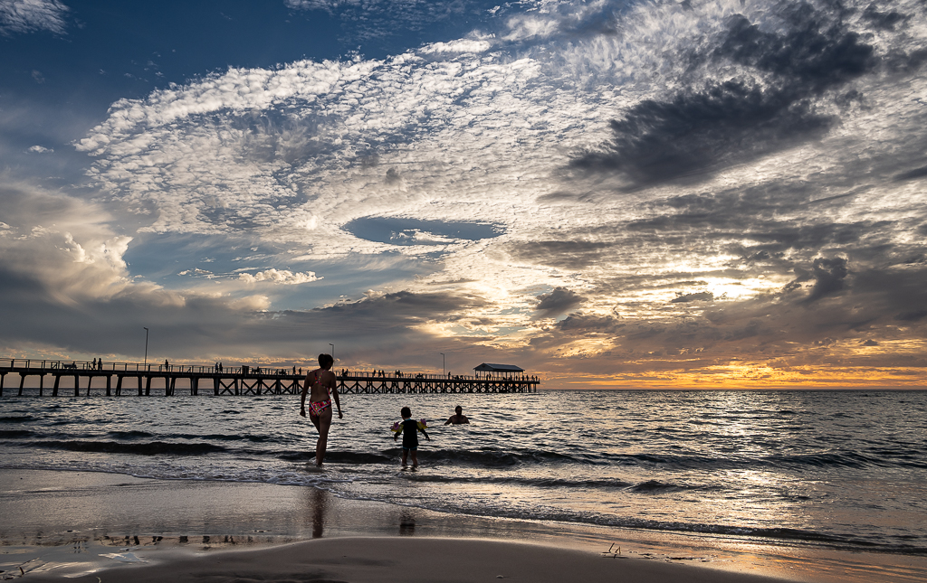
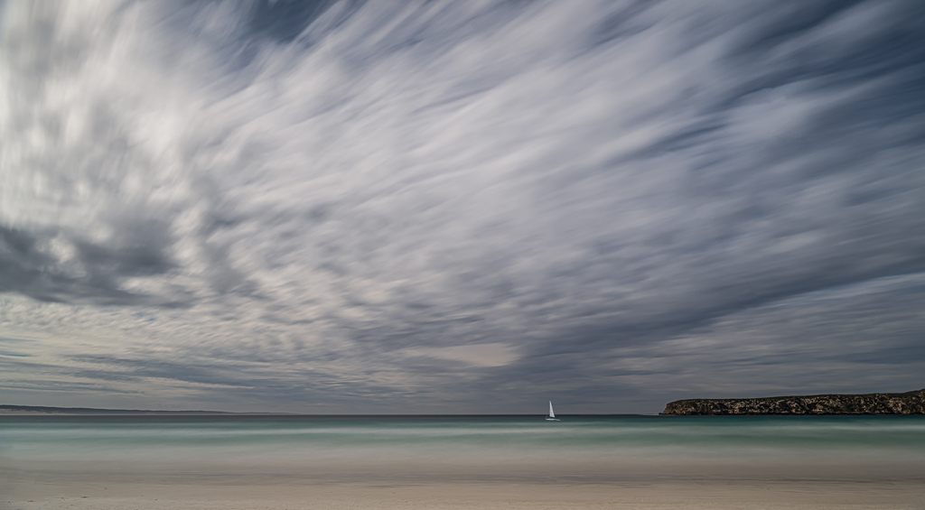
The whole point of this image are the leading lines and focus on the boat in the distance. :) |
Dec 1st |
| 82 |
Dec 19 |
Comment |
Your background is excellent and not blown out, the colours of the image are strong and vivid, the subject looks into the camera.
Improvements:
1)Composition - there is too much window and it is equally in focus as the person - this competes with the main subject. Ideally you would have moved the subject a bit to the left to have less or no window in the image before taking the shot. With the image as is you could try to reduce sharpness and clarity of the window and grid to push it more into the background.
2)You need to remove the bright areas on the subject's face and if possible knees (not quite as important).
|
Dec 1st |
| 82 |
Dec 19 |
Comment |
Hi Andrew, this is a very nice candid shot. The image is very lively and the children's enjoyment of the water tell about the hot day. Seeing individual water drops adds to the image. To even better balance the image, I would crop it to exclude the boy on the right hand side and at the bottom to avoid having the girl's legs cut off at the ankles.
A lovely image Andrew. |
Dec 1st |
6 comments - 6 replies for Group 82
|
6 comments - 6 replies Total
|