|
| Group |
Round |
C/R |
Comment |
Date |
Image |
| 86 |
Mar 26 |
Reply |
Thanks Bill . . . I was not aware of that feature. I'll play with it. |
Mar 28th |
| 86 |
Mar 26 |
Comment |
Well done. Interesting/sharp image - I like the range of tones and many leading lines to the bright, backlit windows. Some interesting shadows/reflections. I like that you didn't center the stairs. An ever lower vantage point (close to a step) might be more impactful. Consider a monochrome version; not sure the color in this image is adding much. |
Mar 3rd |
| 86 |
Mar 26 |
Comment |
WOW - I had no idea they do this. Sharp/colorful and I like the flags around the monument. I assume those scenes are projected? From a source on the ground? Amazing that they don't have more distortion from the angle of projection (if projected form the ground. I like your composition! |
Mar 3rd |
| 86 |
Mar 26 |
Comment |
Agree with Susan - the pole makes it more interesting! Kind of a yin-yang including untouched nature and a man made pole/wire. I like the texture/layers of landscape and the shadows. I assume the sun was to camera right. Why do you think the pole doesn't cast much of a shadow? |
Mar 3rd |
| 86 |
Mar 26 |
Comment |
Great color - such scenes are fleeting - kudos to your for capturing it! What is the yellow area? Since you didn't change colors/saturation - I think this is an example of the iPhone over-saturating an image. At least that's how it appears to me. From my perspective too much of the frame is filled with the red sky which is phenomenal color, but not that interesting. I wonder if there were other compositions that would have captured more foreground. The overhead branches are a nice touch, but not necessary. I would have sacrificed them for more foreground. |
Mar 3rd |
| 86 |
Mar 26 |
Comment |
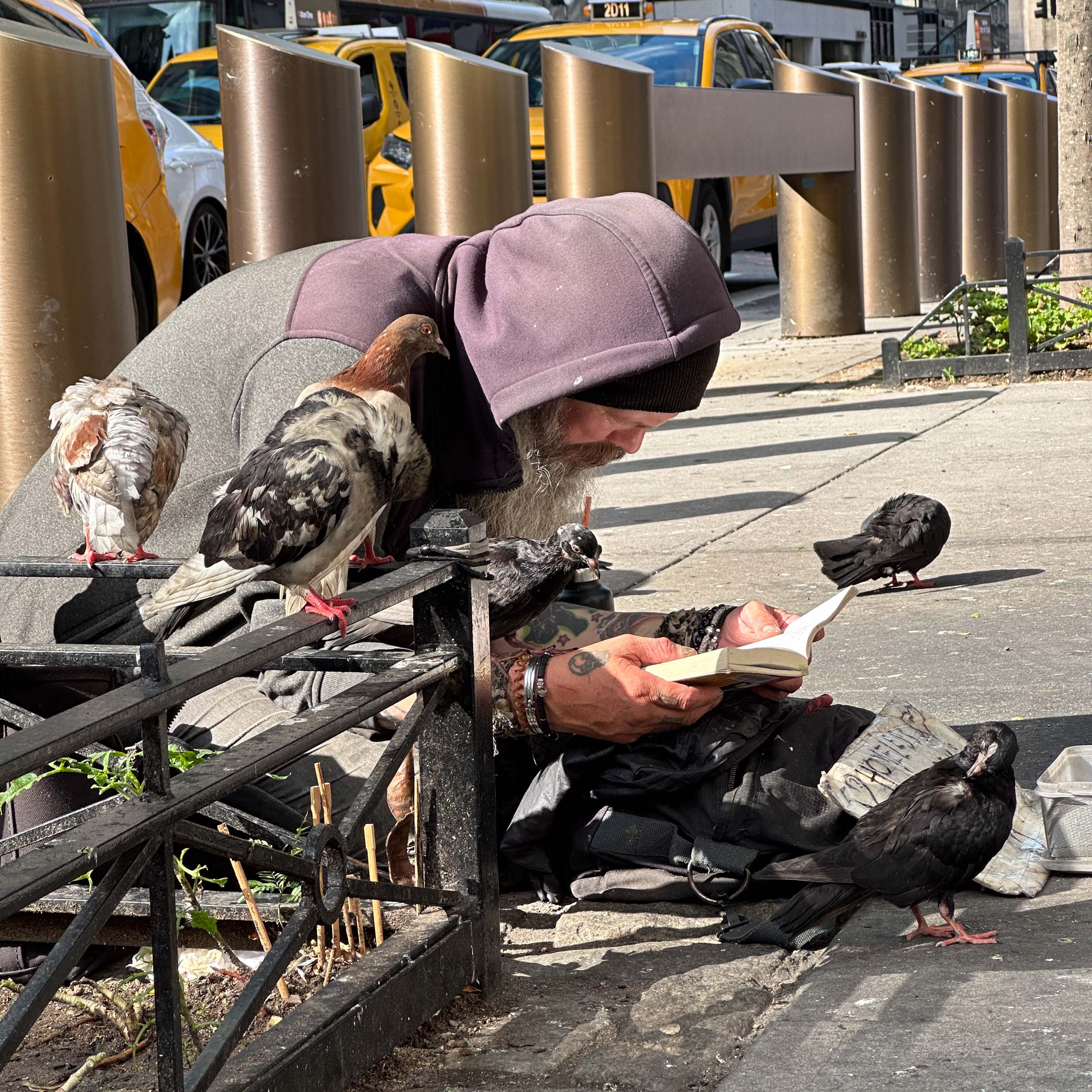
When I first looked at this I saw a police officer dancing . . . . which seemed interesting/unusual. I didn't appreciate the ball - I thought that was part of the background/building. Then I read your description and understand. I like the action - subject airborne, kicking his foot with the ball flying! The posted image is 640x480 (300,000 pixels). Assuming you shot this with a 12 megapixel phone camera and didn't alter the size to submit - this image is < 3% of the original. Although the resolution isn't great - it's certainly OK for social media, etc. - better than I would have expected and another example of the capabilities of the iphone! |
Mar 3rd |
| 86 |
Mar 26 |
Reply |
Good catch - I wouldn't crop tighter - I'd like to leave plenty of room above his head - but I did remove that overhang - and I think the picture is cleaner/better without it. Thank you. |
Mar 2nd |
 |
5 comments - 2 replies for Group 86
|
| 87 |
Mar 26 |
Comment |
Great job processing this image! The background looks very natural to me, like some distant/out of focus greenery.
Mike Moats recommends photographing bushes that are very out of focus, printing those images and using those prints as background for macro photography. I've tried that and it works well. You found a similar, perhaps more versatile, solution by doing it all on your computer.
I agree with other's comments re: nice composition, sharpness and processing of the mono versions. The soft natural lighting works well. If I was going to hang one of these images on my wall - I'd select the color version you posted as your main image. I do think the mono has potential . . . . |
Mar 5th |
| 87 |
Mar 26 |
Reply |
tx. My guess is that what you're calling banding is very dimly lit and out of focus vegetation behind the main subject. Below is the first image you sent me - posted with high resolution, but low file size. If you download and play with exposure - I think you'll see where the banding is coming from. It's likely exacerbated by color noise in the dark background, lots of processing (in different programs; each of which may handle the color space differently) and finally compression for posting on this website. The falloff of light from the macro flash is sharp; so whatever is in the background is very dark. I think this has nothing to do with calibration of your monitor. Just my two cents - curious what others think.
More importantly - I like your composition, the colors that fit so well together and the sharpness! Also the activity of the bee. Using the flash enables you to capture such detail hand-held. Well done! |
Mar 5th |
 |
| 87 |
Mar 26 |
Comment |
Can you point out the banding? Either describe or circle it? Tx! |
Mar 4th |
| 87 |
Mar 26 |
Comment |
You achieved your objective! Although I'm no expert in the ethics of photographing other's work - in my mind this is clearly such a different/unusual vantage point that the work becomes your own. I like the big diagonal, many lines going in different directions, texture of the material and range of tone from (almost) pure white to black. I wonder if some subtle toning would enhance this image? |
Mar 3rd |
| 87 |
Mar 26 |
Comment |
I love the image you chose - much more interesting that the postcard version. I also suspect that it's an emotional connection for your back to that trip. All the people milling around, taking photographs, seeking dry ground - tell a story and make the scene come to life! I like that the coloring on the lower structure - reveals exactly the water line at high tide; clearly above the heads of those tourists. |
Mar 3rd |
| 87 |
Mar 26 |
Comment |
Nice/sharp image. The texture of the petals and edges are great. Your large, natural light source creates a pretty flat image. You could experiment with angling the flowers (or dodging/burning in post) to create a wider range of tones/shadows that could increase interest.
I've never tried in camera focus bracketing; I also have the R5, but the older version that doesn't have this feature. Does the camera save the 10 images that went into the final stack? If yes - it would be interesting to look at one frame (perhaps focused one third of the way through the frame) and compare it with your submitted image. Is the stack sharper? I've played with focus stacking (esp with macro) - and although it is a useful tool, sometimes I found myself overusing it when a single frame did the job. I put your technical data into photopills (making a guess at your distance from the subject) and believe that your depth of field would have been over a foot; likely enough to capture a sharp image with one exposure. KUDOS to you for trying this feature; please don't misunderstand my comment - only seeking to understand where it really makes a difference worth the effort. It's also helpful for landscapes, where sometimes as few as three images make a real difference. |
Mar 3rd |
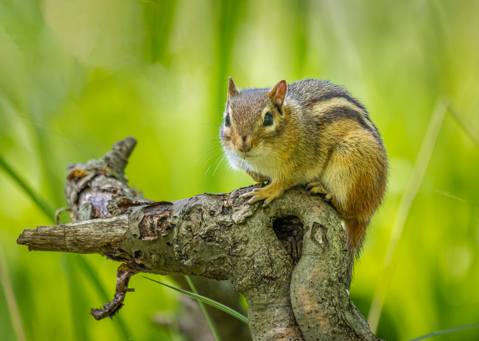
| 87 |
Mar 26 |
Comment |
Nice capture of this critter! I like that you're at his (or her) eye-level and he's looking at the camera. Makes the shot more interesting. Nicely blurred background. Two suggestions - I'd suggest removing few blades of grass (one coming our of his shoulder, two bright/saturated spots to camera left of him and one thin blade that crosses the branch at the lower left) and adding a vignette (mostly on the upper right)/slightly brightening the chipmunk. See attached example. |
Mar 3rd |
 |
6 comments - 1 reply for Group 87
|
11 comments - 3 replies Total
|


