|
| Group |
Round |
C/R |
Comment |
Date |
Image |
| 86 |
Jan 26 |
Reply |
Interesting suggestion. I tried - limited perhaps by the fact that I'm traveling and didn't have the original file - so I downloaded the image from this website and worked with that. Do you think this is better than the original? |
Jan 20th |
 |
| 86 |
Jan 26 |
Reply |
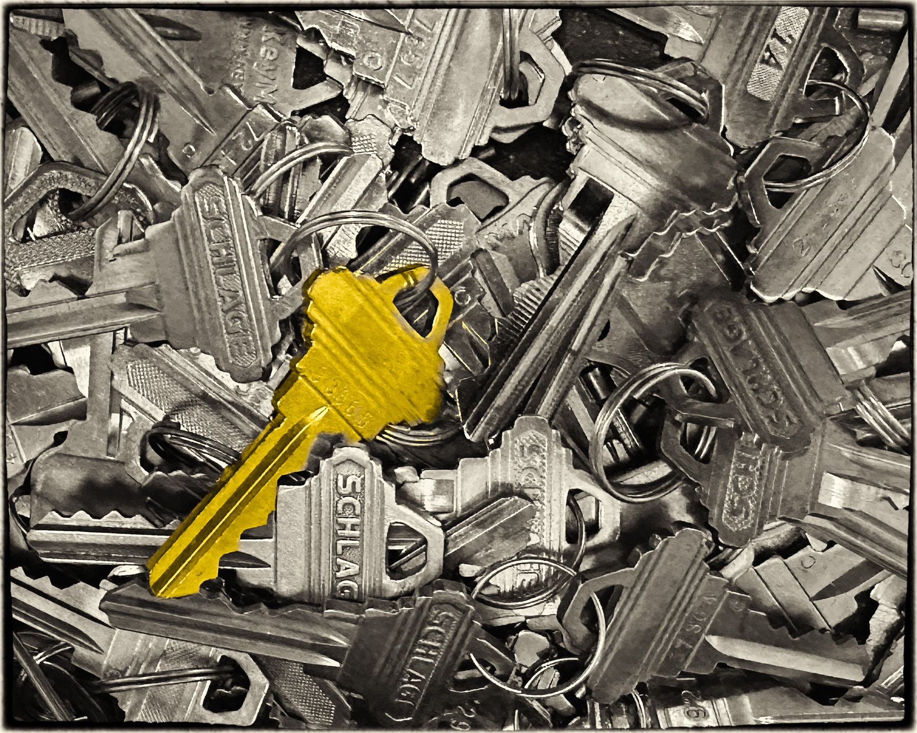
Tx. Agree with your suggestion. I didn't touch the scene/keys. Just took the picture. |
Jan 17th |
| 86 |
Jan 26 |
Reply |
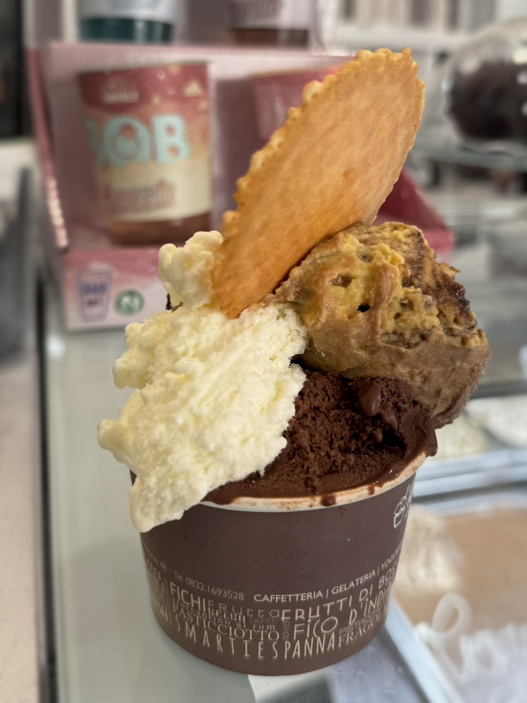
I didn't appreciate that was cream . . . so the texture would be different. I thought it was vanilla gelato! |
Jan 11th |
| 86 |
Jan 26 |
Comment |
Somehow gelato always tastes better in Italy! Nice image of a yummy treat. If you want to draw attention to the gelato - you might consider desaturating the background. Some may find the red color interesting; but it's bright and draws my gaze away from the gelato. Example attached; I didn't completely desaturate it - rather just reduced the saturation of the background and added some vignette/blur. Not sure what the phone focused on - the letters on the cup and darkest ice cream seem sharp. Other parts of the gelato (including the cookie) - less sharp. |
Jan 9th |
 |
| 86 |
Jan 26 |
Reply |
Thank you - always appreciate and learn from your comments! |
Jan 9th |
| 86 |
Jan 26 |
Comment |
Happy 2026 to you! Never would have guessed what this is . . . I'm seeing lots of liquor bottles . . . but beyond that I'm confused. The repetition/depth helps the image. Your explanation clarifies everything. I suspect it's an expensive gimmick and not as good a listener as a bartender :)
|
Jan 5th |
| 86 |
Jan 26 |
Comment |
Jerry is a great guy . . . so passionate about iPhone photograph/apps. I like you painterly rendition. Agree you've aged him - and the corner ornaments don't add anything and tend to distract. I will look at the app . . . sounds interesting. Did you choose the colors (for example facial hair and background) or does the app do its own thing. |
Jan 5th |
| 86 |
Jan 26 |
Comment |
Nice image - the colors make it for me! The red jackets and green/blue background walls. I like how the two girls are gazing at one another - and yet heading in different directions. My eyes follow their gaze - back and forth - keeps me in the frame. It holds my interest - as I ponder what's going on. |
Jan 5th |
4 comments - 4 replies for Group 86
|
| 87 |
Jan 26 |
Reply |
The original image you submitted is much more interesting than the entire statue! Thanks for reminding us to focus on the details/parts of a frame. Well done. |
Jan 20th |
| 87 |
Jan 26 |
Comment |
|
Jan 13th |
 |
| 87 |
Jan 26 |
Comment |
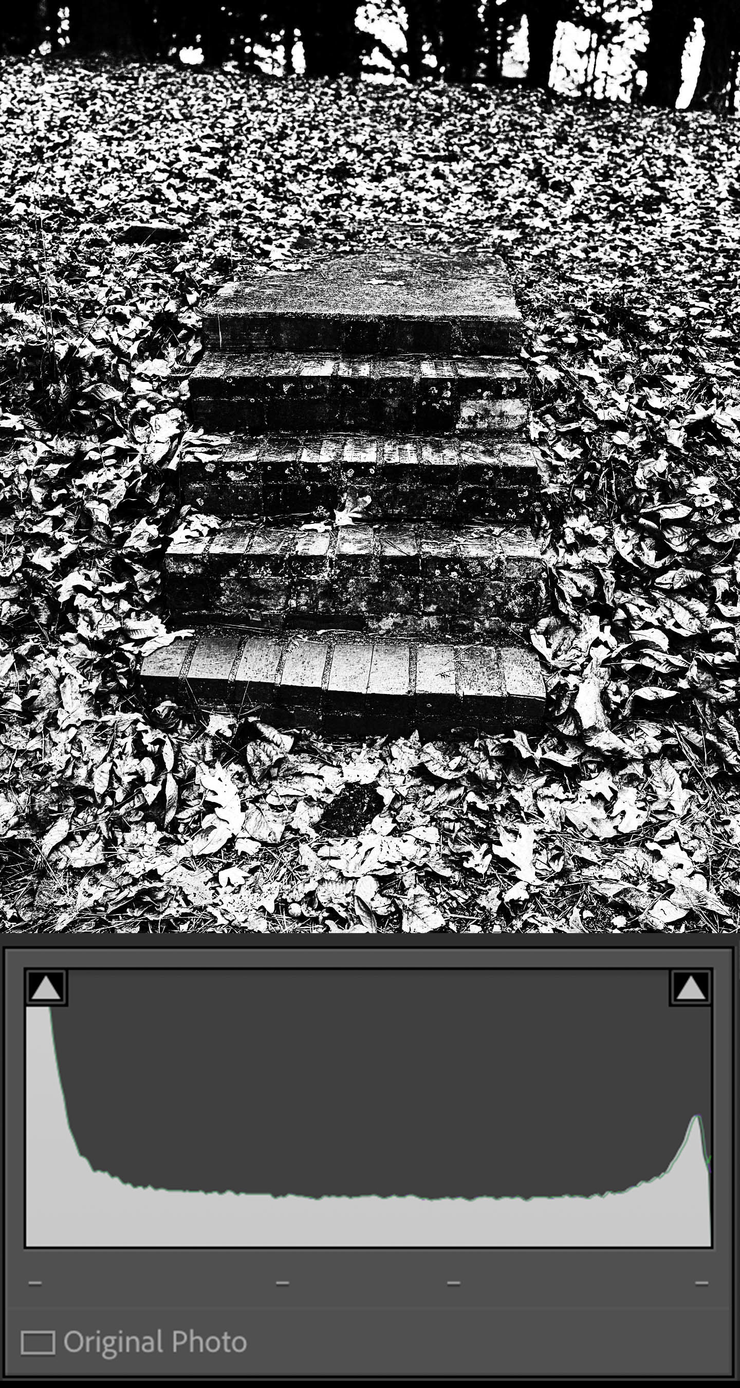
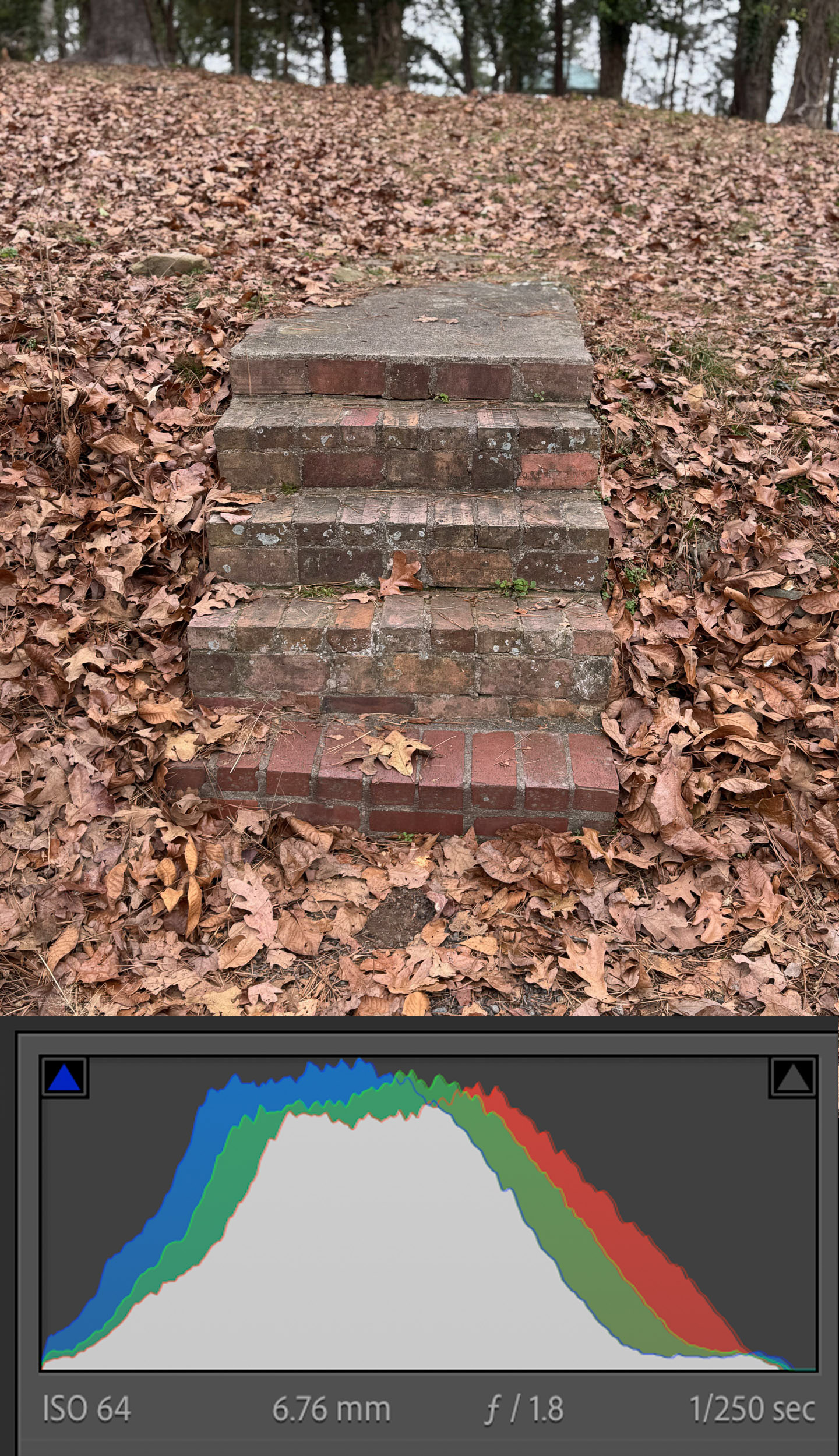
Tx Cindy for posting this - many ways to edit your image. I've posted below your original capture (with color histogram) and your edited mono image (with histogram). I thought this would be a good illustration of how the histogram can be helpful. Your original image is well exposed, nothing over/under-exposed, good range of tones largely in the middle of this histogram. Your edited image amplifies the whites/blacks (over-exposing the sky) - resulting in a histogram skewed to the sides, with relatively less of the image in the middle tones. There is no right/wrong. Sometimes the histogram can help guide edits. |
Jan 13th |
 |
| 87 |
Jan 26 |
Comment |
Cindy - agree with Chan that seeing the original iphone image would be helpful. Something about your editing feels "crunchy" - can't tell if it's contrast or sharpness. I like the subject/idea and think B&W was likely a good choice. |
Jan 12th |
| 87 |
Jan 26 |
Reply |
re: Paris - they have a law limiting building height to around 12 stories. That facilitates view of the Eiffel Tower, although the stated reason for the law is environmental. There is one exception (Tour Montparnasse) which is almost 60 stories tall and sticks out. The French refer to it as the skyline's middle finger. The law re: height was enacted after that structure was build. |
Jan 11th |
| 87 |
Jan 26 |
Reply |
Nice work! |
Jan 5th |
| 87 |
Jan 26 |
Comment |
Sharp image for 1/20 sec. Sure the image stabilization helps, but so does the photographer's skill! Great detail. The various finger position create interest/mystique. What is the statue made of? Do you have an image of the entire statue; it would be interesting to see that context and how you chose to zoom in. |
Jan 5th |
| 87 |
Jan 26 |
Comment |
Agree with Jennifer's comments . . . you took a very ordinary home image - and transformed it into something reminiscent of an elegant spa. Totally different vibe. I like the way you lightened the tiles and made the wood look much richer - very natural/effective. The background wood in the original is distracting - again you did a great job toning it down - eliminating the distraction and increasing viewer focus on the bench.
|
Jan 5th |
| 87 |
Jan 26 |
Comment |
Creative commentary! In Chicago - many iconic, older (1920s), gorgeous art deco buildings (e.g., Wrigley Tower) sit adjacent to much taller steel/glass skyscrapers that lack interest/character (e.g. Trump Tower). I wonder if anything will change this trajectory . . . . and what future skylines will look like.
Curious why you added the branches/leaves at the top of the frame? |
Jan 5th |
| 87 |
Jan 26 |
Comment |
Interesting image - agree with the comments above. The creek is a perfect leading line. Two thoughts for your consideration: (a) I think you can darken the periphery - so the brightest spot is where the stream fades into the distance to help guide the viewer there, and (b) the bit of creek leading to the right (and out of the frame) interrupts flow and distracts. I'd be inclined to remove it - - - - but others may find it adds interest. Thoughts? |
Jan 5th |
 |
7 comments - 3 replies for Group 87
|
11 comments - 7 replies Total
|


