|
| Group |
Round |
C/R |
Comment |
Date |
Image |
| 86 |
Aug 25 |
Reply |
Thanks Wayne. I agree that object is distracting!
|
Aug 21st |
| 86 |
Aug 25 |
Comment |
I like the color palette - the yellow/green-blue backgound works well. I like that you got up close to the cactus and let the background fall out of focus. The differing textures help make this interesting - the soft/inviting background vs. the prickly/dangerous cactus spines. |
Aug 12th |
| 86 |
Aug 25 |
Reply |
thanks Ruth! I agree that more of her environment is visible in this brighter cell phone image. |
Aug 12th |
| 86 |
Aug 25 |
Comment |
Colorful, interesting and sharp image! So much for my eyes to wander around and look at. It has a whimsical flavor. It's a photograph that looks to me like a painting; perhaps because much of the scene is a painting. Did you ride one of those bikes? |
Aug 4th |
| 86 |
Aug 25 |
Comment |
To my eye - the reflection is the main focal point. The image is sharp and nicely composed. Agree with Jack that there is a lot of foreground that may not add much. I also like that although this is clearly an infrared image - it doesn't "scream" infrared - perhaps because the tree trunks/bark are so prominent. I like the way we are led to the bright/central area.
You're motivating me to pull out my IR filter. I also plan to try Indigo; I've been reading about it and some of the functionality seems interesting. Perhaps that's why Adobe removed the LR Camera from their software about 2 years ago; they obviuosly knew they had something better. |
Aug 4th |
| 86 |
Aug 25 |
Comment |
The elliptical frame doesn't work for me in a digitally projected image. It's too big/white and leaves me wondering why you did that? Or what you were trying to hide? Perhaps a printed image in such a frame would feel different. I understand you wanting to crop out the background/brick. Perhaps this is an alternate option? |
Aug 4th |
 |
| 86 |
Aug 25 |
Comment |
Agree with Jack - the lighting makes this shot. Nice to see the golden sunset lighting the tops of the clouds. The wing is important - helps anchor the image and creates a sense of the place/time. I was going to suggest playing around with B&W (since you have such a great range of tones), but then realized that the golden color is too important to sacrifice. Well done. |
Aug 4th |
| 86 |
Aug 25 |
Reply |
Thank you . . . I suppose if you do this every day . . . the flames and molten glass become routine.
|
Aug 4th |
5 comments - 3 replies for Group 86
|
| 87 |
Aug 25 |
Comment |
Great example of how a small "supporting" character (the cat) - really changes/improves the image. Without the cat - it's a picture of a sea gull landing - not interesting. With the cat in the corner (small and not sharp - but nobody cares) - makes the viewer wonder what the cat is thinking/up to - and of course - what happens after the picture is taken. |
Aug 14th |
| 87 |
Aug 25 |
Reply |
The best shots require minimal edits. Well done. |
Aug 13th |
| 87 |
Aug 25 |
Comment |
Great work - even pixel peeping (which I confess to doing on occasion!) - your edits are excellent. And I follow the story line . . . where's the guy who left the fishing rod - and what's he doing? Can you explain how you changed the color of he pail and removed the logo? I like that you retained the natural "bright spots' where the sun is hitting the edges. Very natural. |
Aug 7th |
| 87 |
Aug 25 |
Comment |
Well done/different. I like the colors - and the way nothing is sharp - and yet the scene/destruction is evident. Perhaps the greens are a sign for new growth/hope. Should I be concerned about the non-standard aspect ratio :) |
Aug 5th |
| 87 |
Aug 25 |
Comment |
Kids love the water . . . . your crop gives it an abstract vibe - love the way you stopped the action of the water droplets. The rich blue provides a nice background for the splash. You image reminded me of work I saw at a gallery in Chatham (Cape Cod) - http://expressionsgallery.com - this photographer gets into the surf - with a waterproof enclosure for his camera - and captures amazing images. Look at his "in the surf" gallery. If you're ever on the Cape - Steve Koppel is worth meeting! His photography is great and he invests significant time and money in conservation efforts to keep Cape Cod beautiful. The focus of your image is a bit "soft" - perhaps because you cropped in so much.
|
Aug 4th |
| 87 |
Aug 25 |
Reply |
The glass she is working on is in the middle of the flame - at the end of the glass rod in her right hand; she is heating it prior to shaping it. Her left hand is resting on her workbench. The fork/salad bowl in the foreground is her dinner; after all - this is her desk. |
Aug 4th |
| 87 |
Aug 25 |
Comment |
Cindy saw a whale - I saw a mushroom . . . the cap, underside and stalk! I guess that's what an abstract is all about. Great detail - lots of interesting stuff for my eye to wander around to. The distant ice in the water helps give a sense of the place. So many layers/textures. How did you process this? I'm curious if the bluish hue (? temperature) is something you added or if it was there in the original? Either way - it conveys a chilly vibe! |
Aug 4th |
| 87 |
Aug 25 |
Comment |
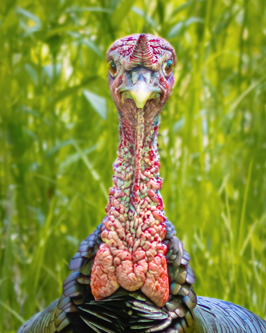
Being a "city boy" - I've never seen a wild turkey. The turkeys I see are in yellow Butterball packaging. I love the color/texture of his neck. Nice that you caught him looking straight at the camera! If I was going to edit this - I'd suggest (a) slightly brighten the bird, (b) slightly darken the background (each about a quarter of a stop), and (c) slightly brighten/increase saturation of the eyes (about a tenth of a stop). It doesn't take much - but I think it might improve the image. Right now the background is the brightest part of the image - and it keeps pulling my gaze from the bird. |
Aug 4th |
 |
6 comments - 2 replies for Group 87
|
11 comments - 5 replies Total
|


