|
| Group |
Round |
C/R |
Comment |
Date |
Image |
| 86 |
Jun 25 |
Reply |
Thank Wayne - I agree with you and Kieu-Hanh that a tighter crop (especially along the bottom) may work. |
Jun 30th |
| 86 |
Jun 25 |
Reply |
Sorry - my mistake - I was playing with few different edits and attached the wrong one. I also can't see any color in the image I originally sent. Not sure if I converted to B&W or just dropped the saturation to 0. I've since deleted the image - so can't retrace what I did. In the image attached below - I think you can see the splash of green trees through the glass. |
Jun 16th |
 |
| 86 |
Jun 25 |
Comment |
Yup - it's an image that makes me smile. Colorful and sharp! Lots for me to look at - and yet not overly busy. I don't have specific suggestions to improve it. I wish the grapes were not so artificial appearing . . . but that's the reality of a storefront display. |
Jun 8th |
| 86 |
Jun 25 |
Comment |
For sure the texture of the foreground is more interesting than the more distant rolling hills/mountains; those curvy lines lead my gaze into the frame/brighter areas. I like that the image has so many layers. I wish the sky was more interesting. Not sure which part of the image is in sharpest focus? The foreground does not appear sharp - it also has grain-like appearance - not sure why? What are these fields? |
Jun 8th |
| 86 |
Jun 25 |
Comment |
Nice playful image! I like Buttercups color and design. She's a perfect subject. Part of me wishes you included more of the cat outside? |
Jun 8th |
| 86 |
Jun 25 |
Comment |
I like this - interesting image - so many shades of rich brown color. Also different textures - the foam, glass and table. I like that you angled the design - much better than our usual tendency to shoot straight on. Also like that the wood grain runs perpendicular to the design.
How to improve it - capture a shot without all the reflections on the table (windows in the background). They're the brightest part of the frame and distract. There are few bright bubbles in the front lip of the glass - those would be easy to remove. Also bubbles/imperfection on the distant lip of the glass - those would be more difficult to remove. There is a bright triangular reflection on the bottom of the glass; some may think it creates interest - I find it a little distracting.
|
Jun 8th |
| 86 |
Jun 25 |
Comment |
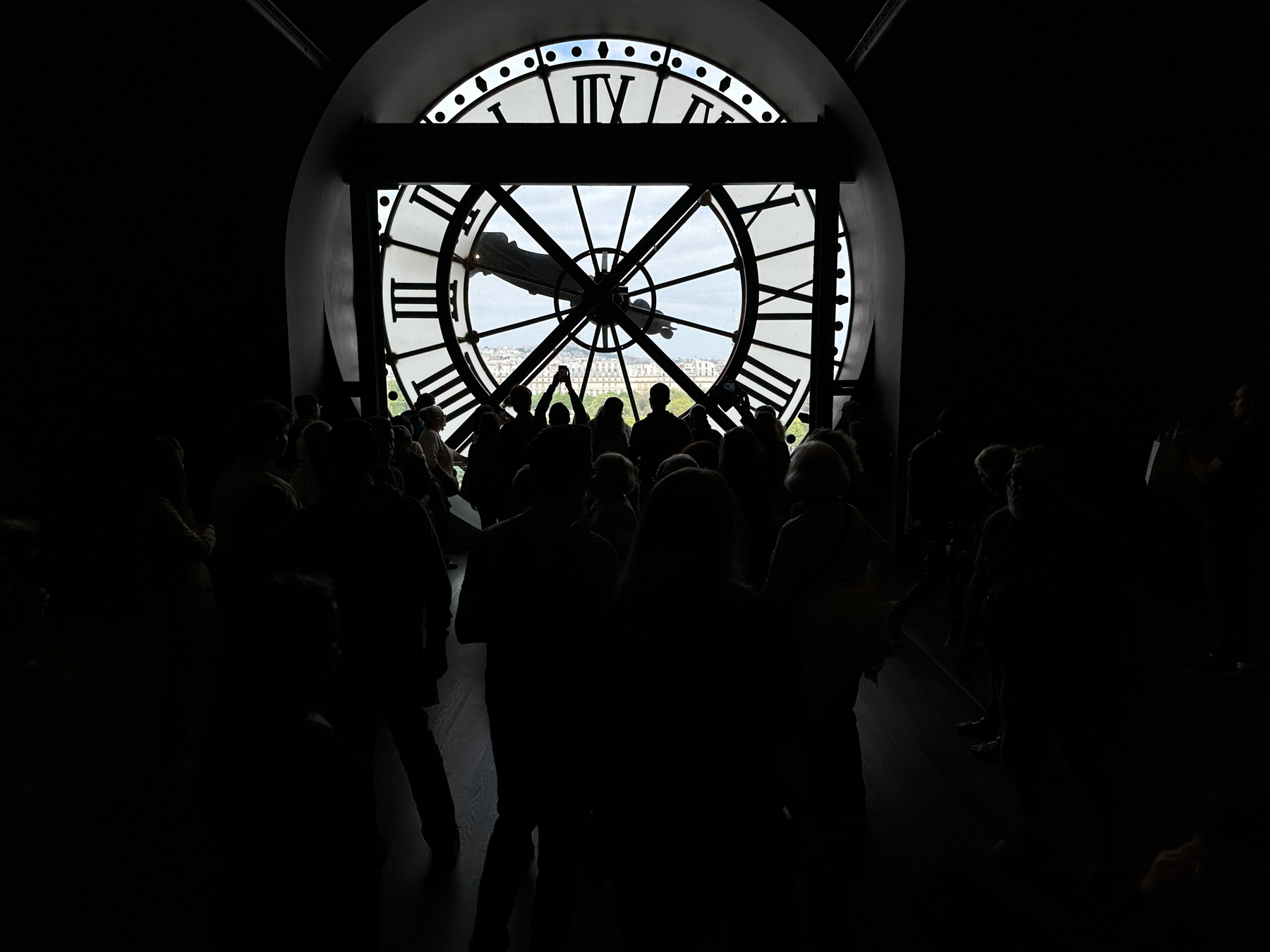
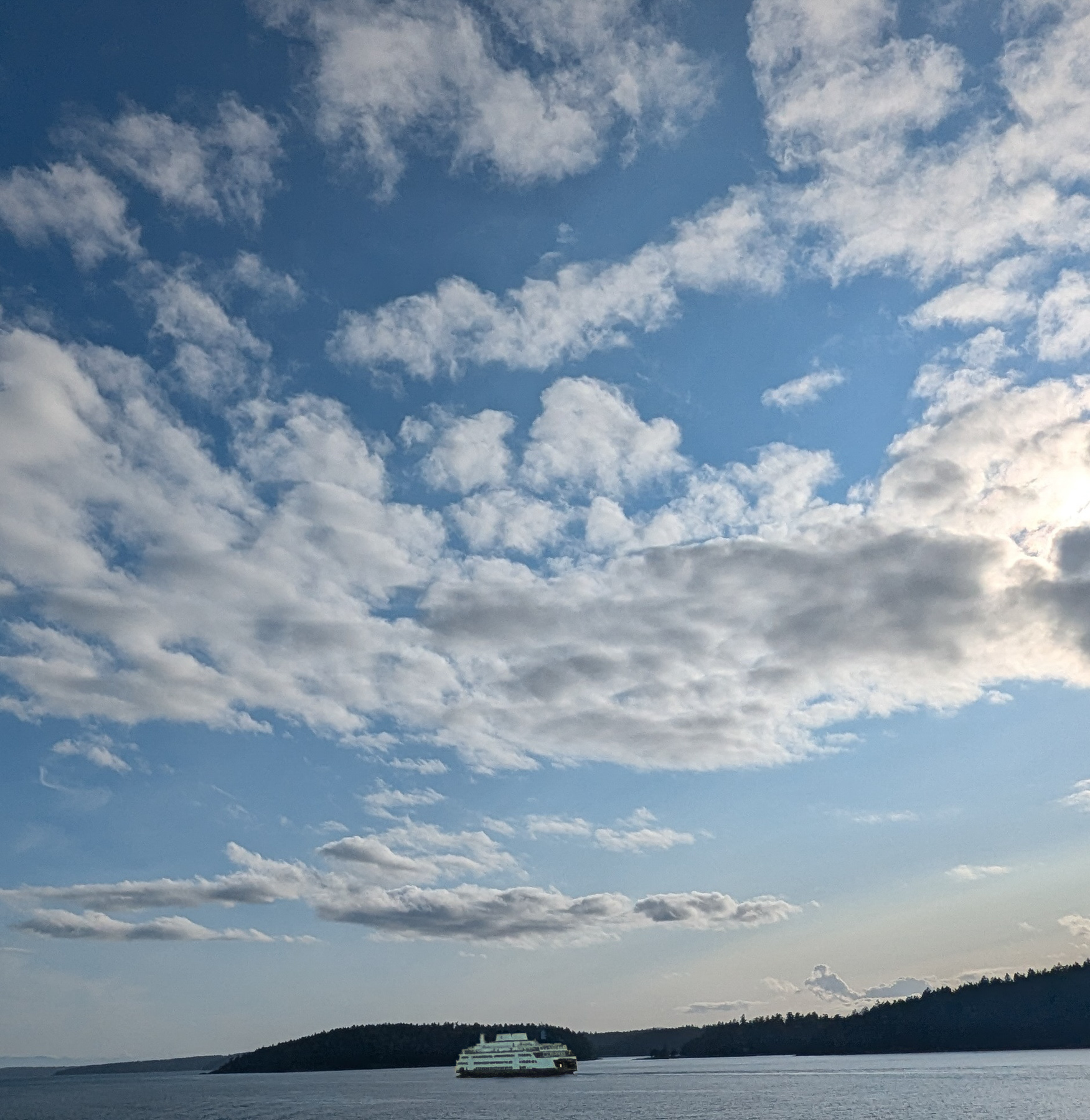
I think the clouds are the feature of this image - they are interesting and lead the viewer from the top to bottom/center - where the boat is. Unfortunately the boat is very small in the frame. I wish the horizon line was higher - so the clouds only occupy about two thirds of the frame. I appreciate that the water might not be very interesting . . . but including more would make for a more balanced composition. The boat is also dark - almost gets lost against the background greenery. You could consider brightening the boat a bit. |
Jun 8th |
 |
5 comments - 2 replies for Group 86
|
| 87 |
Jun 25 |
Reply |
I find the B&W most interesting - almost as thought the color distracts from the scene. Well done. |
Jun 14th |
| 87 |
Jun 25 |
Reply |
What I did was bring your image into Ps, used the rectangular marquee tool to select the area I wanted to replace (because it's almost a perfect rectangle) PLUS added a little bit of the surrounding area (to help guide generative fill as to what we want), - then with the selection made - went to edit, generative fill - and I let Ps do it's thing. Often takes few tries until you find something you like. |
Jun 8th |
| 87 |
Jun 25 |
Comment |
Love this - really captures my attention - because at first glance - I had no idea what I was looking at. I saw interesting/irregular shapes (reminded me of a map!) - good sharpness and range of tones. The mono works well. I like the way you composed the shot (just a bit of ground to anchor the scene, their heads are large). My gazes wanders from eye to eye to eye - trying to understand what's going on. Well done! |
Jun 7th |
| 87 |
Jun 25 |
Comment |
Interesting subject - good eye!
Regarding your camera settings - this is a bright day - and you're taking a landscape/cityscape - you may have better results with the base ISO (100) - you have lots of room to slow the shutter speed and close down the aperture. Most lenses (and this lens specifically) are not sharpest wide open - try to shoot such images around f8 (unless you deliberately want less depth of field or don't have enough light). The 24-105 f4 lens is my favorite - it's the only lens I travel with.
Re: edits - if you want to fill in the missing section (and some may argue the the original shot creates interest - what is the black area?) - the challenge is really continuity with the trees/rocks and the right vertical edge of the structure. Neither would be easy to do manually (you did a great job!). I tried using generative fill in Ps (see attached) - was frankly surprised with the quality of the result (two clicks - no further edits - it could be improved). Amazing/scary technology.
|
Jun 7th |
 |
| 87 |
Jun 25 |
Comment |
Agree with the others - the detail is interesting. One suggestion (if your lens allows) would be to get closer - perhaps capturing only part of the web. You could include perhaps one branch to anchor it - but I'd like to see more detail of the web. Great choice of subject. And if you chose only web - and covered to B&W - it could be an interesting abstract image. |
Jun 7th |
| 87 |
Jun 25 |
Comment |
I like that you chose to get close - capturing part of the wheel. Our imagination completes the circle - and your photograph allows us to focus in on interesting parts. Lots of lines/shapes. Agree with Jennifer that the color makes the "new" wood more different/obvious. On the other hand - the B&W works well and emphasizes the weathered texture. If I was going to hang one in my home - I'd choose the B&W. |
Jun 7th |
4 comments - 2 replies for Group 87
|
9 comments - 4 replies Total
|


