|
| Group |
Round |
C/R |
Comment |
Date |
Image |
| 86 |
Mar 25 |
Reply |
Not The Villages - but the vibe could probably be captured in so many FLA communities. |
Mar 25th |
| 86 |
Mar 25 |
Reply |
If you used the iPhone's wide angle lens - it's usually wider than 24mm. |
Mar 17th |
| 86 |
Mar 25 |
Reply |
You are 100% correct! 24mm. Looked wider vs what I'm used to - but it is shot at 24mm. |
Mar 17th |
| 86 |
Mar 25 |
Reply |
If you used the iPhone's wide angle lens - it's usually wider than 24mm. |
Mar 17th |
| 86 |
Mar 25 |
Comment |
Definitely a future baseball fanatic! Great hair/expression/outstretched arm. The important parts of this image are too close to the edges for my taste. If I was going to edit this - I'd try to expand the canvas left, right and bottom to make the frame more balanced. Agree with Jack that cropping isn't the solution, we need the boy at the bottom to tell the story. |
Mar 16th |
| 86 |
Mar 25 |
Comment |
Love the color of the sky - also your composition that allows the sky to occupy most of the image. Interesting clouds as well. I'm guessing you took this with your phone's wide angle lens - resulting in a great expanse of view - but introducing distortion. Although some may find that distortion attractive/part of the desired aesthetic, I find it distracting/artificial and tend to prefer more conventional images. |
Mar 16th |
| 86 |
Mar 25 |
Comment |
|
Mar 15th |
 |
| 86 |
Mar 25 |
Comment |
I played with this image - trying to darken the bright area. Darkening the white - yielded gray - which didn't look good. I was able to fill that area with pink or red (from the surrounding area). These might be options; either could be cropped. |
Mar 15th |
 |
| 86 |
Mar 25 |
Reply |
I've tried unsuccessfully to improve the image with various programs. Can you share an example of your edit with Snapseed? Curious what the result would look like and if you can improve this image. |
Mar 9th |
| 86 |
Mar 25 |
Comment |
I agree that the sticks are the most interesting part of the image. Unfortunately they are small - perhaps too small to have the desired impact. I'd prefer a shot closer/lower - at their level - but I can see that that was likely not possible without wading into the water! |
Mar 8th |
| 86 |
Mar 25 |
Comment |
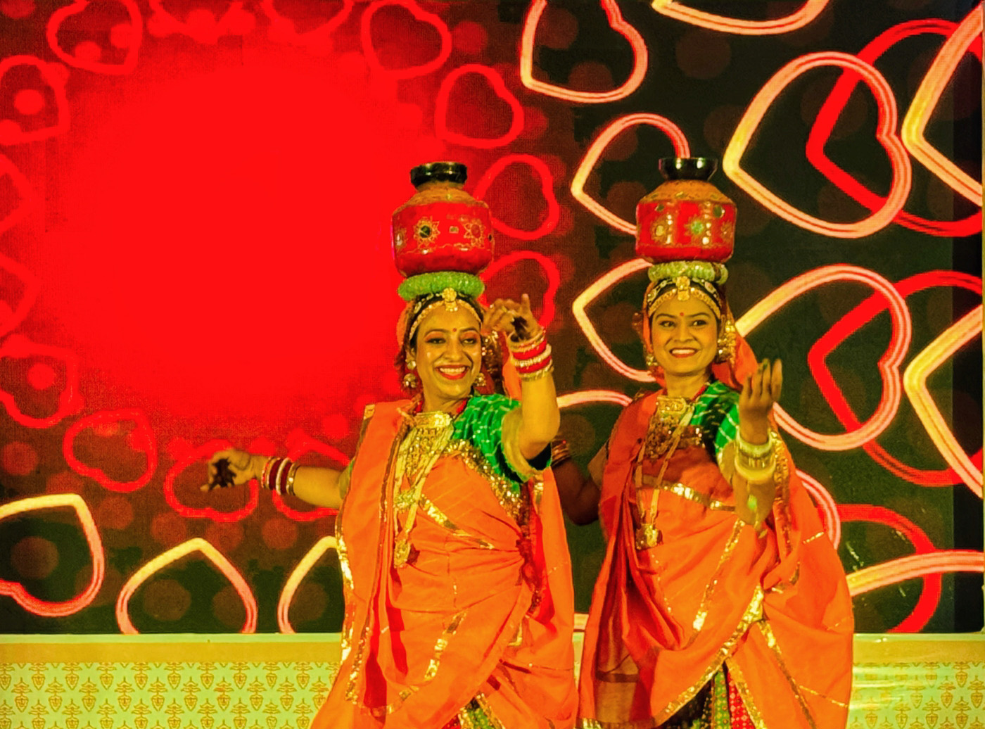
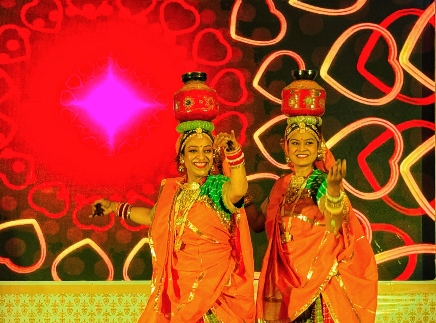
You have a knack for finding the most colorful images - love that! So many colors/shapes that work well together. The dancers - with outstretched arms and pots on their heads - are very engaging and grab my interest. My only suggestion is to consider doing something with the bright white diamond. It's the brightest part of the image - keeps pulling my gaze away from the dancers. I didn't have a great solution - you could clone it out - but then the red sphere is boring. Darkening it didn't work for me. Could make it pink to match the surrounding area? Might consider a tighter crop of the dancers? |
Mar 8th |
| 86 |
Mar 25 |
Comment |
What a happy image as we head into Spring! I was unsure what the red peppers were . . . but Kieu-Hanh explained it. I need to work on my imagination! The poor guy is missing his nose! |
Mar 8th |
| 86 |
Mar 25 |
Reply |
Thank you! I agree with you - what I did created something unnatural; where we can see instances of three lit phones (agree distracting) - without the motion blur that I was looking for. |
Mar 8th |
7 comments - 6 replies for Group 86
|
| 87 |
Mar 25 |
Reply |
I like Will's crop, but I don't think it achieves Chun's more mystical vibe. |
Mar 25th |
| 87 |
Mar 25 |
Reply |
Thank Chun! I appreciate your comments and edit. Your edit is interesting - more artistic - but also less realistic. Keep moving us in a creative direction. |
Mar 10th |
| 87 |
Mar 25 |
Comment |
You did an amazing job removing the distracting leaf, and completing/sharpening the pod. I also see that you added some greenery on the left side to hide the brown plant behind. If you were to submit this or print it - I'd try to correct a bit of artifact above the pod where you removed the leaf. Regarding color - only you know what the scene looked like and how you want to present it. There is room for artistic license. If the goal was to replicate true color - we could use a color checker and get it perfect each time. Only you can decide how realistic you want the image to be. I struggle with color and knowing when I've gone to far. |
Mar 8th |
| 87 |
Mar 25 |
Comment |
Decaying tree stumps are great subject for abstracts. When I first glanced at your image - I saw a footprint. To my eye - the image feels a little dark; perhaps that's what you saw and/or intended. A tighter crop might offer an alternate image you could consider. |
Mar 8th |
| 87 |
Mar 25 |
Comment |
I like your composition! The sky doesn't add much - so you made if a small part of the frame. I like that you capture vines going in different directions - they lead the viewers gaze through the frame. The B&W accentuates the stark/barren landscape. If I was going to edit this - I might try removing the 2-3 tall/thick/black posts in the foreground. |
Mar 8th |
| 87 |
Mar 25 |
Reply |
Thanks Jennifer - yes I extended the canvas in Ps. In the original - I thought the birds beak was too close to the edge of the frame. |
Mar 8th |
| 87 |
Mar 25 |
Comment |
Interesting/different image of an iconic structure. Kudos to you (I assume) for laying on the ground to capture this shot. The B&W works well. I find the image dark - and am curious why you chose to present it this way. Increasing the exposure creates a more pleasing image to my eye. Regarding the birds - they create some chaos in an otherwise very geometric/repetitive image. They're so small - not sure if they help or hurt the scene. Interested in what others think? |
Mar 7th |
 |
| 87 |
Mar 25 |
Comment |
Welcome to the group! I like this image - so many layers of depth. The person gazing in awe at the scene makes the image much more powerful! Well done. I like the simplicity/starkness of the B&W.
I'm not sure how you processed it - but the fog/blur you created is distracting to me. At first I thought it was a long exposure with the clouds moving - but the original is sharp. How did you achieve that blur effect? I would avoid having the blur spill on the grasses. As presented - it creates the impression of something not natural.
Another approach might have been to darken the periphery; still keeping it sharp.
I look forward to enjoying future images and am happy that you have joined our group!
|
Mar 7th |
5 comments - 3 replies for Group 87
|
12 comments - 9 replies Total
|


