|
| Group |
Round |
C/R |
Comment |
Date |
Image |
| 86 |
Sep 24 |
Reply |
Thank you! |
Sep 26th |
| 86 |
Sep 24 |
Comment |
I like the juxtaposition of old/new architecture. The vibrant colors create interest and grab my attention. To my eye - it appears a bit over saturated; I appreciate that's a question of taste. Regarding composition - agree it would be best to avoid the overlapping temple and tower. That creates some tension in the image and interrupts the tower. I'd also consider getting rid of the lower right corner temple edge. And also the darker blue triangle pointed out by Kieu-Hanh. |
Sep 21st |
| 86 |
Sep 24 |
Reply |
I like this alternate - the people with umbrellas are a nice bonus! |
Sep 6th |
| 86 |
Sep 24 |
Comment |
Thank you both! At first I was inclined to ignore the boring image . . . then decided to make it something different. |
Sep 6th |
| 86 |
Sep 24 |
Comment |
Agree with the comments above! Well done. I like how the main stem leads my eyes through the frame. First up into the brightest/colorful area with the blooms - and then continuing to guide me up/back through the buds. There is a bright spot of greenery on the lower left - that you could darken a bit - so it doesn't distract. I also wonder if there might be some opportunity to brighten the orange color - so the flowers pop even more. |
Sep 6th |
| 86 |
Sep 24 |
Comment |
I think the tilt (elevated vantage point) make the viewer a bit unbalanced - but in a good way! It grabs/hold my interest; I feel like I'm looking down on the scene from a second story window. Not your average snapshot. The red pub street sign is important - if you were to shoot this again - might consider a bit more breathing room to the left of the that sign. It's very close to the edge - not a great spot for perhaps the most important part of the frame. The reflections and various hues caused by different lights are great! The black square on the lower right isn't great; it's so black that one almost wonders if it's some kind of interfering subject/artifact. It would be difficult to clone in parts of other squares and make it look natural. My only other suggestion might be a fine white border; since the current presentation (against a black background) - leaves the viewer unclear where you image stops. Must have been an amazing trip! |
Sep 6th |
| 86 |
Sep 24 |
Comment |
I also like Jack's edits - they make the image a little more vibrant/interesting. Your original capture is bit flat/washed out. The cross "reaching up into the sky" . . . lets the viewer ponder what that means. A lot of the image is taken up by the clouds (perhaps a bit too much) - but nothing you can do about that - since it's important to include a bit of blue sky. And for me - the clouds are the "star" of this image. Well done! |
Sep 6th |
| 86 |
Sep 24 |
Comment |
Fall already! Timely image - there is definitely a chill in the air here in Chicagoland. I like your image and the street scene. Brown leaves pop nicely against the blue car. The car, buildings across the street, air conditioner in the window - really feels like NYC. I'm not sure I would have caught your reflection the car - but since Jack pointed it out - I can't unsee it! I tried unsuccessfully to remove it - perhaps best to just crop it out. Regarding the car in the distance - the LR remove tool didn't do a great job (it's a pretty busy/tough area) - I can still see the tire rim - the rest just looks smudged. We know it's a street - probably with cars parked on the other side - I'd just leave it. |
Sep 6th |
6 comments - 2 replies for Group 86
|
| 87 |
Sep 24 |
Reply |
Chan - always appreciate your comments! What do you think of this? |
Sep 8th |
 |
| 87 |
Sep 24 |
Reply |
What do you fill the feeder with? I placed one in my backyard 2 years ago . . . changed the sugar solution regularly - never saw a single customer :(
|
Sep 7th |
| 87 |
Sep 24 |
Comment |
Beautiful creatures - glad you made it to Iceland - also on my bucket list. In the original image - agree you could improve it by cropping tighter - ideally just the two birds on the right. You could still leave enough water/risk to give a sense of the place - while filling more of the frame with the birds. |
Sep 7th |
| 87 |
Sep 24 |
Comment |
Great job - these tiny birds are so hard to even spot - much less photograph. The head/body is sharp - the best you could expect from a hovering hummingbird @ 1/125 sec. Their wings flap incredibly fast (around 100 flaps/second) - so the linear speed (esp around the end of the wing) is super fast. If you want to try o freeze more of the wings - you either need a really fast shutter speed (1/4000 sec or faster; typically not enough ambient light to do this) or off-camera speedlights (low power to achieved flash durations around 1/20,000 sec). While the latter gives the best technical result - it would not be allowed in nature competition and some believe it is harms the birds. Keep trying - esp in bright light with faster shutter speeds. |
Sep 7th |
| 87 |
Sep 24 |
Comment |
Nice image of a solitary flower against a dark background. I agree with the comment above - and like Lance's second edit. Your original image devotes too much of the frame to leaves/black - the tighter image allows me to better appreciate the flower - while leaving enough background to frame it. Another suggestion might be to add a fine white border. Images with black edges - presented on a black background - leave the viewer uncertain where the image ends. On the other hand - this might be part of the aesthetic you are looking for? |
Sep 7th |
| 87 |
Sep 24 |
Comment |
Reminds me of your ice cream sprinkles -which I loved and tried to replicate!
There is so much going on in this image that grabs/holds my interest.
I'm uncertain of the subject.
Looks like some small tubular structures (hollow, ? pasta) - alongside smaller strands of something. You added color and motion. Curious that some of the tubes are tack sharp - while other parts of the image convey motion - leads me to think this is a double exposure of some type.
I like the image - perhaps because the nerd in my tries to figure it out. I spend more time doing that vs. enjoying the abstract. Perhaps that's a left vs. right brain thing.
I await your explanation! |
Sep 7th |
| 87 |
Sep 24 |
Comment |
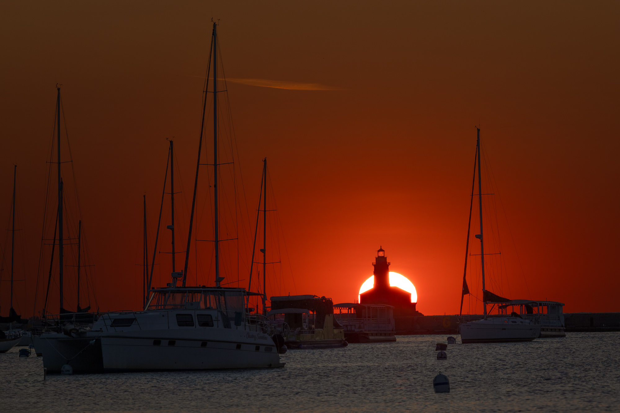
Appreciate your kind comments. This was one 3AM trek into Chicago that was totally worth it. Nice when the stars align (pun intended). |
Sep 7th |
| 87 |
Sep 24 |
Comment |
Chan - creative edits of a conventional image! For my taste - the vase is pretty sharp - and the fact that the surface below is not (which is in the same focal plane) gives the impression of something artificial or over-processed. It does have an ethereal vibe - but then why is the vase sharp? Agree with Cindy that there appears to be a reflection of something behind the camera in the neck of the vase. And also windows/etc. in the lower part of the vase. Having said the above - it holds my interest longer than the original image as I wander around it and try to understand it. . |
Sep 7th |
| 87 |
Sep 24 |
Comment |
Interesting - definitely grabs/hold my attention! Agree with points above - nice that one could view this quite literally as a documentary image? Or an abstract? I like the range of tones and also the bright, curved central line. Very creative! |
Sep 7th |
7 comments - 2 replies for Group 87
|
13 comments - 4 replies Total
|


