|
| Group |
Round |
C/R |
Comment |
Date |
Image |
| 86 |
Mar 24 |
Reply |
Definitely agree that the leading lines need to lead to something - and that keeping some sky/horizon is important. |
Mar 12th |
| 86 |
Mar 24 |
Comment |
Love it - the leading lines work well and guide us through the image. The repetition/monotony actually helps the image! the bagged strawberries add a nice pop of color and help us "city boys" understand what the plants are. I like the idea of the lines leading to a person; unfortunately in this image I think your son is too small/far/dark to make much of an impact. I wonder if it would be better with or without him there? |
Mar 10th |
| 86 |
Mar 24 |
Comment |
A nice reminder of Spring . . . having also just changed our clocks! The density of blooms is great - and I like the pop of the brown tree on the right and darker greenery at the base. I think I'd prefer a crop that includes the whole tree (with a bit of breathing room on the sides. |
Mar 10th |
| 86 |
Mar 24 |
Comment |
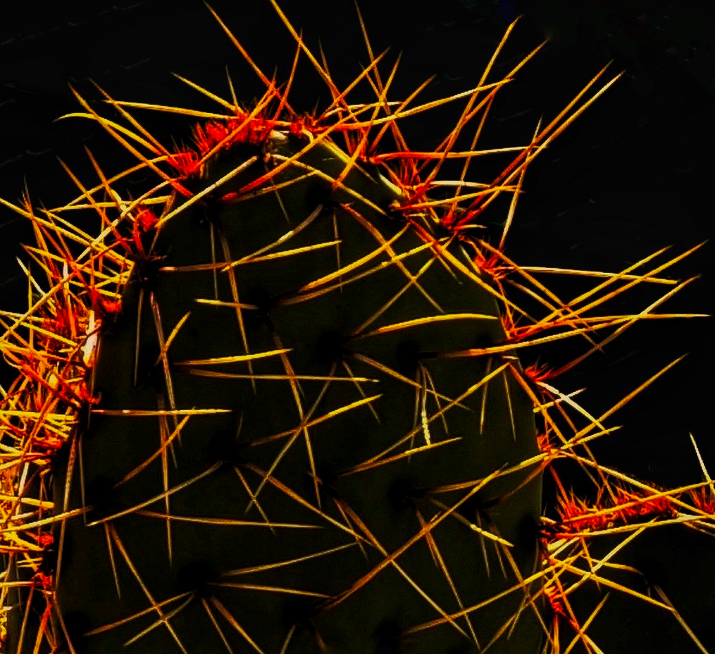
Love this - very creative. Was the orange-red color there - or added in Snapseed? The random/chaotic nature of the spines creates interest. I agree the diagonals in the background are distracting - I was able to remove them (this did require Photoshop). I also like your chosen name of the image! The body of the cactus in shadow - works well with the black background.
|
Mar 10th |
 |
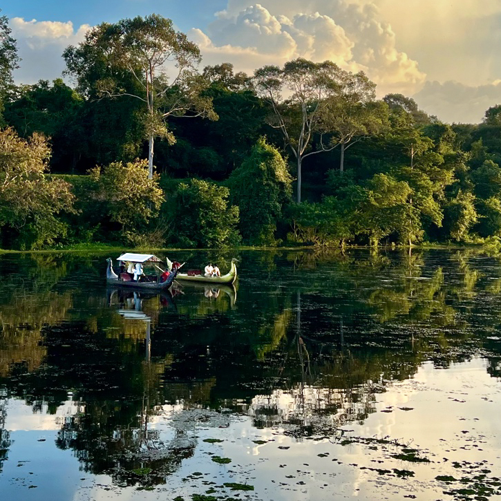
| 86 |
Mar 24 |
Reply |
Sorry . . . old abbreviation for Florida. Many scenes like yours . . . of course without the boat! |
Mar 7th |
| 86 |
Mar 24 |
Comment |
The perspective is interesting - upon first glance - I wondered if this was a very wide angle image with associated distortion - but I think it's really the shape of the structure! I agree with Jack that the bright cloud pulls our gaze out of the image - but I'm not sure how to create a better edit. |
Mar 7th |
| 86 |
Mar 24 |
Comment |
Agree the lighting is good/interesting! Unfortunately the boat is not that visible due to its small size and location in dark shadow. When I first saw this picture - my thought was that it could be FLA. Further inspection reveals the boat. I tried to edit it (cropping and then brightening the boat) - with limited success. You may have better results with the higher resolution/original image. The crop loses the impact of the cloud. |
Mar 7th |
 |
| 86 |
Mar 24 |
Comment |
Interesting image Ruth! I like the way the house is hidden in the brush. Part of me wishes more of it was visible - but then the current rendition creates interest, because I struggle to visualize it and need to use my imagination. I wonder how it came to be in this state? I think Kieu-Hanh makes a good suggestion to consider a vintage or "grunge" look . . . to go along with the scene. The red roof doesn't bother me or look over processed. |
Mar 3rd |
6 comments - 2 replies for Group 86
|
| 87 |
Mar 24 |
Comment |
Hi Cindy - I agree with Chan that the butterfly is a bit lost in the frame (perhaps due to its small size and and/or clutter). If you were able to get closer (or use your long lens) - it might have been a better shot. Regarding the out of focus areas in the distance - I like them - they create interest and give the shot depth. I think your camera settings are perfect. Butterflies are a great subject! |
Mar 10th |
| 87 |
Mar 24 |
Comment |
My initial thought was that this was composite. Love it/creative/whimsical still life. I like your lighting - off to camera right - creating interesting bright and dark areas. |
Mar 10th |
| 87 |
Mar 24 |
Comment |
I like the way the soft colors pop! Nice sharp image. Curious that the Village Center is so empty. I wish the guy on the bench was wearing a bright red or yellow sweatshirt. Regarding the tree on the left - partially cut off - I might try either cloning it out - or a slightly wider crop that would allow inclusion of the whole tree. From a composition standpoint - I like that the trees are off-center and asymmetric. |
Mar 10th |
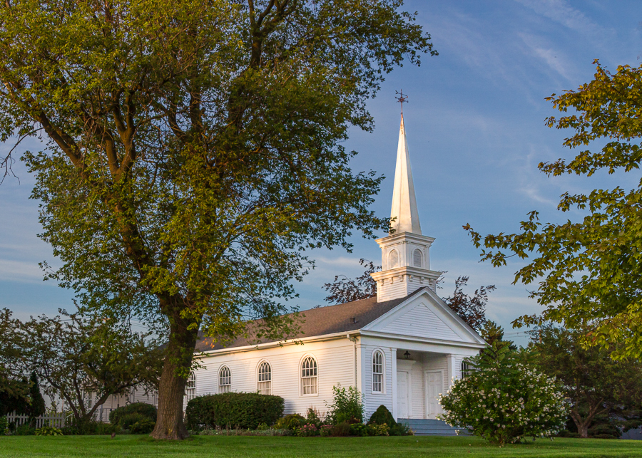
| 87 |
Mar 24 |
Reply |
Cindy - I agree with you that the steeple is too bright. Regarding how I did the edit - all in LR - I selected the church and increased the exposure by 1 stop (the LR exposure slider has markings for stops of exposure). Then I duplicated/inverted that mask (so I had everything except the church selected) and reduced the exposure by one stop. I think this helps the church pop! |
Mar 6th |
| 87 |
Mar 24 |
Comment |
I like both of these images . . . even before reading the text - they conjured up memories of my Sept 2023 image in the same location. Kudos to you for taking a very different image. Great vantage point and capture of the motion/pace/chaos. Makes sense that these could be part of a related series. I think the B&W further emphasizes the motion - by removing the distraction of color. Well done! |
Mar 3rd |
| 87 |
Mar 24 |
Comment |
Very tranquil scene . . . the colors work well together! Nicely exposed/sharp. One suggestion might be to brighten the church relative to the rest of the scene. In your image - the bright/vivid sky and greenery pull my gaze away from the main subject (which is shaded/relatively dark). In my LR edit - I brightened the church by 1 stop and darkened everything else by 0.5 stop. |
Mar 3rd |
 |
5 comments - 1 reply for Group 87
|
11 comments - 3 replies Total
|


